  - type: custom:swipe-card
    cards:
      - square: false
        type: grid
        columns: 1
        cards:
          - type: custom:mushroom-template-card
            primary: {{user}}
            card_mod:
              style:
                mushroom-state-info$: |
                  .container {
                    text-align: center !important;

                .: |
                  ha-card {
                    --card-primary-font-size: 18px;
                    box-shadow: 0px 2px 5px 0px rgba(0,0,0,0.3) !important;
                    background-color: rgba({{ states("input_text.kleur_iconen")}},0.2) !important;
                    width: 80%;
                    margin-left: 40px;
                    height: 55px !important;
                    }
primary: '{{user}}'
1 Like
I found it…
you cannot use
primary: {{user}}
you have to put some text before
primary: hi {{user}}
you can like I showed with single quotes
1 Like
next question 
is it possible to make a card where the entity is dynamic ?
f.e.
              - type: custom:mushroom-chips-card
                chips:
                  - type: entity
                    entity: ('input_text.XXXXXX ')
and the input_text has to be followed by {{user}} ?
so depending on the user who is logged in I get a different value shown ?
possibly, but easier with conditional card i guess.
type: conditional
conditions:
  - condition: user
    users:
      - ccc83b18ee8d4c498fcac9df2436b493
card:
  type: custom:mushroom-chips-card
  chips:
    - type: entity
      entity: input_text.xxxxx
1 Like
Hey ya’ll… I have a mushroom template card that uses a 20pt font for the primary text with no secondary text. It cuts off all lower case letters that go below the normal line the text is written on, ie. letters g, j, p, q, y. Can someone help me expand the primary text area? Not having much luck googling. Thanks.

card_mod:
    style:
      mushroom-state-info$: |
        .container {
         --card-primary-font-size: 46px;
         --card-primary-line-height: 46px !important;
        }
Many thanks Frosty!
Hello everyone,
As a newcomer to Home Assistant and the Mushroom cards, I’ve been following this thread with great interest. The customization options you’re all discussing are impressive!
While exploring ways to enhance my smart home setup, I came across a product that might be useful for those looking to expand their Home Assistant capabilities, especially in relation to creating more interactive dashboards.
I recently purchased the Aqara Presence Sensor from Amazon, and it’s been a great addition to my setup. It’s compatible with Home Assistant and can be used to trigger automations or display motion status on your Mushroom cards.
I’ve found it particularly useful for creating more dynamic dashboards, as I can use its data to change icon colors or trigger animations on my Mushroom cards based on room occupancy.
Has anyone else integrated presence sensors with their Mushroom cards? I’d love to hear about your experiences or any creative uses you’ve found!
@piitaya is it possible to add the “display_type: complete” like in badges to the Chips too?
Edit: i saw someone else already create a feature requests, so WE will See 
Hello, does anyone know of a way to change the actual function of the lock/unlock button in the mushroom lock card? I would like for the unlock/lock button to run a script that I have created that updates the entity state after toggling the lock because my door lock takes ~30 seconds to update itself. Thanks
You cant alter the function of the buttons or sliders on mushroom cards. The only actions you can alter are the default, tap, hold, double tap actions.
If you want to do this still you will have to fork the mushroom project and add this yourself.
1 Like
I did search but I’m sure someone will have beaten me to the punch somewhere in this thread but I wanted to animate my robot vacuum and couldn’t find any examples. Initially I was doing it in a template-entity-row and it took ages to find out how to do it there - so I adapted it to a mushroom card too so I could post.
I appreciate it’s not a complex one but might save someone else some time.
type: custom:mushroom-template-card
primary: Vacuum
icon: mdi:robot-vacuum
icon_color: white
layout: vertical
card_mod:
  style:
    .: |
      ha-state-icon {
        animation: vacuumMovement 4s infinite;
      }
      @keyframes vacuumMovement {
        0% {
          transform: translate(-5px,-5px) rotate(0deg);
        }
        12.5% {
          transform: translate(-5px,5px) rotate(0deg);
        }
        25% {
          transform: translate(-5px,5px) rotate(-90deg);
        }
        37.5% {
          transform: translate(5px,5px) rotate(-90deg);
        }
        50% {
          transform: translate(5px,5px) rotate(-180deg);
        }
        62.5% {
          transform: translate(5px,-5px) rotate(-180deg);
        }
        75% {
          transform: translate(5px,-5px) rotate(-270deg);
        }
        87.5% {
          transform: translate(-5px,-5px) rotate(-270deg);
        }
        100% {
          transform: translate(-5px,-5px) rotate(-360deg);
        }
      }

10 Likes
Dont sell yourself short - this is great and its always nice to post a solution.
3 Likes
Note: Current code sizes best for desktop viewing. If planning to use on mobile you can change the padding options
Nevermind, I have solved my own problem! I came up with this. It is essentially two mushroom template cards stacked vertically. The bottom card is using card mod to adjust the icon spacing, padding, and size to match what the mushroom lock card button looks like. This way you can set the button’s tap action to whatever you want. I included the code for both a normal layout/size and another for using it in a 2-column grid if anyone would like to use it!
Thanks!
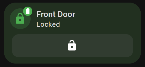

Full Size:
type: custom:stack-in-card
mode: vertical
cards:
  - type: custom:mushroom-template-card
    primary: Front Door
    secondary: >
      {% if is_state('binary_sensor.front_door_contact_sensor_intrusion','on')
      %}
        Door Open
      {% elif is_state('lock.front_door','unlocked') %}
        Unlocked
      {% else %}
        Locked
      {% endif%}
    icon: >-
      {% if is_state('binary_sensor.front_door_contact_sensor_intrusion','on')
      %}
        mdi:door-open
      {% elif is_state('lock.front_door','unlocked') %}
        mdi:lock-open
      {% else %}
        mdi:lock
      {% endif%}
    icon_color: >-
      {% if is_state('lock.front_door','locked') and
      is_state('binary_sensor.front_door_contact_sensor_intrusion','off') %}
        green
      {% else %}
        red
      {% endif%}
    badge_icon: >-
      {% set battery_level = (states('sensor.front_door_battery') | int / 10) |
      round(0) | int * 10 %} {% if battery_level == 100 %} mdi:battery {% elif
      battery_level > 0 %} mdi:battery-{{ battery_level }} {% else %}
      mdi:battery-alert-variant-outline {% endif %}
    badge_color: |-
      {% set battery_level = states('sensor.front_door_battery') | int %}
      {% if battery_level > 90 %} green
      {% elif battery_level > 60 %} light-green
      {% elif battery_level > 50 %} lime
      {% elif battery_level > 40 %} yellow
      {% elif battery_level > 30 %} amber
      {% elif battery_level > 20 %} orange
      {% elif battery_level > 10 %} deep-orange
      {% else %} red
      {% endif %}
    tap_action:
      action: none
    hold_action:
      action: more-info
  - type: custom:mushroom-template-card
    primary: ''
    secondary: ''
    icon: |-
      {% if is_state('lock.front_door','locked') %}
        mdi:lock-open
      {% else %}
        mdi:lock
      {% endif%}
    layout: vertical
    entity: script.front_door_lock_and_refresh
    tap_action:
      action: perform-action
      perform_action: script.front_door_lock_and_refresh
      target: {}
    card_mod:
      style:
        mushroom-shape-icon$: |
          .shape {
            --icon-symbol-size: 23px;
            --icon-size: 30px;
            padding-right: 420px;
            padding-left: 10px;
            padding-bottom: 10px;
            border-radius: 12px !important;
          }
        .: |
          ha-state-icon {
            padding-right: 3px;
            padding-left: 380px;
            padding-bottom: -20px;
            height: 15px;
            width: 50px;
            color: white;
          }
           ha-card {
            margin-top: -19px;
            margin-bottom: 1px;
            margin-left: 30px;
            margin-right: 30px;
            }
card_mod:
  style: |
    ha-card {
      {% if is_state('lock.front_door','locked') and
      is_state('binary_sensor.front_door_contact_sensor_intrusion','off') %}
          background: rgba(101,170,91,0.2);
      {% else %}
          background: rgba(226,84,66,0.2);
      {% endif %}
    }
Half Size:
type: custom:stack-in-card
mode: vertical
cards:
  - type: custom:mushroom-template-card
    primary: Front Door
    secondary: >
      {% if is_state('binary_sensor.front_door_contact_sensor_intrusion','on')
      %}
        Door Open
      {% elif is_state('lock.front_door','unlocked') %}
        Unlocked
      {% else %}
        Locked
      {% endif%}
    icon: >-
      {% if is_state('binary_sensor.front_door_contact_sensor_intrusion','on')
      %}
        mdi:door-open
      {% elif is_state('lock.front_door','unlocked') %}
        mdi:lock-open
      {% else %}
        mdi:lock
      {% endif%}
    icon_color: >-
      {% if is_state('lock.front_door','locked') and
      is_state('binary_sensor.front_door_contact_sensor_intrusion','off') %}
        green
      {% else %}
        red
      {% endif%}
    badge_icon: >-
      {% set battery_level = (states('sensor.front_door_battery') | int / 10) |
      round(0) | int * 10 %} {% if battery_level == 100 %} mdi:battery {% elif
      battery_level > 0 %} mdi:battery-{{ battery_level }} {% else %}
      mdi:battery-alert-variant-outline {% endif %}
    badge_color: |-
      {% set battery_level = states('sensor.front_door_battery') | int %}
      {% if battery_level > 90 %} green
      {% elif battery_level > 60 %} light-green
      {% elif battery_level > 50 %} lime
      {% elif battery_level > 40 %} yellow
      {% elif battery_level > 30 %} amber
      {% elif battery_level > 20 %} orange
      {% elif battery_level > 10 %} deep-orange
      {% else %} red
      {% endif %}
    tap_action:
      action: none
    hold_action:
      action: more-info
  - type: custom:mushroom-template-card
    primary: ''
    secondary: ''
    icon: |-
      {% if is_state('lock.front_door','locked') %}
        mdi:lock-open
      {% else %}
        mdi:lock
      {% endif%}
    layout: vertical
    entity: script.front_door_lock_and_refresh
    tap_action:
      action: perform-action
      perform_action: script.front_door_lock_and_refresh
      target: {}
    card_mod:
      style:
        mushroom-shape-icon$: |
          .shape {
            --icon-symbol-size: 21px;
            --icon-size: 30px;
            padding-right: 170px;
            padding-left: 10px;
            padding-bottom: 10px;
            border-radius: 12px !important;
          }
        .: |
          ha-state-icon {
            padding-right: 3px;
            padding-left: 145px;
            padding-bottom: -20px;
            height: 12px;
            width: 5px;
            color: white;
          }
           ha-card {
            margin-top: -19px;
            margin-bottom: 1px;
            margin-left: 30px;
            margin-right: 30px;
            }
card_mod:
  style: |
    ha-card {
      {% if is_state('lock.front_door','locked') and
      is_state('binary_sensor.front_door_contact_sensor_intrusion','off') %}
          background: rgba(101,170,91,0.2);
      {% else %}
          background: rgba(226,84,66,0.2);
      {% endif %}
    }
1 Like
Thanks,
Just wanted to say that this worked perfectly 
May I pick your brain again and ask if I want to do something similar however instead of showing what is not at zero value and rather show one of two sensors that are not set to off state. Followed by generic text For example:-
“Waiting for battery to charge to 80%”
(binary_sensor.battery_is_80)
Or
“Waiting for PV to generate over 2500kWh”
(binary_sensor.total_pv_power_helper)
As currently I have no idea of the correct syntax to use?
Regards Mike.
Hello, is it possible to make the same Gauge card using mushroom cards? If possible, does anyone have a code example?

Hi everybody,
as of now I have single custom:button-cards to change the source of my amp,
which works fine.

type: custom:button-card
entity: script.src_htpc
tap_action:
  action: perform-action
  perform_action: script.src_htpc
  target: {}
icon_tap_action:
  action: none
show_entity_picture: false
icon: phu:emby
layout_options:
  grid_columns: 2
  grid_rows: auto
show_state: false
show_name: false
card_mod:
  style: |
    :host {
      {% if is_state_attr('media_player.denon_avr_x2800h', 'source','HTPC') -%}
              --paper-item-icon-color: rgba(140, 20, 252,1)
      {% else -%}
              --paper-item-icon-color: grey
      {%- endif %}
     }
    ha-card {
      --ha-card-background: #;
      border-radius: 15px;
      box-shadow: rgba(140, 20, 252,1) 0px 1px 50px;important
    }
Reading up on all those beatiful solutions that have amassed in (Part 1), this one triggered me.
I thought it would be a nice option to cut down on the amount of buttons on the dashboard.
I tried to adapt the given code to my needs but, looks like something that only a mother could love …

type: custom:layout-card
layout_type: grid
layout:
  grid-template-columns: 50% 50%
  grid-template-areas: |
    "A1 A2"
cards:
  - type: horizontal-stack
    cards:
      - type: custom:button-card
        name: ''
        entity: input_select.denon
        show_state: true
        show_entity_picture: true
        entity_picture: /local/EMBY.png
        styles:
          card:
            - font-size: 2rem
            - font-weight: bold
          icon:
            - height: 4rem
            - width: 4rem
    view_layout:
      grid-area: A1
  - type: horizontal-stack
    view_layout:
      grid-area: A1
    cards:
      - type: custom:mushroom-select-card
        entity: input_select.denon
        secondary_info: none
        icon_type: none
        fill_container: true
        card_mod:
          style:
            mushroom-select-option-control$:
              mushroom-select$: |
                .mdc-select__anchor{
                  background: none !important;
                  border-radius: 20px !important;
                }
                .mdc-line-ripple::before {
                  border-bottom-width: 0px !important;
                }
                .mdc-line-ripple::after {
                  border-bottom-width: 0px !important;
                }
                .mdc-select__selected-text {
                  color: transparent !important;
                }
                .mdc-select__dropdown-icon {
                  fill: transparent !important;
                }
                .mdc-select {
                  position: absolute !important;
                  width: 100% !important;
                  --select-height: 97px;
                  top: 0%;
                  right: 0%;
                }
            .: |
              ha-card {
               background: none;
              }
layout_options:
  grid_columns: 4
  grid_rows: auto
But I’m scratching my head, will get bloody soon  , about 3 things:
-
Besides the overall look, I’d like to change the picture per source value, as in the original code with heat, cool…
Just cant find where the other pictures, or better icons, are hidden in the code ? -
When I change the source outside of HA, i.e. Alexa or a remote, the input_select.denon doesn’t seem to acknowledge ? How to change this ?
-
Why does it write Denon (brand of the amp) into the card ?
I guess its the friendly_name of my input_select helper, which calls the automations.
Is there a way to hide those names ?
Maybe someone could give me a push into the right direction, or enlight my nearly bloody head 
Better use apex char cards

square: false
type: grid
show_name: false
cards:
  - type: custom:apexcharts-card
    chart_type: radialBar
    experimental:
      color_threshold: true
    header:
      show: true
      title: Climate
      show_states: true
      colorize_states: true
    series:
      - entity: sensor.humidity
        color_threshold:
          - value: 10
            color: red
          - value: 20
            color: orange
          - value: 40
            color: green
          - value: 50
            color: green
          - value: 60
            color: green
          - value: 70
            color: orange
          - value: 90
            color: red
        show:
          header_color_threshold: true
      - entity: sensor.temperature
        min: 0
        max: 35
        color_threshold:
          - value: 0
            color: MidnightBlue
          - value: 5
            color: RoyalBlue
          - value: 10
            color: DeepSkyBlue
          - value: 20
            color: GreenYellow
          - value: 23
            color: GreenYellow
          - value: 25
            color: Orange
          - value: 28
            color: OrangeRed
        show:
          header_color_threshold: true
    apex_config:
      plotOptions:
        radialBar:
          offsetY: 0
          startAngle: -90
          endAngle: 90
          dataLabels:
            name:
              show: false
            value:
              show: false
      legend:
        show: false
      fill:
        type: gradient
        opacity: 0.2
columns: 1
1 Like