Probably, but not apparent with the example code you posted.
Bookmarked
2 Likes
Another stupid question: whats the difference between
--icon-symbol-size: and --icon-size: ?
 --icon-symbol-size:  the actual icon
 --icon-size: the background size of the icon
1 Like
Ahhhh, makes perfectly sense, thank you!
I’m going to experiment a bit when I come home from work and post the results (at least if they are good  )
)
PS: I changed my variables and it still works, so no predefinitions used 
1 Like
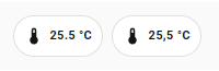
Tried both ways, second one is advised by chatgpt
- type: custom:mushroom-chips-card
  chips:
    - type: template
      entity: sensor.kotela6_pmeter_power
      content: "{{ states('sensor.boiler_temp') | float | round(1) }} °C"
      icon: mdi:thermometer
      tap_action:
          action: more-info
- type: custom:mushroom-chips-card
  chips:
    - type: template
      entity: sensor.kotela6_pmeter_power
      icon: mdi:thermometer
      tap_action:
          action: more-info
at first glance I’d say the first version should work… but is states(‘sensor.boiler_temp’) the right entity?
and is there a reason why you use the template-chips-card?
type: custom:mushroom-chips-card
chips:
  - type: template
    entity: sensor.sensor_bad_temperatur
    content: "{{ states('sensor.sensor_bad_temperatur') | float | round(1) }} °C"
    icon: mdi:thermometer
    tap_action:
      action: more-info
  - type: entity
    entity: sensor.sensor_bad_temperatur
both cards result in the same chip in my environment…
1 Like
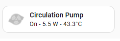
Hi all, I am asking for help!
The new mushroom card has done some weird things with my animations; some stopped working others lost the icon circle.
Here are some examples and I hope someone can point me in the the right direction.
This one the animation stopped working:
type: custom:mushroom-template-card
primary: Circulation Pump
icon: mdi:pump
secondary: >
  {{ states('switch.circulation_pump') | title }} - {{
  states('sensor.circulation_pump_power') }} W -  {{
  states('sensor.circulation_pump_temperature') }}°C
tap_action:
  action: more-info
grid_options:
  columns: 6
  rows: 1
entity: switch.circulation_pump
color: |
  {% if is_state('switch.circulation_pump', 'on') %}
    green
  {% else %}
    grey
  {% endif %}
features_position: bottom
card_mod:
  style:
    mushroom-shape-icon$: |
      .shape {
        --icon-symbol-size: 30px;
        --shape-color: none;
        background: none;
        border-radius: 50%;
        animation: {{ 'spin 2s linear infinite' if is_state(config.entity, 'on') else 'none' }} !important;
        stroke: white;
        stroke-width: .3px;
      }
      .shape:before {
        content: "";
        background: {{ 'lightgrey' if is_state(config.entity, 'on') else 'red' }};
        position: absolute;
        height: 24px;
        width: 24px;
        border-radius: 50%;
      }
      @keyframes spin {
        0% { transform: rotate(0deg); }
        100% { transform: rotate(360deg); }
      }
And this one is a moving but the circle background has disappeared.
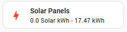
type: custom:mushroom-template-card
primary: Solar Panels
secondary: >
  {{ states('sensor.solarnet_power_photovoltaics') | float | round(2) }} Solar
  kWh -

  {{ states('sensor.solarnet_energy_day') | float | round(2) }} kWh
icon: |-
  {% if is_state('sensor.solarnet_power_photovoltaics', 'unavailable') %}
    mdi:lightning-bolt
  {% elif states('sensor.solarnet_power_photovoltaics') | float >= 0.1 %}
    mdi:solar-power-variant
  {% else %}
    mdi:lightning-bolt
  {% endif %}
tap_action:
  action: navigate
  navigation_path: /panel-backend/solar_panel
entity: sensor.solarnet_power_photovoltaics
multiline_secondary: false
grid_options:
  columns: 6
  rows: 1
color: >-
  {% set pv = states('sensor.solarnet_power_photovoltaics') | float %} {% if pv
  >= 0.1 and pv < 2 %}
    deep-orange
  {% elif pv >= 2 and pv <= 4 %}
    orange
  {% elif pv > 4 and pv < 15 %}
    amber
  {% else %}
    red
  {% endif %}
features_position: bottom
card_mod:
  style: >-
    {% set real_power = states('sensor.smart_meter_ts_65a_3_real_power') | float
    %} {% set solar = states('sensor.solarnet_power_photovoltaics') | float %}

    {% if real_power <= 0 and solar > 0 %}
      {% if solar > 6 %}
        ha-state-icon { animation: rays 0.5s infinite; }
      {% elif solar > 4 %}
        ha-state-icon { animation: rays 1s infinite; }
      {% elif solar > 2 %}
        ha-state-icon { animation: rays 1.5s infinite; }
      {% else %}
        ha-state-icon { animation: rays 2s infinite; }
      {% endif %}

      @keyframes rays {
        0%, 100% { clip-path: inset(0 0 0 0); }
        80% {
          clip-path: polygon(
            100% 99%, 0% 99%, 11% 50%, 57% 48%, 56% 31%, 41% 31%,
            33% 25%, 29% 18%, 27% 11%, 27% 6%, 74% 6%, 73% 15%,
            69% 23%, 62% 29%, 71% 42%, 87% 47%
          );
        }
      }

    {% elif real_power > 0 and solar <= 0 %}
      ha-state-icon {
        animation: charge 1s linear infinite;
      }

      @keyframes charge {
        0%, 10%, 20%, 30%, 40%, 50%, 60%, 70%, 80%, 90%, 100% { transform: translate(0, 0); }
        5% { transform: translate(0.6px, -0.9px); }
        15% { transform: translate(-0.7px, 0.8px); }
        25% { transform: translate(0.4px, -0.5px); }
        35% { transform: translate(-0.6px, 0.4px); }
        45% { transform: translate(0.5px, -0.7px); }
        55% { transform: translate(-0.3px, 0.6px); }
        65% { transform: translate(0.7px, -0.4px); }
        75% { transform: translate(-0.5px, 0.3px); }
        85% { transform: translate(0.4px, -0.6px); }
        95% { transform: translate(-0.6px, 0.5px); }
      }

    {% else %}
      ha-state-icon {
        animation: none !important;
        clip-path: none !important;
        transform: none !important;
      }
    {% endif %}
I have this case with several buttons.
Try replacing custom:mushroom-template-card with custom:mushroom-legacy-template-card.
The mushroom-template-card has been renewed an changed in several ways. The mushroom-legacy-version should be the old variant (according to the creator(s?)).
Let me know if it works, otherwise we need further investigation
2 Likes
Yeah that works for some, but i still want to know how to get it to work with the new version!
Even when using custom:mushroom-legacy-template-card some of the colours aren’t working:
type: custom:mushroom-legacy-template-card
primary: Circulation Pump
icon: mdi:pump
secondary: >
  {{ states('switch.circulation_pump') | title }} - {{
  states('sensor.circulation_pump_power') }} W -  {{
  states('sensor.circulation_pump_temperature') }}°C
tap_action:
  action: more-info
grid_options:
  columns: 6
  rows: 1
entity: switch.circulation_pump
color: |
  {% if is_state('switch.circulation_pump', 'on') %}
    green
  {% else %}
    grey
  {% endif %}
features_position: bottom
card_mod:
  style:
    mushroom-shape-icon$: |
      .shape {
        --icon-symbol-size: 30px;
        --shape-color: none;
        background: none;
        border-radius: 50%;
        animation: {{ 'spin 2s linear infinite' if is_state(config.entity, 'on') else 'none' }} !important;
        stroke: white;
        stroke-width: .3px;
      }
      .shape:before {
        content: "";
        background: {{ 'lightgrey' if is_state(config.entity, 'on') else 'red' }};
        position: absolute;
        height: 24px;
        width: 24px;
        border-radius: 50%;
      }
      @keyframes spin {
        0% { transform: rotate(0deg); }
        100% { transform: rotate(360deg); }
      }
Its on and spinning and should be green but I get grey.
An example you can work with
type: custom:mushroom-template-card
entity: light.xxxxx
primary: Example
icon: mdi:mushroom
tap_action:
  action: more-info
color: >
  {{"#%02x%02x%02x" % (state_attr(config.entity, 'rgb_color') or (128, 128,
  128)) }}
features_position: bottom
icon_tap_action:
  action: toggle
card_mod:
  style:
    ha-tile-icon$: |
      .container {
        width: 70px !important;
        height: 70px !important;
        border-radius: 50% !important;
        --mdc-icon-size: 45px !important;
          }
    .: |
      ha-state-icon {
       animation: jump 2400ms ease-in-out infinite;
        transform-origin: 50% 110%;
        }
      @keyframes jump {
       0%, 100% {transform: translate(0, 0) rotate(0) scaleY(1) scaleX(1); }
       12% {transform: translate(0, 0) rotate(0) scaleY(0.85) scaleX(1.1); }
       24% {transform: translate(0, -4px) rotate(-2deg) scaleY(1) scaleX(1);}
       30% {transform: translate(-0.1px, -4px) rotate(2deg);}
       45% {transform: translate(0, 0) rotate(0); }
       50% {transform: translate(0, 0) rotate(0) scaleY(0.95) scaleX(1.07); }
       60% {transform: translate(0, -2px) rotate(0) scaleY(1.05) scaleX(0.95);}
       70% {transform: translate(0, 0) rotate(0) scaleY(1) scaleX(1);}
       80% {transform: translate(-0.2px, -0.2px) rotate(-1deg);}
       90% {transform: translate(0.2px, 0.2px) rotate(1deg);}
          }
Other examples here
1 Like
You need to define the entity here 
config.entity will not work.
animation: {{ 'spin 2s linear infinite' if is_state(config.entity, 'on') else 'none' }} !important;
needs to be
animation: {{ 'spin 2s linear infinite' if is_state('switch.circulation_pump', 'on') else 'none' }} !important;
New format example
type: custom:mushroom-template-card
primary: Circulation Pump
icon: mdi:pump
secondary: >
  {{ states(entity) | title }} - {{
  states('sensor.circulation_pump_power') }} W -  {{
  states('sensor.circulation_pump_temperature') }}°C
tap_action:
  action: more-info
grid_options:
  columns: 6
  rows: 1
entity: switch.circulation_pump
color: |
  {% if is_state(entity, 'on') %}
    green
  {% else %}
    grey
  {% endif %}
features_position: bottom
card_mod:
  style:
    ha-tile-icon$: |
      .container {
        --icon-symbol-size: 30px;
        --shape-color: none;
        background: none;
        border-radius: 50%;
        animation: {{ 'spin 2s linear infinite' if is_state('switch.circulation_pump', 'on') else 'none' }} !important;
        stroke: white;
        stroke-width: .3px;
          }
      .container:before {
        content: "";
        background: {{ 'lightgrey' if is_state('switch.circulation_pump', 'on') else 'red' }} !important;
        position: absolute;
        height: 24px;
        width: 24px;
        border-radius: 50%;
         }
      @keyframes spin {
        0% { transform: rotate(0deg); }
        100% { transform: rotate(360deg); }
        }
2 Likes
Thanks @LiQuid_cOOled it worked for one but not this one:
type: custom:mushroom-template-card
primary: Compressor
secondary: |-
  {% set d = {'off':'Off','on':'On'} %}
  {{ d.get(states(entity)) }}
icon: mdi:pump
tap_action:
  action: more-info
multiline_secondary: false
entity: binary_sensor.s1255_compressor_status
color: |-
  {% if is_state(entity, 'on') %}
    green
  {% else %}
   grey
  {% endif %}
features_position: bottom
card_mod:
  style:
    mushroom-shape-icon$: |
      .shape {
        --icon-symbol-size: 30px;
        --shape-color: none;
        background: ;
        border-radius: 50%;
        animation: {{ 'spin 2s linear infinite' if is_state(binary_sensor.s1255_compressor_status, 'on') else 'none' }} !important;
        stroke: white;
        stroke-width: .3px;
          }
      .shape:before {
        content: "";
        background:{{ 'lightgrey' if is_state(binary_sensor.s1255_compressor_status, 'on') else 'red' }};
        position: absolute;
        height: 24px;
        width: 24px;
        border-radius: 50%;
           }
       @keyframes spin {
        0% { transform: rotate(0deg); }
        100% { transform: rotate(360deg); }
      }
What am I missing?
Quotes on the entity name. Use this format on both background: and:
animation: {{ 'spin 2s linear infinite' if is_state('binary_sensor.s1255_compressor_status', 'on') else 'none' }} !important;
1 Like
Ok i did that. Colour is right but not animating now:
card_mod:
  style:
    mushroom-shape-icon$: |
      .shape {
        --icon-symbol-size: 30px;
        --shape-color: none;
        background: ;
        border-radius: 50%;
        animation: {{ 'spin 2s linear infinite' if is_state('binary_sensor.s1255_compressor_status', 'on') else 'none' }} !important;
        stroke: white;
        stroke-width: .3px;
          }
      .shape:before {
        content: "";
        background:{{ 'lightgrey' if is_state('binary_sensor.s1255_compressor_status', 'on') else 'red' }};
        position: absolute;
        height: 24px;
        width: 24px;
        border-radius: 50%;
           }
       @keyframes spin {
        0% { transform: rotate(0deg); }
        100% { transform: rotate(360deg); }
      }
This doesn’t work?
type: custom:mushroom-legacy-template-card
primary: Circulation Pump
icon: mdi:pump
secondary: >
  {{ states(entity) | title }} - {{ states('sensor.circulation_pump_power') }} W
  -  {{ states('sensor.circulation_pump_temperature') }}°C
tap_action:
  action: more-info
grid_options:
  columns: 6
  rows: 1
entity: binary_sensor.s1255_compressor_status
icon_color: |
  {% if is_state(entity, 'on') %}
    green
  {% else %}
    grey
  {% endif %}
card_mod:
  style:
    mushroom-shape-icon$: |
      .shape {
        --icon-symbol-size: 30px;
        --shape-color: none;
        background: ;
        border-radius: 50%;
        animation: {{ 'spin 2s linear infinite' if is_state('binary_sensor.s1255_compressor_status', 'on') else 'none' }} !important;
        stroke: white;
        stroke-width: .3px;
          }
      .shape:before {
        content: "";
        background:{{ 'lightgrey' if is_state('binary_sensor.s1255_compressor_status', 'on') else 'red' }};
        position: absolute;
        height: 24px;
        width: 24px;
        border-radius: 50%;
           }
       @keyframes spin {
        0% { transform: rotate(0deg); }
        100% { transform: rotate(360deg); }
      }
I think you are mixing Legacy fields with the updated fields.
Probably! This is extremely frustrating! I think they need to introduce animated icons as standard…
Spin and Blink are included
type: custom:mushroom-legacy-template-card
primary: Circulation Pump
icon: mdi:pump
secondary: >
  {{ states(entity) | title }} - {{ states('sensor.circulation_pump_power') }} W
  -  {{ states('sensor.circulation_pump_temperature') }}°C
tap_action:
  action: toggle
grid_options:
  columns: 6
  rows: 1
entity: binary_sensor.s1255_compressor_status
icon_color: |
  {% if is_state(entity, 'on') %}
    green
  {% else %}
    grey
  {% endif %}
card_mod:
  style:
    mushroom-shape-icon$: |
      .shape {
        --icon-symbol-size: 30px;
        --shape-color: none;
        background: ;
        border-radius: 50%;
        animation: {{ 'spin 2s linear infinite' if is_state('binary_sensor.s1255_compressor_status', 'on') else 'none' }} !important;
        stroke: white;
        stroke-width: .3px;
          }
      .shape:before {
        content: "";
        background:{{ 'lightgrey' if is_state('binary_sensor.s1255_compressor_status', 'on') else 'red' }};
        position: absolute;
        height: 24px;
        width: 24px;
        border-radius: 50%;
           }
Keyframes are removed in this example…
I apologize if I am not being clear with what is needed.
1 Like
@LiQuid_cOOled I got it! but i also noticed an interesting behaviour with the new card. If you put nothing in the icon setting under interactions then the icon “halo” disappears!!