Mushroom Cards - Build a beautiful dashboard easily šŸ„ (Part 2)

Hi everyone, I’m trying to get the fan in the chip card to spin, I’m using the following code, but it still doesn’t spin, what am I doing wrong?

type: custom:mushroom-chips-card
chips:
  - type: entity
    entity: sensor.ugreen_nas_device_fan
card_mod:
  style:
    mushroom-entity-chip:nth-child(2)$: |
      ha-state-icon {
        animation: wobbling 0.7s linear infinite alternate;
      }

1 and not 2…
mushroom-entity-chip:nth-child(1)$: |

And your animation should follow... like: 
      @keyframes wobbling { 
             0% { transform: scale(1); opacity: 1; } 
             50% { transform: scale(1.12); opacity: 0.8; } 
             100% { transform: scale(1); opacity: 1; }
      }

Hello everyone. Can anyone tell me what happened? All my room cards have lost all their settings, and I can’t get them back. Can anyone give me examples of how to set up room cards now?

If you updated Mushroom … Check the details, Template-card has been changed…

As I understand it, there’s a problem with the card-mode settings. They stopped working.

Yes, but you have a backup card, to ensure it’s working like the old way. Up to you to rename your cards :wink: or to adapt your Card-mod for the new way of using it…

does somebody know how i can combine a mushroom-title-card with a graph-card? like having the graph as/in the background of the title-card.

There have been some big, ā€œadvancementsā€ or, ā€œproblems,ā€ depending on your point of view. I spent two weeks updating 200+ Mushroom template cards because I didn’t want to go back to legacy. Then, 2025.10 slapped me in the face with more formatting, ā€œadvancementsā€ without warning (surely, my fault).

I suspect any example posted today might be unusable in a week/month or two. So, I don’t expect many examples any time soon. With any luck, I’ll be proven wrong.

It should be really great around March, or April. I’m looking forward to it.

Your reply is extremely vague and could be easily viewed as you simply gaslighting…

1 Like

I used to add 4 badges to a mushroom template card. One of them through the UI and the other 3 through card mod.
I managed to fix 2 of the badges (the 1st 2 blocks in card mod below) by changing mushroom-shape-icon to ha-tile-icon, but the last badge is giving me a headache (the last block in card mod below). This used to be mushroom-shape-icon. Does anyone know?

type: custom:mushroom-template-card
primary: Woonkamer
secondary: >-
  {{state_attr('climate.woonkamer', 'current_temperature') }}°C ·
  {{states('sensor.airco_woonkamer_humidity') | int(0) }}%
icon: mdi:sofa
entity: light.alle_woonkamer_lampen
hold_action:
  action: toggle
tap_action:
  action: navigate
  navigation_path: woonkamer
double_tap_action:
  action: none
badge_icon: |-
  {{ 'mdi:window-shutter-open' if
     expand(area_entities('woonkamer')) 
     | selectattr('domain', 'equalto', 'cover') 
     | selectattr('state', 'equalto', 'open') 
     | list | count > 0 
     else 'mdi:blank' }}
badge_color: |-
  {{ 'blue' if
     expand(area_entities('woonkamer')) 
     | selectattr('domain', 'equalto', 'cover') 
     | selectattr('state', 'equalto', 'open') 
     | list | count > 0 
     else 'transparent' }}  
color: "{{'amber' if states(entity) == 'on'}}"
features_position: bottom
icon_hold_action:
  action: toggle
icon_tap_action:
  action: navigate
  navigation_path: woonkamer
card_mod:
  style: |
    {% if is_state('media_player.lg_webos_tv_oled55c8lla', 'on') %}    
    ha-tile-icon:after {
        content: "tv";

        font-size: 0.9em;
        font-family: 'Material Icons Outlined';
        
        position: absolute;
        display: flex;
        justify-content: center;
        align-items: center;
        top: 29px;

        color: var(--icon-color);
        background: var(--blue-color);
        #background: var(--main-color);

        width: var(--mush-badge-size, 16px);
        height: var(--mush-badge-size, 16px);
        border-radius: var(--mush-badge-border-radius, 50%);
      }
    {% endif %}        
    {% if not is_state('climate.airco_woonkamer', 'off') %}        
    ha-tile-icon:before {
        content: "air";

        font-size: 0.9em;
        font-family: 'Material Icons Outlined';
        
        position: absolute;
        display: flex;
        justify-content: center;
        align-items: center;
        right: 25px;
        top: 3px;

        color: var(--icon-color);
        background: var(--blue-color);

        width: var(--mush-badge-size, 16px);
        height: var(--mush-badge-size, 16px);
        border-radius: var(--mush-badge-border-radius, 50%);
      }
    {% endif %}      
    {% if not is_state('media_player.woonkamer', 'off') %}          
    mushroom-shape-icon:after {
      content: "audiotrack";
      
      font-size: 0.9em;
      font-family: 'Material Icons Outlined';
      
      position: absolute;
      display: flex;
      justify-content: center;
      align-items: center;
      bottom: -6px;
      left: -6px;
      
      color: var(--primary-text-color);
      background: var(--blue-color);
      
      width: 16px;
      height: 16px;
      border-radius: 50%;
    } 
    {% endif %}

Hi liQuid.

It looks like something has changed again with version 25.10.
I have a question — do you know how to use an if - else clause inside the .secondary section?
Here’s an example code below. I’d really appreciate your help if you could guide me.

.secondary {
  padding: 3px 8px 2px 5px; 
  display: flex !important;   
  white-space: pre-wrap !important;
  inline-size: 355px !important;
  margin-left: 42px;
  background: rgba(0, 0, 0, 0.35);
  text-shadow: 0 0 10px rgba(0, 0, 0, 1), 0 0 6px rgba(0, 0, 0, 0.9);
  -webkit-text-stroke: 0.6px rgba(0,0,0,.6); 
  color: #fff !important;
  -webkit-backdrop-filter: blur(2px);
  margin-top: 0px !important;
  font-size: 22px !important;
  --primary-text-color: white;
  font-weight: bold !important;   
  border-radius: 0 16px 16px 0;
    white-space: normal;
  word-wrap: break-word;
  overflow-wrap: break-word;
} 

I tried a ā€˜secondary not empty’ condition and also added a direct if clause, but neither worked.

I’ve previously asked in the mushroom card mod topic, but maybe here is better:

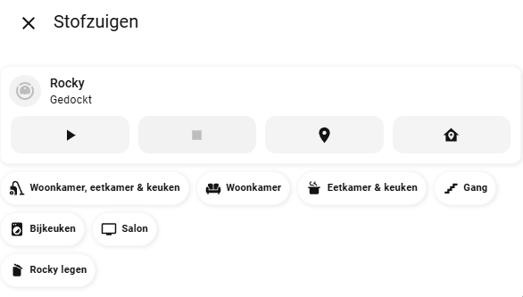
Is there any way to give an entity chip a ā€œtap effectā€? Right now I have a bunch of entity chips acting like a button to vacuum different sections of the house, but my wife indicated she’s missing the visual feedback that a button has been tapped. It would be great if there is some kind of yellow color or something to indicate the chip has been tapped.

- type: custom:mushroom-vacuum-card
  entity: vacuum.rocky
  icon_animation: true
  commands:
    - on_off
    - start_pause
    - stop
    - locate
    - return_home
- type: custom:mushroom-chips-card
  alignment: left
  chips:
    - type: entity
      entity: vacuum.rocky
      name: Woonkamer, eetkamer & keuken
      content_info: name
      icon: mdi:vacuum
      tap_action:
        action: perform-action
        perform_action: vacuum.send_command
        data:
          command: app_segment_clean
          params:
            - segments: [18, 17]
        target:
          entity_id: vacuum.rocky
    - type: entity
      entity: vacuum.rocky
      name: Woonkamer
      content_info: name
      icon: mdi:sofa
      tap_action:
        action: perform-action
        perform_action: vacuum.send_command
        data:
          command: app_segment_clean
          params:
            - segments: [17]
        target:
          entity_id: vacuum.rocky
...you get the idea....

Are you trying to apply the If/Else to a specific style change or to the all the style changes listed under .secondary?

I solved the issue — though I’m not entirely sure how, since at first it didn’t react at all, but later it started working. By the way, I don’t have any major problems with the new template card anymore, aside from a few minor details. In fact, since everything is changing anyway, I decided to build a new dashboard from scratch. I’m still working on it, but I’ll share a small preview for now.

For me personally, everything’s fine until the next update. However, what really makes me sad is that on Mushroom’s main page, thousands of people had learned and built great dashboards — and now, about half of that page has basically become useless. New users could have created amazing things. Also, everyone keeps wondering, ā€œEven if we fix it, what will change next?ā€

Anyway, for now, I’m satisfied on my end. Thanks for your attention.
I also hope that Dimitry updates his highly valuable page to adapt to the new changes, so that people can continue to use it — you and him have provided truly invaluable resources to the community.

1 Like

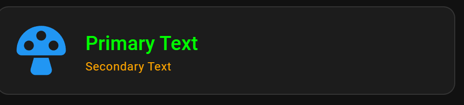
Why on earth has it become so difficult to style a mushroom card?!? This is getting ridiculous to just make some relatively simple changes. I’m using AI to help with this as it’s almost unfathomable to the average user. I am trying to make the text size larger on this card, but I can’t get to the bottom of it. anyone got any suggestions?

type: custom:mushroom-template-card
primary: |
  {{ state_attr('sensor.bin_day_sensor', 'bin_type') }}
secondary: |
  {{ states('sensor.bin_day_sensor') }}
icon: "{{ state_attr('sensor.bin_day_sensor', 'icon') }}"
entity: sensor.bin_day
layout_options:
  grid_columns: 4
  grid_rows: 2
color: "{{ state_attr('sensor.bin_day_sensor', 'bin_color') }}"
features_position: bottom
card_mod:
  style:
    ha-tile-icon$: |
      :host {
        --mdc-icon-size: 90px !important;
      }
      .container {
        width: 90px !important;
        height: 90px !important;
        display: flex;
        align-items: center;
        justify-content: center;
      }
      ha-state-icon {
        --mdc-icon-size: 90px !important;
        width: 90px !important;
        height: 90px !important;
        font-size: 90px !important;
        line-height: 90px !important;
      }
    .: |
      ha-card {
        width: 600px;
        text-align: left;
        justify-self: left;
        box-shadow: none;
        border-radius: 20px;
        background: rgba(50, 50, 50, 0.8) !important;
      }
      ha-card::before {
        content: "";
        position: absolute;
        top: 0;
        left: 0;
        width: 100%;
        height: 100%;
        background: |
          {% set current_bin_type = state_attr('sensor.bin_day_sensor', 'bin_type') %}
          {% if current_bin_type == 'Recycling' %}
            rgba(51, 51, 51, 0.8)
          {% elif current_bin_type == 'Refuse' %}
            rgba(33, 91, 16, 0.8)
          {% elif current_bin_type == 'Garden' %}
            rgba(91, 50, 16, 0.8)
          {% else %}
            rgba(255, 255, 255, 0.8)
          {% endif %};
        z-index: -1;
        border-radius: 20px;
      }
      ha-card /deep/ .tile-info .primary,
      ha-card /deep/ .tile-info .secondary {
        font-size: 20px !important;
        line-height: 46px !important; /* For primary */
        font-family: 'Comfortaa', cursive !important;
      }
      ha-card /deep/ .tile-info .secondary {
        line-height: 20px !important; /* For secondary */
      }

Just use the legacy option.

That doesn’t feel very forward thinking though. I just don’t understand why making simple visual tweaks is so hard. It’s just insane.

I would just use what works today i.e. legacy… Once people have worked out how to edit the tile based mushroom card, change over. Legacy is only a month or so old.

It’s not only the mushroom card. Nearly all cards are following different concepts to modify their CSS. I know only custom:button_card having a compareable simple style concept. It would be helpful if other cards would follow this example.

Use this as a basic example to apply to your card mods

card_mod:
  style:
    ha-tile-icon$: |
      .container {
         --mdc-icon-size: 60px !important;
         width: 70px !important;
         height: 70px !important;
          }
    ha-tile-info$: |
      .primary{
        color: lime !important;
        font-size: 20px !important;      
          }
      .secondary {
        color: orange !important;
        font-size: 12px !important;    
        }

2 Likes