Spartacus
November 12, 2025, 8:20pm
1906
Hi all,
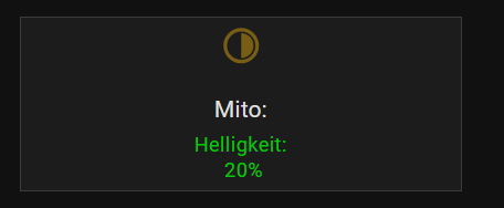
I noticed that there were changes in the mushroom-card and all my card-mods do not work anymore. Yes I can switch back to the old template, but I think this will not help for the future!
I’m currently a bit overwhelmed with the situation, and it would be great if someone could show me how to transfer the old code into the new one. At the moment, neither the font size adjustments nor the hover effects are working.
and currently everything looks like this example!
Thank you!
card_mod:
  style:
    mushroom-shape-icon$: |
      .shape
        {
         --icon-symbol-size: 22px;
         --icon-size: 22px;
         --shape-color: transparent !important;
        }
    mushroom-state-info$: |
      {% if is_state(config.entity,'off') %}
       .secondary {
        font-style: italic;
        }
      {%endif%}
       .container {
         --card-primary-font-size: 12px;
         --card-secondary-font-size: 10px;
        }
    .: |
      ha-card
      {
       margin-top: 0px;
       margin-bottom: 0px;
       height: 90px !important;
       # border: none !important;
        --mdc-icon-size: 20px;
        --ha-card-border-radius: 0px;
        --ha-card-border-color: #3c3c3c;
        --ha-card-border-width: 1px;
        --card-primary-font-weight: normal;
        --card-primary-line-height: 2.0;
        --card-secondary-line-height: 1.3;
       {% if is_state(config.entity,'on') %}
         --card-primary-color:;
         --card-secondary-color:#00CC00;
       {%else%}
         --card-primary-color:#7E7E7E;
         --card-secondary-color:#7E7E7E;
       {% endif %}
      }
      ha-state-icon
      {
        rotate: 0deg;
        {% if is_state(config.entity, 'on') %}
          opacity:
          {% set state = (state_attr(config.entity, "brightness")|
                float(0)/ 128 *100) %}
          {% set y = (((state/10) | int) +1) * 10 %}
          {{ ([30, y, 100] | sort)[1] }}%
        {%endif%}
      }
      ha-state-icon:hover
         {
          --icon-symbol-size: 30px;
         }
Spartacus
November 12, 2025, 8:52pm
1907
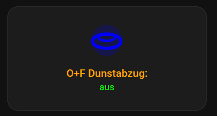
.I’ve made some progress, but where can I set
the secondary font style to italic
card_mod:
  style: |
    ha-card {
      height: 120px !important;
       }
    ha-tile-icon {
       --tile-icon-color: blue !important;
       --mdc-icon-size: 44px;
       }
    #info {
      --tile-info-primary-font-size: 12px;
      --tile-info-secondary-font-size: 10px;
      --tile-info-secondary-font-style: italic;
      --tile-info-primary-color: orange;
      --tile-info-secondary-color: lime;
       }
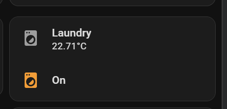
trying to apply this myself and follow along with dev tools in edge.
type: custom:simple-swipe-card
show_pagination: false
card_spacing: 15
cards:
  - type: custom:vertical-stack-in-card
    cards:
      - type: custom:mushroom-template-card
        primary: Laundry
        secondary: "{{ states('sensor.0x54ef441000684c17_temperature') }}°C"
        icon: mdi:washing-machine
        tap_action:
          action: navigate
          navigation_path: laundry
        picture:
        card_mod:
          style: |
            ha-card {
              border-radius: 16px 16px 0px 0px;
            }
      - type: custom:mushroom-template-card
        entity: binary_sensor.washer_running
        primary: |-
          {% if is_state(config.entity, 'off') %}
          Idle
          {% elif is_state(config.entity, 'on') %}
          On
          {% else %}
          Full
          {% endif %}
        icon: mdi:washing-machine
        icon_color: |-
          {% if is_state(config.entity, 'on') -%}
            orange
          {%- else -%}
            blue
          {%- endif %}
        card_mod:
          style:
            mushroom-shape-icon$: |
              .shape:before {
              content: '';
              z-index: 1;
              position: absolute;
              justify-content: center;
              align-items: center;
              width: 22%;
              height: 11.5%;
              border: 1px solid black;
              border-radius: 1rem 1rem 0 0;
              background: {{ 'deepskyblue' if
                is_state(config.entity, 'on') else
                'black' }};
              animation: {{ 'circle 2s linear infinite alternate'if
                is_state(config.entity, 'on') else
                'animation: none;' }};
              transform-origin: 50% 85%;
                  }
              @keyframes circle {
              0% {transform: rotate(0deg);}
              100% {transform:rotate(360deg);}
                }
              .shape:after {
              content: '';
              position: absolute;
              width: 27%;
              height: 27%;
              border-radius: 100%;
              border: 1px solid white !important;
              background:black;
              top: 14px;
              justify-content: center;
              align-items: center;
                }
  - type: custom:stack-in-card
    cards:
      - type: custom:button-card
        entity: sensor.0x54ef441000684c17_temperature
        name: "Laundry"
        styles:
          card:
            - border-style: none
            - box-shadow: 0px 0px 10px -9px black
          custom_fields:
            temp:
              - filter: opacity(100%)
              - justify-self: start
              - margin-left: 10px
              - margin-top: 20px
              - padding-bottom: 10%
              - font-size: 65%
            graph:
              - padding-top: 0%
              - width: 100%
              - height: 100%
              - margin-bottom: "-3%"
          icon:
            - width: 25px
            - color: auto
          name:
            - font-size: 87%
            - font-weight: var(--mcg-title-font-weight, 500)
            - justify-self: start
            - margin-top: 6px
            - margin-left: 12px
            - opacity: 0.65
          grid:
            - grid-template-areas: '"n n" "temp temp" "graph graph"'
            - grid-template-columns: 1fr min-content
            - grid-template-rows: 1fr min-content min-content min-content
        custom_fields:
          temp: |
            [[[
              return `<ha-icon
                icon="mdi:thermometer"
                style="width:18px; height: 18px; color:#ff8c00;">
                </ha-icon><span style="font-size:120%; font-weight: 300;">
                ${states['sensor.0x54ef441000684c17_temperature'].state}°C </span>`
            ]]]
        card_mod:
          style: |
            ha-card {
              z-index: 1;
              height: 86px !important;
            }
      - type: custom:mini-graph-card
        entities:
          - entity: sensor.0x54ef441000684c17_temperature
            name: Temperature
            color: "#ff8c00"
        height: 50
        hours_to_show: 24
        line_width: 3
        font_size: 50
        animate: true
        show:
          name: false
          icon: false
          state: false
          legend: false
          fill: fade
        card_mod:
          style: |
            ha-card {
              position: absolute !important;
              height: 100%;
              width: 100%;
              top: 0px;
              --ha-card-border-width: 0;
            }
            ha-card:after {
              content: "";
              position: absolute;
              width: 100%;
              height: 100%;
              background: linear-gradient(to right, var(--card-background-color) 20%, transparent);
            }
        alignment: end
      - type: custom:mini-graph-card
        entities:
          - entity: sensor.0x54ef441000684c17_temperature
            name: Temperature
            color: "#ff8c00"
        height: 50
        hours_to_show: 24
        line_width: 3
        font_size: 50
        animate: true
        show:
          name: false
          icon: false
          state: false
          legend: false
          fill: fade
        card_mod:
          style: |
            ha-card {
              position: absolute !important;
              height: 100%;
              width: 100%;
              top: 0px;
              --ha-card-border-width: 0;
            }
            ha-card:after {
              content: "";
              position: absolute;
              width: 100%;
              height: 100%;
              background: linear-gradient(to right, var(--card-background-color) 20%, transparent);
            }
Hi there, I have this compact slider that I want to fix. The icon gets overlapped by the slider when sliding over it. I want the icon on top of the slider like the text currently is.
The code is a very vibecoded mess, feel free to change everything around, so long as the final look stays similar.
type: custom:mushroom-number-card
entity: input_number.e_akse_motor_number
fill_container: false
icon_color: blue-grey
name: Roller Shade 1
grid_options:
  rows: 2
  columns: 9
icon: mdi:roller-shade
layout: horizontal
card_mod:
  style:
    mushroom-number-value-control$:
      mushroom-slider$: |
        .slider {
          position: absolute !important;
          top: 0 !important;
          left: 0 !important;
          height: 100% !important;
          width: 100% !important;
          border-radius: 12px !important;
        }
        .slider-track { height: 100% !important; }
        .slider-track-active { z-index: 0 !important; }
        .slider-track-background { z-index: 0 !important; }
        .slider-thumb { z-index: 1 !important; }
    .: |

      ha-card {
        background: none !important;
        box-shadow: none !important;
        border: none !important;
        height: 100% !important;
        position: relative !important;
        padding: 0 !important;
        isolation: isolate !important;
      }
      ha-card > div {
        height: 100% !important;
      }
      mushroom-state-item {
        position: absolute !important;
        top: 0 !important;
        left: 0 !important;
        width: 100% !important;
        height: 100% !important;
        justify-content: center !important;
        pointer-events: none !important;
        z-index: 1000 !important;
      }
      mushroom-number-value-control {
        position: absolute !important;
        top: 0 !important;
        bottom: 0 !important;
        left: 0 !important;
        right: 0 !important;
        height: 100% !important;
        width: 100% !important;
        padding: 0 !important;
        margin: 0 !important;
        z-index: 1 !important;
      }
      mushroom-shape-icon, mushroom-state-info {
        transform: none !important;
      }
Any help is appreciated
