I see some of you have a nice overlay on the whole card instead of only the icon, when its activated. How is this done? Theme variables, or in the cards?
Hello,
Is it possible somehow change only the border color of a icon? I am trying to do simple weather card with the template card, I would like to change the icon based on the weather condition (icon color white) AND icon border color.
For example: Weather is sunny, icon changes to sunny and icon color is white, but the border color is Yellow. When it is cloudy, icon color stays white but icon changes to cloudy, icon border changes to blue.
I can only find the icon color option which changes both icon and icon border color.
Edit: And to specify: I mean by icon border color the circle around the icon.

Yea no worries! Both cards were shared earlier but I couldn’t find the link for the scenes card
Scenes Card
type: custom:stack-in-card
cards:
  - type: custom:layout-card
    layout_type: custom:grid-layout
    layout:
      grid-template-columns: auto 33px
      margin: '-4px -4px -8px -4px'
    cards:
      - type: custom:mushroom-template-card
        primary: Scenes
        secondary: All
        icon: mdi:home-roof
        icon_color: grey
        tap_action:
          action: toggle
        entity: input_boolean.andrews_scenes
        card_mod:
          style: |
            ha-card {
              background: none;
              --ha-card-box-shadow: 0px;
            }
      - type: custom:mushroom-template-card
        entity: input_boolean.andrews_scenes
        primary: ''
        secondary: ''
        icon: >-
          {{ 'mdi:chevron-down' if is_state(entity, 'off') else 'mdi:chevron-up'
          }}
        icon_color: disabled
        hold_action:
          action: none
        card_mod:
          style: |
            ha-card {
              align-items: flex-end;
              background: none;
              --ha-card-box-shadow: 0px;
            }
            mushroom-shape-icon {
              --shape-color: none !important;
            }
  - type: conditional
    conditions:
      - entity: input_boolean.andrews_scenes
        state: 'on'
    card:
      type: custom:stack-in-card
      mode: vertical
      cards:
        - type: custom:stack-in-card
          mode: horizontal
          cards:
            - type: horizontal-stack
              cards:
                - type: custom:mushroom-template-card
                  icon: mdi:desk
                  icon_color: grey
                  layout: vertical
                  tap_action:
                    action: call-service
                    service: scene.turn_on
                    service_data: {}
                    target:
                      entity_id: scene.andrew_s_room_casual
                  secondary: Ambient
                - type: custom:mushroom-template-card
                  icon: mdi:movie-open
                  icon_color: grey
                  tap_action:
                    action: call-service
                    service: scene.turn_on
                    service_data: {}
                    target:
                      entity_id: scene.andrews_room_video_editing
                  hold_action:
                    action: none
                  double_tap_action:
                    action: none
                  layout: vertical
                  secondary: Video Editing
                - type: custom:mushroom-template-card
                  layout: vertical
                  entity: script.1590801199735
                  icon: mdi:lightbulb-on
                  icon_color: grey
                  tap_action:
                    action: call-service
                    service: light.turn_off
                    service_data: {}
                    target:
                      entity_id: light.andrews_room
                  double_tap_action:
                    action: none
                  hold_action:
                    action: none
                  secondary: 'Off'
          style: |
            ha-card {
              box-shadow: none;
              border-radius: 12px;
              background: none;
            }
      card_mod:
        style: |
          ha-card {
            background: rgba(155,155,155,0.05);
          }
Temperature card
1 Like
Is there a way to combine different cards (other than stacking)? E.g. I’d like to use the templated badge_icon on a cover card.
Generally, I am curious about what the reason is that not every card is basically a template card with all the same fields and then some additional stuff, like the cover slider in this case? I.e. why don’t all cards allow templating?
Perfect!!! Well done. It looks nice and clean.
Did you also use the automations ?
No, just pretty basic pages. Navigation under the banner. Atomic Revive Calendar as appropriate on each page. Using @iantrich 's Feedparser and List Card to display news for each team (and overall on the EPL page). News is updated hourly. Pulling from a variety of sources since none provided adequate results overall.
Here’s an example of one of the pages:
views:
  - title: Home
    cards:
      - type: custom:mushroom-title-card
        title: Football
        subtitle: Liverpool
        alignment: center
      - type: custom:mushroom-chips-card
        chips:
          - type: back
          - type: template
            icon: mdi:home
            tap_action:
              action: navigate
              navigation_path: /lovelace-phone
          - type: template
            picture: /local/football/epl.png
            content: EPL
            tap_action:
              action: navigate
              navigation_path: /phone-footie
          - type: template
            picture: /local/football/westham.png
            content: Westham
            tap_action:
              action: navigate
              navigation_path: /phone-westham
          - type: template
            picture: /local/football/forest.png
            content: Forest
            tap_action:
              action: navigate
              navigation_path: /phone-forest
          - type: template
            picture: /local/football/liverpool.png
            content: Liverpool
            tap_action:
              action: navigate
              navigation_path: /phone-liverpool
        alignment: center
      - type: custom:atomic-calendar-revive
        name: Football Calendar
        entities:
          - calendar.liverpool
        enableModeChange: true
        showWeekDay: true
        firstDayOfWeek: 1
        maxDaysToShow: 7
        refreshInterval: 60
      - type: custom:list-card
        entity: sensor.liverpool
        title: News
        row_limit: 10
        feed_attribute: entries
        columns:
          - title: ''
            type: image
            add_link: link
            field: media_thumbnail
          - title: Title
            field: title
          - title: Description
            field: summary
Nice one mate.
I have now started to work on my news page. I will also publish it on github when I complete.
By the way I have also added Tips and Tricks to the end of my wiki for better reading the contents without ads and on a fullscreen page. Anyone interested may check it out.
Hi Sdomotica
Can you share your code ? I just started working on a new page but I am struggling to place news horizontally just like you did in the picture.
You can use overflow: hidden; like this:
        card_mod:
          style: |
            :host {
              --mush-icon-size: 130px;
              height: 100px;
              background: url('https://img.freepik.com/free-vector/terrace-with-mountain-lake-view-home-villa-hotel-area-with-sofa-ottoman-stand-wooden-patio-with-scenery-nature-landscape-background-with-rocks-water-pond-cartoon-vector-illustration_107791-11419.jpg?t=st=1658807264~exp=1658807864~hmac=8ec279678398cc8813f10112ecb27e57af9e4d4da6e42611c78c0a6e290e0946&w=1380') center;
              background-size: cover;
              background-blend-mode: overlay;
              background-color: rgba(var(--rgb-card-background-color), 0.9);
              margin-left: -33px !important;
              overflow: hidden;
            }
As for learning CSS, a good place to start is W3 Schools
1 Like
you can change the size of a Mushroom Chip like this:
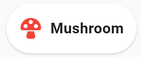
type: custom:mushroom-chips-card
chips:
  - type: template
    icon: mdi:mushroom
    icon_color: red
    content: Mushroom
card_mod:
  style: |
    ha-card {
      --chip-height: 90px;
      --chip-border-radius: 45px;
    }
6 Likes
Try like this:
--primary-text-color: {{ 'rgb(var(--rgb-white))' if is_state('sun.sun', "below_horizon") }};
1 Like
Hi all. beautiful project.
I don’t understand why you use code if this project if called “beautiful dashboard easily”. why isn’t it only via GUI?
I don’t speak english very well. Sorry for my poor english.
Thank you
I think I found part of the answer. From the chip’s tap action I can open a view to the Lovelace home feed card which lists the notifications/events found.
Question is how do I get the notifications, e.g. battery critical, door unlocked etc. into the card. and secondly counting these events so the number can be shown on the dashboard. Will have to be a dynamic list that gets built… Wonder if someone has some code snippets I could start from
Can someone please help me with cache issue. I clear the cache and all is fine. But then my last several udpates revert back. I hit refresh on my broswer or pull down to refresh on my phone and all is fine but then it happens again. I even tried a new computer and new browser and problem remains
Here are the three examples I’m having trouble with. Before and after pictures.


Yes, you can change the shape color like this:

type: custom:mushroom-entity-card
entity: weather.weatherflow_day_based_forecast
name: Daily Forcast
icon_color: light-blue
card_mod:
  style: |
    mushroom-shape-icon {
      --mush-rgb-amber: 255, 193, 7;
      --shape-color: rgba(var(--mush-rgb-amber), 0.2) !important;
    }
1 Like
Have a look here:
1 Like
Is this the sort of thing you wanted?
Mushroom Hourly Weather Card:


type: custom:stack-in-card
cards:
  - type: custom:layout-card
    layout_type: custom:grid-layout
    layout:
      grid-template-columns: 66px auto
      margin: '-4px -4px -12px -4px;'
    cards:
      - type: custom:mushroom-entity-card
        entity: weather.weatherflow_hourly_based_forecast
        icon_color: blue
        card_mod:
          style: |
            ha-card {
              background: none;
              --ha-card-box-shadow: 0px;
            }
      - type: custom:hourly-weather
        entity: weather.weatherflow_hourly_based_forecast
        icons: false
        label_spacing: '2'
        num_segments: '12'
        name: ' '
        card_mod:
          style:
            weather-bar$: |
              .main {
                --mush-rgb-red: 244, 67, 54;
                --mush-rgb-pink: 233, 30, 99;
                --mush-rgb-purple: 156, 39, 176;
                --mush-rgb-deep-purple: 103, 58, 183;
                --mush-rgb-indigo: 63, 81, 181;
                --mush-rgb-blue: 33, 150, 243;
                --mush-rgb-light-blue: 3, 169, 244;
                --mush-rgb-cyan: 0, 188, 212;
                --mush-rgb-teal: 0, 150, 136;
                --mush-rgb-green: 76, 175, 80;
                --mush-rgb-light-green: 139, 195, 74;
                --mush-rgb-lime: 205, 220, 57;
                --mush-rgb-yellow: 255, 235, 59;
                --mush-rgb-amber: 255, 193, 7;
                --mush-rgb-orange: 255, 152, 0;
                --mush-rgb-deep-orange: 255, 87, 34;
                --mush-rgb-brown: 121, 85, 72;
                --mush-rgb-grey: 158, 158, 158;
                --mush-rgb-blue-grey: 96, 125, 139;
                --mush-rgb-black: 0, 0, 0;
                --mush-rgb-white: 255, 255, 255;

                --color-clear-night: rgba(var(--mush-rgb-black), 0.2) !important;
                --color-cloudy: rgba(var(--mush-rgb-grey), 0.2) !important;
                --color-fog: var(--color-cloudy);
                --color-hail: rgba(var(--mush-rgb-blue), 0.2) !important;
                --color-lightning: var(--color-rainy);
                --color-lightning-rainy: var(--color-rainy);
                --color-partlycloudy: rgba(var(--mush-rgb-light-blue), 0.2) !important;
                --color-pouring: var(--color-rainy);
                --color-rainy: rgba(var(--mush-rgb-blue), 0.2) !important;
                --color-snowy: rgba(var(--mush-rgb-white), 0.2) !important;
                --color-snowy-rainy: var(--color-partlycloudy);
                --color-sunny: rgba(var(--mush-rgb-yellow), 0.2) !important;
                --color-windy: var(--color-sunny);
                --color-windy-variant: var(--color-sunny);
                --color-exceptional: rgba(var(--mush-rgb-amber), 0.2) !important;
              }
              .bar > div {
                height: 42px !important;
              }
              .bar > div:first-child {
                border-top-left-radius: 12px !important;
                border-bottom-left-radius: 12px !important;
              }
              .bar > div:last-child {
                border-top-right-radius: 12px !important;
                border-bottom-right-radius: 12px !important;
              }
              .bar > div > span {
                text-shadow: none !important;
                color: rgb(var(--primary-text-color));
                font-size: 14px;
                font-weight: bold;
              }
              .axes > div > .bar-block-bottom > .hour {
                font-size: 12px;
                font-weight: bolder;
              }
              .axes > div > .bar-block-bottom > .temperature {
                font-size: 12px;
                font-weight: bolder;
              }
            .: |
              ha-card {
                background: none;
                --ha-card-box-shadow: 0px;
                margin: -8px -4px -4px -16px;
              }
20 Likes
Awesome, thanks alot for the help!
Only thing is that I am not able to include the if statement for this, not sure what goes wrong though. Any tips how to solve this? I tried the following with your code:
card_mod:
  style: |
    {% if is_state('sensor.openweathermap_condition', 'sunny') %}
    mushroom-shape-icon {
      --mush-rgb-amber: 255, 193, 7;
      --shape-color: rgba(var(--mush-rgb-amber), 0.2) !important;
    }
    {% endif %}
1 Like
Try like this:
--primary-text-color:
	{% if not is_state('input_boolean.news_chip_fenerbahce', 'off') or not is_state('input_boolean.fenerbahce', 'off') %}
		rgb(var(--rgb-amber))
	{% else %}
		rgb(var(--rgb-white))
	{% endif %};
2 Likes
This should get you started:
type: custom:mushroom-entity-card
entity: weather.weatherflow_hourly_based_forecast
name: Current Weather Conditions
card_mod:
  style: |
    mushroom-shape-icon {
      --mush-rgb-red: 244, 67, 54;
      --mush-rgb-pink: 233, 30, 99;
      --mush-rgb-purple: 156, 39, 176;
      --mush-rgb-deep-purple: 103, 58, 183;
      --mush-rgb-indigo: 63, 81, 181;
      --mush-rgb-blue: 33, 150, 243;
      --mush-rgb-light-blue: 3, 169, 244;
      --mush-rgb-cyan: 0, 188, 212;
      --mush-rgb-teal: 0, 150, 136;
      --mush-rgb-green: 76, 175, 80;
      --mush-rgb-light-green: 139, 195, 74;
      --mush-rgb-lime: 205, 220, 57;
      --mush-rgb-yellow: 255, 235, 59;
      --mush-rgb-amber: 255, 193, 7;
      --mush-rgb-orange: 255, 152, 0;
      --mush-rgb-deep-orange: 255, 87, 34;
      --mush-rgb-brown: 121, 85, 72;
      --mush-rgb-grey: 158, 158, 158;
      --mush-rgb-blue-grey: 96, 125, 139;
      --mush-rgb-black: 0, 0, 0;
      --mush-rgb-white: 255, 255, 255;

      --shape-color:
        {% set condition = states(config.entity) %}
        {% if condition == 'sunny' %}
          rgba(var(--mush-rgb-amber), 0.2)
        {% elif condition == 'partlycloudy' %}
          rgba(var(--mush-rgb-grey), 0.2)
        {% else %}
          rgba(var(--mush-rgb-blue), 0.2)
        {% endif %} !important;
    }
2 Likes