I have an auto entities card that lists all light groups.
I would like to be able to tap on the specific light group card and then have a pop-up (browser mod) that lists all the lights in the group.
The easiest way to do this because the groups are zha groups which don’t expose child entities is to parse the area out of the group entity id which will all have a corresponding area.
light.kitchen_lights group is kitchen.
I have an easy template that will extract the area. I just don’t know if it’s possible to do this or I’m going about it wrong. Not sure what variables the auto entities exposes that could be useful I was trying to read the documentation and play with it but I can’t figure that out.
Here’s how the current setup looks.

Edit: I think I need to do something with this, auto entities and mushroom template card to achieve what I want
type: custom:auto-entities
card:
  type: grid
  columns: 2
  square: false
card_param: cards
filter:
  include:
    - domain: light
      entity_id: /[li]ghts/
      options:
        type: custom:mushroom-template-card
        primary: '{{ states[entity].name }}'
        secondary: '{{ states(entity) | title }}'
        picture: local/icons/custom_icons/ceiling-lamp-off3.png
        hold_action:
          action: toggle
        double_tap_action:
          action: more-info
        tap_action:
          action: fire-dom-event
          browser_mod:
            command: popup
            title: '{{ states[entity].name }}'
            card:
              type: custom:auto-entities
              card:
                type: grid
                columns: 2
                square: false
              card_param: cards
              filter:
                template: >-
                  {% set area = entity | replace('light.','')
                  |replace('_lights','') | replace('_',' ') %} {{ states.light |
                  selectattr('entity_id', 'in', area_entities(area)) |
                  map(attribute='entity_id') | list }}
                include:
                  - domain: light
                    area: filter.template
                    options:
                      type: custom:mushroom-light-card
                      tap_action:
                        action: none
        card_mod:
          style: |
            mushroom-shape-icon {
              --shape-color: none !important;
              --shape-color-disabled: none !important;
            }
            ha-card {
              background: transparent;
              border-radius: 30px;
              margin-left: auto;
              margin-right: auto;
              margin-bottom: 2px;
              --icon-border-radius: 0;
              --icon-size: 55px;
            }
Do you try to keep this card on the home page? I’m trying to take a slightly different approach by simply having a chip on my mushroom home page top bar that visually shows the count of issues/notifications found (coupled maybe with a color change). Clicking on the chip brings me to a page with the standard home feed card; while it’s not mushroom it’s away from the main UI and so doesn’t destroy the clean interface mushroom provides - something I understand you’d like to change; i.e. a home feed card styled in mushroom, right?
You’re talking about ordered functionality which brings me to a question if you don’t mind. Are you monitoring a set number of devices/entities as per the examples? I’m wondering whether there’s a way of creating a “dynamic” list of exceptions (e.g. if battery of any device in my home is <50% then register the device(s) in the home feed etc.).
Thanks everyone, especially Rhys, for all the ideas and tips I’ve learned here.
However, there is one thing that I haven’t been able to accomplish, and I’m hoping someone can point me in the right direction…
Is there a way to move the badge on a template card to the left side of the icon (using card-mod)?
This seems to be the CSS, when I remove the right declaration (in my browser’s dev tools), it does move the icon to the left side. However, I’m struggling with getting the card-mod code right.
.icon ::slotted([slot="badge"]) {
    position: absolute;
    top: -3px;
    right: -3px;
}
Any help would be greatly appreciated!
type: horizontal-stack
cards:
  - type: custom:stack-in-card
    cards:
      - type: custom:mushroom-person-card
        entity: person.sylwester
        icon_type: entity-picture
        primary_info: state
        secondary_info: last-changed
        tap_action:
          action: navigate
          navigation_path: sylwester
        card_mod:
          style: |
            :host([dark-mode]) {
              background: rgba(var(--rgb-primary-background-color), 0.2);
            }
            :host {
              background: rgba(var(--rgb-primary-text-color), 0.025);
            }
      - type: custom:mushroom-chips-card
        chips:
          - type: template
            icon: >
              {% set battery_level = (states(entity) | int / 10) | round(0) |
              int * 10 %} {% if is_state('binary_sensor.sm_g960f_is_charging',
              'on' ) %}
                {% if battery_level > 0 %}
                  mdi:battery-charging-{{ battery_level }}
                {% else %}
                  mdi:battery-charging-outline
                {% endif %}
              {% else %}
                {% if battery_level == 100 %}
                  mdi:battery
                {% elif battery_level > 0 %}
                  mdi:battery-{{ battery_level }}
                {% else %}
                  mdi:battery-alert-variant-outline
                {% endif %}
              {% endif %}
            icon_color: |-
              {% set battery_level = states(entity) | int %}
              {% if battery_level > 90 %}
                green
              {% elif battery_level > 60 %}
                light-green
              {% elif battery_level > 50 %}
                lime
              {% elif battery_level > 40 %}
                yellow
              {% elif battery_level > 30 %}
                amber
              {% elif battery_level > 20 %}
                orange
              {% elif battery_level > 10 %}
                deep-orange
              {% else %}
                red
              {% endif %}
            card_mod:
              style: |
                @keyframes blink {
                  50% {opacity: 0;}
                }
                ha-card {
                  animation: blink linear infinite;
                  {% if states('sensor.sm_g960f_battery_level') < '15' %}
                     animation-duration: 1s;
                  {% endif %}
                }
            tap_action:
              action: none
            entity: sensor.sm_g960f_battery_level
          - type: template
            tap_action:
              action: none
            entity: sensor.sm_g960f_wifi_connection
            icon_color: >-
              {% if is_state('sensor.sm_g960f_wifi_connection', '<not
              connected>' ) %}
                disabled
              {% else %}
                light-green
              {% endif %}
            icon: >
              {% if is_state('sensor.sm_g960f_wifi_connection', '<not
              connected>' ) %}
                mdi:wifi-alert
              {% else %}
                mdi:wifi
              {% endif %}
          - type: template
            tap_action:
              action: toggle
            entity: switch.samsung_galaxy_s9
            icon_color: |-
              {% if is_state('switch.samsung_galaxy_s9', 'on' ) %}
                blue
              {% else %}
                disabled
              {% endif %}
            icon: |
              {% if is_state('switch.samsung_galaxy_s9', 'on' ) %}
                mdi:network
              {% else %}
                mdi:network-off
              {% endif %}
        alignment: start
        card_mod:
          style: |
            ha-card {
              --chip-box-shadow: none;
              --chip-background: none;
              --chip-spacing: 0;
            }
    card_mod:
      style: |
        ha-card {
          height: 102px;
        }
  - type: custom:stack-in-card
    cards:
      - type: custom:mushroom-person-card
        entity: person.jolanta
        icon_type: entity-picture
        primary_info: state
        secondary_info: last-changed
        tap_action:
          action: navigate
          navigation_path: jolanta
        card_mod:
          style: |
            :host([dark-mode]) {
              background: rgba(var(--rgb-primary-background-color), 0.2);
            }
            :host {
              background: rgba(var(--rgb-primary-text-color), 0.025);
            }
      - type: custom:mushroom-chips-card
        chips:
          - type: template
            icon: >
              {% set battery_level = (states(entity) | int / 10) | round(0) |
              int * 10 %} {% if is_state('binary_sensor.sm_a705fn_is_charging',
              'on' ) %}
                {% if battery_level > 0 %}
                  mdi:battery-charging-{{ battery_level }}
                {% else %}
                  mdi:battery-charging-outline
                {% endif %}
              {% else %}
                {% if battery_level == 100 %}
                  mdi:battery
                {% elif battery_level > 0 %}
                  mdi:battery-{{ battery_level }}
                {% else %}
                  mdi:battery-alert-variant-outline
                {% endif %}
              {% endif %}
            icon_color: |-
              {% set battery_level = states(entity) | int %}
              {% if battery_level > 90 %}
                green
              {% elif battery_level > 60 %}
                light-green
              {% elif battery_level > 50 %}
                lime
              {% elif battery_level > 40 %}
                yellow
              {% elif battery_level > 30 %}
                amber
              {% elif battery_level > 20 %}
                orange
              {% elif battery_level > 10 %}
                deep-orange
              {% else %}
                red
              {% endif %}
            card_mod:
              style: |
                @keyframes blink {
                  50% {opacity: 0;}
                }
                ha-card {
                  animation: blink linear infinite;
                  {% if states('sensor.sm_a705fn_battery_level') < '15' %}
                     animation-duration: 1s;
                  {% endif %}
                }
            tap_action:
              action: none
            entity: sensor.sm_a705fn_battery_level
          - type: template
            tap_action:
              action: none
            entity: sensor.sm_a705fn_wifi_connection
            icon_color: >-
              {% if is_state('sensor.sm_a705fn_wifi_connection', '<not
              connected>' ) %}
                disabled
              {% else %}
                light-green
              {% endif %}
            icon: >
              {% if is_state('sensor.sm_a705fn_wifi_connection', '<not
              connected>' ) %}
                mdi:wifi-alert
              {% else %}
                mdi:wifi
              {% endif %}
          - type: template
            tap_action:
              action: toggle
            entity: switch.samsung_a70
            icon_color: |-
              {% if is_state('switch.samsung_a70', 'on' ) %}
                blue
              {% else %}
                disabled
              {% endif %}
            icon: |
              {% if is_state('switch.samsung_a70', 'on' ) %}
                mdi:network
              {% else %}
                mdi:network-off
              {% endif %}
        alignment: start
        card_mod:
          style: |
            ha-card {
              --chip-box-shadow: none;
              --chip-background: none;
              --chip-spacing: 0;
            }
    card_mod:
      style: |
        ha-card {
          height: 102px;
        }
Hi,
I am trying to create person card with chips card on it. all is working fine apart blinking battery icon. I am not yaml person and I used only codes what I found here. My idea was to have battery icon which change color and icon depending from battery level. That part is working fine. Then I tried to add blinking when battery is below 15% and that is not working. It works but when battery level drops below 15 and then goes up gain above 15 icon is blinking constantly. Thanks for help.
@MetalOnes, thank you for your kind words.
You can position the Mushroom Badge like this:
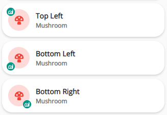
Top Left:
type: custom:mushroom-template-card
primary: Top Left
icon: mdi:mushroom
icon_color: red
badge_icon: mdi:snail
badge_color: teal
secondary: Mushroom
card_mod:
  style: |
    mushroom-badge-icon {
      left: -3px;
    }
Bottom Left:
type: custom:mushroom-template-card
primary: Bottom Left
icon: mdi:mushroom
icon_color: red
badge_icon: mdi:snail
badge_color: teal
secondary: Mushroom
card_mod:
  style: |
    mushroom-badge-icon {
      left: -3px;
      top: 30px;
    }
Bottom Right:
type: custom:mushroom-template-card
primary: Bottom Right
icon: mdi:mushroom
icon_color: red
badge_icon: mdi:snail
badge_color: teal
secondary: Mushroom
card_mod:
  style: |
    mushroom-badge-icon {
      top: 30px;
    }
hallo nice man & can you sharing you config pleas ?
Hey there, thanks for the reply! So as far as approach, I think my answer is both. Currently I do a version of what you described - I use something mushroom-esque on my index page to tell me something might be up and warrant a deeper look. Then I go to a separate page which shows the graphic in my original post. Keep the non-mushroomy stuff hidden  But yes, you stated the goal perfectly: a home feed card styled in mushroom.
There is a use case in that I have a few tablets around the house that would be in ‘security mode’ always and have a view restricted to things like cameras/sensors. For instance, if my wife hears a noise in the night, I want her to be able to easily glance to see which motion sensors triggered most recently. Maybe it’s a kid up going to the restroom or something more concerning. The home feed card functionality works perfectly for this (again aside from that weird entry in my example :)).
I think you can accomplish the filtering aspect of what you’re describing by making creative use of the exclude_states function available for each entity in the home-feed-card. I haven’t investigated it yet, but if it allows you to operate on indirect entities you could always use an input helper that’s influenced by the % state of the actual entity, or perhaps you’d have to use a template to control the state and supply a hint that you can use in the exclude_states stanza. I’ll try to find some time to muck with this a bit.
Thanks again for the reply and again if anyone has any creative ideas around how to mushroomize a home feed as in my original example, I’d be very interested and appreciative!
Well, I think I need to go back to rhys CSS bootcamp again Or anyone else who might be willing to re-hash something I’m sure has been discussed. I’m having an awful lot of trouble conceptualizing how to access pieces of the hierarchy to stylize those pieces in my mushroom cards. I put together a super simple use case to try and illustrate my question. I basically have a card with two columns. Each column has a mushroom-light-card as part of it. I want some cards to take up both columns, however. With live CSS editors I can accomplish this with either --grid-column: span 2 or --grid-column: 1/ -1. However, I can’t figure out how to accomplish that with the card_mod/style construct and I’m fairly certain I’m overthinking it.
- type: custom:layout-card
        layout_type: masonry
        cards:
          - type: grid
            square: false
            columns: 2
            cards:
              - type: custom:mushroom-light-card
                entity: light.kitchen_sink
                show_brightness_control: true
                use_light_color: false
                fill_container: true
                card_mod:
                  style: |
                    mushroom-light-card {
                      grid-column: span 2;
                      }
              - type: custom:mushroom-light-card
                entity: light.kitchen_bar_area
                primary: Kitchen Bar Area
                show_brightness_control: true
                fill_container: true
              - type: custom:mushroom-light-card
                entity: light.kitchen_overhead
                fill_container: true
              - type: custom:mushroom-light-card
                entity: light.kitchen_table_2
                primary: Kitchen Table
                fill_container: true
A lot of the examples here show us how to navigate the CSS tree to find specific elements within a primary card so I imagine it should be easy to apply something to the top of the hierarchy, right? If I am in the Inspector via Chrome or Firefox, I can manually adjust the grid-column attribute to either of the above and watch the card expand to fill both columns. That -only- works when applied to the element { } section when selecting the mushroom-light-card itself. Modifying any of its children, e.g. ha-card, has no effect.

What’s the equivalent card_mod syntax to affect the mushroom-light-card portion of the hierarchy such that it expands to 2 columns?
Thanks!
Added a dropdown to the Mushroom media card as a conditonal source select for my alexas.
How can I disable to input select from popping up with the show more page and just drop down right from the card? heres my code for reference

square: false
columns: 1
type: grid
cards:
  - type: conditional
    conditions:
      - entity: input_select.alexa_media_mode
        state: office
    card:
      type: custom:stack-in-card
      cards:
        - type: custom:layout-card
          layout_type: grid
          layout:
            grid-template-rows: 8px
            grid-template-areas: |
              "entity menu"
        - type: custom:mushroom-media-player-card
          entity: media_player.office_echo
          name: Office Echo
          icon: si:amazonalexa
          view_layout:
            grid-area: entity
            grid-column-start: 1
            grid-column-end: 3
          use_media_artwork: false
          fill_container: false
          use_media_info: true
          show_volume_level: false
          media_controls:
            - previous
            - play_pause_stop
            - next
          collapsible_controls: true
          tap_action:
            action: toggle
          card_mod:
            style: |
              ha-card {
                padding-bottom: 0px !important;
              }
        - type: custom:mushroom-chips-card
          alignment: end
          view_layout:
            grid-area: menu
          card_mod:
            style: |
              ha-card {
                background-color: transparent !important;
                margin-top: -40px;
                margin-right: 10px;
                text-align: right;
                box-shadow: none !important;
              }
          chips:
            - type: entity
              entity: input_select.alexa_media_mode
        - entity: media_player.office_echo
          hide:
            icon: true
            name: true
            runtime: true
            source: true
            power: true
            state_label: true
            volume: true
            info: true
            progress: true
            controls: true
          more_info: false
          tts:
            platform: alexa
          type: custom:mini-media-player
          toggle_power: false
          group: true
          card_mod:
            style: |
              ha-card {
                padding: 10px 8px 8px !important;
              }
      card_mod:
        style: |
          ha-card {
            {% if not is_state('media_player.office_echo', 'standby') %}
              background: rgba(var(--rgb-card-background-color), 0.5) url( '{{ state_attr( "media_player.office_echo", "entity_picture" ) }}' ) center no-repeat;
              background-size: cover;
              background-blend-mode: overlay;
            {% endif %}
          }
  - type: conditional
    conditions:
      - entity: input_select.alexa_media_mode
        state: kitchen
    card:
      type: custom:stack-in-card
      cards:
        - type: custom:layout-card
          layout_type: grid
          layout:
            grid-template-rows: 8px
            grid-template-areas: |
              "entity menu"
        - type: custom:mushroom-media-player-card
          entity: media_player.kitchen_echoshow
          name: Kitchen Echo
          icon: si:amazonalexa
          view_layout:
            grid-area: entity
            grid-column-start: 1
            grid-column-end: 3
          use_media_artwork: false
          fill_container: false
          use_media_info: true
          show_volume_level: false
          media_controls:
            - previous
            - play_pause_stop
            - next
          collapsible_controls: true
          tap_action:
            action: toggle
          card_mod:
            style: |
              ha-card {
                padding-bottom: 0px !important;
              }
        - type: custom:mushroom-chips-card
          alignment: end
          view_layout:
            grid-area: menu
          card_mod:
            style: |
              ha-card {
                background-color: transparent !important;
                margin-top: -40px;
                margin-right: 10px;
                text-align: right;
                box-shadow: none !important;
              }
          chips:
            - type: entity
              entity: input_select.alexa_media_mode
        - entity: media_player.kitchen_echoshow
          hide:
            icon: true
            name: true
            runtime: true
            source: true
            power: true
            state_label: true
            volume: true
            info: true
            progress: true
            controls: true
          more_info: false
          tts:
            platform: alexa
          type: custom:mini-media-player
          toggle_power: false
          group: true
          card_mod:
            style: |
              ha-card {
                padding: 10px 8px 8px !important;
              }
      card_mod:
        style: |
          ha-card {
            {% if not is_state('media_player.kitchen_echoshow', 'standby') %}
              background: rgba(var(--rgb-card-background-color), 0.5) url( '{{ state_attr( "media_player.kitchen_echoshow", "entity_picture" ) }}' ) center no-repeat;
              background-size: cover;
              background-blend-mode: overlay;
            {% endif %}
          }
  - type: conditional
    conditions:
      - entity: input_select.alexa_media_mode
        state: bedroom
    card:
      type: custom:stack-in-card
      cards:
        - type: custom:layout-card
          layout_type: grid
          layout:
            grid-template-rows: 8px
            grid-template-areas: |
              "entity menu"
        - type: custom:mushroom-media-player-card
          entity: media_player.bedroom_echo
          name: Bedroom Echo
          icon: si:amazonalexa
          view_layout:
            grid-area: entity
            grid-column-start: 1
            grid-column-end: 3
          use_media_artwork: false
          fill_container: false
          use_media_info: true
          show_volume_level: false
          media_controls:
            - previous
            - play_pause_stop
            - next
          collapsible_controls: true
          tap_action:
            action: toggle
          card_mod:
            style: |
              ha-card {
                padding-bottom: 0px !important;
              }
        - type: custom:mushroom-chips-card
          alignment: end
          view_layout:
            grid-area: menu
          card_mod:
            style: |
              ha-card {
                background-color: transparent !important;
                margin-top: -40px;
                margin-right: 10px;
                text-align: right;
                box-shadow: none !important;
              }
          chips:
            - type: entity
              entity: input_select.alexa_media_mode
        - entity: media_player.bedroom_echo
          hide:
            icon: true
            name: true
            runtime: true
            source: true
            power: true
            state_label: true
            volume: true
            info: true
            progress: true
            controls: true
          more_info: false
          tts:
            platform: alexa
          type: custom:mini-media-player
          toggle_power: false
          group: true
          card_mod:
            style: |
              ha-card {
                padding: 10px 8px 8px !important;
              }
      card_mod:
        style: |
          ha-card {
            {% if not is_state('media_player.bedroom_echo', 'standby') %}
              background: rgba(var(--rgb-card-background-color), 0.5) url( '{{ state_attr( "media_player.bedroom_echo", "entity_picture" ) }}' ) center no-repeat;
              background-size: cover;
              background-blend-mode: overlay;
            {% endif %}
          }
  - type: conditional
    conditions:
      - entity: input_select.alexa_media_mode
        state: living room
    card:
      type: custom:stack-in-card
      cards:
        - type: custom:layout-card
          layout_type: grid
          layout:
            grid-template-rows: 8px
            grid-template-areas: |
              "entity menu"
        - type: custom:mushroom-media-player-card
          entity: media_player.livingroom_echo
          name: Livingroom Echo
          icon: si:amazonalexa
          view_layout:
            grid-area: entity
            grid-column-start: 1
            grid-column-end: 3
          use_media_artwork: false
          fill_container: false
          use_media_info: true
          show_volume_level: false
          media_controls:
            - previous
            - play_pause_stop
            - next
          collapsible_controls: true
          tap_action:
            action: toggle
          card_mod:
            style: |
              ha-card {
                padding-bottom: 0px !important;
              }
        - type: custom:mushroom-chips-card
          alignment: end
          view_layout:
            grid-area: menu
          card_mod:
            style: |
              ha-card {
                background-color: transparent !important;
                margin-top: -40px;
                margin-right: 10px;
                text-align: right;
                box-shadow: none !important;
              }
          chips:
            - type: entity
              entity: input_select.alexa_media_mode
        - entity: media_player.livingroom_echo
          hide:
            icon: true
            name: true
            runtime: true
            source: true
            power: true
            state_label: true
            volume: true
            info: true
            progress: true
            controls: true
          more_info: false
          tts:
            platform: alexa
          type: custom:mini-media-player
          toggle_power: false
          group: true
          card_mod:
            style: |
              ha-card {
                padding: 10px 8px 8px !important;
              }
      card_mod:
        style: |
          ha-card {
            {% if not is_state('media_player.livingroom_echo', 'standby') %}
              background: rgba(var(--rgb-card-background-color), 0.5) url( '{{ state_attr( "media_player.livingroom_echo", "entity_picture" ) }}' ) center no-repeat;
              background-size: cover;
              background-blend-mode: overlay;
            {% endif %}
          }
sure for which part ? as I already put some cards here
in the meantime I created 2 new viewes, maybe someone is intereseted
first one is inspired by the card from other Polish forum, it was written based on the button cards, I;ve rearranged it to Mushroom:

it is it not ideal yet though
second is the pollution, here I;m yet struggling to change the background based on the pollution, but the rest is done

hello if it is possible the map of system would I like the config which is very nicely made ?
You’ve got a point re the dynamic list.
Possibly a combination of exclusion via exclude_states (as this is exception reporting after all) and specific inclusions via id_filter may provide the list I’m after.
From GitHub
id_filter (optional)
This is a regular expression for filtering persistent notifications by notification id. In the example above, "^home_feed_.*" will result in only notifications with ids starting with home_feed_ from being displayed.
Not really clear to me what this notification id is - don’t see this being assigned in the examples. Logically though this would have to be part of a particular event/notification…
More research needed…
Here is my card. Its 90% finished though. PS5 button need to set to grab sensor attributes and TV to grab selected media… but I don’t know how to do it 

type: custom:stack-in-card
mode: vertical
cards:
  - type: horizontal-stack
    cards:
      - type: custom:mushroom-entity-card
        entity: switch.plug_mediasystem
        fill_container: false
        primary_info: name
        tap_action:
          action: toggle
        name: Media
        icon: mdi:youtube-tv
        icon_color: cyan
      - type: custom:mushroom-chips-card
        style: |
          ha-card {
            --chip-box-shadow: none;
            --chip-background: none;
            --chip-spacing: none;
            --chip-height: 43px;
            margin-top: 12px;
          }
        chips:
          - type: entity
            icon_color: yellow
            entity: sensor.plug_mediasystem_power
        alignment: center
      - type: custom:mushroom-chips-card
        style: |
          ha-card {
            --chip-box-shadow: none;
            --chip-background: none;
            --chip-spacing: none;
            --chip-height: 43px;
            margin-top: 12px;
          }
        chips:
          - type: entity
            icon_color: blue
            entity: sensor.plug_mediasystem_energy
        alignment: center
  - type: conditional
    conditions:
      - entity: switch.plug_mediasystem
        state: 'on'
    card:
      type: horizontal-stack
      cards:
        - type: custom:mushroom-media-player-card
          entity: media_player.tv
          icon: mdi:television-box
          show_volume_level: false
          media_controls: []
          use_media_info: true
          tap_action:
            action: toggle
          secondary_info: state
          icon_type: icon
          collapsible_controls: false
          card_mod:
            style: |
              ha-card {
                --rgb-state-media-player: var(--rgb-red)
              }
        - type: custom:mushroom-media-player-card
          entity: media_player.denon
          media_controls: []
          name: AVR
          tap_action:
            action: call-service
            service: media_player.toggle
            data: {}
            target:
              device_id: 3533f012333423eaae9c51a8bd87ba87
          card_mod:
            style: |
              ha-card {
                --rgb-state-media-player: var(--rgb-green)
              }
        - type: custom:mushroom-entity-card
          entity: switch.ps5_175_power
          name: PS5
          icon_color: blue
          primary_info: name
          tap_action:
            action: toggle
  - type: conditional
    conditions:
      - entity: switch.plug_mediasystem
        state: 'on'
    card:
      type: custom:mushroom-media-player-card
      entity: media_player.tv
      media_controls:
        - previous
        - play_pause_stop
        - next
      collapsible_controls: true
      volume_controls: []
      show_volume_level: false
      use_media_info: true
      fill_container: true
      secondary_info: none
      primary_info: none
      icon_type: none
      tap_action:
        action: toggle
  - type: conditional
    conditions:
      - entity: switch.plug_mediasystem
        state: 'on'
    card:
      type: custom:mushroom-media-player-card
      entity: media_player.denon
      volume_controls:
        - volume_mute
        - volume_set
        - volume_buttons
      secondary_info: none
      primary_info: none
      icon_type: none
      collapsible_controls: true
      card_mod:
        style: |
          ha-card {
            --rgb-state-media-player: var(--rgb-green)
          }
Hi all,
in this card I have content: ‘{{ states(entity) }}’ but i’d show an attribute of entity (message). Can you help me please?


Can I use this syntax?
state_attr(‘device_tracker.paulus’, ‘battery’)
I resolved
content: ‘{{ state_attr(’‘calendar.garbage_collection’’, ‘‘message’’) }}’
very nice card thank you for sharing made it beautiful
Exactly what I was looking for. Thanks man. I knew their had to be a way to call media controls from different entities. I’ll play around with this tonight and see what I can come up with.
Have a look at the Universal Media Player. You can combine multiple Media Player Entities.