Sylwester
August 22, 2022, 5:19pm
2455
type: horizontal-stack
cards:
  - type: custom:stack-in-card
    cards:
      - type: custom:mushroom-person-card
        entity: person.sylwester
        icon_type: entity-picture
        primary_info: state
        secondary_info: last-changed
        tap_action:
          action: navigate
          navigation_path: sylwester
        card_mod:
          style: |
            :host([dark-mode]) {
              background: rgba(var(--rgb-primary-background-color), 0.2);
            }
            :host {
              background: rgba(var(--rgb-primary-text-color), 0.025);
            }
      - type: custom:mushroom-chips-card
        chips:
          - type: template
            icon: >
              {% set battery_level = (states(entity) | int / 10) | round(0) |
              int * 10 %} {% if is_state('binary_sensor.sm_g960f_is_charging',
              'on' ) %}
                {% if battery_level > 0 %}
                  mdi:battery-charging-{{ battery_level }}
                {% else %}
                  mdi:battery-charging-outline
                {% endif %}
              {% else %}
                {% if battery_level == 100 %}
                  mdi:battery
                {% elif battery_level > 0 %}
                  mdi:battery-{{ battery_level }}
                {% else %}
                  mdi:battery-alert-variant-outline
                {% endif %}
              {% endif %}
            icon_color: |-
              {% set battery_level = states(entity) | int %}
              {% if battery_level > 90 %}
                green
              {% elif battery_level > 60 %}
                light-green
              {% elif battery_level > 50 %}
                lime
              {% elif battery_level > 40 %}
                yellow
              {% elif battery_level > 30 %}
                amber
              {% elif battery_level > 20 %}
                orange
              {% elif battery_level > 10 %}
                deep-orange
              {% else %}
                red
              {% endif %}
            card_mod:
              style: |
                @keyframes blink {
                  50% {opacity: 0;}
                }
                ha-card {
                  animation: blink linear infinite;
                  {% if states('sensor.sm_g960f_battery_level') < '15' %}
                     animation-duration: 1s;
                  {% endif %}
                }
            tap_action:
              action: none
            entity: sensor.sm_g960f_battery_level
          - type: template
            tap_action:
              action: none
            entity: sensor.sm_g960f_wifi_connection
            icon_color: >-
              {% if is_state('sensor.sm_g960f_wifi_connection', '<not
              connected>' ) %}
                disabled
              {% else %}
                light-green
              {% endif %}
            icon: >
              {% if is_state('sensor.sm_g960f_wifi_connection', '<not
              connected>' ) %}
                mdi:wifi-alert
              {% else %}
                mdi:wifi
              {% endif %}
          - type: template
            tap_action:
              action: toggle
            entity: switch.samsung_galaxy_s9
            icon_color: |-
              {% if is_state('switch.samsung_galaxy_s9', 'on' ) %}
                blue
              {% else %}
                disabled
              {% endif %}
            icon: |
              {% if is_state('switch.samsung_galaxy_s9', 'on' ) %}
                mdi:network
              {% else %}
                mdi:network-off
              {% endif %}
        alignment: start
        card_mod:
          style: |
            ha-card {
              --chip-box-shadow: none;
              --chip-background: none;
              --chip-spacing: 0;
            }
    card_mod:
      style: |
        ha-card {
          height: 102px;
        }
  - type: custom:stack-in-card
    cards:
      - type: custom:mushroom-person-card
        entity: person.jolanta
        icon_type: entity-picture
        primary_info: state
        secondary_info: last-changed
        tap_action:
          action: navigate
          navigation_path: jolanta
        card_mod:
          style: |
            :host([dark-mode]) {
              background: rgba(var(--rgb-primary-background-color), 0.2);
            }
            :host {
              background: rgba(var(--rgb-primary-text-color), 0.025);
            }
      - type: custom:mushroom-chips-card
        chips:
          - type: template
            icon: >
              {% set battery_level = (states(entity) | int / 10) | round(0) |
              int * 10 %} {% if is_state('binary_sensor.sm_a705fn_is_charging',
              'on' ) %}
                {% if battery_level > 0 %}
                  mdi:battery-charging-{{ battery_level }}
                {% else %}
                  mdi:battery-charging-outline
                {% endif %}
              {% else %}
                {% if battery_level == 100 %}
                  mdi:battery
                {% elif battery_level > 0 %}
                  mdi:battery-{{ battery_level }}
                {% else %}
                  mdi:battery-alert-variant-outline
                {% endif %}
              {% endif %}
            icon_color: |-
              {% set battery_level = states(entity) | int %}
              {% if battery_level > 90 %}
                green
              {% elif battery_level > 60 %}
                light-green
              {% elif battery_level > 50 %}
                lime
              {% elif battery_level > 40 %}
                yellow
              {% elif battery_level > 30 %}
                amber
              {% elif battery_level > 20 %}
                orange
              {% elif battery_level > 10 %}
                deep-orange
              {% else %}
                red
              {% endif %}
            card_mod:
              style: |
                @keyframes blink {
                  50% {opacity: 0;}
                }
                ha-card {
                  animation: blink linear infinite;
                  {% if states('sensor.sm_a705fn_battery_level') < '15' %}
                     animation-duration: 1s;
                  {% endif %}
                }
            tap_action:
              action: none
            entity: sensor.sm_a705fn_battery_level
          - type: template
            tap_action:
              action: none
            entity: sensor.sm_a705fn_wifi_connection
            icon_color: >-
              {% if is_state('sensor.sm_a705fn_wifi_connection', '<not
              connected>' ) %}
                disabled
              {% else %}
                light-green
              {% endif %}
            icon: >
              {% if is_state('sensor.sm_a705fn_wifi_connection', '<not
              connected>' ) %}
                mdi:wifi-alert
              {% else %}
                mdi:wifi
              {% endif %}
          - type: template
            tap_action:
              action: toggle
            entity: switch.samsung_a70
            icon_color: |-
              {% if is_state('switch.samsung_a70', 'on' ) %}
                blue
              {% else %}
                disabled
              {% endif %}
            icon: |
              {% if is_state('switch.samsung_a70', 'on' ) %}
                mdi:network
              {% else %}
                mdi:network-off
              {% endif %}
        alignment: start
        card_mod:
          style: |
            ha-card {
              --chip-box-shadow: none;
              --chip-background: none;
              --chip-spacing: 0;
            }
    card_mod:
      style: |
        ha-card {
          height: 102px;
        }
Hi,
rhysb
August 22, 2022, 9:17pm
2456
@MetalOnes , thank you for your kind words.
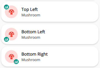
You can position the Mushroom Badge like this:
Top Left:
type: custom:mushroom-template-card
primary: Top Left
icon: mdi:mushroom
icon_color: red
badge_icon: mdi:snail
badge_color: teal
secondary: Mushroom
card_mod:
  style: |
    mushroom-badge-icon {
      left: -3px;
    }
Bottom Left:
type: custom:mushroom-template-card
primary: Bottom Left
icon: mdi:mushroom
icon_color: red
badge_icon: mdi:snail
badge_color: teal
secondary: Mushroom
card_mod:
  style: |
    mushroom-badge-icon {
      left: -3px;
      top: 30px;
    }
Bottom Right:
type: custom:mushroom-template-card
primary: Bottom Right
icon: mdi:mushroom
icon_color: red
badge_icon: mdi:snail
badge_color: teal
secondary: Mushroom
card_mod:
  style: |
    mushroom-badge-icon {
      top: 30px;
    }
13 Likes
hallo nice man & can you sharing you config pleas ?
Hey there, thanks for the reply! So as far as approach, I think my answer is both. Currently I do a version of what you described - I use something mushroom-esque on my index page to tell me something might be up and warrant a deeper look. Then I go to a separate page which shows the graphic in my original post. Keep the non-mushroomy stuff hidden
There is a use case in that I have a few tablets around the house that would be in ‘security mode’ always and have a view restricted to things like cameras/sensors. For instance, if my wife hears a noise in the night, I want her to be able to easily glance to see which motion sensors triggered most recently. Maybe it’s a kid up going to the restroom or something more concerning. The home feed card functionality works perfectly for this (again aside from that weird entry in my example :)).
I think you can accomplish the filtering aspect of what you’re describing by making creative use of the exclude_states function available for each entity in the home-feed-card. I haven’t investigated it yet, but if it allows you to operate on indirect entities you could always use an input helper that’s influenced by the % state of the actual entity, or perhaps you’d have to use a template to control the state and supply a hint that you can use in the exclude_states stanza. I’ll try to find some time to muck with this a bit.
Thanks again for the reply and again if anyone has any creative ideas around how to mushroomize a home feed as in my original example, I’d be very interested and appreciative!
Well, I think I need to go back to rhys CSS bootcamp again
- type: custom:layout-card
        layout_type: masonry
        cards:
          - type: grid
            square: false
            columns: 2
            cards:
              - type: custom:mushroom-light-card
                entity: light.kitchen_sink
                show_brightness_control: true
                use_light_color: false
                fill_container: true
                card_mod:
                  style: |
                    mushroom-light-card {
                      grid-column: span 2;
                      }
              - type: custom:mushroom-light-card
                entity: light.kitchen_bar_area
                primary: Kitchen Bar Area
                show_brightness_control: true
                fill_container: true
              - type: custom:mushroom-light-card
                entity: light.kitchen_overhead
                fill_container: true
              - type: custom:mushroom-light-card
                entity: light.kitchen_table_2
                primary: Kitchen Table
                fill_container: true
A lot of the examples here show us how to navigate the CSS tree to find specific elements within a primary card so I imagine it should be easy to apply something to the top of the hierarchy, right? If I am in the Inspector via Chrome or Firefox, I can manually adjust the grid-column attribute to either of the above and watch the card expand to fill both columns. That -only- works when applied to the element { } section when selecting the mushroom-light-card itself. Modifying any of its children, e.g. ha-card, has no effect.
What’s the equivalent card_mod syntax to affect the mushroom-light-card portion of the hierarchy such that it expands to 2 columns?
Thanks!
1 Like
rolfokevin
August 23, 2022, 5:32am
2460
Added a dropdown to the Mushroom media card as a conditonal source select for my alexas.
square: false
columns: 1
type: grid
cards:
  - type: conditional
    conditions:
      - entity: input_select.alexa_media_mode
        state: office
    card:
      type: custom:stack-in-card
      cards:
        - type: custom:layout-card
          layout_type: grid
          layout:
            grid-template-rows: 8px
            grid-template-areas: |
              "entity menu"
        - type: custom:mushroom-media-player-card
          entity: media_player.office_echo
          name: Office Echo
          icon: si:amazonalexa
          view_layout:
            grid-area: entity
            grid-column-start: 1
            grid-column-end: 3
          use_media_artwork: false
          fill_container: false
          use_media_info: true
          show_volume_level: false
          media_controls:
            - previous
            - play_pause_stop
            - next
          collapsible_controls: true
          tap_action:
            action: toggle
          card_mod:
            style: |
              ha-card {
                padding-bottom: 0px !important;
              }
        - type: custom:mushroom-chips-card
          alignment: end
          view_layout:
            grid-area: menu
          card_mod:
            style: |
              ha-card {
                background-color: transparent !important;
                margin-top: -40px;
                margin-right: 10px;
                text-align: right;
                box-shadow: none !important;
              }
          chips:
            - type: entity
              entity: input_select.alexa_media_mode
        - entity: media_player.office_echo
          hide:
            icon: true
            name: true
            runtime: true
            source: true
            power: true
            state_label: true
            volume: true
            info: true
            progress: true
            controls: true
          more_info: false
          tts:
            platform: alexa
          type: custom:mini-media-player
          toggle_power: false
          group: true
          card_mod:
            style: |
              ha-card {
                padding: 10px 8px 8px !important;
              }
      card_mod:
        style: |
          ha-card {
            {% if not is_state('media_player.office_echo', 'standby') %}
              background: rgba(var(--rgb-card-background-color), 0.5) url( '{{ state_attr( "media_player.office_echo", "entity_picture" ) }}' ) center no-repeat;
              background-size: cover;
              background-blend-mode: overlay;
            {% endif %}
          }
  - type: conditional
    conditions:
      - entity: input_select.alexa_media_mode
        state: kitchen
    card:
      type: custom:stack-in-card
      cards:
        - type: custom:layout-card
          layout_type: grid
          layout:
            grid-template-rows: 8px
            grid-template-areas: |
              "entity menu"
        - type: custom:mushroom-media-player-card
          entity: media_player.kitchen_echoshow
          name: Kitchen Echo
          icon: si:amazonalexa
          view_layout:
            grid-area: entity
            grid-column-start: 1
            grid-column-end: 3
          use_media_artwork: false
          fill_container: false
          use_media_info: true
          show_volume_level: false
          media_controls:
            - previous
            - play_pause_stop
            - next
          collapsible_controls: true
          tap_action:
            action: toggle
          card_mod:
            style: |
              ha-card {
                padding-bottom: 0px !important;
              }
        - type: custom:mushroom-chips-card
          alignment: end
          view_layout:
            grid-area: menu
          card_mod:
            style: |
              ha-card {
                background-color: transparent !important;
                margin-top: -40px;
                margin-right: 10px;
                text-align: right;
                box-shadow: none !important;
              }
          chips:
            - type: entity
              entity: input_select.alexa_media_mode
        - entity: media_player.kitchen_echoshow
          hide:
            icon: true
            name: true
            runtime: true
            source: true
            power: true
            state_label: true
            volume: true
            info: true
            progress: true
            controls: true
          more_info: false
          tts:
            platform: alexa
          type: custom:mini-media-player
          toggle_power: false
          group: true
          card_mod:
            style: |
              ha-card {
                padding: 10px 8px 8px !important;
              }
      card_mod:
        style: |
          ha-card {
            {% if not is_state('media_player.kitchen_echoshow', 'standby') %}
              background: rgba(var(--rgb-card-background-color), 0.5) url( '{{ state_attr( "media_player.kitchen_echoshow", "entity_picture" ) }}' ) center no-repeat;
              background-size: cover;
              background-blend-mode: overlay;
            {% endif %}
          }
  - type: conditional
    conditions:
      - entity: input_select.alexa_media_mode
        state: bedroom
    card:
      type: custom:stack-in-card
      cards:
        - type: custom:layout-card
          layout_type: grid
          layout:
            grid-template-rows: 8px
            grid-template-areas: |
              "entity menu"
        - type: custom:mushroom-media-player-card
          entity: media_player.bedroom_echo
          name: Bedroom Echo
          icon: si:amazonalexa
          view_layout:
            grid-area: entity
            grid-column-start: 1
            grid-column-end: 3
          use_media_artwork: false
          fill_container: false
          use_media_info: true
          show_volume_level: false
          media_controls:
            - previous
            - play_pause_stop
            - next
          collapsible_controls: true
          tap_action:
            action: toggle
          card_mod:
            style: |
              ha-card {
                padding-bottom: 0px !important;
              }
        - type: custom:mushroom-chips-card
          alignment: end
          view_layout:
            grid-area: menu
          card_mod:
            style: |
              ha-card {
                background-color: transparent !important;
                margin-top: -40px;
                margin-right: 10px;
                text-align: right;
                box-shadow: none !important;
              }
          chips:
            - type: entity
              entity: input_select.alexa_media_mode
        - entity: media_player.bedroom_echo
          hide:
            icon: true
            name: true
            runtime: true
            source: true
            power: true
            state_label: true
            volume: true
            info: true
            progress: true
            controls: true
          more_info: false
          tts:
            platform: alexa
          type: custom:mini-media-player
          toggle_power: false
          group: true
          card_mod:
            style: |
              ha-card {
                padding: 10px 8px 8px !important;
              }
      card_mod:
        style: |
          ha-card {
            {% if not is_state('media_player.bedroom_echo', 'standby') %}
              background: rgba(var(--rgb-card-background-color), 0.5) url( '{{ state_attr( "media_player.bedroom_echo", "entity_picture" ) }}' ) center no-repeat;
              background-size: cover;
              background-blend-mode: overlay;
            {% endif %}
          }
  - type: conditional
    conditions:
      - entity: input_select.alexa_media_mode
        state: living room
    card:
      type: custom:stack-in-card
      cards:
        - type: custom:layout-card
          layout_type: grid
          layout:
            grid-template-rows: 8px
            grid-template-areas: |
              "entity menu"
        - type: custom:mushroom-media-player-card
          entity: media_player.livingroom_echo
          name: Livingroom Echo
          icon: si:amazonalexa
          view_layout:
            grid-area: entity
            grid-column-start: 1
            grid-column-end: 3
          use_media_artwork: false
          fill_container: false
          use_media_info: true
          show_volume_level: false
          media_controls:
            - previous
            - play_pause_stop
            - next
          collapsible_controls: true
          tap_action:
            action: toggle
          card_mod:
            style: |
              ha-card {
                padding-bottom: 0px !important;
              }
        - type: custom:mushroom-chips-card
          alignment: end
          view_layout:
            grid-area: menu
          card_mod:
            style: |
              ha-card {
                background-color: transparent !important;
                margin-top: -40px;
                margin-right: 10px;
                text-align: right;
                box-shadow: none !important;
              }
          chips:
            - type: entity
              entity: input_select.alexa_media_mode
        - entity: media_player.livingroom_echo
          hide:
            icon: true
            name: true
            runtime: true
            source: true
            power: true
            state_label: true
            volume: true
            info: true
            progress: true
            controls: true
          more_info: false
          tts:
            platform: alexa
          type: custom:mini-media-player
          toggle_power: false
          group: true
          card_mod:
            style: |
              ha-card {
                padding: 10px 8px 8px !important;
              }
      card_mod:
        style: |
          ha-card {
            {% if not is_state('media_player.livingroom_echo', 'standby') %}
              background: rgba(var(--rgb-card-background-color), 0.5) url( '{{ state_attr( "media_player.livingroom_echo", "entity_picture" ) }}' ) center no-repeat;
              background-size: cover;
              background-blend-mode: overlay;
            {% endif %}
          }
2 Likes
Posreg
August 23, 2022, 7:01am
2461
sure for which part ? as I already put some cards here
in the meantime I created 2 new viewes, maybe someone is intereseted
it is it not ideal yet though
second is the pollution, here I;m yet struggling to change the background based on the pollution, but the rest is done
2 Likes
Posreg:
sure for which part ? as I already put some cards here
in the meantime I created 2 new viewes, maybe someone is intereseted
hello if it is possible the map of system would I like the config which is very nicely made ?
1 Like
tfmeier
August 23, 2022, 1:34pm
2463
You’ve got a point re the dynamic list.
Possibly a combination of exclusion via exclude_states (as this is exception reporting after all) and specific inclusions via id_filter may provide the list I’m after.
From GitHub
id_filter (optional)
This is a regular expression for filtering persistent notifications by notification id. In the example above, "^home_feed_.*" will result in only notifications with ids starting with home_feed_ from being displayed.
Not really clear to me what this notification id is - don’t see this being assigned in the examples. Logically though this would have to be part of a particular event/notification…
More research needed…
Mosher
August 23, 2022, 2:48pm
2464
Here is my card. Its 90% finished though. PS5 button need to set to grab sensor attributes and TV to grab selected media… but I don’t know how to do it
type: custom:stack-in-card
mode: vertical
cards:
  - type: horizontal-stack
    cards:
      - type: custom:mushroom-entity-card
        entity: switch.plug_mediasystem
        fill_container: false
        primary_info: name
        tap_action:
          action: toggle
        name: Media
        icon: mdi:youtube-tv
        icon_color: cyan
      - type: custom:mushroom-chips-card
        style: |
          ha-card {
            --chip-box-shadow: none;
            --chip-background: none;
            --chip-spacing: none;
            --chip-height: 43px;
            margin-top: 12px;
          }
        chips:
          - type: entity
            icon_color: yellow
            entity: sensor.plug_mediasystem_power
        alignment: center
      - type: custom:mushroom-chips-card
        style: |
          ha-card {
            --chip-box-shadow: none;
            --chip-background: none;
            --chip-spacing: none;
            --chip-height: 43px;
            margin-top: 12px;
          }
        chips:
          - type: entity
            icon_color: blue
            entity: sensor.plug_mediasystem_energy
        alignment: center
  - type: conditional
    conditions:
      - entity: switch.plug_mediasystem
        state: 'on'
    card:
      type: horizontal-stack
      cards:
        - type: custom:mushroom-media-player-card
          entity: media_player.tv
          icon: mdi:television-box
          show_volume_level: false
          media_controls: []
          use_media_info: true
          tap_action:
            action: toggle
          secondary_info: state
          icon_type: icon
          collapsible_controls: false
          card_mod:
            style: |
              ha-card {
                --rgb-state-media-player: var(--rgb-red)
              }
        - type: custom:mushroom-media-player-card
          entity: media_player.denon
          media_controls: []
          name: AVR
          tap_action:
            action: call-service
            service: media_player.toggle
            data: {}
            target:
              device_id: 3533f012333423eaae9c51a8bd87ba87
          card_mod:
            style: |
              ha-card {
                --rgb-state-media-player: var(--rgb-green)
              }
        - type: custom:mushroom-entity-card
          entity: switch.ps5_175_power
          name: PS5
          icon_color: blue
          primary_info: name
          tap_action:
            action: toggle
  - type: conditional
    conditions:
      - entity: switch.plug_mediasystem
        state: 'on'
    card:
      type: custom:mushroom-media-player-card
      entity: media_player.tv
      media_controls:
        - previous
        - play_pause_stop
        - next
      collapsible_controls: true
      volume_controls: []
      show_volume_level: false
      use_media_info: true
      fill_container: true
      secondary_info: none
      primary_info: none
      icon_type: none
      tap_action:
        action: toggle
  - type: conditional
    conditions:
      - entity: switch.plug_mediasystem
        state: 'on'
    card:
      type: custom:mushroom-media-player-card
      entity: media_player.denon
      volume_controls:
        - volume_mute
        - volume_set
        - volume_buttons
      secondary_info: none
      primary_info: none
      icon_type: none
      collapsible_controls: true
      card_mod:
        style: |
          ha-card {
            --rgb-state-media-player: var(--rgb-green)
          }
5 Likes
Hi all,
Can I use this syntax?
I resolved
very nice card thank you for sharing made it beautiful
1 Like
rolfokevin
August 24, 2022, 3:06am
2469
Exactly what I was looking for. Thanks man. I knew their had to be a way to call media controls from different entities. I’ll play around with this tonight and see what I can come up with.
1 Like
rhysb
August 24, 2022, 4:46am
2470
Have a look at the Universal Media Player. You can combine multiple Media Player Entities.
rhysb
August 24, 2022, 5:08am
2471
Perhaps this is what you wanted?
type: custom:layout-card
layout_type: masonry
cards:
  - type: grid
    square: false
    columns: 2
    cards:
      - type: custom:mushroom-light-card
        entity: light.kitchen_sink
        show_brightness_control: true
        use_light_color: false
        fill_container: true
        card_mod:
          style: |
            :host {
               grid-column: 1 / span 2;
            }
      - type: custom:mushroom-light-card
        entity: light.kitchen_bar_area
        primary: Kitchen Bar Area
        show_brightness_control: true
        fill_container: true
      - type: custom:mushroom-light-card
        entity: light.kitchen_overhead
        fill_container: true
      - type: custom:mushroom-light-card
        entity: light.kitchen_table_2
        primary: Kitchen Table
        fill_container: true
1 Like
Proche72
August 24, 2022, 5:40am
2472
would you share code for the “system” card? the one with the updates and RPI status, and restarts. that looks awesome
rhysb
August 24, 2022, 5:41am
2473
Try like this:
        card_mod:
          style: |
            @keyframes blink {
              50% {opacity: 0;}
            }
            ha-card {
              {% if  (states(config.entity) | int) < 15 %}
                 animation: blink 1s linear infinite;
              {% endif %}
            }
Remember that there can be a delay between your battery level changing and the sensor updating in HA.
rhysb
August 24, 2022, 7:56am
2474
You can add card_mod to your theme to apply CSS to various aspects of Lovelace.
To have Mushroom Media Card collapse on idle you can do it like this:
type: custom:mushroom-media-player-card
entity: media_player.lounge_tv
use_media_info: true
collapsible_controls: true
media_controls:
  - next
  - play_pause_stop
  - previous
volume_controls:
  - volume_buttons
  - volume_set
card_mod:
  style: |
    mushroom-card .actions {
      {{ 'display: none;' if is_state(config.entity, 'idle') }}
    }
    mushroom-state-item {
      {{ 'margin-bottom: 0px;' if is_state(config.entity, 'idle') }}
    }
 But yes, you stated the goal perfectly: a home feed card styled in mushroom.


