Thank you so very much…
1 Like
Is possible use default entity icon in a template chip?
I have set the mush-rgb-disabled to red, so I could see the difference, and it works with the cards (entity, cover, climate), but not with the chips.
Is this a chip limit, or a bug?
Thanks
Maybe a bit of both. Chips use --primary-text-color, but seems to ignore it when defined in a theme.
Try using --primary-text-color:
Here you go, a Mushroom Light Scene Card with four (or more) buttons:

type: custom:stack-in-card
cards:
  - type: custom:mushroom-light-card
    entity: light.dining_room_light
    show_brightness_control: true
    collapsible_controls: true
  - type: custom:mushroom-chips-card
    chips:
      - type: entity
        entity: input_boolean.scene_1
        icon_color: red
        icon: mdi:numeric-1-circle
        content_info: none
        tap_action:
          action: toggle
        card_mod:
          style: |
            ha-card {
              --chip-background: rgba(var({{ '--rgb-red' if is_state(config.entity, 'on') else '--rgb-disabled' }}), 0.2);
              --icon-color: rgb(var(--rgb-disabled));
            }
      - type: entity
        entity: input_boolean.scene_2
        icon_color: green
        icon: mdi:numeric-2-circle
        content_info: none
        tap_action:
          action: toggle
        card_mod:
          style: |
            ha-card {
              --chip-background: rgba(var({{ '--rgb-green' if is_state(config.entity, 'on') else '--rgb-disabled' }}), 0.2);
              --icon-color: rgb(var(--rgb-disabled));
            }
      - type: entity
        entity: input_boolean.scene_3
        icon_color: blue
        icon: mdi:numeric-3-circle
        content_info: none
        tap_action:
          action: toggle
        card_mod:
          style: |
            ha-card {
              --chip-background: rgba(var({{ '--rgb-blue' if is_state(config.entity, 'on') else '--rgb-disabled' }}), 0.2);
              --icon-color: rgb(var(--rgb-disabled));
            }
      - type: entity
        entity: input_boolean.scene_4
        icon_color: purple
        icon: mdi:numeric-4-circle
        content_info: none
        tap_action:
          action: toggle
        card_mod:
          style: |
            ha-card {
              --chip-background: rgba(var({{ '--rgb-purple' if is_state(config.entity, 'on') else '--rgb-disabled' }}), 0.2);
              --icon-color: rgb(var(--rgb-disabled));
            }
    card_mod:
      style: |
        ha-card {
            --chip-box-shadow: none;
            top: 16px;
            width: -webkit-fill-available;
            right: 12px;
            position: absolute;
        }
        .chip-container {
            right: 0px;
            position: absolute;
        }
Updated: Support collapsible control and toggle issue. Credit to @leofabri 
29 Likes
The toggle of the lights by pressing the light bulb seems to be very inconsistent when these buttons are also present.
Also, how do I keep those buttons in place when collapsible_controls is true?
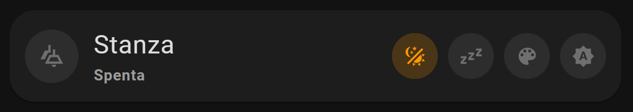
Not sure if this is the right way, but it seems to work.
type: custom:stack-in-card
cards:
  - type: custom:mushroom-light-card
    entity: light.dining_room_light
    show_brightness_control: true
    show_color_temp_control: true
    show_color_control: true
    collapsible_controls: true
    use_light_color: true
    name: Stanza
    icon: mdi:wall-sconce
    hide_state: false
    card_mod:
      style: |
        ha-card {
          --card-primary-font-size: 20px;
          --card-primary-font-weight: normal;
          border-radius: 0px;
          --ha-card-background: none;
          --ha-card-box-shadow: 0px;
          --chip-font-weight: normal;
        }
        mushroom-shape-icon {
          {{ '--card-mod-icon: mdi:ceiling-light-multiple;' if is_state(config.entity, 'on') else '--card-mod-icon: mdi:ceiling-light-multiple-outline;' }}
        }
  - type: custom:mushroom-chips-card
    chips:
      - type: entity
        entity: input_boolean.scene_1
        icon_color: orange
        content_info: none
        tap_action:
          action: toggle
        card_mod:
          style: |
            ha-card {
              --chip-background: rgba(var({{ '--rgb-orange' if is_state(config.entity, 'on') else '--rgb-disabled' }}), 0.2);
              --icon-color: rgb(var(--rgb-disabled));
            }
      - type: entity
        entity: input_boolean.scene_2
        icon_color: orange
        content_info: none
        tap_action:
          action: toggle
        card_mod:
          style: |
            ha-card {
              --chip-background: rgba(var({{ '--rgb-orange' if is_state(config.entity, 'on') else '--rgb-disabled' }}), 0.2);
              --icon-color: rgb(var(--rgb-disabled));
            }
      - type: entity
        entity: input_boolean.scene_3
        icon_color: orange
        content_info: none
        tap_action:
          action: toggle
        card_mod:
          style: |
            ha-card {
              --chip-background: rgba(var({{ '--rgb-orange' if is_state(config.entity, 'on') else '--rgb-disabled' }}), 0.2);
              --icon-color: rgb(var(--rgb-disabled));
            }
      - type: entity
        entity: input_boolean.scene_4
        icon_color: orange
        content_info: none
        tap_action:
          action: toggle
        card_mod:
          style: |
            ha-card {
              --chip-background: rgba(var({{ '--rgb-orange' if is_state(config.entity, 'on') else '--rgb-disabled' }}), 0.2);
              --icon-color: rgb(var(--rgb-disabled));
            }
    alignment: end
    card_mod:
      style: |
        ha-card {
            --chip-box-shadow: none;
            top: 18px;
            width: -webkit-fill-available;
            right: 12px;
            position: absolute;
            display: block;
        }
        .chip-container {
            right: 0px;
            position: absolute;
        }
5 Likes
I have made something similar, but with cards and not chips:

type: custom:stack-in-card
mode: horizontal
cards:
  - type: custom:mushroom-template-card
    primary: Sicurezza
    secondary: Controllo
    icon: mdi:alert-decagram-outline
    tap_action:
      action: navigate
      navigation_path: sicurezza
    icon_color: orange
    multiline_secondary: true
  - square: false
    columns: 4
    type: grid
    cards:
      - type: custom:mushroom-entity-card
        entity: light.luci
        primary_info: none
        secondary_info: none
        layout: horizontal
        icon_color: orange
        tap_action:
          action: more-info
        hold_action:
          action: more-info
        double_tap_action:
          action: more-info
      - type: custom:mushroom-entity-card
        entity: binary_sensor.stato_termostati
        primary_info: none
        secondary_info: none
        layout: horizontal
        icon: mdi:thermostat
        icon_color: orange
      - type: custom:mushroom-entity-card
        entity: binary_sensor.porte
        primary_info: none
        secondary_info: none
        layout: horizontal
        icon_color: orange
      - type: custom:mushroom-entity-card
        entity: binary_sensor.finestre
        primary_info: none
        secondary_info: none
        layout: horizontal
        icon_color: orange
7 Likes
Is it possible to paste your code in YAML please?
Just by pasting this code, I get - of course- a lot of indentation errors and I can’t make it right (still).
Thanks a lot
It’s just the same:
icon: "{{ 'mdi:dog' if is_state('switch.sonoff_10004da9de','on') else 'mdi:cat' }}"
Is there someone that can point me in the right direction? I’m still not able to show mushroom styled cards in a pop up.
Any ideas on what could be causing this? Am I missing something? Thanks for your help.
Nice thanks!!!
1 Like
So I’m really liking the card, question is, can you make an “expandable” version?
Like I’d love just the bar with the current condition (rain) to only show, and then when tapped or a dropped down arrow tapped it expands the card with the temperatures.

Just trying to make it a little smaller to save some space here.

EDIT: I think ill also remove the top weather card since I have yous but still an expandable version would be cool so I can have both.
Hey, how are you producing that weather info using Mushroom?
1 Like
@rhysb

if all the media options are selected then the above is the default layout. On clicking the speaker/volume button the below layout is shown.

is there a way to keep this as the default layout and on clicking the speaker/volume button the first layout is shown?
2 Likes
I just built my first template chip card. In the following code, if I remove the “W” from the end of the content template, and the state of the sensor is zero (and only if it’s zero), the state doesn’t appear at all on the chip. If I add anything at all, like the “W”, the zero shows up. What am I missing?
type: custom:mushroom-chips-card
chips:
  - type: template
    entity: sensor.myenergi_bayview_power_charging
    icon: mdi:car-arrow-left
    icon_color: |-
      {% set charging=states(entity) %}
      {% if charging | int != 0 %}
        {% set state=states('sensor.myenergi_bayview_power_import') %}
        {% if state | int > 200 %}
        red
        {% else %}
        green
        {% endif %}
      {% else %}
      default
      {% endif %}
    content: '{{ states(entity) }} W'
    tap_action:
      action: more-info
    double_tap_action:
      action: more-info
    hold_action:
      action: more-info
Like this:
3 Likes