Thank you verry much, that works!!!
Yes it works… Thanks a lot ![]()
Did you figure out why it happened, what broke the CSS?
got something that is maybe a little easier… but its still not great.
type: custom:mushroom-update-card
entity: update.adaptive_lighting_update
show_buttons_control: true
card_mod:
  style:
    mushroom-update-buttons-control$:
      mushroom-button:nth-child(1)$: |
        .button {
          height: 42px !important;
          width: 42px !important;
          border-radius: 21px !important;
          background: rgba(10, 10, 10, 0.2) !important;
          --card-mod-icon: mdi:download;
          --icon-color: red !important;
          --icon-color-disabled: red !important;
          --control-icon-size: 10px;
        }
      mushroom-button:nth-child(2)$: |
        .button {
          height: 42px !important;
          width: 42px !important;
          border-radius: 21px !important;
          background: rgba(10, 10, 10, 0.2) !important;
          --card-mod-icon: mdi:close-circle-outline;
          --icon-color: blue !important;
          --icon-color-disabled: blue !important;
          --control-icon-size: 10px;
        }
Still havent been able to figure out why the ha-icon when applied through the shadow root of mushroom-update-buttons-control applies to both icons even when using nth-child or nth-of-type.
all of my button icon styling in this guide is broken now… ![]()
Hi Dimitri - thanks for this extensive guide. I have 4 mushroom-person cards inside a 2x2 grid card on my dashboard. however the size of the cards are different from the other cards on the dashboard and hence looks weird. Been trying to solve for this for quite sometime and nothing seems to work.

Here is the code as of now:
      - type: grid # People
        cards:
          - entity: person.person1
            name: person 1
            use_entity_picture: true
            vertical: true
            type: custom:mushroom-person-card
            card_mod:
              style: |
                ha-card {
                  height: 20px !important;
                  width: 20px;
                }
          - entity: person.person2
            name: person 2
            use_entity_picture: true
            vertical: true
            type: custom:mushroom-person-card
            card_mod:
              style: |
                ha-card {
                  height: 20px !important;
                  width: 20px;
                }
          - entity: person.person3
            name: Person 3
            use_entity_picture: true
            vertical: true
            type: custom:mushroom-person-card
            card_mod:
              style: |
                ha-card {
                  height: 20px !important;
                  width: 20px;
                }
          - entity: person.person4
            name: Person 4
            use_entity_picture: true
            vertical: true
            type: custom:mushroom-person-card
            card_mod:
              style: |
                ha-card {
                  height: 20px !important;
                  width: 20px;
                }
        columns: 2
        square: true
What am I doing wrong? Any and ll help appreciated. Thanks in advance.
First try and turn off square: true in the grid card.
        type: grid # People
        columns: 2
        square: false
        cards:
See if that helps to start.
Tried that and nothing changed.
if its not too large, can you try and send me the full dashboard page code please?
DM’d you with the whole code.
Thanks for all the time you have invested in this for everyone and your continual help. I want to decrease the amount of space between the icon and the entity name is there a way to do this here is the code:
 - type: custom:mushroom-entity-card
        entity: input_button.kitchen_chromecast
        name: Kitchen Music
        layout: vertical
        secondary_info: none
        tap_action:
          action: toggle
        card_mod:
          style:
            mushroom-shape-icon$: |
              .shape {
              --icon-symbol-size: 21px;
              --icon-size: 30px;
              }
            .: |
              ha-card {
                height: 75px !important;
                --card-mod-icon-color: grey;
                box-shadow: 0px 2px 6px 0px rgba(173,216,230.8) ;
                --card-primary-font-size: var(--mush-card-primary-font-size, 10px);
                --card-secondary-font-size: var(--mush-card-secondary-font-size, 10px);
                {% if states('sensor.gxr2status_1') == '6' %}
                  box-shadow: 0px 2px 4px 0px rgba(0,255,0,0.66) !important
                {% elif states('sensor.gxr2status_1') == '0' %}
                  background-color: var(--card-background-color); /* Default */
                {% endif %}
                }

Just add margin-bottom:-14px; the the shape mod like this:

Adjust the px accordingly
type: custom:mushroom-entity-card
entity: input_button.kitchen_chromecast
name: Kitchen Music
layout: vertical
secondary_info: none
tap_action:
          action: toggle
card_mod:
          style:
            mushroom-shape-icon$: |
              .shape {
              --icon-symbol-size: 21px;
              --icon-size: 30px;
              margin-bottom:-14px;
              }
            .: |
              ha-card {
                height: 75px !important;

                --card-mod-icon-color: grey;
                box-shadow: 0px 2px 6px 0px rgba(173,216,230.8) ;
                --card-primary-font-size: var(--mush-card-primary-font-size, 10px);
                --card-secondary-font-size: var(--mush-card-secondary-font-size, 10px);
                {% if states('sensor.gxr2status_1') == '6' %}
                  box-shadow: 0px 2px 4px 0px rgba(0,255,0,0.66) !important
                {% elif states('sensor.gxr2status_1') == '0' %}
                  background-color: var(--card-background-color); /* Default */
                {% endif %}
                }
Thank you sir!
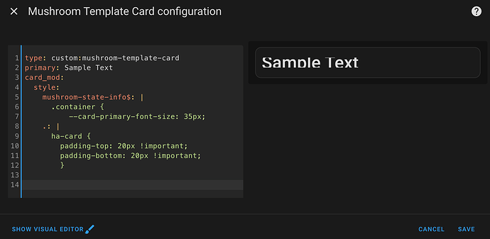
Text is getting cut off after a recent update. I made some cards about 2 months ago but now they’re all like this.
Adding padding doesn’t help. I’ve also tried using overflow: visible in a few places but that doesn’t seem to apply here. Any way around this? I couldn’t find any relevant posts about it.
This should resolve your issue and minimize your code.
type: custom:mushroom-template-card
primary: Sample Text
icon: mdi:home
card_mod:
 style: |
   ha-card {
           --card-primary-font-size: 35px;
           --card-primary-line-height: 35px;
             }

Amazing. Thanks so much!!
For Mushroom Template card text styling, I’ve not found this to work for me:
card_mod:
  style:
    mushroom-state-info$: |
      .container {
        --primary-text-color: blue;
        --secondary-text-color: orange;
      }
This works for font size (as opposed to what’s shown in the guide):
            ha-card {
              --card-primary-font-size: 30px;
              --card-secondary-font-size: 22px;
            }
…but this also does not work for font color:
            ha-card {
              --card-primary-font-color: white;
              --card-secondary-font-color: white;
            }
Guide will be updated soon to reflect these changes. you can see that in the first post the version number of Mushroom probably doenst line up with what you are using.
A quick check shows that’s likely the problem, thanks!
…in the meantime, what’s everyone using to change the text color of the elements in a title card in Mushroom v3.4.2? This doesn’t do it for me:
        card_mod:
          style: |
            ha-card {
              --card-primary-text-color: white;
              --secondary-text-color: white;
            }
type: custom:mushroom-title-card
title: Hello, {{ user }} !
subtitle: TEST
card_mod:
  style: |
    ha-card {
      --title-color: red !important;
      --title-font-size: 40px;
      --subtitle-color: red !important;
      --subtitle-font-size: 40px;
    }
Awesome! Thanks.
