yes. I have a custom theme created, and the latest version of the card mushroom is 5.0.8.
yes, this is not the first time I use the card mod, but due to the lack of programming knowledge, it is not easy for me.
yes. I have a custom theme created, and the latest version of the card mushroom is 5.0.8.
yes, this is not the first time I use the card mod, but due to the lack of programming knowledge, it is not easy for me.
Is your Theme only Mushroom related or is it card-mod-theme: based?
not only mushrooms, I also style other cards in card-mod-card:
  card-mod-card: |
    mushroom-shape-icon {
      --shape-color: none !important;
      --shape-color-disabled: none !important;
    }
    ha-card {
      --chip-background: none;
    }
This thread is probably not the best place for your question. I’d move it to
Many thanks, but unfortunately this is not working 
Not sure if the custom:mushroom-template-card has a special behaviour here…
Do you have another idea?
Many many thanks in advance!!!
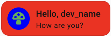
This should work. Here is my working example
type: custom:mushroom-template-card
primary: Hello, {{user}}
secondary: How are you?
icon: mdi:mushroom
features_position: bottom
tap_action:
  action: more-info
color: green
card_mod:
  style:
    .: |
      ha-card {
        --ha-card-background: red;
      }
    ha-tile-icon$: |
      .container {
         background: blue;
      }
I found the issue @RkcCorian is experiencing. When you add a entity to the Template card and want the background transparent, you have to use 
type: custom:mushroom-template-card
primary: Hello, LiQuid_cOOled
secondary: How are you?
icon: mdi:mushroom
features_position: bottom
entity: light.corner_stand
card_mod:
 style:
  ha-tile-icon$: |
       .container:before {
            display: none;
            }
card_mod:
 style:
  ha-tile-icon$: |
       .container:before {
            background: none ;
            }
or
card_mod:
 style:
  ha-tile-icon$: |
       .container:before {
              background: none !important ;
            }
Good find on the ripple getting involved. Nice.
Nice!! The second one is working
card_mod:
 style:
  ha-tile-icon$: |
       .container:before {
              background: none !important ;
            }
Many many thanks!!!
I am struggling to combine card mod to both color the icon conditionally based on entity state and set the secondary text to a fixed color. On their own each works but I cannot find a way to use both sets of styling in the one card. Here is my first card that colors the icon :
entity: sensor.r5_battery_level
name: Battery Level
icon: mdi:car-battery
card_mod:
  style: >
    ha-state-icon {    {% set battery = states('sensor.hg25dyb_battery') | float
    %}    {% if battery > 50 %}
     color: green;
    {% elif battery > 25 %}
     color: yellow;
    {% else %}
     color: red;
    {% endif %} }
and here is the code to color the secondary text I want to add into the above card. I cant find a way to use both in the same card that works:
card_mod: style: mushroom-state-info$: | .container { --card-secondary-color: orange; }
Hi,
Here some trouble with coloring primary and secondary text as well for the Mushroom Template Card
“back in the day’s” (I can;t remeber when) the following code worked for me:
card_mod:
  style: |
    ha-card {
      height: 120px !important;
    }
    mushroom-card {
      --icon-size: 60px;
      --card-primary-font-size: 1.75rem;
      --card-secondary-font-size: 1rem;
      --card-secondary-color: {{ 'coral' if is_state_attr('climate.thermostat_attic', 'hvac_action', 'heating') else 'grey'}};
      --card-primary-line-height: 30px;
    }
Now I learned I probably have to do something different, as posted in the ‘tutorial’ posts something like:
card_mod:
  style:
    mushroom-state-info$: |
      .container {
        --card-primary-color: grey;
        --card-secondary-color: coral;
      }
Unfortunately this does not work for me. All text stay’s the same grey color. I tried to find a solution (working on it for quite some time before I reached out here).
I still would like to combine the mods I wrote in the first code (card height, icon size, font sizes, font color (depending on the state of the ‘hvac_action’) and line height. But unfortunately I’m lost.
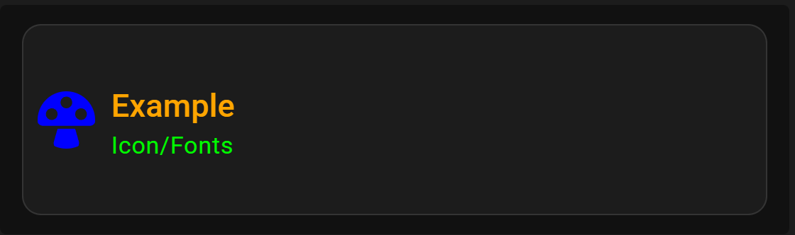
Start with this as an example…
type: custom:mushroom-template-card
primary: Example
secondary: Icon/Fonts
icon: mdi:mushroom
card_mod:
style: |
ha-card {
      height: 120px !important;
    }
ha-tile-icon {
--tile-icon-color: blue !important;
--mdc-icon-size: 44px;
}
#info {
--tile-info-primary-font-size: 20px;
--tile-info-secondary-font-size: 15px;
--tile-info-primary-color: orange;
--tile-info-secondary-color: lime;
}
Please specify the Mushroom card type. The card_mod code for Mushroom is card specific with recent updates.
Yes! Thanx for your “push in the right direction”!
I’m using the mushroom template card.
I ended up with following, which suits my needs:
card_mod:
  style:
    ha-tile-icon$: |
      .container:before {
        background: none !important;
        }
    .: |
      ha-card {
        height: 120px !important;
        }
      ha-tile-icon {
         --mdc-icon-size: 40px;
         --tile-icon-size: 45px;
         }
      #info {
        --tile-info-primary-font-size: 1.75rem !important;
        --tile-info-secondary-font-size: 1rem !important;
        --tile-info-primary-line-height: 30px !important;
        --tile-info-primary-color: grey !important;
        --tile-info-secondary-color: {{ 'coral' if is_state_attr('climate.thermostat_attic', 'hvac_action', 'heating') else 'grey'}} !important;
        }
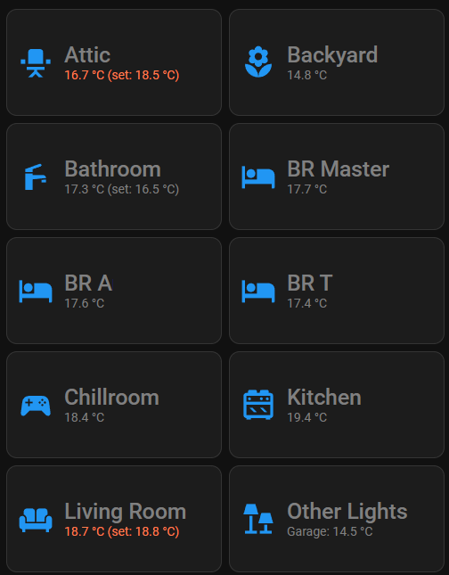
My “Home” dashboard is up and running again:
I consider the code provided a little more than a push is the right direction 
The card type question was directed at another user.
Happy to assist!
I have an input text helper which i want to show in the ui.
I want it so it has an inline text field…
I tried using mushroom entity card, but then when i click i go to more info to fill in something.
Is it possible to fill in directly without going to the more info field?
Thx in advance !
Use a standard tile card and add the ‘select options’ feature.
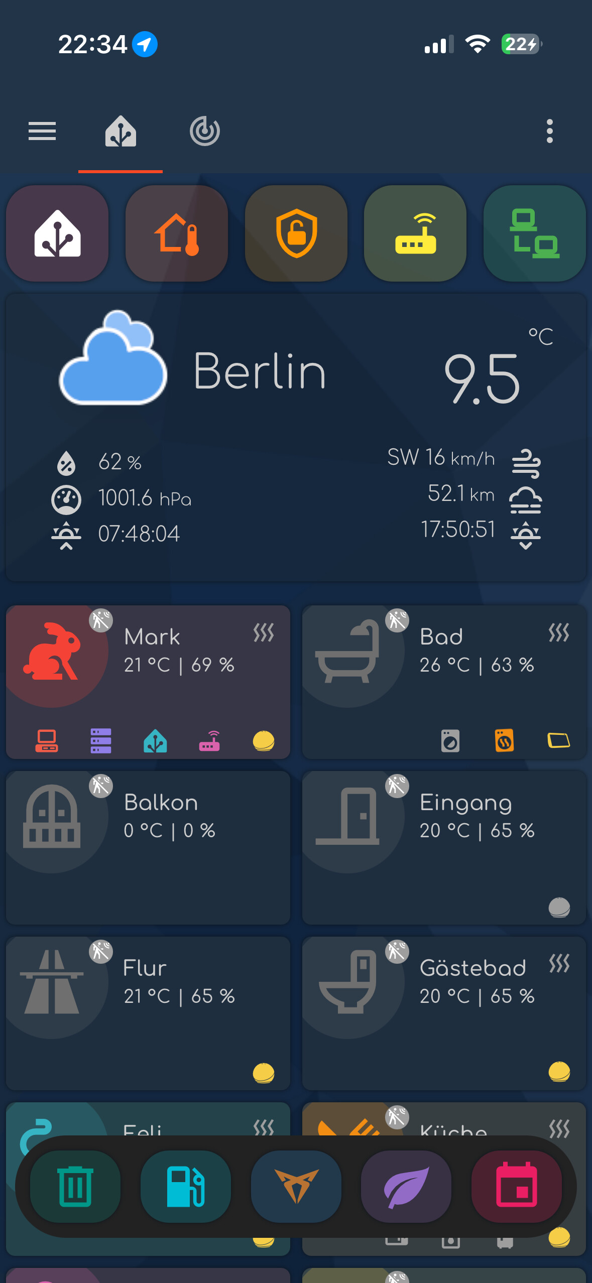
Hey there… i am using a bottom menu which worked for very long but one recent update broke it so it stays no longer at the bottom of my ios ha-app - browser works fine… any suggestions?
type: custom:mod-card
card:
  type: grid
  square: false
  columns: 5
  cards:
    - type: custom:mushroom-chips-card
      chips:
        - type: template
          icon: mdi:trash-can-outline
          icon_color: teal
          tap_action:
            action: navigate
            navigation_path: /dashboard-home/trash
          card_mod:
            style: |
              ha-card {
                --chip-background: rgba(var(--rgb-teal), 0.2);
                justify-content: center;
                --chip-icon-size: 36px;
                --chip-height: 48px;
              }
        - type: template
          icon: mdi:gas-station
          tap_action:
            action: navigate
            navigation_path: /dashboard-home/benzin
          icon_color: cyan
          card_mod:
            style: |
              ha-card {
                --chip-background: rgba(var(--rgb-cyan), 0.2);
                justify-content: center;
                --chip-icon-size: 36px;
                --chip-height: 48px;
              }
        - type: template
          icon: phu:cupra
          icon_color: "#B87333"
          tap_action:
            action: navigate
            navigation_path: /dashboard-home/zug
          card_mod:
            style: |
              ha-card {
                justify-content: center;
                --chip-icon-size: 36px;
                --chip-height: 48px;
                --chip-background: rgba(var(--rgb-blue), 0.2);
              }
        - type: template
          icon: mdi:leaf
          icon_color: purple
          tap_action:
            action: navigate
            navigation_path: /dashboard-home/misc
          card_mod:
            style: |
              ha-card {
                --chip-background: rgba(var(--rgb-purple), 0.2);
                justify-content: center;
                --chip-icon-size: 36px;
                --chip-height: 48px;
              }
        - type: template
          icon: mdi:calendar
          icon_color: pink
          tap_action:
            action: navigate
            navigation_path: /dashboard-home/kalender
          card_mod:
            style: |
              ha-card {
                --chip-background: rgba(var(--rgb-pink), 0.2);
                justify-content: center;
                --chip-icon-size: 36px;
                --chip-height: 48px;
              }
      alignment: justify
      card_mod:
        style: |
          @media (min-width:180px) {
            ha-card {
              z-index: 1;
              position: fixed;
              bottom: 30px;
              left: 10px;
              width: calc(100% - 20px);
              height: 68px;
              background: #222222;
              border-radius: 100px;
              padding: 10px;
              box-shadow: none;
              transition: all 0s;
              }
          }
          @media (min-width:1400px) {
            ha-card {
              width: calc(40% - 30px);
              height: 68px;
              left: calc(30% + 30px);
              background: #222222;
              transition: all 0s;
              }
          }
card_mod:
  style: |
    @media (min-width:180px) {
      ha-card {
        z-index: 1;
        position: fixed;
        bottom: 30px;
        left: 10px;
        width: calc(100% - 20px);
        height: 68px;
        background: #222222;
        border-radius: 100px;
        padding: 10px;
        box-shadow: none;
        transition: all 0s;
          }
        }
    @media (min-width:1400px) {
      ha-card {
        width: calc(40% - 30px);
        height: 68px;
        left: calc(30% + 30px);
        background: #222222;
        transition: all 0s;
          }
        }
Tested it on both a Masonry and Sections dashboards. I had no issues with the bottom sticky menu floating on my iPhone 16 Pro Max or my PC’s browser.
Hi together,
now I would like to add a shadow to the icon of my chips as well to the text. So not to the chip itself, but for the icon and the text. Can anybody help me here?
Many many thanks!
My current YAML…
type: custom:mushroom-chips-card
chips:
  - type: template
    entity: sensor.haustemperatur
    icon: mdi:thermometer
    icon_color: "#FF6F22"
    content: "{{ states(entity) | float | round(1) }} %"
    tap_action:
      action: more-info
    double_tap_action:
      action: navigate
      navigation_path: /dashboard-haus/klima
    card_mod:
      style: |
        ha-card {
          border-width: 0px !important;
        }
  - type: template
    entity: sensor.hausfeuchtigkeit
    icon: mdi:water-percent
    icon_color: "#2196F3"
    content: "{{ states(entity) | float | round(1) }} %"
    tap_action:
      action: more-info
    double_tap_action:
      action: navigate
      navigation_path: /dashboard-haus/klima
    card_mod:
      style: |
        ha-card {
          border-width: 0px !important;
        }
  - type: template
    entity: sensor.beschattungsfreigabe
    icon: |
      {% if is_state(entity, 'on') %}
        mdi:shield-sun
      {% else %}
        mdi:shield-moon-outline
      {% endif %}
    icon_color: |
      {% if is_state(entity, 'on') %}
        var(--corian-blue)
      {% else %}
        var(--corian-gray)
      {% endif %}
    tap_action:
      action: more-info
    double_tap_action:
      action: navigate
      navigation_path: /dashboard-haus/klima
    card_mod:
      style: |
        ha-card {
          border-width: 0px !important;
        }
  - type: template
    entity: binary_sensor.hausbatterien
    icon: |
      {% if is_state(entity, 'on') %}
        mdi:battery-alert-variant-outline
      {% else %}
        mdi:battery
      {% endif %}
    icon_color: |
      {% if is_state(entity, 'on') %}
        var(--corian-red)
      {% else %}
        var(--corian-gray)
      {% endif %}
    tap_action:
      action: more-info
    double_tap_action:
      action: navigate
      navigation_path: /dashboard-haus/infrastruktur
    card_mod:
      style: |
        ha-card {
          border-width: 0px !important;
        }
      .: |
        ha-state-icon {
          {% if is_state('binary_sensor.arbeitszimmerfenster_links_batterie', 'off') %}
            color: var(--success-color) !important;
          {% else %}
            color: var(--state-binary_sensor-battery-on-color) !important;
            animation: blink 2s linear infinite;
          {% endif %}
          }
          @keyframes blink {50% {opacity: 0;}}
  - type: template
    entity: binary_sensor.hausfenster
    icon: |
      {% if is_state(entity, 'on') %}
        mdi:window-open
      {% else %}
        mdi:window-closed
      {% endif %}
    icon_color: |
      {% if is_state(entity, 'on') %}
        var(--corian-yellow)
      {% else %}
        var(--corian-gray)
      {% endif %}
    tap_action:
      action: more-info
    double_tap_action:
      action: navigate
      navigation_path: /dashboard-haus/sicherheit
    card_mod:
      style: |
        ha-card {
          border-width: 0px !important;
        }
  - type: template
    entity: binary_sensor.haustueren
    icon: |
      {% if is_state(entity, 'on') %}
        mdi:door-open
      {% else %}
        mdi:door
      {% endif %}
    icon_color: |
      {% if is_state(entity, 'on') %}
        var(--corian-yellow)
      {% else %}
        var(--corian-gray)
      {% endif %}
    tap_action:
      action: more-info
    double_tap_action:
      action: navigate
      navigation_path: /dashboard-haus/sicherheit
    card_mod:
      style: |
        ha-card {
          border-width: 0px !important;
        }
alignment: end
card_mod:
  style: |
    ha-card {
      position: absolute;
      top: 9px;
      left: 12px;
    }
    :host {
      --chip-icon-size: 20px !important;  /* Default is 24px */
      --mush-chip-spacing: 0px; /* Standard ist 8px */
    }