Hey All,
I’ve built my Home Assistant dashboard based on the Rounded Theme (found here: 🟣 Rounded - Dashboard guide) and want to get opinions on improving it. I’ll share screenshots of the various pages and some code (as others might want to steal), but I’d like to get feedback and ideas for improvement.
Needs to have wife/partner approval too for functionality.
Home Page
Each of the room buttons will take you to the room page, and the temperatures slider will show the “More info” page when you click on them.
Alarm Page
Lights Page
The labels update when lights are on or off
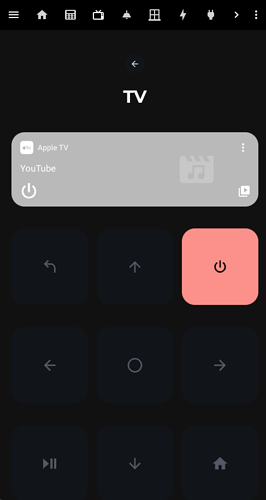
Apple TV Remote Page
Underneath I have buttons for each HDMI input to easily switch between Xbox, Switch and Apple TV.
Windows & Doors
Again, the labels update when windows/doors are open.
Living Room
Here I have two different button types, and I can’t quite get it to match. One is a light, and one is a switch. Would be good to help understand how to get these matching.
Light Card;
type: custom:button-card
name: Living Room
icon: '[[[ return entity.attributes.icon ]]]'
entity: light.living_room_light_switch
tap_action:
  action: toggle
  haptic: medium
hold_action:
  action: more-info
  haptic: medium
custom_fields:
  slider:
    card:
      type: custom:my-slider-v2
      entity: '[[[ return entity.entity_id ]]]'
      colorMode: brightness
      styles:
        container:
          - background: none
          - border-radius: 100px
          - overflow: visible
        card:
          - height: 16px
          - padding: 0 8px
          - background: |
              [[[
                if (entity.state == "on") return "linear-gradient(90deg, rgba(255,255,255, 0.3) 0%, rgba(255,255,255, 1) 100%)";
                else return "var(--contrast)";
              ]]]
        track:
          - overflow: visible
          - background: none
        progress:
          - background: none
        thumb:
          - background: |
              [[[
                if (entity.state == "on") return "var(--black)";
                if (entity.state == "off") return "var(--contrast20)";
                else return "var(--contrast8)";
              ]]]
          - top: 2px
          - right: '-8px'
          - height: 12px
          - width: 12px
          - border-radius: 10px
          - display: |
              [[[
                return entity.state === 'on' ? 'block' : 'none';
              ]]]
styles:
  grid:
    - grid-template-areas: '"i" "n" "slider"'
    - grid-template-columns: 1fr
    - grid-template-rows: 1fr min-content min-content
  card:
    - background: var(--purple)
    - padding: 16px
    - '--mdc-ripple-press-opacity': 0
  img_cell:
    - justify-self: start
    - width: 24px
  icon:
    - width: 24px
    - height: 24px
    - color: var(--contrast8)
  name:
    - justify-self: start
    - font-size: 14px
    - margin: 4px 0 12px 0
    - color: var(--contrast12)
    - font-weight: bold
state:
  - value: 'on'
    styles:
      card:
        - background: |
            [[[
                var color = entity.attributes?.rgb_color;
                if (entity.state != "on"){
                  return 'var(--contrast20)';
                }
                else if (color){
                  return 'rgba(' + color + ')'
                }
                else{
                  return 'var(--yellow)'
                }
            ]]]
      icon:
        - color: var(--black)
      name:
        - color: var(--black)
  - value: 'off'
    styles:
      icon:
        - color: var(--black)
      name:
        - color: var(--black)
Switch Card;
type: custom:button-card
label: Media Centre
show_icon: true
show_label: true
show_name: false
show_state: true
entity: switch.media_centre
tap_action:
  action: toggle
  haptic: medium
hold_action:
  action: more-info
  haptic: medium
styles:
  grid:
    - grid-template-areas: '"l" "s" "button"'
    - grid-template-columns: 1fr
    - grid-template-rows: 1fr min-content min-content
  card:
    - background: var(--contrast2)
    - font-family: Montserrat
    - padding: 16px
    - max-width: 190px
    - '--mdc-ripple-press-opacity': 0
  img_cell:
    - justify-self: start
    - width: 64px
  label:
    - justify-self: start
    - font-size: 14px
    - margin: 4px 0 8px 0
    - color: var(--contrast20)
    - font-weight: bold
  state:
    - justify-self: start
    - font-size: 14px
    - margin: 4px 0 22px 0
    - color: var(--contrast8)
    - text-transform: uppercase
state:
  - value: 'off'
    styles:
      card:
        - background: var(--blue)
      icon:
        - color: var(--black)
      label:
        - color: var(--black)
      name:
        - color: var(--black)
  - value: 'on'
    styles:
      card:
        - background: var(--green)
      icon:
        - color: var(--black)
      name:
        - color: var(--black)
      label:
        - color: var(--black)
My other rooms are extremely similar to this, based on the smart items I have in each room.
Energy Page
Plugs Page
Cats Page
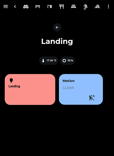
Landing Page
Any feedback that anyone wants to share would be appreciated, and I would love to have ideas on improving this, making it more user-friendly, matching the style more, adding more information and cards etc.
If you want me to share any parts of the code I’ve used, I’m also happy to share.
Many thanks! 


