config.card.entity
1 Like
I tested this:
type: custom:mod-card
card:
  type: custom:mushroom-template-badge
  content: |-
    {% if is_state(config.entity, 'on') %}
      On
    {% else %}
      Off
    {% endif %}
  entity: light.bureau_marijn_lampen
  icon: mdi:led-strip-variant
  label: Bureau
  color: |-
    {% if is_state(config.entity, 'on') %}
      amber
    {% endif %}
card_mod:
  style:
    mushroom-template-badge:
      $: |
        .badge {
            {% if is_state(config.entity, 'on') %}
            --ha-card-border-width: 1px;
            --ha-card-border-color: var(--amber-color);
            --ha-card-background: rgba(255, 193, 6, 0.3);
            {% endif %}
          }
          .info {
              .label {
                font-size: 12px;
              }
              .content {
                font-size: 15px;
            }
          }
      .: |
        ha-card {
          background: none;
          border: none;
        }
and config.entity works just fine
can even do:
  type: custom:mushroom-template-badge
  content: |-
    {{state_translated(config.entity)}}
to get this:

but, wait, you meant for the card_mod itself…
card_mod:
  style:
    mushroom-template-badge:
      $: |
        .badge {
            {% if is_state(config.card.entity, 'on') %}
            --ha-card-border-width: 1px;
            --ha-card-border-color: var(--amber-color);
            --ha-card-background: rgba(255, 193, 6, 0.3);
            {% endif %}
          }
          .info {
              .label {
                font-size: 12px;
              }
              .content {
                font-size: 15px;
            }
          }
      .: |
        ha-card {
          background: none;
          border: none;
        }
does the background, yes:

Correct, cardmod
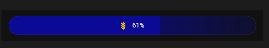
I am trying to do exactly this with one of my entities but I cannot seem to make it work. The code below is what I’ve come up with after perusing the various threads on the topic. It works if I replace everything under background with a solid color but not with the gradient coding.
card:
  type: custom:hui-entity-badge
  show_name: false
  show_state: true
  show_icon: true
  entity: sensor.esphome_web_f48bdc_chicken_feed_level
  icon: mdi:barley
  color: amber
card_mod:
  style:
    hui-entity-badge:
    .: |
       hui-entity-badge {
        --ha-card-background:
          {% set perc = states(config.entity)|float(0) %}
          {% set bar = '0,0,0' %}
          linear-gradient(to right, rgb({{bar}}) 0%, rgb({{bar}}) {{perc}}%, rgba({{bar}},0.6) {{perc}}%, rgba({{bar}},0.2) 100%) !important;
       }
If someone could tell me what I’m doing wrong, I would greatly appreciate it.
Test it using the actual entity vs `config.entity’. I adjusted the color in the code below
card:
  type: custom:hui-entity-badge
  show_name: false
  show_state: true
  show_icon: true
  entity: sensor.esphome_web_f48bdc_chicken_feed_level
  icon: mdi:barley
  color: amber
card_mod:
  style:
    hui-entity-badge:
    .: |
       hui-entity-badge {
        --ha-card-background:
          {% set perc = states('sensor.esphome_web_f48bdc_chicken_feed_level')|float(0) %}
          {% set bar = '10,10,150' %}
          linear-gradient(to right, rgb({{bar}}) 0%, rgb({{bar}}) {{perc}}%, rgba({{bar}},0.6) {{perc}}%, rgba({{bar}},0.2) 100%) !important;
       }
You can also simply use ha-card
card_mod:
  style: |
     ha-card{
       --ha-card-background:
          {% set perc = states('sensor.esphome_web_f48bdc_chicken_feed_level')|float(0) %}
          {% set bar = '10,10,150' %}
          linear-gradient(to right, rgb({{bar}}) 0%, rgb({{bar}}) {{perc}}%, rgba({{bar}},0.6) {{perc}}%, rgba({{bar}},0.2) 100%) !important;
        }
Awesome, thank you! I was so caught up in getting the correct card_mod syntax that I completely missed that I was using rgb (0,0,0) which wasn’t very visible in my theme.
1 Like
From my tests, config.entity or entity will work as long as you use single quotes 
card_mod:
  style: |
    ha-card {
      --ha-card-background:
         {% set perc = states('entity')|float(0) %}
         {% set bar = '10,10,150' %}
         linear-gradient(to right, rgb({{bar}}) 0%, rgb({{bar}}) {{perc}}%, rgba({{bar}},0.6) {{perc}}%, rgba({{bar}},0.2) 100%) !important;
       }
card_mod:
  style: |
    ha-card {
      --ha-card-background:
         {% set perc = states('config.entity')|float(0) %}
         {% set bar = '10,10,150' %}
         linear-gradient(to right, rgb({{bar}}) 0%, rgb({{bar}}) {{perc}}%, rgba({{bar}},0.6) {{perc}}%, rgba({{bar}},0.2) 100%) !important;
       }
had a bit of fun with badges in Add badges (old style and modern) anywhere
besides that, I am glad to be able to post my mods I had ever since card_mod 3.5.0 (which was retracted, so I couldnt post them…)
now card_mod 4.0.0 is out, below can be done by all, and no longer require custom:mod-card.
Just set the modifications to:
card_mod:
  style:
    ha-badge:
entity: binary_sensor.huis_ramen_deuren_puien_veilig
name: Beveiliging klaar
show_name: true
show_state: false
tap_action:
  action: none
hold_action:
  action: navigate
  navigation_path: /ui-instellingen/alarm
card_mod:
  style:
    ha-badge:
      $: |
        {% set veilig = is_state(config.entity,'on') %}
        {% set kleur = 'var(--success-color)' if veilig else 'var(--alert-color)' %}
        .badge {
          border: 2px solid {{kleur}} !important;
          box-shadow: var(--box-shadow) !important;
          background: {{'pink' if not veilig else
                         'var(--card-background-color)'}} !important;
          animation: {{'blink 2s ease infinite' if not veilig}};
        }
        @keyframes blink {
          50% {opacity: 0.2;}
        }

      .: |
        {% set veilig = is_state(config.entity,'on') %}
        {% set kleur = 'var(--success-color)' if veilig else 'var(--alert-color)' %}
        ha-state-icon {
          --card-mod-icon-color: {{kleur}};
        }
and some state-icon:
type: entity
entity: sensor.ws_5500_feels_like_temperature
hold_action:
  action: navigate
  navigation_path: /ui-overzicht/weer
card_mod:
  style:
    ha-badge:
      $: |
        .badge {
          border: 2px solid {{states('sensor.temperature_color_name')}} !important;
          box-shadow: var(--box-shadow-badges) !important;
        }
    .: |
      ha-state-icon {
        color: {{states('sensor.temperature_color_name')}};
        --card-mod-icon:
          {% set temp = states(config.entity)|float(10) %}
          {% if temp > 35 %} mdi:thermometer-alert
          {% elif temp > 30 %} mdi:thermometer-high
          {% elif temp > 15 %} mdi:thermometer
          {% else %} mdi:thermometer-low
          {% endif %}
      }
contains some of the most obvious elements to use.
Can go much more detailed, but this will get you going
a couple of small examples:

or

if you want to modify the name of the badge, then target .content , modify the state needs state-info
if you show both name and state, the property for name changes to .label…

  - entity: binary_sensor.huis_ramen_deuren_puien_veilig
    name: State and name
    show_name: true
    show_state: true
    card_mod:
      style:
        ha-badge:
          $: |
            {% set veilig = is_state(config.entity,'on') %}
            {% set kleur = 'var(--success-color)' if veilig else 'var(--alert-color)' %}
            .badge {
              border: 2px solid {{kleur}} !important;
              box-shadow: var(--box-shadow) !important;
              background: {{'pink' if not veilig else
                             'var(--card-background-color)'}} !important;
              animation: {{'blink 2s ease infinite' if not veilig}};
            }
            @keyframes blink {
              50% {opacity: 0.2;}
            }
            .label {
              color: {{kleur}} !important;
            }
          .: |
            {% set veilig = is_state(config.entity,'on') %}
            {% set kleur = 'var(--success-color)' if veilig else 'var(--alert-color)' %}
            ha-state-icon {
              --card-mod-icon-color: {{kleur}};
            }
            state-display {
              color: red;
            }
4 Likes
Hello,
Thanks for the detailed example. However, I’ve noticed that if you refresh the browser or close and reopen the app, the badge sometimes goes back to its default color state (grey/yellow), and all the color formatting is gone until you manually edit and save the badge again. Do you know a way to fix this, or is it related to beta v4?
I dont see that, never need to edit/re-save the badge at all.
could be that the modification settles after a view has taken in all that it has to show, but in my extensive config, that hardly takes a blink
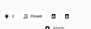
I’m struggling a bit with card-mod and the badges/header section.
using a sections view, I’m trying to shift the first badge all the way over to the extreme left of the view, so that it sits directly above the nav-bar-card:
I’ve tried card-mod directly in the badge card itself, no luck; also tried applying it within my theme. no luck there also.
Does anybody have any hints as to how I’d set the header margin-left?
Hello, sorry, I’m not comfortable with code!
I don’t understand what changes I need to make to my badge.
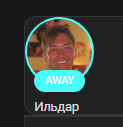
      - type: custom:hui-state-badge-element
        entity: person.daniel
        card_mod:
          style: |
            :host {
              {% if is_state('person.daniel','not_home') %}
              --label-badge-red: purple;
              --ha-label-badge-size: 45px;
            {% endif%}
              {% if is_state('person.daniel','home') %}
              --label-badge-red: green;
              --ha-label-badge-size: 45px;
            {% endif%}
            }
I tried this, but it doesn’t work:
      - type: custom:hui-state-badge-element
        entity: person.daniel
        card_mod:
          style:
            ha-badge:
              $: |
                {% if is_state('person.daniel','not_home') %}
                --label-badge-red: purple;
                --ha-label-badge-size: 45px;
            {% endif%}
              {% if is_state('person.daniel','home') %}
              --label-badge-red: green;
              --ha-label-badge-size: 45px;
            {% endif%}
            }
can you help me ?
thanks in advance.
Then you are talking about old-style badges?
This code should work in card-mod 3.x AND card-mod 3.x:
type: custom:mod-card
card:
  type: custom:hui-state-badge-element
  entity: person.xxx
card_mod:
  style: |
    :host {
      {% if is_state('person.xxx','home') -%}
        --label-badge-red: purple;
        --ha-label-badge-size: 45px;
      {%- else -%}
        --label-badge-red: cyan;
        --ha-label-badge-size: 65px;
      {%- endif %}
    }
This code should work in card-mod 4.0:
type: custom:hui-state-badge-element
entity: person.xxx
card_mod:
  style: |
    :host {
      {% if is_state('person.xxx','home') -%}
        --label-badge-red: purple;
        --ha-label-badge-size: 45px;
      {%- else -%}
        --label-badge-red: cyan;
        --ha-label-badge-size: 65px;
      {%- endif %}
    }
This is the code one of my frontend sections.
type: sections
max_columns: 4
title: temp
path: temp
card_mod:
  style: |
    /* modern part selector (preferred) */
    :host ::part(badges) {
      padding-top: 50px !important;
    }

    /* common fallback selectors */
    :host ::slotted(hui-view-badges),
    hui-view-badges,
    .view-badges,
    .header .view-badges {
      padding-top: 50px !important;
    }

    /* fallback targeting the badge container inside the view */
    :host ::slotted(*) hui-view-badges {
      padding-top: 50px !important;
    }
header:
  layout: responsive
  badges_position: top
  badges_wrap: scroll
badges:
  - type: custom:mod-card
    card:
      type: custom:mushroom-chips-card
      chips:
        - type: menu
      card_mod:
        style: |
          .chip-container {
            --chip-icon-size: 20px;
            --chip-padding: 0 8px;
            --chip-border-radius: 9px;
            --chip-spacing: 5px;
            --chip-border-width: 0px;
          }
  - type: custom:mod-card
    card:
      type: custom:mushroom-chips-card
      chips:
        - type: template
          entity: sensor.sockets_on
          icon: mdi:power-socket-uk
          icon_color: |
            {% if is_state(entity, '0') %}
              disabled
            {% else %}
              orange
            {% endif %}
          tap_action:
            action: more-info
      card_mod:
        style:
          mushroom-template-chip:nth-child(1)$:
            mushroom-chip$: |
              ha-card:after {
                {% if is_state('sensor.sockets_on', '0') %}
                  display: none;
                {% else %}
                  display: flex;
                {% endif %}
                content: "{{ states('sensor.sockets_on') }}";
                position: absolute;
                justify-content: center;
                align-items: center;
                background: rgb(var(--rgb-orange));
                color: var(--card-background-color);
                font-weight: bolder;
                border-radius: 50%;
                top: -7px;
                right: -2px;
                width: 17px;
                height: 17px;
                font-size: 13px;
              }
          .: |
            .chip-container {
              --chip-icon-size: 20px;
              --chip-padding: 0 8px;
              --chip-border-radius: 9px;
              --chip-spacing: 5px;
              --chip-border-width: 0px;
            }
sections:
  - type: grid
    cards:
      - type: heading
        heading: New section
cards: []
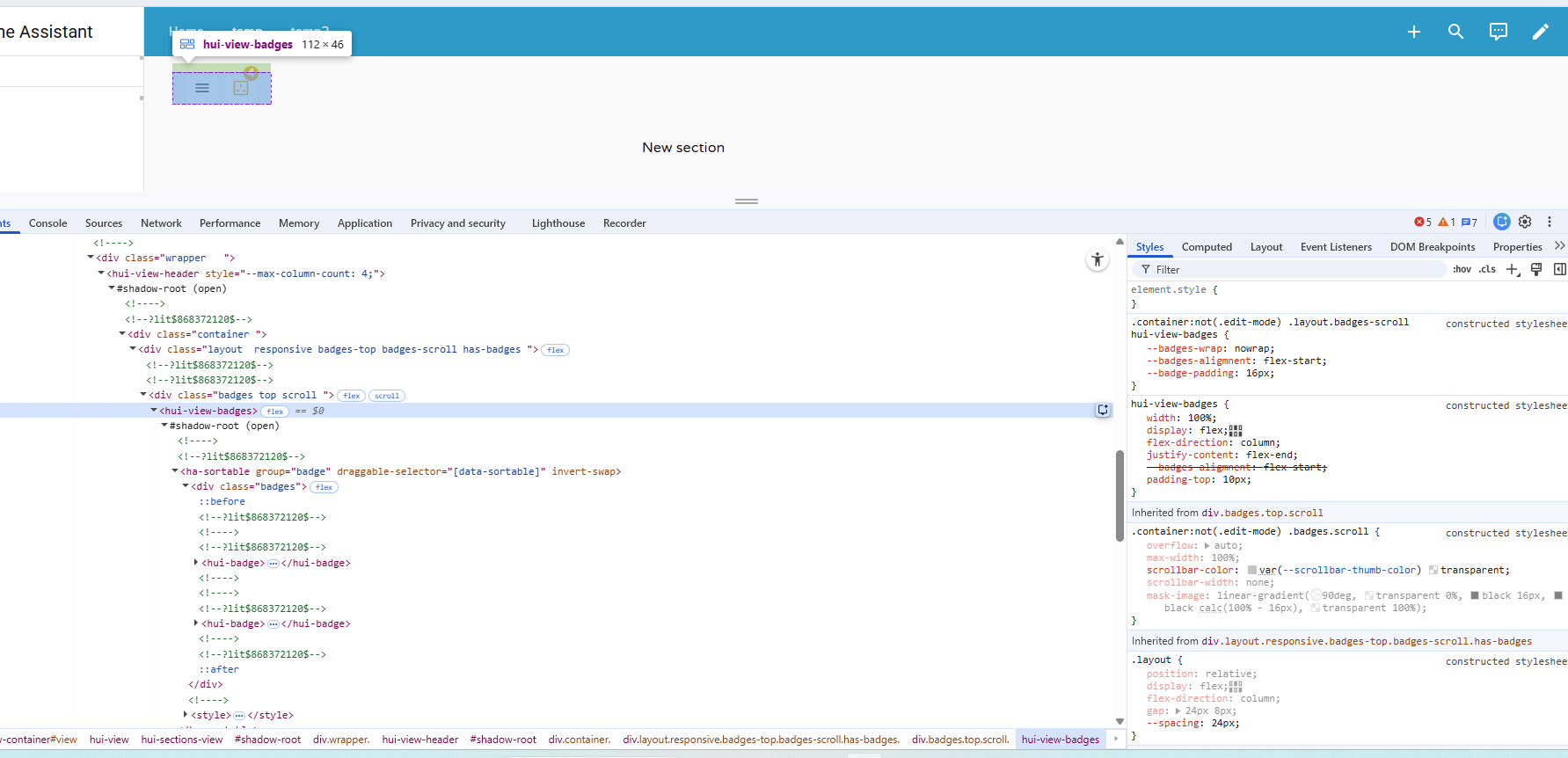
And this is the output i get
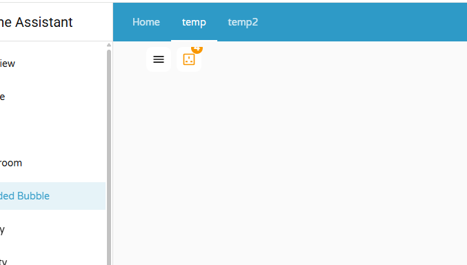
The sockets sensor gives the number of sockets which are ON. If none are on, the icon gets disabled.The count is shown as content.
As attached, the portion of content is partially visible. To increase the top padding, i went throught the developer options and found the target element to be hui-view-badges. I tried several methos in chargpt to add the padding. but not working.
How can i implement this in the code.
i tried different approaches hwihc are alread in the code above
card_mod:
  style: |
    /* modern part selector (preferred) */
    :host ::part(badges) {
      padding-top: 50px !important;
    }

    /* common fallback selectors */
    :host ::slotted(hui-view-badges),
    hui-view-badges,
    .view-badges,
    .header .view-badges {
      padding-top: 50px !important;
    }

    /* fallback targeting the badge container inside the view */
    :host ::slotted(*) hui-view-badges {
      padding-top: 50px !important;
    }
Can someone help.
your post is really about mushroom template chips isnt it?
As this topic is about the new style badges built in stock HA Frontend, please move your question with a minimal config to the mushroom thread.
There we can follow up. glad to help out.
thanks for keeping these threads clean so the title reflects the discussion best, and your problem will be seen by many fellow mushroom users
ok thanks you for pointing the direction. i have moved the post to mushroom cards community
I don’t see any change in your example. My two lines at the beginning are there because my badges are in nested cards.
Here is an example in a single card:
type: custom:hui-state-badge-element
entity: person.daniel
card_mod:
  style: |
    :host {
      {% if is_state('person.daniel','not_home') -%}
        --label-badge-red: red;
        --ha-label-badge-size: 45px;
      {%- else -%}
        --label-badge-red: green;
        --ha-label-badge-size: 45px;
      {%- endif %}
    }

i don’t konw where is my error, thanks for your help
My post which you answered had a typo (just found it & fixed):
it was said that “mod-card way” works in card-mod 3.x, and “w/o mod-card way” works in 4.0 and 3.x.
Of course this is wrong…
In fact, the “mod-card way” works both in card-mod 4.0 & 3.x, and a direct “w/o mod-card way” works in 4.0 only.
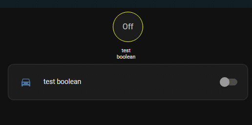
title: xxx
path: xxx
badges:
  - type: custom:hui-state-badge-element
    entity: input_boolean.test_boolean
    card_mod:
      style: |
        :host {
          {% if is_state('input_boolean.test_boolean','on') -%}
            --label-badge-red: cyan;
            --ha-label-badge-size: 45px;
          {%- else -%}
            --label-badge-red: yellow;
            --ha-label-badge-size: 60px;
          {%- endif %}
        }
So, what card-mod version do you have?
Also, I am not getting this expression:
Can you elaborate?
Hi,
I’ve been developing my dashboard using mushroom cards, and have Card Mod 4 installed. I’m trying to animate and colour change badges for my washing machine and tumble dryer when a binary sensor for each is set to “on”, and the power sensor is above 5w.
My binary sensor for the tumble dryer is: “binary_sensor.tumble_dryer_running”
I’ve verified it changes from “off” to “on” when the tumble dryer is running.
My sensor for the tumble dryer power is “sensor.tumble_dryer_power”
I’ve verified it changes from “0” (watts) to “400” odd when running.
My YAML for the tumble dryer mushroom badge is:
type: custom:mushroom-template-badge
entity: binary_sensor.tumble_dryer_running
icon: mdi:tumble-dryer
label: |-
  {% if is_state('binary_sensor.tumble_dryer_running', 'on') %}
    {{ states('sensor.tumble_dryer_power') | round(0) }}W
  {% endif %}
card_mod:
  style:
    mushroom-badge-icon$: |
      ha-state-icon {
        display: block !important;
      }
      ha-state-icon {
        {% if is_state('binary_sensor.tumble_dryer_running', 'on') %}
          animation: spin 3s linear infinite !important;
        {% endif %}
      }
      @keyframes spin {
        from { transform: rotate(0deg); }
        to { transform: rotate(360deg); }
      }
    .: |
      :host {
        --card-mod-icon-color: {% if is_state('binary_sensor.tumble_dryer_running', 'on') %} orange {% else %} grey {% endif %};
      }
I’ve turned the tumble dryer on and verified the sensors above, but the icon is not animating. It is however changing colour correctly. Can anyone help me please?
Thank you!
You have a double ha-state-icon there…
I didn’t test the rest of the card-mod, but that is an obvious error