Vacuum map card
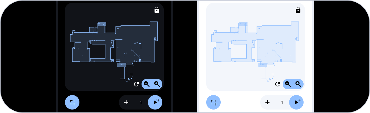
The vacuum screen starts with a title card with badge that we have discussed before. Below that is the vacuum map. Essentially, this is the xiaomi vacuum map card (by PiotrMachowski) that uses the xiaomi cloud map extractor (also by PiotrMachowski). However, we have slightly styled the card to fit in with the rest of the design. Unfortunately, I was not able to use the same card-mod method as the graph card because the card-mod class is not picked up by the xiaomi vacuum map card. So we style it in the code of the card itself.
type: custom:xiaomi-vacuum-map-card
language: nl
icons: []
tiles: []
map_source:
  camera: camera.xiaomi_cloud_map_extractor
calibration_source:
  camera: true
entity: vacuum.roborock_s5_max
vacuum_platform: default
map_locked: true
two_finger_pan: false
map_modes:
  - template: vacuum_clean_zone
  - template: vacuum_goto
card_mod:
  style:
    ha-button-menu:
      $:
        mwc-menu:
          $:
            mwc-menu-surface:
              $: >
                /* Temporary fix for github issue 481:
                https://github.com/PiotrMachowski/lovelace-xiaomi-vacuum-map-card/issues/481
                */ div {
                  left: 0 !important;
                  top: 0 !important;
                  position: absolute !important;
                }
    .: |
      ha-card {
        background: none !important;
        box-shadow: none !important;
        border-radius: 0px !important;
        overflow: visible !important;
        --map-card-internal-primary-color: var(--blue) !important;
        --map-card-internal-secondary-color: var(--contrast2) !important;
        --map-card-internal-primary-text-color: var(--black) !important;
        --map-card-internal-secondary-text-color: var(--contrast20) !important;
        --map-card-internal-manual-point-line-color: var(--contrast20) !important;
        --map-card-internal-manual-point-fill-color: var(--contrast20) !important;
        --map-card-internal-manual-rectangle-description-color: var(--contrast20) !important;
        --map-card-internal-manual-rectangle-line-color: none !important;
        --map-card-internal-manual-rectangle-line-color-selected: none !important;
        --map-card-internal-manual-rectangle-fill-color: rgba(var(--blue-rgb),0.4) !important;
        --map-card-internal-manual-rectangle-fill-color-selected: rgba(var(--blue-rgb),0.3) !important;

        --map-card-internal-manual-rectangle-delete-circle-fill-color: var(--contrast7) !important;
        --map-card-internal-manual-rectangle-delete-circle-line-color: var(--contrast7) !important;
        --map-card-internal-manual-rectangle-delete-icon-color: var(--contrast20) !important;
        --map-card-internal-manual-rectangle-delete-circle-fill-color-selected: var(--contrast7) !important;
        --map-card-internal-manual-rectangle-delete-circle-line-color-selected: var(--contrast7) !important;
        --map-card-internal-manual-rectangle-delete-icon-color-selected: var(--contrast20) !important;

        --map-card-internal-manual-rectangle-resize-circle-fill-color: var(--contrast7) !important;
        --map-card-internal-manual-rectangle-resize-circle-line-color: var(--contrast7) !important;
        --map-card-internal-manual-rectangle-resize-icon-color: var(--contrast20) !important;
        --map-card-internal-manual-rectangle-resize-circle-fill-color-selected: var(--contrast7) !important;
        --map-card-internal-manual-rectangle-resize-circle-line-color-selected: var(--contrast7) !important;
        --map-card-internal-manual-rectangle-resize-icon-color-selected: var(--contrast20) !important;
      }
      .modes-dropdown-menu-button ha-icon {
        color: var(--black) !important;
      }
      .modes-dropdown-menu-button .modes-dropdown-menu-button-text {
        display: none;
      }
      .map-wrapper {
        border-radius: 24px !important;
        overflow: hidden;
      }
      .controls-wrapper {
        margin-right: 0 !important;
        margin-left: 0 !important;
        margin-bottom: 0 !important;
      }
      .controls-wrapper .map-controls-wrapper {
        margin: 0 !important;
      }
      mwc-list-item {
        background: var(--contrast2) !important;
      }
Vacuum zone cards

These buttons are linked to the robot vacuum. The top six buttons represent rooms and zones that can be vacuumed. By selecting one or more of these, the robot vacuum will only vacuum those areas. We can also view the last time each room/zone was vacuumed. The green button can be used to start the robot vacuum, and if no rooms/zones are selected, the robot vacuum will vacuum the entire home. The 'number of repetitions' button speaks for itself and will determine how many times the robot vacuum will vacuum the areas. Finally, we have the 'Empty vacuum' button, which can be used to manually send the robot vacuum to the trash can. However, this also happens automatically when it is full, so we rarely use this.
In case you would like to learn more about the triggered vacuum script and how it vacuums just the selected areas: 🟣 Rounded - Dashboard guide - #25 by LE0N
6 zone cards
Here we also highlight one of the six buttons. In the code I use two helpers. A toggle for selecting and deselecting the area and a date helper for keeping track of the last cleaned date.
type: custom:button-card
icon: mdi:sofa-single
entity: input_boolean.woonkamer_robotstofzuiger_selecteren_voor_stofzuigen
name: Woonkamer
label: '[[[return states["sensor.robotstofzuiger_laatst_actief_woonkamer"].state ]]]'
show_label: true
tap_action:
  action: toggle
  haptic: medium
state:
  - value: 'on'
    styles:
      card:
        - background-color: var(--yellow)
        - box-shadow: none
      icon:
        - color: var(--black)
      name:
        - color: var(--black)
      label:
        - color: var(--black)
        - opacity: '0.5'
  - value: 'off'
    styles:
      card:
        - background: var(--contrast2)
        - box-shadow: none
      icon:
        - width: 24px
        - color: var(--contrast20)
      name:
        - color: var(--contrast20)
      label:
        - color: var(--contrast9)
styles:
  icon:
    - width: 24px
  img_cell:
    - justify-content: flex-start
    - margin-top: '-4px'
  name:
    - font-family: In case of a custom font, otherwise you can remove this line
    - justify-self: start
    - font-size: 12px
    - margin-bottom: 0px
  card:
    - height: 84px
    - border-radius: 24px
    - padding: 12px 0 12px 14px
    - box-sizing: border-box
    - '--mdc-ripple-press-opacity': 0
  label:
    - font-family: In case of a custom font, otherwise you can remove this line
    - justify-self: start
    - font-size: 12px
Start vacuum card
This button calls a script when pressed. The script determines whether zones or the entire house should be vacuumed. Depending on whether zones are selected or not, the name and icon will change.
type: custom:button-card
entity: input_boolean.algemeen_robotstofzuiger_zones_selected
icon: mdi:robot-vacuum
name: Zones
label: Stofzuigen
show_label: true
tap_action:
  action: call-service
  service: script.selectie_stofzuigen
  haptic: success
state:
  - value: 'off'
    name: Huis
    icon: mdi:home
styles:
  icon:
    - width: 24px
    - color: var(--black)
  img_cell:
    - justify-content: flex-start
    - margin-top: '-4px'
  name:
    - font-family: In case of a custom font, otherwise you can remove this line
    - justify-self: start
    - color: var(--black)
    - font-size: 12px
    - margin-bottom: 0px
  card:
    - height: 84px
    - background-color: var(--green)
    - box-shadow: none
    - border-radius: 24px
    - padding: 12px 0 12px 14px
    - z-index: 1
  label:
    - font-family: In case of a custom font, otherwise you can remove this line
    - justify-self: start
    - color: var(--black)
    - font-size: 12px
Number of repetitions card
This button allow the user to loop over 1, 2, or 3 repetitions of vacuuming the selected areas. Pressing the buttons will trigger a script that determines whether the number of repetitions should be increased by 1 or reset back to 1 if it is currently set to 3.
type: custom:button-card
icon: mdi:numeric-1-box
entity: input_number.algemeen_robotstofzuiger_zone_herhalingen
name: Aantal
label: herhalingen
show_label: true
state:
  - value: '1.0'
    icon: mdi:numeric-1-box
  - value: '2.0'
    icon: mdi:numeric-2-box
  - value: '3.0'
    icon: mdi:numeric-3-box
tap_action:
  action: call-service
  service: script.robotstofzuiger_herhalingen
  haptic: medium
styles:
  icon:
    - width: 24px
    - color: var(--contrast1)
  img_cell:
    - justify-content: flex-start
    - margin-top: '-4px'
  name:
    - font-family: In case of a custom font, otherwise you can remove this line
    - justify-self: start
    - color: var(--contrast1)
    - font-size: 12px
    - margin-bottom: 0px
  card:
    - height: 84px
    - background-color: var(--contrast20)
    - box-shadow: none
    - border-radius: 24px
    - padding: 12px 0 12px 14px
    - z-index: 1
  label:
    - font-family: In case of a custom font, otherwise you can remove this line
    - justify-self: start
    - color: var(--contrast1)
    - font-size: 12px
Empty vacuum card
As mentioned above, this button sends the robot vacuum to the trash can. Additionally, the button also displays how many cubic meters the robot vacuum has already vacuumed. Based on this, it is determined whether the robot vacuum should automatically go to the trash can after vacuuming.
type: custom:button-card
icon: mdi:broom
name: Leeg maken
label: >-
  [[[return states["sensor.robotstofzuiger_meters_schoongemaakt"].state + "m²
  gezogen"]]]
show_label: true
tap_action:
  action: call-service
  service: script.stofzuiger_legen
  haptic: success
styles:
  icon:
    - width: 24px
    - color: var(--contrast1)
  img_cell:
    - justify-content: flex-start
    - margin-top: '-4px'
  name:
    - font-family: In case of a custom font, otherwise you can remove this line
    - justify-self: start
    - color: var(--contrast1)
    - font-size: 12px
    - margin-bottom: 0px
  card:
    - height: 84px
    - background-color: var(--contrast20)
    - box-shadow: none
    - border-radius: 24px
    - padding: 12px 0 12px 14px
    - z-index: 1
  label:
    - font-family: In case of a custom font, otherwise you can remove this line
    - justify-self: start
    - color: var(--contrast11)
    - font-size: 12px
Vacuum maintenance cards
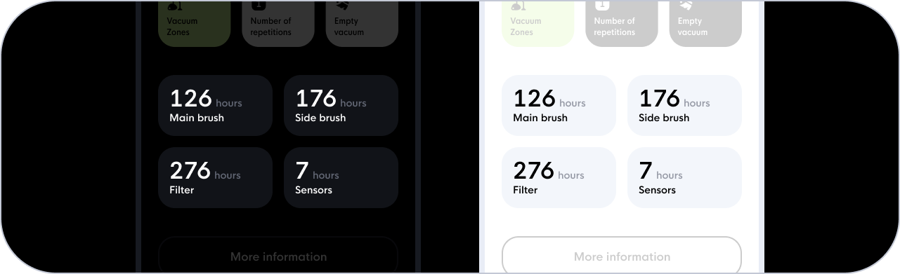
These four cards display the hours remaining before we need to clean specific sensors or brushes of the robot vacuum. Pressing a card triggers a pop-up that asks us to confirm whether we want to reset the hours.
type: custom:button-card
name: >-
  [[[return
  Math.round(states["sensor.roborock_vacuum_s5e_main_brush_left"].state / 60 /
  60)]]]
styles:
  grid:
    - grid-template-areas: '"n eenheid" "l l"'
    - grid-template-columns: min-content min-content
  name:
    - font-size: 32px
    - color: var(--contrast20)
  card:
    - height: 80px
    - border-radius: 24px
    - padding: 30px 0 6px 16px
    - box-sizing: border-box
    - background: var(--contrast2)
    - box-shadow: none
  label:
    - justify-self: start
    - font-size: 12px
    - color: var(--contrast20)
    - margin-top: '-2px'
  custom_fields:
    eenheid:
      - font-size: 12px
      - color: var(--contrast9)
      - margin-bottom: 6px
      - padding-left: 2px
label: Hoofdborstel
custom_fields:
  eenheid: ' uur'
show_label: true
tap_action:
  action: call-service
  haptic: medium
  service: script.robotstofzuiger_uren_resetten_hoofdborstel
confirmation:
  text: Onderhouds uren van de hoofdborstel resetten?
More information button

This one is simple, just a basic custom button-card that opens the more-info modal window of the robot vacuum. Here we can, for example, adjust the fan speed if desired, although we rarely make use of this feature. As such, it doesn't get a particularly prominent position on the screen.
type: custom:button-card
name: Meer info
entity: vacuum.roborock_s5_max
show_icon: false
styles:
  card:
    - background: none
    - border-radius: 24px
    - color: var(--contrast20)
    - margin-top: 8px
    - padding: 18px 0px
    - font-size: 16px
    - border: 2px solid var(--contrast5)
tap_action:
  action: more-info
  haptic: medium
Television source

This card displays the active TV app, such as Netflix, YouTube, NPO, Videoland, and more. Its primary purpose is to provide a quick overview of what's playing. I've chosen not to show the specific movie/series/video title, as it doesn't interest me much. While the card isn't highly functional, it's visually pleasing. I built the card using a custom button-card and a template sensor that tracks which app is active on the TV. Based on this, an image with the corresponding logo is displayed. I saved the image in the 'www' folder in the root directory.
type: custom:button-card
entity: sensor.televisie_media
name: '[[[return states["sensor.televisie_media"].state]]]'
show_entity_picture: true
styles:
  grid:
    - grid-template-areas: '"i gutter n"'
    - grid-template-columns: min-content 24px 1fr
  card:
    - font-family: In case of a custom font, otherwise you can remove this line
    - background: var(--contrast2)
    - padding: 24px
    - '--mdc-ripple-press-opacity': 0
  icon:
    - width: 70px
    - height: 70px
    - border-radius: 16px
    - border: 5px solid var(--contrast4)
  name:
    - font-size: 16px
    - color: var(--contrast20)
    - width: 100%
    - text-align: left
state:
  - value: GoogleTV
    entity_picture: /local/googletv.png
    styles:
      card:
        - background: var(--blue-tint)
      icon:
        - border: 5px solid rgba(66,133,244,0.5)
  - value: Twitch
    entity_picture: /local/twitch.png
    styles:
      card:
        - background: rgba(169,112,255,var(--color-tint))
      icon:
        - border: 5px solid rgba(169,112,255,0.5)
  - value: Spotify
    entity_picture: /local/spotify.png
    styles:
      card:
        - background: rgba(101,211,110,var(--color-tint))
      icon:
        - border: 5px solid rgba(101,211,110,0.5)
  - value: Netflix
    entity_picture: /local/netflix.png
    styles:
      card:
        - background: rgba(229,9,20,var(--color-tint))
      icon:
        - border: 5px solid rgba(229,9,20,0.5)
  - value: YouTube
    entity_picture: /local/youtube.png
    styles:
      card:
        - background: rgba(255,0,0,var(--color-tint))
      icon:
        - border: 5px solid rgba(255,0,0,0.5)
  - value: NPO Start
    entity_picture: /local/npo.png
    styles:
      card:
        - background: rgba(255,109,0,var(--color-tint))
      icon:
        - border: 5px solid rgba(255,109,0,0.5)
  - value: Plex
    entity_picture: /local/plex.png
    styles:
      card:
        - background: rgba(229,160,13,var(--color-tint))
      icon:
        - border: 5px solid rgba(229,160,13,0.5)
  - value: Ziggo
    entity_picture: /local/ziggo.png
    styles:
      card:
        - background: rgba(244,140,0,var(--color-tint))
      icon:
        - border: 5px solid rgba(244,140,0,0.5)
  - value: Videoland
    entity_picture: /local/videoland.png
    styles:
      card:
        - background: rgba(255,55,71,var(--color-tint))
      icon:
        - border: 5px solid rgba(255,55,71,0.5)
  - value: Aan het casten
    icon: mdi:cast
    styles:
      card:
        - background: var(--blue-tint)
      icon:
        - border: 5px solid rgba(177,197,255,0.5)
        - color: var(--blue)
        - width: 24px
        - height: 24px
        - padding: 23px
  - value: Televisie staat uit
    icon: mdi:television-off
    styles:
      card:
        - background: var(--contrast2)
      icon:
        - border: 5px solid var(--contrast4)
        - color: var(--contrast9)
        - width: 24px
        - height: 24px
        - padding: 23px
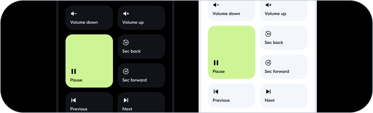
Television control cards

These buttons represent the most frequently used functions of our TV remote. The layout is partially inspired by the GoogleTV remote. Each button is a custom button-card within a grid card, with its own call-service or script action. The buttons' appearance changes depending on the TV's status, showing whether they are active or inactive. I will show the three different types of buttons below.
Action button
The most used button, with a call-service as tap action and a simple icon color change based on the TV state.
type: custom:button-card
icon: mdi:home-variant
aspect_ratio: 1/1
entity: media_player.sony_bravia_tv
show_name: false
tap_action:
  action: call-service
  haptic: medium
  service: remote.send_command
  service_data:
    entity_id: remote.sony_bravia_tv
    command: Home
styles:
  card:
    - border-radius: 24px
    - background-color: var(--contrast2)
  icon:
    - width: 32px
    - color: var(--contrast8)
state:
  - value: 'on'
    styles:
      icon:
        - color: var(--contrast20)
Power button
Also pretty straightforward but uses a toggle function for the tap action.
type: custom:button-card
icontype: custom:button-card
icon: mdi:power
entity: media_player.sony_bravia_tv
show_name: false
aspect_ratio: 1/1
tap_action:
  action: call-service
  haptic: success
  service: media_player.toggle
  service_data:
    entity_id: media_player.sony_bravia_tv
styles:
  card:
    - border-radius: 24px
    - background: var(--green)
  icon:
    - width: 32px
    - color: var(--black)
state:
  - value: 'on'
    styles:
      card:
        - background: var(--red)
Pause button
This is a somewhat unusual case where we use both the 'state' rule and if statements. This is because the 'state' rule only works with a single specified entity. If you want to use the states of multiple entities, it's simpler to use if statements.
Furthermore, the pause button has three states: inactive (when the TV is off OR on but nothing is playing), paused, or played. Personally, I prefer to treat the "least concrete" state as the default and apply changes based on clear state changes. So in this case, the default style is for the inactive state. And if the state is 'on' or 'off', I modify the style accordingly.
type: custom:button-card
aspect_ratio: 1/1
show_name: false
tap_action:
  action: call-service
  haptic: medium
  service: media_player.media_play_pause
  service_data:
    entity_id: media_player.sony_bravia_tv
styles:
  icon:
    - width: 32px
    - color: var(--contrast8)
  card:
    - border-radius: 24px
    - background-color: var(--contrast2)
icon: mdi:pause
entity: media_player.googletv
state:
  - value: paused
    icon: mdi:play
    styles:
      card:
        - background-color: |
            [[[
              if (states['media_player.sony_bravia_tv'].state == 'off')
               return "var(--contrast2)";
              if (states['sensor.televisie_media'].state == 'GoogleTV')
                return "var(--contrast2)";
              return "var(--green)";
            ]]]
      icon:
        - color: |
            [[[
              if (states['media_player.sony_bravia_tv'].state == 'off')
               return "var(--contrast8)";
              if (states['sensor.televisie_media'].state == 'GoogleTV')
                return "var(--contrast8)";
              return "var(--black)";
            ]]]
  - value: playing
    styles:
      card:
        - background-color: |
            [[[
              if (states['sensor.televisie_media'].state == 'GoogleTV')
                return "var(--contrast2)";
              return "var(--yellow)";
            ]]]
      icon:
        - color: |
            [[[
              if (states['sensor.televisie_media'].state == 'GoogleTV')
                return "var(--contrast8)";
              return "var(--black)";
            ]]]
Speaker artist card

Similar to the 'Television source' card, but more functional. Due to the use of song covers as thumbnails and a blurred background, we need to use two custom button-cards here. One as a container and the other for the content.
type: custom:button-card
entity: media_player.sonos
show_entity_picture: true
show_name: false
tap_action:
  action: more-info
styles:
  grid:
    - grid-template-areas: '"info"'
    - grid-template-columns: 1fr
    - grid-template-rows: min-content
  card:
    - background: none
    - padding: 0
    - position: relative
    - '--mdc-ripple-press-opacity': 0
  img_cell:
    - position: absolute
  icon:
    - width: 150%
    - opacity: var(--color-tint)
    - '-webkit-filter': blur(20px)
    - '-moz-filter': blur(20px)
    - '-o-filter': blur(20px)
    - '-ms-filter': blur(20px)
    - filter: blur(20px)
custom_fields:
  info:
    card:
      type: custom:button-card
      entity: media_player.sonos
      show_entity_picture: true
      name: |
        [[[
          if (states['media_player.sonos'].attributes.media_title)
            return states['media_player.sonos'].attributes.media_title;
          else
            return "Nothing is playing";
        ]]]
      label: |
        [[[
          if (states['media_player.sonos'].attributes.media_artist)
            return states['media_player.sonos'].attributes.media_artist;
          else
            return "";
        ]]]
      show_label: true
      show_icon: true
      styles:
        grid:
          - grid-template-areas: '"i gutter n" "i gutter l"'
          - grid-template-columns: min-content 24px 1fr
          - grid-template-rows: min-content
        card:
          - font-family: hk nova medium
          - background: none
          - border-radius: 0
          - background: none
          - padding: 24px
          - '--mdc-ripple-press-opacity': 0
        img_cell:
          - height: 80px
          - width: 80px
          - border-radius: 16px
        icon:
          - height: 100%
          - width: 100%
        name:
          - font-size: 16px
          - color: var(--contrast20)
          - width: 100%
          - text-align: left
          - align-self: end
        label:
          - font-size: 12px
          - color: var(--contrast20)
          - opacity: 0.5
          - width: 100%
          - text-align: left
          - align-self: start
        custom_fields:
          image:
            - '--mdc-ripple-press-opacity': 0.5
Speaker control cards
Also similar to the TV variants, only in this case a two columns grid because it worked better in terms of layout. And sometimes it's fun to play with the sizes, where we can make the play/pause button a bit larger. Below, I will highlight the play/pause button and one of the 6 standard buttons, but this won't be anything we haven't discussed before.
Action button
type: custom:button-card
icon: mdi:volume-plus
name: Volume omhoog
tap_action:
  action: call-service
  haptic: medium
  service: media_player.volume_up
  service_data:
    entity_id: media_player.sonos
styles:
  icon:
    - width: 24px
    - color: var(--contrast20)
  img_cell:
    - justify-content: flex-start
    - margin-top: 0px
  name:
    - justify-self: start
    - font-size: 14px
    - margin-top: 0px
    - color: var(--contrast20)
  card:
    - height: 84px
    - border-radius: 24px
    - padding: 8px 0px 16px 20px
    - background-color: var(--contrast2)
  grid:
    - grid-template-areas: '"i" "n"'
Play / pause button
Our Sonos doesn't have a power-off state, it either plays music or not. This means that we only give the play/pause button two states.
type: custom:button-card
icon: mdi:play
entity: media_player.sonos
name: Afspelen
tap_action:
  action: call-service
  haptic: medium
  service: script.sonos_play_pause
styles:
  icon:
    - width: 24px
    - color: var(--black)
  img_cell:
    - justify-content: flex-start
    - margin-top: 0px
  name:
    - justify-self: start
    - font-size: 14px
    - margin-top: 0px
    - color: var(--black)
  card:
    - height: 184px
    - border-radius: 24px
    - padding: 108px 0px 16px 20px
    - background-color: var(--green)
  grid:
    - grid-template-areas: '"i" "n"'
state:
  - value: playing
    name: Pauzeren
    icon: mdi:pause
    styles:
      card:
        - background-color: var(--yellow)
And to briefly touch on the layout, the controls make use of multiple nested grid cards, similar to the light cards in combination with the slider cards.

That’s it! 
It goes without saying that you will need to make some adjustments to the dashboard to fit your specific scenarios, but I hope this is a good starting point. As you may have noticed, I prefer using the custom button-card. In essence, it acts as a mini container that allows for endless placement and styling possibilities. A big shout-out to RomRider for creating such a versatile card! I hope you found this guide useful and I'm excited to see the dashboards you come up with!
Complete Rounded.yaml file
 This is including the bottom bar from the ‘Beta stuff’ section below
View here: 🟣 Rounded - Dashboard guide - #23 by LE0N