jeells102
December 14, 2023, 10:34am
352
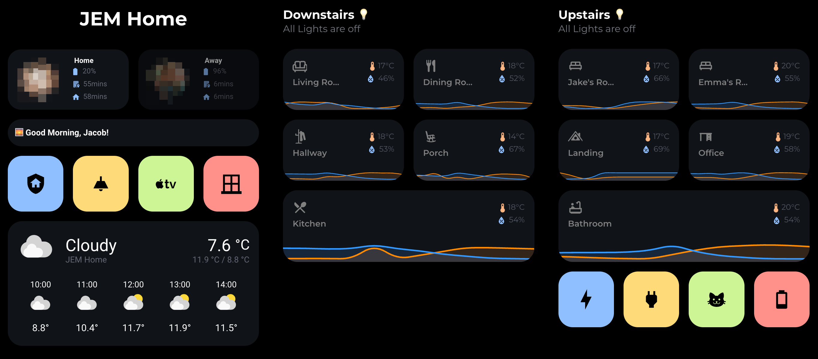
I thought I would share my dashboard that I have spent the last few months developing and updating. I have been using the shared code in this topic to update my own personal dashboard and thought I would share.
I’d love to have feedback from the community and see what I can do to improve or make better.
The dashboard itself is fully responsive for tablets, desktop and mobile, and is customisable for me and my partner.
My dashboard
Living Room Card
Light Card
Plugs
If anyone can help me add the brightness value to my light card so it displays the brightness percentage, I would really appreciate that! My light card code is as below;
type: custom:button-card
name: Main Light
show_icon: false
entity: light.living_room_light_switch
tap_action:
  action: toggle
  haptic: medium
hold_action:
  action: more-info
  haptic: medium
custom_fields:
  icon_cells: |

    [[[
           var state = states['light.living_room_light_switch'].state;
           if(state == "on")
            return `<ha-icon
            icon="mdi:ceiling-light"
            style="width: 30px; height: 30px; color: black;">
            </ha-icon>
            `;
           else
            return `<ha-icon
            icon="mdi:ceiling-light-outline"
            style="width: 30px; height: 30px; color: grey;">
            </ha-icon>
            `;
          ]]]
  slider:
    card:
      type: custom:my-slider-v2
      entity: '[[[ return entity.entity_id ]]]'
      colorMode: brightness
      styles:
        container:
          - background: none
          - border-radius: 100px
          - overflow: visible
        card:
          - height: 16px
          - padding: 0 8px
          - background: |
              [[[
                if (entity.state == "on") return "linear-gradient(90deg, rgba(255,255,255, 0.3) 0%, rgba(255,255,255, 1) 100%)";
                else return "var(--contrast4)";
              ]]]
        track:
          - overflow: visible
          - background: none
        progress:
          - background: none
        thumb:
          - background: |
              [[[
                if (entity.state == "on") return "var(--black)";
                if (entity.state == "off") return "var(--contrast20)";
                else return "var(--contrast8)";
              ]]]
          - top: 2px
          - right: '-8px'
          - height: 12px
          - width: 12px
          - border-radius: 10px
styles:
  grid:
    - grid-template-areas: '"icon_cells" "n" "state" "slider"'
    - grid-template-columns: 1fr
    - grid-template-rows: 1fr min-content min-content
  custom_fields:
    icon_cells:
      - justify-self: start
  card:
    - background: var(--contrast2)
    - padding: 16px
    - '--mdc-ripple-press-opacity': 0
    - height: 100%
  img_cell:
    - justify-self: start
    - width: 24px
  icon:
    - width: 24px
    - height: 24px
    - color: var(--contrast8)
  icon_cells:
    - justify-self: start
    - margin-top: 12px
    - margin-left: 15px
  name:
    - justify-self: start
    - font-size: 90%
    - margin: 4px 0 12px 0
    - color: var(--contrast8)
    - font-weight: bold
state:
  - value: 'on'
    styles:
      card:
        - background: |
            [[[
                var color = entity.attributes?.rgb_color;
                if (entity.state != "on"){
                  return 'var(--contrast20)';
                }
                else if (color){
                  return 'rgba(' + color + ')'
                }
                else{
                  return 'var(--yellow)'
                }
            ]]]
      name:
        - color: var(--black)
  - value: 'off'
    styles:
      name:
        - color: grey
5 Likes
Looks really neat. My only comment would be that its all very much in a grid. You dont seem to try and use the “bento” style very much. I think that would really suit your layout
jeells102
December 14, 2023, 2:23pm
354
The bento style? I’m not sure what you mean by that!
Portrait format, bento style 9:16 grid system, style sheets and layout template designed for Adobe InDesign. Ideal for screen-based brand and logo presentations on vertical 4k televisions and other digital displays. The included style sheets make...
Just some random google results - but essentially a grid where you have more overlapping than you do. Yours are very in line with eachother. Which is absolutely fine! Just IMO bento has a bit more visual interest
Bento is definitely very popular right now, but i think its best to use it, but use it sparingly. Not everywhere, as it can draw attention on the wrong things otherwise and feel cluttered.
1 Like
Hello jeels102,
name: Gäste WC
icon: mdi:lightbulb-group
show_label: true
label: |
  [[[
    var bri = (Math.round(states['light.gaste_wc_beleuchtung_gesamt'].attributes.brightness / 2.55));
    return ' ' + (bri ? bri : '0') + '%';
  ]]]
entity: light.gaste_wc_beleuchtung_gesamt
tap_action:
  action: toggle
  haptic: medium
hold_action:
  action: more-info
  haptic: medium
custom_fields:
  slider:
    card:
      type: custom:my-slider-v2
      entity: light.gaste_wc_beleuchtung_gesamt
      colorMode: brightness
      styles:
        container:
          - background: none
          - border-radius: 100px
          - overflow: visible
        card:
          - height: 16px
          - padding: 0 8px
          - background: |
              [[[
                if (entity.state == "on") return "linear-gradient(90deg, rgba(255,255,255, 0.3) 0%, rgba(255,255,255, 1) 100%)";
                else return "var(--contrast4)";
              ]]]
        track:
          - overflow: visible
          - background: none
        progress:
          - background: none
        thumb:
          - background: |
              [[[
                if (entity.state == "on") return "var(--black)";
                if (entity.state == "off") return "var(--contrast20)";
                else return "var(--contrast8)";
              ]]]
          - top: 2px
          - right: '-6px'
          - height: 12px
          - width: 12px
          - border-radius: 100px
styles:
  grid:
    - grid-template-areas: '"i" "n" "l" "slider"'
    - grid-template-columns: 1fr
    - grid-template-rows: 1fr min-content min-content
  card:
    - padding: 16px
    - '--mdc-ripple-press-opacity': 0
  img_cell:
    - justify-self: start
    - width: 24px
  icon:
    - width: 24px
    - height: 24px
    - color: var(--contrast8)
  name:
    - justify-self: start
    - font-size: 90%
    - margin: 4px 0 12px 0
    - color: var(--contrast8)
    - font-weight: bold
  label:
    - justify-self: end
    - margin-top: '-20%'
state:
  - value: 'on'
    styles:
      card:
        - background: |
            [[[
                var color = entity.attributes?.rgb_color;
                if (entity.state != "on"){
                  return 'var(--contrast20)';
                }
                else if (color){
                  return 'rgba(' + color + ')'
                }
                else{
                  return 'var(--yellow)'
                }
            ]]]
      icon:
        - color: var(--black)
      name:
        - color: var(--black)
      label:
        - color: var(--black)
  - value: 'off'
    styles:
      icon:
        - color: var(--contrast20)
      name:
        - color: var(--contrast20) ```
jeells102
December 15, 2023, 4:07pm
357
@Manen123 So I added your code into mine, and I managed to get it to display the brightness value which is great! My only thing, is that when I have a short card, my margin-top is set as -15% but if I have longer card, I’ve had to manually set it to -6% so it looks in the right place.
I’m sure there is a better way to deal with it so it’s consistently in the same place but it does for now. Thanks for providing your code to help me out
type: custom:button-card
name: Main Light
show_icon: false
show_label: true
label: |
  [[[
    var bri = (Math.round(states['light.living_room_light_switch'].attributes.brightness / 2.55));
    return ' ' + (bri ? bri : '0') + '%';
  ]]]
entity: light.living_room_light_switch
tap_action:
  action: toggle
  haptic: medium
hold_action:
  action: more-info
  haptic: medium
custom_fields:
  icon_cells: |

    [[[
           var state = states['light.living_room_light_switch'].state;
           if(state == "on")
            return `<ha-icon
            icon="mdi:ceiling-light"
            style="width: 30px; height: 30px; color: black;">
            </ha-icon>
            `;
           else
            return `<ha-icon
            icon="mdi:ceiling-light-outline"
            style="width: 30px; height: 30px; color: grey;">
            </ha-icon>
            `;
          ]]]
  slider:
    card:
      type: custom:my-slider-v2
      entity: '[[[ return entity.entity_id ]]]'
      colorMode: brightness
      styles:
        container:
          - background: none
          - border-radius: 100px
          - overflow: visible
        card:
          - height: 16px
          - padding: 0 8px
          - background: |
              [[[
                if (entity.state == "on") return "linear-gradient(90deg, rgba(255,255,255, 0.3) 0%, rgba(255,255,255, 1) 100%)";
                else return "var(--contrast4)";
              ]]]
        track:
          - overflow: visible
          - background: none
        progress:
          - background: none
        thumb:
          - background: |
              [[[
                if (entity.state == "on") return "var(--black)";
                if (entity.state == "off") return "var(--contrast20)";
                else return "var(--contrast8)";
              ]]]
          - top: 2px
          - right: '-8px'
          - height: 12px
          - width: 12px
          - border-radius: 10px
styles:
  grid:
    - grid-template-areas: '"icon_cells" "n" "l" "slider"'
    - grid-template-columns: 1fr
    - grid-template-rows: 1fr min-content min-content
  custom_fields:
    icon_cells:
      - justify-self: start
  card:
    - background: var(--contrast2)
    - padding: 16px
    - '--mdc-ripple-press-opacity': 0
    - height: 100%
  label:
    - justify-self: end
    - margin-top: '-15%'
    - color: |
        [[[
          if (entity.state == "on") return "var(--black)";
          if (entity.state == "off") return "grey";
        ]]]
  img_cell:
    - justify-self: start
    - width: 24px
  icon:
    - width: 24px
    - height: 24px
    - color: var(--contrast8)
  icon_cells:
    - justify-self: start
    - margin-top: 12px
    - margin-left: 15px
  name:
    - justify-self: start
    - font-size: 90%
    - margin: 4px 0 12px 0
    - color: var(--contrast8)
    - font-weight: bold
state:
  - value: 'on'
    styles:
      card:
        - background: |
            [[[
                var color = entity.attributes?.rgb_color;
                if (entity.state != "on"){
                  return 'var(--contrast20)';
                }
                else if (color){
                  return 'rgba(' + color + ')'
                }
                else{
                  return 'var(--yellow)'
                }
            ]]]
      name:
        - color: var(--black)
  - value: 'off'
    styles:
      name:
        - color: grey
h3ku
December 16, 2023, 1:22pm
358
Could you share the yaml? Looks amazing, Im mostly curious about the grid system for it to be responsive and the cards for the room where you combine both temp and humidity.
jeells102
December 16, 2023, 2:21pm
359
Hey @h3ku - yeah of course you got it!
Below is my YAML code for my living room card. So when the main light is on, the icon will appear in yellow and “bounce” in place. I would love to see how you implement this
type: custom:stack-in-card
cards:
  - type: custom:button-card
    entity: light.living_room_light_switch
    icon: '[[[ return entity.attributes.icon ]]]'
    show_icon: false
    name: Living Room
    tap_action:
      action: navigate
      navigation_path: /lovelace/living-room
      haptic: medium
    styles:
      card:
        - background: var(--contrast2)
        - padding: 16px
        - '--mdc-ripple-press-opacity': 0
      icon_cells:
        - justify-self: start
        - margin-top: 12px
        - margin-left: 15px
        - animation: |
            [[[
              var state = states['light.living_room_light_switch'].state;
              return state === 'on' ? 'bounce 2s infinite' : 'none';
            ]]]
      img_cell:
        - justify-self: start
        - width: 24px
      custom_fields:
        temp:
          - align-self: start
          - justify-self: end
          - font-size: 13px
          - font-weight: 500
          - margin: 4px 0 0px 0
          - color: var(--contrast8)
          - font-family: Montserrat
        hum:
          - align-self: start
          - justify-self: end
          - font-size: 13px
          - font-weight: 500
          - margin: 1px 0 12px 0
          - color: var(--contrast8)
          - font-family: Montserrat
        graph:
          - padding-top: 0%
          - width: 100%
          - height: 100%
        icon_cells:
          - width: 24px
          - height: 24px
          - color: var(--contrast8)
          - animation: |
              [[[
                var state = states['light.living_room_light_switch'].state;
                return state === 'on' ? 'bounce 2s infinite' : 'none';
              ]]]
      name:
        - justify-self: start
        - font-size: 14px
        - margin: 1px 0 1px 0
        - color: |
            [[[
              var state = states['light.living_room_light_switch'].state;
              return state === 'on' ? 'white' : 'grey';
            ]]]
        - font-family: Montserrat
        - font-weight: 600
      grid:
        - grid-template-areas: '"icon_cells slider temp" "n slider hum"'
        - grid-template-columns: 1fr min-content 1fr
        - grid-template-rows: 1fr min-content min-content
    custom_fields:
      icon_cells: |
        [[[
         var state = states['light.living_room_light_switch'].state;
         if(state == "on")
          return `<ha-icon
          icon="mdi:sofa"
          style="width: 25px; height: 25px; color: yellow;">
          </ha-icon>
          `;
         else
          return `<ha-icon
          icon="mdi:sofa-outline"
          style="width: 25px; height: 25px; color: grey;">
          </ha-icon>
          `;
        ]]]
      temp: |
        [[[
          return `<ha-icon
          icon="mdi:thermometer"
          style="width: 18px; height: 18px; color: var(--orange);">
          </ha-icon><span>${parseFloat(states['sensor.everything_presence_one_dacc08_temperature'].state).toFixed(0)}°C</span>`
        ]]]
      hum: |
        [[[
          return `<ha-icon
          icon="mdi:water-percent"
          style="width: 18px; height: 18px; color: var(--blue);">
          </ha-icon> <span>${parseFloat(states['sensor.everything_presence_one_dacc08_humidity'].state).toFixed(0)}%</span>`
        ]]]
    card_mod:
      style: |
        ha-card {
          z-index: 1;
          height: 70px;
        }
    extra_styles: |
      @keyframes bounce {
        0% { transform: scale3d(1, 1, 1); }
        7% { transform: scale3d(1.25, 0.75, 1); }
        10% { transform: scale3d(0.75, 1.25, 1); }
        12% { transform: scale3d(1.15, 0.85, 1); }
        16% { transform: scale3d(0.95, 1.05, 1); }
        19% { transform: scale3d(1.05, 0.95, 1); }
        25% { transform: scale3d(1, 1, 1); }
      }
  - type: custom:mini-graph-card
    tap_action:
      action: navigate
      navigation_path: /lovelace/living-room
      haptic: medium
    entities:
      - entity: sensor.everything_presence_one_dacc08_temperature
        name: Temperature
        color: '#ff8c00'
        show_points: false
        legend: false
      - entity: sensor.everything_presence_one_dacc08_humidity
        name: Humidity
        color: '#3399ff'
        y_axis: secondary
        show_points: false
        legend: false
    height: 40
    hours_to_show: 24
    line_width: 3
    font_size: 50
    show:
      name: false
      icon: false
      state: false
      legend: false
      animate: true
      labels: false
      labels_secondary: false
    card_mod:
      style: |
        ha-card {
          position: absolute;
          height: 100%;
          width: 100%;
          top: 0px;
          --ha-card-border-width: 0;
        }
        ha-card:after {
          content: "";
          position: absolute;
          width: 100%;
          height: 100%;
        }
sebbaT
December 16, 2023, 5:45pm
360
try this:
type: custom:button-card
template: title_card
entity: sensor.greeting_time
show_icon: false
label: #test
show_label: false
name: >
  [[[

  const emojis = ["!", ".", ". 😉", "! 👍", ". 🤩"];
  const randomEmoji = emojis[Math.floor(Math.random() * emojis.length)];

  return (entity.state) + ', ' + hass.user.name + randomEmoji

  ]]]
damiantje99
December 25, 2023, 11:01am
361
Nice setup! I’m looking for a nice persons card. Could you share your code for that one?
jeells102
December 26, 2023, 10:49am
362
So the person card is done in 2 parts. You have the cards themselves, and then the template.
The person cards themselves are using the following code;
type: custom:decluttering-card
template: person_card_new
variables:
  - entity: person.jacob
  - name: Jacob
  - battery: device_tracker.jacobs_iphone_3
  - battery_state: sensor.jacobs_iphone_battery_state
  - battery_level: sensor.jacobs_iphone_battery_level
  - work_sensor: sensor.jake_to_work
  - home_sensor: sensor.jake_work_to_home
  - work_icon: mdi:car
  - show_entity_picture: true
  - tap_action: null
    action: none
    haptic: light
Then you’ll need to add a template to the dashboard directly. To do this, click on the 3 dots in the top right-hand corner, and then edit dashboard, and then click on the 3 dots again and choose Raw Configuration File to edit the dashboard template.
Then you’ll want to add the following;
decluttering_templates:
  person_card_new:
    default:
      - size: 60%
      - color: auto
      - background_color: var(--primary-background-color)
      - variable: spin
      - spin: false
      - show_name: false
      - show_state: true
      - show_label: false
      - show_icon: true
      - show_last_changed: false
      - show_entity_picture: true
      - aspect_ratio: 2/1
      - margin-right: 20px
      - label: ' '
      - off_icon_color: gray
      - off_name_color: gray
      - off_state_color: gray
    card:
      type: custom:button-card
      battery: '[[battery]]'
      battery_android: '[[battery_android]]'
      home_sensor: '[[home_sensor]]'
      work_sensor: '[[work_sensor]]'
      work_icon: '[[work_icon]]'
      name: '[[name]]'
      icon: mdi:[[icon]]
      size: '[[size]]'
      color: '[[color]]'
      aspect_ratio: '[[aspect_ratio]]'
      entity: '[[entity]]'
      label: '[[label]]'
      show_name: '[[show_name]]'
      show_icon: '[[show_icon]]'
      show_state: '[[show_state]]'
      show_label: '[[show_label]]'
      show_last_changed: '[[show_last_changed]]'
      show_entity_picture: '[[show_entity_picture]]'
      styles:
        card:
          - border-radius: 22px
          - '--card-background-color': '[[background_color]]'
        icon:
          - grid-column: 1
          - grid-row: 1 / 4
        label:
          - color: gray
          - font-size: 11px
          - padding: 0px 10px
          - justify-self: start
        state:
          - font-size: 12px
          - padding: 0px 10px
          - justify-self: start
          - text-transform: capitalize
          - font-weight: bold
          - padding-left: 10px
          - color: var(--primary-text-color)
        grid:
          - grid-template-areas: '"i s" "i battery" "i home" "i work"'
          - grid-template-columns: 50% 50%
          - grid-template-rows: 25% 25% 25% 25%
        img_cell:
          - align-self: start
          - text-align: start
        name:
          - justify-self: start
          - padding-left: 10px
          - font-weight: bold
          - font-size: 13px
        entity_picture:
          - height: 60px
          - width: 60px
          - border-radius: 100%
        custom_fields:
          battery:
            - align-self: start
            - justify-self: start
            - font-size: 12px
            - color: var(--secondary-text-color)
          battery_android:
            - align-self: start
            - justify-self: start
            - font-size: 12px
            - color: var(--secondary-text-color)
          home:
            - align-self: start
            - justify-self: start
            - font-size: 12px
            - color: var(--secondary-text-color)
          work:
            - align-self: start
            - justify-self: start
            - font-size: 12px
            - color: var(--secondary-text-color)
      custom_fields:
        battery: |
          [[[
            var state = states['[[battery_state]]'].state;
             if(state == "Charging")
              return `<ha-icon
                icon="mdi:battery-charging"
                style="; --mdc-icon-size: 14px; padding-left: 6px; padding-right: 5px; color: var(--primary-color);">
                </ha-icon><span>${states['[[battery_level]]'].state}%</span>`
            else return `<ha-icon
              icon="mdi:battery"
              style="; --mdc-icon-size: 14px; padding-left: 5px; padding-right: 5px; color: var(--primary-color);">
              </ha-icon><span>${states['[[battery_level]]'].state}%</span>`
          ]]]
        battery_android: |
          [[[
            var state = states['[[battery_state]]'].state;
             if(state == "charging")
              return `<ha-icon
                icon="mdi:battery-charging"
                style="; --mdc-icon-size: 14px; padding-left: 6px; padding-right: 5px; color: var(--primary-color);">
                </ha-icon><span>${states['[[battery_level]]'].state}%</span>`
            else return `<ha-icon
              icon="mdi:battery"
              style="; --mdc-icon-size: 14px; padding-left: 5px; padding-right: 5px; color: var(--primary-color);">
              </ha-icon><span>${states['[[battery_level]]'].state}%</span>`
          ]]]
        home: |
          [[[
            return `<ha-icon
              icon="mdi:office-building-marker"
              style="; --mdc-icon-size: 14px; padding-left: 6px; padding-right: 5px; color: var(--primary-color);">
              </ha-icon><span>${states['[[home_sensor]]'].state}mins</span>`
          ]]]
        work: |
          [[[
            return `<ha-icon
              icon="mdi:home"
              style="; --mdc-icon-size: 14px; padding-left: 6px; padding-right: 5px; color: var(--primary-color);">
              </ha-icon><span>${states['[[work_sensor]]'].state}mins</span>`
          ]]]
      state:
        - value: not_home
          styles:
            card:
              - opacity: 0.6
            entity_picture:
              - border: 2px solid var(--severity-1)
        - value: home
          styles:
            entity_picture:
              - border: 2px solid var(--severity-5)
        - value: Jake Work
          styles:
            entity_picture:
              - border: 2px solid var(--severity-4)
        - value: Emma Work
          styles:
            entity_picture:
              - border: 2px solid var(--severity-4)
        - value: Emma Home
          styles:
            entity_picture:
              - border: 2px solid var(--severity-3)
        - value: Jake Home
          styles:
            entity_picture:
              - border: 2px solid var(--severity-3)
Hopefully this will help.
Patrick1610
December 27, 2023, 12:47pm
363
Hi! I am really happy with how my Rounded dashboar is coming together! REally happy with this project!
Left from the plus/minus I would like to have two buttons in the same shape and size, but for two booleans, instead of the name with the state. Is this possible and if so, how?
EDIT: The icon is not really needed, so it may also be one in place of the icon and one where the title is.
My code is:
type: custom:button-card
entity: climate.living_room
name: |-
  [[[ return " State: " + states['climate.living_room'].attributes.hvac_action
    ]]]
icon: phu:rooms-living
label: >-
  [[[ return states['climate.living_room'].attributes.current_temperature + "
  °C";
    ]]]
show_label: true
tap_action:
  action: more-info
  entity: climate.living_room
double_tap_action:
  action: call-service
  service: input_boolean.toggle
  data: {}
  target:
    entity_id: input_boolean.heating_boost_living_room
custom_fields:
  slider:
    card:
      type: custom:my-slider-v2
      entity: input_number.temperature_setting_living_room
      styles:
        container:
          - background: none
          - border-radius: 100px
          - overflow: visible
        card:
          - height: 34px
          - padding: 0 8px
          - background: >-
              linear-gradient(90deg, rgba(177,197,255, 0.5) 0%,
              rgba(255,175,131, 1) 100%
        track:
          - overflow: visible
          - background: none
        progress:
          - background: none
        thumb:
          - background: var(--black)
          - top: 5px
          - right: '-6px'
          - height: 24px
          - width: 24px
          - border-radius: 100px
  setting:
    card:
      type: custom:mushroom-climate-card
      entity: climate.living_room
      show_temperature_control: true
      primary_info: none
      secondary_info: none
      tap_action:
        action: none
      hold_action:
        action: none
      double_tap_action:
        action: none
      fill_container: false
      icon_type: none
      card_mod:
        style:
          mushroom-climate-temperature-control$:
            mushroom-input-number$: |
              .value {
                color: var(--contrast10) !important;}
              #container .button:nth-child(1) {
                --card-mod-icon-color: var(--contrast10);
              }
              #container .button:nth-child(3) {
                --card-mod-icon-color: var(--contrast10);
              }
          .: |
            ha-card {
              background-color: transparent;
              border: 0px
            }
styles:
  grid:
    - grid-template-areas: '"i l" "n setting" "slider slider"'
    - grid-template-columns: 1fr 1fr
    - grid-template-rows: 1fr min-content min-content
  card:
    - background: rgba(144, 191, 255,var(--color-tint))
    - padding: 16px
    - '--mdc-ripple-press-opacity': 0
  img_cell:
    - justify-self: start
    - width: 60px
    - margin: 1% 0 -10% 0
  icon:
    - width: 60px
    - height: 60px
    - color: var(--contrast20)
  name:
    - justify-self: start
    - font-size: 26px
    - margin: 4px 0 12px 0
    - color: var(--contrast20)
  label:
    - justify-self: end
    - font-weight: bold
    - font-size: 26px
    - margin: 1% 11% -10% 0
    - color: var(--contrast20)
  custom_fields:
    setting:
      - justify-self: end
      - margin: 4px 0 12px 0
      - font-size: 16px
      - width: 130px
Thanks a lot in advance!
Guys,
It should look more like this:
But I’m having a hard time with everything, whether with the layout card or the grid card. I need your help. I’ve been reading for almost 3 days and can’t get any further.
my goal is to create a “bento-style” grid layout like the one in the next picture.
I took screenshots of each of my cards and then used an image editor to create the layout I liked best. Good tip, by the way, to test many variations quickly and easily
Here ist the code so far, for the 2 light cards:
square: false
type: grid
cards:
  - type: custom:button-card
    name: Hue
    icon: '[[[ return entity.attributes.icon ]]]'
    entity: light.hue
    tap_action:
      action: toggle
      haptic: medium
    hold_action:
      action: more-info
      haptic: medium
    custom_fields:
      slider:
        card:
          type: custom:my-slider-v2
          entity: '[[[ return entity.entity_id ]]]'
          colorMode: brightness
          styles:
            container:
              - background: none
              - border-radius: 100px
              - overflow: visible
            card:
              - height: 16px
              - padding: 0 8px
              - background: |
                  [[[
                    if (entity.state == "on") return "linear-gradient(90deg, rgba(255,255,255, 0.3) 0%, rgba(255,255,255, 1) 100%)";
                    else return "var(--contrast4)";
                  ]]]
            track:
              - overflow: visible
              - background: none
            progress:
              - background: none
            thumb:
              - background: |
                  [[[
                    if (entity.state == "on") return "var(--black)";
                    if (entity.state == "off") return "var(--contrast20)";
                    else return "var(--contrast8)";
                  ]]]
              - top: 2px
              - right: '-8px'
              - height: 12px
              - width: 12px
              - border-radius: 10px
    styles:
      grid:
        - grid-template-areas: '"i" "n" "slider"'
        - grid-template-columns: 1fr
        - grid-template-rows: 1fr min-content min-content
      card:
        - font-family: In case of a custom font, otherwise you can remove this line
        - background: var(--contrast2)
        - padding: 16px
        - '--mdc-ripple-press-opacity': 0
      img_cell:
        - justify-self: start
        - width: 24px
      icon:
        - width: 24px
        - height: 24px
        - color: var(--contrast8)
      name:
        - justify-self: start
        - font-size: 14px
        - margin: 4px 0 12px 0
        - color: var(--contrast8)
    state:
      - value: 'on'
        styles:
          card:
            - background: |
                [[[
                    var color = entity.attributes?.rgb_color;
                    if (entity.state != "on"){
                      return 'var(--contrast20)';
                    }
                    else if (color){
                      return 'rgba(' + color + ')'
                    }
                    else{
                      return 'var(--yellow)'
                    }
                ]]]
          icon:
            - color: var(--black)
          name:
            - color: var(--black)
      - value: 'off'
        styles:
          icon:
            - color: var(--contrast20)
          name:
            - color: var(--contrast20)
  - type: custom:button-card
    name: Hue Küche
    icon: '[[[ return entity.attributes.icon ]]]'
    entity: light.kuche
    tap_action:
      action: toggle
      haptic: medium
    hold_action:
      action: more-info
      haptic: medium
    custom_fields:
      slider:
        card:
          type: custom:my-slider-v2
          entity: '[[[ return entity.entity_id ]]]'
          colorMode: brightness
          styles:
            container:
              - background: none
              - border-radius: 100px
              - overflow: visible
            card:
              - height: 16px
              - padding: 0 8px
              - background: |
                  [[[
                    if (entity.state == "on") return "linear-gradient(90deg, rgba(255,255,255, 0.3) 0%, rgba(255,255,255, 1) 100%)";
                    else return "var(--contrast4)";
                  ]]]
            track:
              - overflow: visible
              - background: none
            progress:
              - background: none
            thumb:
              - background: |
                  [[[
                    if (entity.state == "on") return "var(--black)";
                    if (entity.state == "off") return "var(--contrast20)";
                    else return "var(--contrast8)";
                  ]]]
              - top: 2px
              - right: '-8px'
              - height: 12px
              - width: 12px
              - border-radius: 10px
    styles:
      grid:
        - grid-template-areas: '"i" "n" "slider"'
        - grid-template-columns: 1fr
        - grid-template-rows: 1fr min-content min-content
      card:
        - font-family: In case of a custom font, otherwise you can remove this line
        - background: var(--contrast2)
        - padding: 16px
        - '--mdc-ripple-press-opacity': 0
      img_cell:
        - justify-self: start
        - width: 24px
      icon:
        - width: 24px
        - height: 24px
        - color: var(--contrast8)
      name:
        - justify-self: start
        - font-size: 14px
        - margin: 4px 0 12px 0
        - color: var(--contrast8)
    state:
      - value: 'on'
        styles:
          card:
            - background: |
                [[[
                    var color = entity.attributes?.rgb_color;
                    if (entity.state != "on"){
                      return 'var(--contrast20)';
                    }
                    else if (color){
                      return 'rgba(' + color + ')'
                    }
                    else{
                      return 'var(--yellow)'
                    }
                ]]]
          icon:
            - color: var(--black)
          name:
            - color: var(--black)
      - value: 'off'
        styles:
          icon:
            - color: var(--contrast20)
          name:
            - color: var(--contrast20)
columns: 2
here is a detailed view of the layout as it should be. Maybe do everything with the layout card in CSS?
Here would be the perfect grid-template-area:
grid-template-areas:
  "a b c d e f h h"
  ". i i i j j h h"
  "k k l l l . h h"
  "m m n n o o h h"
  "p q r s t t h h"
  "u u v w t t h h"
But when I use it, the dashboard goes much further out to the right and down than the tablet is big.
I love and hate you for this post =) Bento style dashboards just look so incredibly good. That was one of the best tips I’ve seen so far. Thanks for that!
Now I’ve got it in my head that I’ve been working on how to design such a dashboard for days. After 3 days of troubleshooting I’m going crazy because the layout is incredibly difficult to design. But when one day the moment comes when it’s finished and I get a big smile on my face, I’ll kiss your cheek in thanks
PS: If I may be so bold as to ask and you have a few minutes to spare, feel free to take a look here and here . It says what it’s all about. If anyone can solve it, it’s the knight of the community round, aka you
1 Like
I would definitely try and use the layout card for at least 90% of the layout.
If possible what i would do is use a layout card with all my cards for each row of cards to have it control the widths of each, but let HA control individually the order of the rows.
So not 1 huge card, but 1 card for each row.
Here is an example of what i think you are looking for with the layout card:
Auto just means the first card takes up whatever remaining space is available. You could hard code the width if you wanted as well.
I have margin -4px because for some reason layout card adds some margin for me. You might not need it.
type: custom:layout-card
layout_type: custom:grid-layout
cards:
  - type: custom:mushroom-light-card
    entity: light.bedroom_chest_lamp
    use_light_color: true
    fill_container: false
  - type: custom:mushroom-template-card
    icon: mdi:test-tube
    primary: Test
    secondary: Test
layout:
  grid-template-columns: auto 33%
  grid-template-rows: auto
  max_cols: 2
  margin: '-4px'
Jeroenterh
January 3, 2024, 9:58am
370
Hi Leon,
I am really impressed by the rounded dashboard setup. Finally a dashboard which less techie and user friendly for others. I am trying to implement it. However, am getting an error when pasting the code for the ‘graph’-part into the rounded.yaml (not pasting the full code here)
card-mod-theme: Rounded
card-mod-view-yaml: |
hui-masonry-view:
  $: |

    /* Swipe-card full width on mobile */
The error I get is:
Which is rather strange because the indentation seems ok. I fiddled a bit around, but nothing seems to resolve it. Any thoughts?
regards,
Bully89
January 3, 2024, 11:12am
371
Hi @jeells102 ,
First off, best wished for 2024!
Your person cards indeed look great and thanks for sharing!
Maybe you have had similar issues when you started and was hoping for a pointer. Already have the button_card_templates: with all the standard template of the rounded dashboard in the config file.
Thanks!
Bully89
January 3, 2024, 1:04pm
372
Great, that worked.
Any way to have a subtitle with this info:
subtitle: >-
        The weather is {{ states('weather.buienradar') }} and it's {{
        states('sensor.outdoor_temperature') }}°C outside. ☁🌡

        🚗{% if states('sensor.ev6_ev_battery_level') == 'unavailable' %} {%
        elif  states('sensor.ev6_ev_battery_level')|float < 50 %} EV6 battery is
        almost empty, battery level is {{ states('sensor.ev6_ev_battery_level')
        }}%

        ({{ states('sensor.ev6_ev_range') }} KM range){% else %} {% endif %}

        ♻️ {{state_attr('calendar.bins', 'message')}} on {{
        as_timestamp(state_attr("calendar.bins","start_time") |
        default(now(),true) )| timestamp_custom('%-d %b') }}
jeells102
January 3, 2024, 1:45pm
373
Heya!
Happy New year! In your normal home assistant configuration file, did you add the decluttering card js file at all? Mine looks like this;
frontend:
  themes: !include_dir_merge_named themes/
  extra_module_url:
    - /local/community/custom-brand-icons/custom-brand-icons.js
    - /hacsfiles/lovelace-card-mod/card-mod.js
    - /local/decluttering-card.js
I think that’s the cause of your issue there.


 Could you expand or share any links/resources?


