Does margin work, because the card isn’t moving up. It’s just the icon that is clipping out of the card.
  - type: custom:button-card
    tap_action:
      action: call-service
      service: script.fernseher_ok
    icon: mdi:circle-outline
    show_name: false
    icon_height: 50px
    styles:
      card:
        - margin-top: '-20px'
        - border-radius: 0px
        - border: 2px
        - padding: 0
        - box-shadow: none
this is inside a custom:stack-in-card ass you can see
pimp1310
November 4, 2021, 6:01pm
209
hello,
i tried your code but i get another output:
have you perhaps a idea?
@RomRider sorry for direct address, but can you have a look at these issues?
opened 02:12AM - 18 Dec 21 UTC
bug
<!-- READ THIS FIRST:
- If you need additional help with this template please r… efer to https://www.home-assistant.io/help/reporting_issues/
- Make sure you are running the latest version of Home Assistant before reporting an issue: https://github.com/home-assistant/home-assistant/releases
- Provide as many details as possible. Do not delete any text from this template!
-->
**Checklist:**
- [x ] I updated to the latest version available
- [ x] I cleared the cache of my browser
**Release with the issue:**
0.2.0
**Last working release (if known):**
**Browser and Operating System:**
Win10x64, Chrome
<!--
Provide details about what browser (and version) you are seeing the issue in. And also which operating system this is on. If possible try to replicate the issue in other browsers and include your findings here.
-->
**Description of problem:**
If one `stack-in-card` contains another `stack-in-card`, the card my not be displayed:
1. Open some dashboard.
2. Switch to "edit" mode.
3. Add a new card and then paste code into Editor. Save the changes.
4. The card is not displayed:

5. Switch off the edit mode.
6. The card is not displayed.
7. Refresh the page.
8. The card is displayed.
<!--
Explain what the issue is, and how things should look/behave. If possible provide a screenshot with a description.
-->
**Javascript errors shown in the web inspector (if applicable):**
no errors
```
```
**Additional information:**
```
type: custom:stack-in-card
mode: vertical
keep:
background: true
box_shadow: false
margin: true
outer_padding: false
border_radius: true
cards:
- type: entities
entities:
- sun.sun
card_mod:
style: |
ha-card {
--ha-card-background: red;
}
- type: custom:stack-in-card
mode: horizontal
keep:
background: true
box_shadow: true
margin: false
outer_padding: false
border_radius: true
cards:
- &ref_button
type: button
card_mod:
style: |
ha-card {
--ha-card-background: grey;
}
- *ref_button
- *ref_button
```

opened 11:30PM - 08 Dec 21 UTC
bug
<!-- READ THIS FIRST:
- If you need additional help with this template please r… efer to https://www.home-assistant.io/help/reporting_issues/
- Make sure you are running the latest version of Home Assistant before reporting an issue: https://github.com/home-assistant/home-assistant/releases
- Provide as many details as possible. Do not delete any text from this template!
-->
**Checklist:**
- [x ] I updated to the latest version available
- [x ] I cleared the cache of my browser
**Release with the issue:**
0.2.0
**Last working release (if known):**
**Browser and Operating System:**
Chrome, Win10x64
<!--
Provide details about what browser (and version) you are seeing the issue in. And also which operating system this is on. If possible try to replicate the issue in other browsers and include your findings here.
-->
**Description of problem:**
<!--
Explain what the issue is, and how things should look/behave. If possible provide a screenshot with a description.
-->
If the 'keep: margin: false' is set then the margin between card is supposed to be 0.
It works for two Entities cards:
```
- type: custom:stack-in-card
mode: vertical
keep:
background: true
box_shadow: false
margin: false
outer_padding: false
border_radius: false
cards:
- type: entities
entities:
- sun.sun
card_mod:
style: |
ha-card {
background-color: red;
}
- type: entities
entities:
- sun.sun
card_mod:
style: |
ha-card {
background-color: green;
}
```

But if the 2nd card is `stack-in-card`, then the margin is present anyway - look at the margin-top:
```
- type: custom:stack-in-card
mode: vertical
keep:
background: true
box_shadow: false
margin: false
outer_padding: false
border_radius: false
cards:
- type: entities
entities:
- sun.sun
card_mod:
style: |
ha-card {
background-color: red;
}
- type: custom:stack-in-card
mode: horizontal
keep:
background: true
box_shadow: false
margin: false
outer_padding: false
border_radius: false
cards:
- type: entities
entities:
- sun.sun
card_mod:
style: |
ha-card {
background-color: red;
}
- type: entities
entities:
- sun.sun
card_mod:
style: |
ha-card {
background-color: green;
}
```


**Javascript errors shown in the web inspector (if applicable):**
no
```
```
**Additional information:**
Using the card gives erratic results…
1 Like
on a regular base, I see the spaces between button-cards in this horizontal stack-in-card reappear. refreshing the page a few times then makes it ok again, concatenating the buttons as they should:
this is a set of button cards in:
  - type: custom:stack-in-card
    mode: horizontal
    keep:
      background: true
    cards:

    #history.back(-1)
      - type: custom:button-card
I believe the stack-in-card sets ‘outer-padding’ to 0, but, and here comes the question, if I do that in a core horizontal-stack, nothing happens, and I see all separated buttons.
  - type: horizontal-stack
    cards:

    #history.back(-1)
      - type: custom:button-card
        template: button_shortcut_menu
given the fact these all use a button_shortcut_menu template, I was wondering if I could set a card styles: option for the outer-padding (obviously tried that)
    card:
      - box-shadow: none
      - background: >
          [[[ return variables.view === variables.path
              ? 'var(--secondary-background-color)' : 'var(--background-color-off)'; ]]]
      - padding-top: 10px
      - padding-bottom: 10px
      - outer-padding: 0 #<--- no functional, but to show what I am looking for
but it doesnt work… so, please help me out if I can set anything css option here, to get the same result and make the buttons touch?
thanks!
not sure, I dont have keep: margin: false set, only keep background: true
and it’s not always, it comes and goes. Bam, as we type:
somehow the default card-background-color of my current theme peeps through… (this is the stack-in-card, not the horizontal stack)
added the margin: false to see if that improves things.
update
no that doesnt seem to make a difference. Would be surprising too, because ‘false’ is the default value.
what does seem to help, is changing to:
  - type: custom:stack-in-card
    mode: horizontal
    keep:
      background: true
    card_mod:
      style: |
        ha-card {
          background-color: var(--background-color-off);
        }
so, if it peeps through, its the same as the default button background
Would still love to learn which variable sets the space between cards in core Lovelace though…
Seems that the repository is not maintained for a long time.The custom:stack-in-card is incompatible with the new Material Web Components’ dropdown list control.
Surely this issue (and some others) may be fixed by card-mod.
ilgio
May 17, 2022, 1:54pm
215
how can i put a border around the two cards
similar
my code is
type: custom:stack-in-card
title: titolo
keep:
  box_shadow: true/false
  margin: true/false
  border_radius: true/false
  background: true/false
  outer_padding: true/false
cards:
  - entity: input_boolean.irrigazione_flag_zona1_ciclo3
    type: custom:multiple-entity-row
    name: Pippo
    state_color: false
    state_header: 3
    toggle: false
    show_state: false
    entities:
      - entity: input_select.irrigazione_tipo_zona1
        name: false
      - entity: input_select.irrigazione_tipo_zona1
        name: false
  - type: horizontal-stack
    cards:
      - type: custom:button-card
        entity: input_boolean.irrigazione_zona1_lun
        name: Lun
        show_icon: false
      - type: custom:button-card
        entity: input_boolean.irrigazione_zona1_mar
        name: Mar
        show_icon: false
      - type: custom:button-card
        entity: input_boolean.irrigazione_zona1_mer
        name: Mer
        show_icon: false
      - type: custom:button-card
        entity: input_boolean.irrigazione_zona1_gio
        name: Gio
        show_icon: false
      - type: custom:button-card
        entity: input_boolean.irrigazione_zona1_ven
        name: Ven
        show_icon: false
      - type: custom:button-card
        entity: input_boolean.irrigazione_zona1_sab
        name: Sab
        show_icon: false
      - type: custom:button-card
        entity: input_boolean.irrigazione_zona1_dom
        name: Dom
        show_icon: false
benm7
July 11, 2022, 2:51am
216
Is there any way to have the cards within the stack occupy min-content rather than 1/x of the stack?
Seems to be a job for card-mod.
Vandana
August 27, 2022, 6:12am
218
I added Stack-In-Card via hacs frontend integration. I restarted Home assistant but Sick-In-card is not showing when I try to add a card in Lovelace dashboard UI.
What am I doing wrong ? Kindly guide. I am on Home-assistant ver 2022.8.7
gnec220
August 29, 2022, 9:44am
219
i have the same problem as @Vandana has. can you please help us ?
Do you mean “I do not see any UI to add a new card of stack-in-card type”?
Add a card of ANY type.
Edit the added card in yaml mode.
Rewrite this card to stack-in-card.
gnec220
September 3, 2022, 6:39am
221
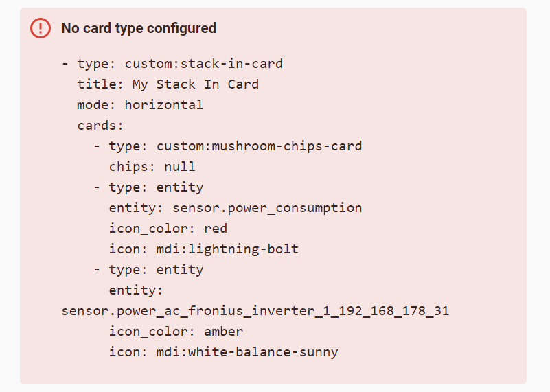
Hi, it says no card type found. see the omahe below:
Do you use a storage mode of Lovelace?
Any workarounds for this? I have nested stacks but indeed doesn’t show. For a while it hasn’t been a problem up until 2 months ago or something. Also, some pages it actually does work, it only appears to be missing in a state switch configuration.
Must admit that for the last time I do not observe the “Card may not be displayed if one stack contains another stack” issue .
What is your code which does not work?
Update 08.09.22: closed this issue; do not see problems on 2 setups (2022.7, 2022.9).
Not sure how to make it short and simple without stripping too much of code, I use the headers from @benm7 this one is based on the alarm state to make it green/red.
- title: ""
  icon: mdi:shield-check
  path: security
  badges: []
  cards:
    - type: custom:state-switch
      entity: alarm_control_panel.alarmo
      default: disarmed
      states:
        disarmed:
          type: custom:stack-in-card
          mode: vertical
          keep:
            box_shadow: true
            margin: true
            border_radius: true
            background: true
            outer_padding: true
          style: |
            ha-card {
              background-color: rgba(var(--color-green),0.7);
              border-radius: var(--border-radius);
            }
          cards:
            - type: "custom:layout-card"
              layout_type: grid
              layout:
                grid-template-columns: 24% 76%
                margin: 0px 0px 0px 0px
              cards:
                - type: custom:stack-in-card
                  mode: vertical
                  keep:
                    box_shadow: false
                    margin: false
                    border_radius: true
                    background: false
                    outer_padding: false
                  style: |
                    ha-card {
                      background-color: rgba(var(--color-green-bg),1.0);
                      border-radius: var(--border-radius-bar);
                      box-shadow: none;
                    }
                  cards:
                    - type: horizontal-stack
                      cards:
                        - type: 'custom:button-card'
                          template: chip_back
                          variables:
                            ulm_chip_back_path: /ui-lovelace-minimalist/home
                        - type: 'custom:button-card'
                          template: chip_navigate
                          variables:
                            ulm_chip_navigate_path: /ui-lovelace-minimalist/home
                            ulm_chip_navigate_icon: mdi:home
            - type: "custom:button-card"
              template:
                - "card_title_icon"
              name: "Beveiliging en veiligheid"
              variables:
                ulm_card_navigate_title: Beveiliging en veiligheid
                ulm_card_navigate_icon: mdi:shield-off
                icon_color: green
                background_color: green-bg
# More state-switches stripped away to reduce code
    - type: "custom:button-card"
      template: "card_title_fixed_small"
      name: "Alarm"
    - type: 'custom:button-card'
      template:
        - "custom_alarm"
      variables:
        ulm_custom_alarm_grid_state: alarm_control_panel.alarmo
# More cards below here of course ;)
SHORT - means “everyone may take your code and reproduce it”.
driz
September 13, 2022, 4:12pm
227
Hello all, I searched this thread (and ghi) for anything about card gaps, but what I found didn’t seem to apply. I’m just converting a vertical stack to stack-in-card. I was hoping to eliminate the gaps from vertical stack (see image)
After moving to stack-in-card, the black emptiness is gone, but the gap is still present.
type: custom:stack-in-card
title: Kid1 Chores
mode: vertical
cards:
  - type: entities
    entities:
      - entity: input_boolean.chore_12
      - entity: input_boolean.chore_11
    show_header_toggle: false
    state_color: true
  - type: entities
    entities:
      - entity: input_boolean.chore_10
    state_color: true
    show_header_toggle: false
Is there any way to eliminate the gap between cards to make it appear as if it were one single card? If that is not a function of this card, my apologies in advance. Note that while the code makes it look like i could just put all the entities together, in reality i am using conditional cards to only display some entities cards on certain days, i removed that code to confirm the conditional card wasn’t the cause.