Great news! New version does indeed fix the “all cards in one column” issue.
Hi all,
Did anyone manage to have custom:stack-in-card inside custom:layout-card?
For me, custom:stack-in-card is not visible once it’s inside custom:layout-card.
cards:
  - cards:
      - entities: null
        entity: sensor.unavailable_sensors
        max: 100
        min: 0
        type: gauge
      - cards:
          - type: glance
            entities:
              - entity: camera.living_room_camera
                icon: 'mdi:cctv'
                style: |
                  state-badge {
                    margin: 0px !important;
                  }
              - entity: binary_sensor.living_room_camera_motion_sensor
                style: |
                  state-badge {
                    margin: 0px !important;
                  }
              - entity: binary_sensor.living_room_motion_sensor
                style: |
                  state-badge {
                    margin: 0px !important;
                  }
              - entity: binary_sensor.balcony_door_sensor
                style: |
                  state-badge {
                    margin: 0px !important;
                  }
              - entity: binary_sensor.living_room_window_sensor
                style: |
                  state-badge {
                    margin: 0px !important;
                  }
            show_name: false
            show_state: false
            style: |
              ha-card {

                line-height: 40px;
                display: flex;
                justify-content: space-between;
                flex-direction: row;
                overflow: hidden;
                padding: 4px 8px 0px;
              }
              .card-header {
                font-size: 16px;
                flex-direction: row;
                font-weight: 500;
                padding: 8px 8px 0px;
              }
              .entities {
                padding: 0px 0px 0px !important;
                flex-direction: row !important;
              }
              .entity {
                margin-bottom: 0px !important;
              }
              state-badge {
                margin: 0px !important;
              }
            title: Living Room
          - type: entities
            entities:
              - type: divider
          - type: entities
            entities:
              - entity: light.living_room_main_light_zha_group
                name: Main Light
              - entity: light.living_room_table_light
                name: Table Light
              - entity: light.living_room_floor_light_zha_group
                name: Floor Light
              - entity: light.living_room_toys_table_zha_group
                name: Toys Table Lights
                show_header_toggle: false
        type: 'custom:stack-in-card'
        mode: vertical
    type: vertical-stack
  - break
  - cards:
      - entities:
          - entity: light.kitchen_spots_zha_group
            name: Main Spots
        show_header_toggle: false
        type: entities
    type: vertical-stack
layout: vertical
type: 'custom:layout-card'
Any idea what is wrong?
Thanks a lot in advance!
I’ve just tried version 0.1.1 and everything works fine, seems like an issue introduced by the latest 0.2.0 build.
Cheers!
What I am doing wrong?, I am getting doble background.
I am staking an entities card on top of another entities card to get some icons
a horizontal stack on top of a vertical stack, Ive tried to get the background off a couple of times but no luck… :S
(lower button icons are too big but that’s another issue)
type: 'custom:stack-in-card'
mode: vertical
keep:
  box_shadow: false
  background: false
cards:
  - type: entities
    entities:
      - type: 'custom:multiple-entity-row'
        entities:
          - entity: sensor.118d_remaining_fuel
            name: Gasolina
          - entity: sensor.118d_remaining_range_total
            name: Autonomía
        entity: binary_sensor.118d_door_lock_state
        name: Serie 1
        secondary_info:
          entity: binary_sensor.118d_door_lock_state
          name: ' '
        show_state: false
        state_color: true
        state_header: true
      - type: divider
  - type: picture
    image: /local/images/118d2.png
    entity: lock.118d_lock_2
  - type: 'custom:stack-in-card'
    mode: horizontal
    keep:
      box_shadow: false
      background: false
    cards:
      - type: button
        tap_action:
          action: none
        entity: binary_sensor.118d_check_control_messages
        hold_action:
          action: none
        icon: 'mdi:alert-outline'
        icon_height: 25px
        name: Check Control
      - type: button
        tap_action:
          action: none
        entity: binary_sensor.118d_condition_based_services
        hold_action:
          action: none
        show_name: true
        icon_height: 25px
        name: Revisión
      - type: button
        tap_action:
          action: none
        entity: binary_sensor.118d_lights_parking
        hold_action:
          action: none
        show_name: true
        icon_height: 25px
        name: Luces
      - type: button
        tap_action:
          action: none
        entity: binary_sensor.118d_windows
        hold_action:
          action: none
        show_name: true
        icon_height: 25px
        name: Ventanas
      - type: button
        tap_action:
          action: none
        entity: binary_sensor.118d_lids
        hold_action:
          action: none
        show_name: true
        icon_height: 25px
        name: Puertas
  - type: 'custom:mini-graph-card'
    entities:
      - entity: sensor.118d_remaining_range_total
    name: AUTONOMÍA 118d - 15 días
    hours_to_show: 360
    points_per_hour: 0.1
    line_width: 1
    font_size: 90
    animate: true
    show:
      name: false
      icon: false
      state: false
    color_thresholds:
      - value: 120
        color: '#3498DB'
      - value: 80
        color: red
    lower_bound: 0
    upper_bound: 900
    lower_bound_secondary: 0
    upper_bound_secondary: 60
    icon: 'mdi:gas-station'

3 Likes
check the style, like this:
- type: 'custom:stack-in-card'
  mode: horizontal
  style: |
    ha-card {
      box-shadow: none;
    }
  cards:
1 Like

@alnavasa and @basti4k
No offense, but why would you need car information in HA? This is a genuine question.  I’m thinking about implementing something like that, and as much as I would love to have it, I can’t seem to think of any reason, why I would possible need that…
  And as you all know, the WAF is far greater, if you have kind of a reason to show.
The only thing I’d really want to have is an automation to start the parking heater…
AD-Blue Info, Car and Windows all Close? Refilling from fuel?
yes it works for skoda, but i dont have a “parking heater”. But i can start the “Frontwindow heater” 
And best of all, it’s beautiful to look at 
1 Like
I am currently in the process of integrating all the sensors for home assistant, just that is a big plus for me.
Automations could be from, close the car if it is at home and it is open and it is 1am.
Notify me if windows are open while car is close for more than 1 hour.
Notify me if amble range is … fuel range is… service is…
If car is at home and I am at home and everyone else is at home then…
show me the 3 cars, so I can choose which one to take since I am in a hurry (thanks wife for refueling mine)
and so on…
Hello.
I was wondering if there was anything to do to get my picture card to fill the whole first box of the three cards I have in horizontal stack?
The card gets rounded nicely at the top, but cuts short at the bottom?

    - type: custom:stack-in-card
      keep:
        background: true
        border_radius: true
        margin: true
        box_shadow: true
        outer_padding: false
#      title: My Stack In Card

      mode: vertical
      cards:
        - type: horizontal-stack
          cards:
            - type: picture-entity
              entity: switch.plug_1
              tap_action:
                action: toggle
              state_image:
                "on": /local/images/picture_elements/fairylightson.jpg
                "off": /local/bed_light_off.png
              show_name: false
              show_state: false
I don’t think this is related to stack-in-card. But because the mini-graph-card you have, it extends also the first card.
You’ll want to have a look at card-mod to do what you want.

Like I said, not related to stack-in-card but card-mod might help you extend the image so that it fills the container.
Hello,
If I use custom-stack-in-card type (Horizontal or Vertical), my customs button-cards don’t show their states when I refresh my page. They only update their states after a first change of state, and after they work normaly. Is it normal ?
The update is always ok if I use normal horizontal or vertical stack
Franck
Unless you share your config, it’s going to be hard to help
Yes 
Lovelace in mode storage
Version core-2021.2.2
supervisor-2021.02.6
Home Assistant OS 5.11
HACS version 1.11.2
 - title: tests2
    path: test2
    panel: false
    theme: noctis
    badges: []
    cards:

      - type: horizontal-stack
        title: Temperature

        cards:

          - type: 'custom:button-card'
            color_type: card
            entity: switch.enocean_relais_chaudiere_0
            state:
              - value: 'on'
                icon: 'mdi:recycle-variant'
                color: green
                name: 'Circulation'
              - operator: default
                icon: 'mdi:slack'
                color: grey
                name: 'Pompe Arret'


      - type: custom:stack-in-card
        title: Temperature
        mode: horizontal
        cards:

          - type: 'custom:button-card'
            color_type: card
            entity: switch.enocean_relais_chaudiere_0
            state:
              - value: 'on'
                icon: 'mdi:recycle-variant'
                color: green
                name: 'Circulation'
              - operator: default
                icon: 'mdi:slack'
                color: grey
                name: 'Pompe Arret'
Hi Romrider,
with the latest updates in HA, I suddenly notice a tiny gap between the cards that come before and after an auto-entities card in the larger stack-in-card:

my config is using:
type: custom:stack-in-card
keep:
  background: true
cards:
since forever, and I havent changed anything here. Would this be a stack-in-card issue with the newest frontend, or could it probably be caused by the auto-entities (which has seen a few updates itself last couple of days)
core of the card is:
type: custom:stack-in-card
keep:
  background: true
cards:

  - type: custom:hui-element
    card_type: markdown
    content: >
      etcetc content
  - type: horizontal-stack
    cards:
      - type: picture-entity
        etcetc
      - type: picture-entity
        etcetc
      - type: picture-entity
        etcetc
  - type: custom:auto-entities
    card:
      type: entities
      title: Volgende ophaaldata
    filter:
      exclude:
        - entity_id: sensor.afvalwijzer*next*
        - entity_id: sensor.afvalwijzer*to*

      include:
        - entity_id: sensor.afvalwijzer_*
          options:
            type: custom:template-entity-row
            etcetc

  - type: entities
    show_header_toggle: false
    entities:
     - entity: input_boolean.trash_reminder
       secondary_info: last-changed
       etc etc
maybe related to auto-entities, which has changed quite a few time lately, so also posted an issue https://github.com/thomasloven/lovelace-auto-entities/issues/173
if I take out the keep: the gaps gone, but the background of some of my cards is too so that’s not an option…
taking out the full auto-entities section makes the gap go away too.
Some time ago I posted a new issue:
The problem is with a clipping tooltip when using a stock “history-graph” card:

It never happens with a stock “vertical-stack” card.
Now I realized that the reason of this clipping may be because of CSS style "overflow: hidden" which is set for “custom:stack-in-card” by default.
A possible workaround - use "card-mod" & set "overflow: visible":

The final result:
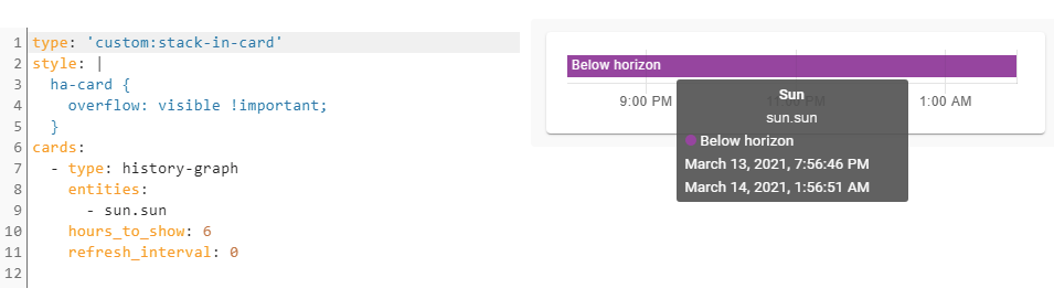
type: 'custom:stack-in-card'
style: |
  ha-card {
    overflow: visible !important;
  }
cards:
  - type: history-graph
    entities:
      - sun.sun
    hours_to_show: 6
    refresh_interval: 0
I described the possible reason & solution in that GitHub issue - hope it will be investigated.
Hi,
Maybe somebody can help with my next question, because I’m lost in space! -)
I am trying to build a lovelace card with buttons who are able to show different other cards below with entities.
My goal is this screenshot example here:

But i’m not able to get this done!
This is my result at the moment:

Everything on my card is horizontal!
And I want the cards with my entities results lower, like in the example.
And I’m also not able to find a option to customize my font size in my buttons!
Also it would be nice to have my selected button in a kind of highlighted state!
type: 'custom:stack-in-card'
mode: horizontal
cards:
  - type: 'custom:button-card'
    name: Woonkamer
    icon: 'hass:sofa'
    tap_action:
      action: navigate
      navigation_path: '#p1'
  - type: 'custom:button-card'
    name: Slaapkamer Ouders
    icon: 'hass:bed'
    tap_action:
      action: navigate
      navigation_path: '#p2'
  - type: 'custom:button-card'
    name: Slaapkamer Lukas
    icon: 'hass:bed'
    tap_action:
      action: navigate
      navigation_path: '#p3'
  - type: 'custom:button-card'
    name: Slaapkamer Jasper
    icon: 'hass:bed'
    tap_action:
      action: navigate
      navigation_path: '#p4'
  - type: 'custom:state-switch'
    entity: hash
    default: p1
    states:
      p1:
        type: horizontal-stack
        cards:
          - type: sensor
            entity: sensor.netatmo_kerkstraat_10_woonkamer_temperature
            graph: line
            name: Temperatuur
          - type: sensor
            graph: line
            entity: sensor.netatmo_kerkstraat_10_woonkamer_humidity
            name: Luchtvochtigheid
          - type: sensor
            graph: line
            entity: sensor.netatmo_kerkstraat_10_woonkamer_co2
            name: Co2
      p2:
        type: horizontal-stack
        cards:
          - type: sensor
            entity: sensor.slaapkamer_ouders
            naam: Temperatuur
          - type: sensor
            graph: line
            entity: sensor.netatmo_kerkstraat_10_woonkamer_slaapkamer_ouders_humidity
            name: Luchtvochtigheid
          - type: sensor
            graph: line
            entity: sensor.netatmo_kerkstraat_10_woonkamer_slaapkamer_ouders_co2
            name: Co2
      p3:
        type: horizontal-stack
        cards:
          - type: sensor
            entity: sensor.netatmo_kerkstraat_10_woonkamer_slaapkamer_lukas_temperature
            naam: Temperatuur
          - type: sensor
            graph: line
            entity: sensor.netatmo_kerkstraat_10_woonkamer_slaapkamer_lukas_humidity
            name: Luchtvochtigheid
          - type: sensor
            graph: line
            entity: sensor.netatmo_kerkstraat_10_woonkamer_slaapkamer_lukas_co2
            name: Co2
      p4:
        type: horizontal-stack
        cards:
          - type: sensor
            entity: sensor.slaapkamer_jasper
            name: Temperatuur
Thx,
JurgenWhat do you expect if you use mode: horizontal?
You have the stack-in-card as the main card and you use mode:horizontal. That means that ALL cards inside that stack will be displayed horizontal. You have to put the main card as vertical an inside that card, all horizontal-stacks. So you get:
STACK-IN-CARD VERTICAL
  - HORIZONTAL-STACK
  - HORIZONTAL-STACK
  - HORIZONTAL-STACK
  - HORIZONTAL-STACK
This translates in multiple horizontal stacks in a vertical stack. So exactly like the first picture. Also, you don’t really need stack-in-card for this, unless you need the extra options or you’re trying to place it inside a different card, like picture-elements. You can just use vertical-stack card (like you use horizontal-stack).