I completely agree that the Energy view is something special.
But, it lacks some features that this card has
Do you think I can configure the card in a way as described in point #1? I think it could be useful to many other usages, too.
And about point #3? Am I doing something wrong?
I assume point #4 is the one where the Energy card is special, and so that won’t be possible. Correct?
That’s is not something that needs to be fixed, that’s the way it works. I learned that the hard way, just like you.
That behavior is because you didn’t chose a reset period for the utility meter, or you chose a reset period that you happen to dislike right now (that happened to me, too).
Search for the bad utility_meter: in the /homeassistant/.storage/core.config_entries file, then change its cycle attribute to daily, save the file, then restart Home Assistant. I personally did it to change one utility_meter from daily to hourly.
It would be wonderful if we could change this from the GUI, but I understand that is a somewhat intrusive action.
No, that’s not supported by the card at this point.
I tend to agree with you. Please feel free to open a feature request on the Github repo. No promises on an ETA though. I’m planning a new release with some FRs and general improvements still this month, but since I unfortunately have very little time to spend on this card lately, I have to prioritize.
Kinda, but it’s mostly my fault for not documenting this. Some of these are supported, some are not (y and W, for example). I really need to find the time to update the readme on that one (and others).
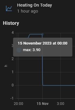
As you can see on midnight previous day’s max is retained. Issue been raised many times on HA GitHub, it goes stale and get auto-closed.
This custom card bypasses the issue which is amazing. I was hoping that csv exports data processed for the chart, but as Alex pointed out it’s just raw data export.
Hi, I’m using this custom card and in a timeline graph I’m trying to color the battery line based on state (red <= 30, 30 < yellow <= 60, green > 60) but I don’t find out how to do this, can anyone help me please?
I hope you’ll find the time for documenting or finishing the time options!
I’m a programmer, and I may find the time to open a PR for the FR or for the time options, who knows. First of all, I’ll need to learn how to generate the final .js
Yes issue persist and as I’ve mentioned it’s the way HA calculate statistical data. I’ve used export CSV tool and we can see sensor data is correct, but statics max value is broken
Another question, now in the timeline graph I have the right colors but inside is written “high” or “medium” or “low”, is it possible to show the state of the battery instead of those names?
With your range requirements, you forced the actual battery level into one of three range categories. You cannot go backwards and get the actual battery state from that. That wouldn’t make sense since it varies within a given range, you cannot have a state within a state. What you can do is use different state names for the low, medium, high, those were just examples.
Hi
I just discovered this card and I was wondering if it was possible to merge on the same graph 2 different entities with different 2 units using 2 different Y axis (left and right)?
Old history is old history, it won’t change. “enable history panel” only changes in pop-up history - when you clilck on entity, on card…
If you want to use new history as it was in old one, then create a new dashboard, type is " 1 panel" and with only one card: this new history card.
my dashboard for new history has this card:
type: custom:history-explorer-card
cardName: historycard-85859299
uimode: dark
combineSameUnits: false
recordedEntitiesOnly: true
defaultTimeRange: 1h
lineMode: stepped
showUnavailable: true
infoPanel:
  uimode: dark
uiColors:
  labels: white
Then you ignore (or hide) existing history panel and use a new one.
This is mostly a FR release, implementing a number of feature requests you guys posted on github. There’s some nice stuff in there to make the card more intuitive and useful !
Stacked bar charts
Bar charts with multiple entities can now be stacked rather than shown side by side. Use the stacked setting, as described here.
Interactive cursor
A vertical cursor line can now be added:
The cursor will follow your mouse position on either only the graph currently under the mouse pointer, or as a common line over all graphs in the card. You can also select on what types of graphs (line, timeline, etc) the cursor appears.
cursor:
  mode: auto   # show cursor automatically on the current graph
  mode: all    # show cursor across all graphs of the card
  mode: hide   # don't use a cursor
Use the types setting to choose which graph types will trigger the cursor when hovering over them. By default only the timeline type shows a cursor (I think this one makes the most sense). You can add other types or all types:
cursor:
  types:
    - line
    - timeline
   # etc
    - all    # or you can use this to add all graph types at once
By default the cursor color is the same as the grid lines color. You can configure it separately if you want:
uiColors:
  cursorline: '#FF00008F'
Misc
Numbers exported in a CSV can now be optionally formatted according to a locale (numberLocale). See here for an example.
A default line width setting was added: lineWidth
Added year time offsets, both relative (y) and current year snapped ones (Y). See here.
The readme is becoming an unmanageable monster. Organizing documentation is not one of my strong points. And this card has a lot of options… If someone knows this card well and wants to take a shot at reorganizing the readme into something a little more readable, I’ll gladly take a PR for it. Not actually rewriting the thing, but making a TOC, reorganizing the headers in a logical order, maybe adding a YAML setting summary.
Oh and some nice dark mode screenshots would be awesome too
type: custom:history-explorer-card
defaultTimeRange: 1o
csv:
  statisticsPeriod: day
graphs:
  - type: bar
    options:
      interval: daily
    entities:
      - entity: sensor.octopus_energy_gas
It looks like data is there and correct, but chart looks all wonky. Not sure what I’m missing.
If I change to line it seems to work correctly, but it’s hard to read and would really like consumption be represented by bars.
Thank you!