Thanks for the card. I have updated the example to suite my CyberPower UPS running on Nut.
id: server_ups
type: custom:config-template-card
variables:
- states['sensor.server_ups_status'].state
- states['sensor.server_ups_battery_charge'].state
- states['sensor.server_ups_load'].state
- states['sensor.server_ups_input_voltage'].state
- states['sensor.server_ups_battery_voltage'].state
- states['sensor.server_ups_battery_runtime'].state
entities:
- sensor.server_ups_status
- sensor.server_ups_battery_charge
- sensor.server_ups_load
- sensor.server_ups_input_voltage
- sensor.server_ups_battery_voltage
- sensor.server_ups_battery_runtime
card:
type: entities
show_header_toggle: 'off'
style: |
.card-header {
padding: 0px 0px 0px 0px !important;
}
entities:
- type: section
card_mod:
style: |
.label {
text-align: center !important;
margin-left: 0px !important;
font-size: 17px !important;
}
.divider {
height: 0px !important;
}
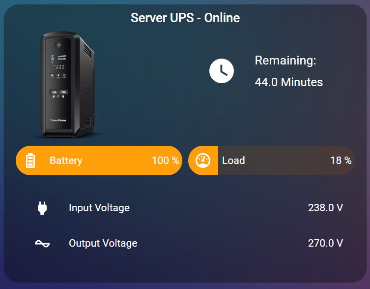
label: ${ 'Server UPS - ' + vars[0] }
- type: custom:hui-element
card_type: vertical-stack
cards:
- type: horizontal-stack
cards:
- type: picture
style: |
ha-card {
--paper-card-background-color: 'rgba(0, 0, 0, 0.0)';
--ha-card-background: "rgba(0, 0, 0, 0.0)";
--ha-card-box-shadow: 'none';
width: 60% !important;
}
image: /local/Pictures/Cyberpower-mini.png
- type: custom:button-card
layout: icon_name_state2nd
show_icon: true
show_label: true
styles:
grid: null
card:
- '--ha-card-background': rgba(0, 0, 0, 0.0)
- '--ha-card-box-shadow': none
icon:
- padding: 10px 0px 0px
- height: 40px
- width: 40px
label:
- padding: 10px 0px 0px
- justify-self: start
- font-family: Roboto, sans-serif
- font-size: 16px
name:
- padding: 20px 0px 0px
- justify-self: start
label: ${ (Number(vars[5])/60).toFixed(1) + ' Minutes' }
name: 'Remaining:'
tap_action:
action: none
hold_action:
action: none
double_tap_action:
action: none
icon: mdi:clock
- type: horizontal-stack
cards:
- type: custom:bar-card
show_icon: true
align: split
columns: 1
max: 100
positions:
icon: inside
indicator: inside
name: inside
value: inside
unit_of_measurement: '%'
severity:
- value: 50
color: '#3498db'
- value: 75
color: '#f39c12'
- value: 100
color: '#e45e65'
style: |
ha-card {
--paper-card-background-color: 'rgba(0, 0, 0, 0.0)';
--ha-card-background: "rgba(0, 0, 0, 0.0)";
--paper-item-icon-color: 'var(--text-primary-color)';
--ha-card-box-shadow: 'none';
}
bar-card-name {
margin-left: -10px;
}
entity: sensor.server_ups_battery_charge
name: Battery
icon: mdi:battery-high
entity_row: true
tap_action:
action: none
hold_action:
action: none
double_tap_action:
action: none
- type: custom:bar-card
show_icon: true
align: split
columns: 1
max: 100
positions:
icon: inside
indicator: inside
name: inside
value: inside
unit_of_measurement: '%'
severity:
- value: 50
color: '#3498db'
- value: 75
color: '#f39c12'
- value: 100
color: '#e45e65'
style: |
ha-card {
--paper-card-background-color: 'rgba(0, 0, 0, 0.0)';
--ha-card-background: "rgba(0, 0, 0, 0.0)";
--paper-item-icon-color: 'var(--text-primary-color)';
--ha-card-box-shadow: 'none';
}
bar-card-name {
margin-left: -10px;
}
entity: sensor.server_ups_load
tap_action:
action: none
hold_action:
action: none
double_tap_action:
action: none
name: ${ 'Load' }
entity_row: true
- type: entities
entities:
- entity: sensor.server_ups_input_voltage
name: Input Voltage
icon: mdi:power-plug
tap_action:
action: none
hold_action:
action: none
double_tap_action:
action: none
- entity: sensor.server_ups_output_voltage
name: Output Voltage
icon: mdi:current-ac
tap_action:
action: none
hold_action:
action: none
double_tap_action:
action: none
style: |
ha-card {
--paper-card-background-color: 'rgba(0, 0, 0, 0.0)';
--ha-card-background: "rgba(0, 0, 0, 0.0)";
--paper-item-icon-color: 'var(--text-primary-color)';
--ha-card-box-shadow: 'none';
}


