UPS System Monitoring Card

Thanks to @petro over at this thread: Nuc System Monitoring Card

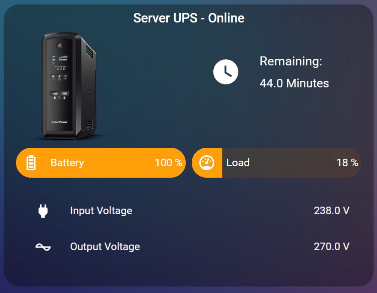
I’ve come up with a UPS Monitoring Card:

UPS

.
.
.
.
.
I have made some optimised code for this card now, I suggest you check new post and use the code there: UPS System Monitoring Card - #33 by liamstears
Code below is for reference only

.
.
.
.
.

Custom cards needed for this to work:
card-mod
config-template-card
button-card
bar-card
hui-element

Will also include my UPS picture:

Card:

id: nuc_status
type: custom:config-template-card
variables:
  - states[''sensor.ups_model''].state
  - states[''sensor.ups_status''].state
  - states[''sensor.ups_battery''].state
  - states[''sensor.ups_load''].state
  - states[''sensor.ups_input_voltage''].state
  - states[''sensor.ups_battery_voltage''].state
entities:
  - sensor.ups_model
  - sensor.ups_status
  - sensor.ups_battery
  - sensor.ups_load
  - sensor.ups_input_voltage
  - sensor.ups_battery_voltage
card:
  type: entities
  show_header_toggle: 'off'
  style: |
    .card-header {
      padding: 0px 0px 0px 0px !important;
    }
  entities:
    - type: section
      style: |
        .label {
          text-align: center !important;
          margin-left: 0px !important;
          font-size: 17px !important;
        }
      label: '${ ''APC --- '' + vars[0] + '' --- '' + vars[1] }'
    - type: custom:hui-element
      card_type: vertical-stack
      cards:
        - type: horizontal-stack
          cards:
            - type: picture
              style: |
                ha-card { 
                    --paper-card-background-color: 'rgba(0, 0, 0, 0.0)';
                    --ha-card-background: "rgba(0, 0, 0, 0.0)";
                    --ha-card-box-shadow: 'none';
                }
              image: /local/images/apc.ups.png
            - type: custom:button-card
              layout: icon_name_state2nd
              show_icon: true
              show_state: true
              styles:
                grid: null
                card:
                  - '--ha-card-background': 'rgba(0, 0, 0, 0.0)'
                  - '--ha-card-box-shadow': none
                icon:
                  - padding: 10px 0px 0px
                  - height: 40px
                  - width: 40px
                state:
                  - padding: 10px 0px 0px
                  - justify-self: start
                  - font-family: 'Roboto, sans-serif'
                  - font-size: 14px
                name:
                  - padding: 20px 0px 0px
                  - justify-self: start
              entity: sensor.ups_time_left
              name: 'Remaining:'
              icon: 'mdi:battery-high'
        - type: horizontal-stack
          cards:
            - type: custom:bar-card
              show_icon: true
              align: split
              columns: 1
              max: 100
              positions:
                icon: inside
                indicator: inside
                name: inside
                value: inside
              unit_of_measurement: '%'
              severity:
                - value: 50
                  color: '#3498db'
                - value: 75
                  color: '#f39c12'
                - value: 100
                  color: '#e45e65'
              style: |
                ha-card { 
                  --paper-card-background-color: 'rgba(0, 0, 0, 0.0)';
                  --ha-card-background: "rgba(0, 0, 0, 0.0)";
                  --paper-item-icon-color: 'var(--text-primary-color)';
                  --ha-card-box-shadow: 'none';
                }
                bar-card-name {
                  margin-left: -10px;
                }
              entity: sensor.ups_battery
              name: Battery
              icon: 'mdi:battery-high'
              entity_row: true
            - type: custom:bar-card
              show_icon: true
              align: split
              columns: 1
              max: 100
              positions:
                icon: inside
                indicator: inside
                name: inside
                value: inside
              unit_of_measurement: '%'
              severity:
                - value: 50
                  color: '#3498db'
                - value: 75
                  color: '#f39c12'
                - value: 100
                  color: '#e45e65'
              style: |
                ha-card { 
                  --paper-card-background-color: 'rgba(0, 0, 0, 0.0)';
                  --ha-card-background: "rgba(0, 0, 0, 0.0)";
                  --paper-item-icon-color: 'var(--text-primary-color)';
                  --ha-card-box-shadow: 'none';
                }
                bar-card-name {
                  margin-left: -10px;
                }
              entity: sensor.ups_load
              name: Load
              entity_row: true
        - type: entities
          entities:
            - entity: sensor.ups_input_voltage
              name: Input Voltage
              icon: 'mdi:power-plug'
            - entity: sensor.ups_battery_voltage
              name: Battery Voltage
              icon: 'mdi:battery-charging-high'
          style: |
            ha-card { 
                --paper-card-background-color: 'rgba(0, 0, 0, 0.0)';
                --ha-card-background: "rgba(0, 0, 0, 0.0)";
                --paper-item-icon-color: 'var(--text-primary-color)';
                --ha-card-box-shadow: 'none';
            }
13 Likes

Thnx, I’m using it now!

I like it. My entities are named a bit different because mine is older (SmartUPS1400). Any idea how to convert battery runtime from seconds to minutes?

You are using config-template-card only to display a name of UPS and it’s current status.
You may just use a markdown card for the title instead.

It is better to convert the card to decluttering-card and then pass your own entities as variables.

Thanks, Followed your example and modify it to match my Ups
image

type: custom:config-template-card
variables:
  - states['sensor.ups_smart_type_1'].state
  - states['sensor.ups_smart_status_1'].state
  - states['sensor.ups_smart_capacity_1'].state
  - states['sensor.ups_smart_load_percentage_1'].state
  - states['sensor.ups_smart_input_voltage_1'].state
entities:
  - sensor.ups_smart_type_1
  - sensor.ups_smart_status_1
  - sensor.ups_smart_capacity_1
  - sensor.ups_smart_load_percentage_1
  - sensor.ups_smart_input_voltage_1
  - sensor.ups_battery_voltage_1
card:
  type: custom:hui-entities-card
  show_header_toggle: 'off'
  entities:
    - type: section
      label: ${ 'APC - ' + vars[0]  }
    - type: custom:hui-vertical-stack-card
      cards:
        - type: horizontal-stack
          cards:
            - type: picture-entity
              entity: sensor.ups_smart_status_1
              name: 'UPS status is:'
              image: /local/pictures/ups750.png
              aspect_ratio: 50%
            - type: button
              layout: icon_name_state2nd
              show_icon: true
              show_state: true
              styles:
                grid:
                  - grid-template-columns: 50px auto
                icon:
                  - padding: 0px 20px
                  - height: 50px
                  - width: 50px
                card:
                  - '--ha-card-background': rgba(0, 0, 0, 0.0)
                  - '--ha-card-box-shadow': none
                state:
                  - padding: 0px 20px
                  - justify-self: start
                  - font-family: Roboto, sans-serif
                  - font-size: 15px
                name:
                  - padding: 0px 10px
                  - justify-self: start
                  - color: var(--secondary-text-color)
              entity: sensor.ups_smart_runtime_remaining_1
              name: Time Remaining
              icon: mdi:clock-outline
              icon_height: 30px
        - type: horizontal-stack
          cards:
            - type: custom:bar-card
              title_position: inside
              show_icon: true
              align: split
              columns: 1
              max: 100
              unit_of_measurement: '%'
              positions:
                icon: inside
                indicator: outside
                minmax: 'off'
                value: inside
              severity:
                - value: 50
                  color: '#3498db'
                - value: 75
                  color: '#f39c12'
                - value: 100
                  color: '#e45e65'
              style: |
                ha-card { 
                 --paper-card-background-color: 'rgba(0, 0, 0, 0.0)';
                 --ha-card-background: "rgba(0, 0, 0, 0.0)";
                 --ha-card-box-shadow: 'none';
                }
                ha-icon {
                 color: white;
                  }

Great addition!

keep up the nice ideas!

Same - using the config-template-card to display ONE state…
And to declare FIVE variables and use only ONE.

Great Idea, can you paste the code :wink:

I just cannot get this card to work :frowning: below is the error I keep getting after refreshing the page. I have all the dependencies installed and it starts working briefly but after a refresh this error occurs.

Did something break in the latest build?

1 Like

Having the same issue, the card works after adding it, but then after refreshing the page I get Custom element doesn't exist: hui-vertical-stack-card.. I haven’t found any workaround yet, this happened right after updating to the latest core build (Home Assistant Core 2022.5.5).

Update: So after diving deeper into the issue, I’ve figured out that the code should be changed from:

    - type: custom:hui-vertical-stack-card

to:

    - type: custom:hui-element
      card_type: vertical-stack

I hope, this will be helpful.

Thank you for taking the time to look at this, it was on my list of things to do but just hadn’t got around to it, have fixed the op and updated it so hopefully everyone else can get this working too, thanks again

1 Like

Thanks for the card. I have updated the example to suite my CyberPower UPS running on Nut.

id: server_ups
type: custom:config-template-card
variables:
  - states['sensor.server_ups_status'].state
  - states['sensor.server_ups_battery_charge'].state
  - states['sensor.server_ups_load'].state
  - states['sensor.server_ups_input_voltage'].state
  - states['sensor.server_ups_battery_voltage'].state
  - states['sensor.server_ups_battery_runtime'].state
entities:
  - sensor.server_ups_status
  - sensor.server_ups_battery_charge
  - sensor.server_ups_load
  - sensor.server_ups_input_voltage
  - sensor.server_ups_battery_voltage
  - sensor.server_ups_battery_runtime
card:
  type: entities
  show_header_toggle: 'off'
  style: |
    .card-header {
      padding: 0px 0px 0px 0px !important;
    }
  entities:
    - type: section
      card_mod:
        style: |
          .label {
            text-align: center !important;
            margin-left: 0px !important;
            font-size: 17px !important;
          }
          .divider {
              height: 0px !important;
          }
      label: ${ 'Server UPS - ' + vars[0] }
    - type: custom:hui-element
      card_type: vertical-stack
      cards:
        - type: horizontal-stack
          cards:
            - type: picture
              style: |
                ha-card { 
                    --paper-card-background-color: 'rgba(0, 0, 0, 0.0)';
                    --ha-card-background: "rgba(0, 0, 0, 0.0)";
                    --ha-card-box-shadow: 'none';
                    width: 60% !important;
                }
              image: /local/Pictures/Cyberpower-mini.png
            - type: custom:button-card
              layout: icon_name_state2nd
              show_icon: true
              show_label: true
              styles:
                grid: null
                card:
                  - '--ha-card-background': rgba(0, 0, 0, 0.0)
                  - '--ha-card-box-shadow': none
                icon:
                  - padding: 10px 0px 0px
                  - height: 40px
                  - width: 40px
                label:
                  - padding: 10px 0px 0px
                  - justify-self: start
                  - font-family: Roboto, sans-serif
                  - font-size: 16px
                name:
                  - padding: 20px 0px 0px
                  - justify-self: start
              label: ${ (Number(vars[5])/60).toFixed(1) + ' Minutes' }
              name: 'Remaining:'
              tap_action:
                action: none
              hold_action:
                action: none
              double_tap_action:
                action: none
              icon: mdi:clock
        - type: horizontal-stack
          cards:
            - type: custom:bar-card
              show_icon: true
              align: split
              columns: 1
              max: 100
              positions:
                icon: inside
                indicator: inside
                name: inside
                value: inside
              unit_of_measurement: '%'
              severity:
                - value: 50
                  color: '#3498db'
                - value: 75
                  color: '#f39c12'
                - value: 100
                  color: '#e45e65'
              style: |
                ha-card { 
                  --paper-card-background-color: 'rgba(0, 0, 0, 0.0)';
                  --ha-card-background: "rgba(0, 0, 0, 0.0)";
                  --paper-item-icon-color: 'var(--text-primary-color)';
                  --ha-card-box-shadow: 'none';
                }
                bar-card-name {
                  margin-left: -10px;
                }
              entity: sensor.server_ups_battery_charge
              name: Battery
              icon: mdi:battery-high
              entity_row: true
              tap_action:
                action: none
              hold_action:
                action: none
              double_tap_action:
                action: none
            - type: custom:bar-card
              show_icon: true
              align: split
              columns: 1
              max: 100
              positions:
                icon: inside
                indicator: inside
                name: inside
                value: inside
              unit_of_measurement: '%'
              severity:
                - value: 50
                  color: '#3498db'
                - value: 75
                  color: '#f39c12'
                - value: 100
                  color: '#e45e65'
              style: |
                ha-card { 
                  --paper-card-background-color: 'rgba(0, 0, 0, 0.0)';
                  --ha-card-background: "rgba(0, 0, 0, 0.0)";
                  --paper-item-icon-color: 'var(--text-primary-color)';
                  --ha-card-box-shadow: 'none';
                }
                bar-card-name {
                  margin-left: -10px;
                }
              entity: sensor.server_ups_load
              tap_action:
                action: none
              hold_action:
                action: none
              double_tap_action:
                action: none
              name: ${ 'Load' }
              entity_row: true
        - type: entities
          entities:
            - entity: sensor.server_ups_input_voltage
              name: Input Voltage
              icon: mdi:power-plug
              tap_action:
                action: none
              hold_action:
                action: none
              double_tap_action:
                action: none
            - entity: sensor.server_ups_output_voltage
              name: Output Voltage
              icon: mdi:current-ac
              tap_action:
                action: none
              hold_action:
                action: none
              double_tap_action:
                action: none
          style: |
            ha-card { 
                --paper-card-background-color: 'rgba(0, 0, 0, 0.0)';
                --ha-card-background: "rgba(0, 0, 0, 0.0)";
                --paper-item-icon-color: 'var(--text-primary-color)';
                --ha-card-box-shadow: 'none';
            }
1 Like

Just “name: Load

Guys, you keep using this code w/o bothering to fix it…

The code is, let’s say, not optimal:

  1. You are using only ONE var for a label - no need to declare other FOUR vars.
  2. Moreover - there is no need to place the WHOLE card into config-template-card - place only ONE row with a label.

@Ildar_Gabdullin Thank you for the feedback. I will fix up the code.

Also, this code is USELESS:

  style: |
    .card-header {
      padding: 0px 0px 0px 0px !important;
    }

since the card does not have a header.

Probably, someone took a whole code from a place where this code has a meaning.
Then this code was truncated, became full of some useless stuff and then started been using by other people…

Use a row” option instead of “card” for the “section” element only.
Or just use a markdown card instead of config-template-card.

There is no need to wrap custom:button-card into custom:config-template-card !!!
The button-card does support templates as you know.
Probably you need to look at the decluttering-card if you want to write a code abstract to a particular sensor’s name.

Guys this card was originally written by someone else a long time ago for earlier versions of home assistant and was quickly modified to make it functional only. In no way have I ever said the code for this card is optimal but it works so it’s been left as is. To be honest all my home assistant could prob do with code rewrites but I haven’t the time to spend “fixing” something that already just works so that is why it is how it is. If someone here has the time to rewrite it to optimise it and make it current please go ahead and do so and I’ll update the op, it would be greatly appreciated I just don’t have the time to do it myself and I’ll only look at it if a home assistant update breaks it…

OK, I will try to rewrite it then.
It will be just a “skeleton” code so it could be upgraded if required.


Here is my test example.
I took as an initial example a card which contains a graph.
The result card looks a bit differently than cards described above - but this may be tuned up by card-mod (colors, text-align, font-size, paddings. border-radius etc). The main point is a general idea - how to compose a card, additional styling is a secondary point.

Imho the most proper way is - place all cards in a stack w/o using hacks like “hui-element” card:

type: custom:stack-in-card
keep:
  outer_padding: true
cards:
  - type: markdown
    content: |
      APC --- {{states('sensor.ups_model')}} --- {{states('sensor.ups_status')}}
    card_mod:
      style: |
        ha-card {
          color: var(--mdc-theme-primary);
        }
  - type: horizontal-stack
    cards:
      - type: picture
        image: /local/images/devices/ups_sua1500i.png
      - type: custom:button-card
        entity: sensor.ups_time_left
        name: 'Remaining:'
        icon: mdi:battery-high
        layout: icon_name_state2nd
        show_icon: true
        show_state: true
  - type: custom:bar-card
    columns: 2
    entity_row: true
    positions:
      icon: inside
      indicator: 'off'
      name: inside
      value: inside
    entities:
      - entity: sensor.ups_battery
        name: Battery
        icon: mdi:battery-high
        unit_of_measurement: '%'
        severity:
          - from: 0
            to: 33
            color: red
          - from: 34
            to: 66
            color: orange
          - from: 67
            to: 100
            color: green
      - entity: sensor.ups_load
        name: Load
        icon: mdi:gauge
        unit_of_measurement: '%'
        severity:
          - from: 0
            to: 33
            color: green
          - from: 34
            to: 66
            color: orange
          - from: 67
            to: 100
            color: red
    card_mod:
      style: |
        ha-card { 
          --paper-item-icon-color: var(--primary-text-color);
        }
  - type: entities
    entities:
      - entity: sensor.ups_input_voltage
        name: Input Voltage
        icon: mdi:power-plug
      - entity: sensor.ups_battery_voltage
        name: Battery Voltage
        icon: mdi:battery-charging-high
      - type: section
  - type: custom:mini-graph-card
    entities:
      - entity: sensor.ups_input_voltage
    name: Input Voltage last 7 days
    hours_to_show: 0.15
    points_per_hour: 240
    aggregate_func: last
    smoothing: false
    line_width: 1
    lower_bound: ~0
    show:
      extrema: true
      labels: true
      fill: fade
      points: false
      icon: true
      state: false

Here there is no “config-template-card” since the “markdown” card (the only one which is supposed to show states as text labels) supports templates. Also, the “button-card” used for “remaining time” may be also used with a template.
For the graph - use your own “hours_to_show” & “points_per_hour”. Also, you may want to remove “lower_bound” if you are interested to see small deviations.
Icons & UoMs may be parts of sensors - so probably there is no need to specify them in the code (as long as you do not convert values to smth else).

Alternatively (especially if you dislike “stack-in-card”) - place everything inside Entities card and use “custom:hui-element” for the “markdown” & “horizontal-stack” cards.
Here the “Input Voltage” & “Battery Voltage” are placed into the “internal” Entities card (which gives additional paddings; the card is inserted by using “custom:hui-element”); alternatively they may be placed in the same Entities card - then those paddings may be added by card-mod.

type: entities
card_mod:
  style: |
    ha-card {
      --ha-card-box-shadow: none;
    }
entities:
  - type: custom:hui-element
    card_type: markdown
    content: |
      APC --- {{states('sensor.ups_model')}} --- {{states('sensor.ups_status')}}
    card_mod:
      style: |
        ha-card {
          color: var(--mdc-theme-primary);
        }
  - type: custom:hui-element
    card_type: horizontal-stack
    cards:
      - type: picture
        image: /local/images/devices/ups_sua1500i.png
      - type: custom:button-card
        entity: sensor.ups_time_left
        name: 'Remaining:'
        icon: mdi:battery-high
        layout: icon_name_state2nd
        show_icon: true
        show_state: true
  - type: custom:bar-card
    columns: 2
    entity_row: true
    positions:
      icon: inside
      indicator: 'off'
      name: inside
      value: inside
    entities:
      - entity: sensor.ups_battery
        name: Battery
        icon: mdi:battery-high
        unit_of_measurement: '%'
        severity:
          - from: 0
            to: 33
            color: red
          - from: 34
            to: 66
            color: orange
          - from: 67
            to: 100
            color: green
      - entity: sensor.ups_load
        name: Load
        icon: mdi:gauge
        unit_of_measurement: '%'
        severity:
          - from: 0
            to: 33
            color: green
          - from: 34
            to: 66
            color: orange
          - from: 67
            to: 100
            color: red
    card_mod:
      style: |
        ha-card { 
          --paper-item-icon-color: var(--primary-text-color);
        }
  - type: custom:hui-element
    card_type: entities
    entities:
      - entity: sensor.ups_input_voltage
        name: Input Voltage
        icon: mdi:power-plug
      - entity: sensor.ups_battery_voltage
        name: Battery Voltage
        icon: mdi:battery-charging-high
  - type: section
  - type: custom:mini-graph-card
    entities:
      - entity: sensor.ups_input_voltage
    name: Input Voltage last 7 days
    hours_to_show: 0.15
    points_per_hour: 240
    aggregate_func: last
    smoothing: false
    line_width: 1
    lower_bound: ~0
    show:
      extrema: true
      labels: true
      fill: fade
      points: false
      icon: true
      state: false

The card has a bit different view because paddings are different. This may be tuned up by card-mod.

P.S. Do not have a card for UPS in my HA setup since my SMT1500i, SMT750i cannot be integrated with HA. So, cannot share my own experience.
P.P.S. Found a typo in my test code - it should be “SMT1500i” instead of “SUA1500i”, these are different models (btw, SUA may be integrated with HA).

3 Likes

Hi @Ildar_Gabdullin I am trying to use this card. I have managed to set up NUT addon and integration for APC UPS Pro 900 since APC integration was not working (APC is connected with usb directly to NUC) but this integration does not have sensor.ups_time_left sensor. Is there a way how to set it up?

Hi, cannot help you, sorry.
I only proposed a card with assumption that these sensors are available.
I myself do not have UPS integrated since my SMT1500i & SMT750i do not seem to be supported ((((.

1 Like

My simple UPS monitoring card
image

Requires:

type: custom:stack-in-card
title: ''
mode: vertical
cards:
  - type: picture-elements
    elements:
      - type: conditional
        style:
          display: inline
          position: absolute
          transform: translate(0%, 0%)
          width: 100%
          top: 4%
          left: 2%
          bottom: 4%
          font-size: clamp(.75rem, 1.2vh, 2vh)
          overflow: hidden
          padding-right: 2%
        conditions:
          - entity: sensor.smt1500_1_status
            state_not: '0'
        elements:
          - type: image
            entity: sensor.smt1500_1_status
            title: SMT1500-1
            image: /local/lovelace/1500.png
            style:
              transform: translate(0%, 0%)
              width: 22%
              border-radius: .0%
              top: 5%
          - type: state-label
            entity: sensor.smt1500_1_status
            prefix: 'SMT1500-1: '
            style:
              transform: translate(0%, 0%)
              top: 0%
              left: 22%
              font-weight: bold
              width: 75%
              overflow: hidden
              margin-left: 15px
              margin-bottom: 10px
          - type: state-label
            entity: sensor.smt1500_1_battery_runtime
            prefix: 'Runtime: '
            style:
              transform: translate(0%, 0%)
              top: 20%
              left: 60%
              width: 36%
              overflow: hidden
              margin-left: 15px
              margin-bottom: 10px
          - type: state-label
            entity: sensor.smt1500_1_input_voltage
            prefix: 'Input: '
            style:
              transform: translate(0%, 0%)
              top: 40%
              left: 60%
              width: 36%
              overflow: hidden
              margin-left: 15px
              margin-bottom: 10px
          - type: state-label
            entity: sensor.smt1500_1_battery_charge
            prefix: 'Battery: '
            style:
              transform: translate(0%, 0%)
              top: 20%
              left: 22%
              width: 36%
              overflow: hidden
              margin-left: 15px
              margin-bottom: 10px
          - type: state-label
            entity: sensor.smt1500_1_load
            prefix: 'Load: '
            style:
              transform: translate(0%, 0%)
              top: 40%
              left: 22%
              width: 36%
              overflow: hidden
              margin-left: 15px
              margin-bottom: 10px
          - type: state-label
            entity: sensor.smt1500_1_self_test_result
            prefix: 'Test: '
            style:
              transform: translate(0%, 0%)
              top: 60%
              left: 60%
              width: 36%
              overflow: hidden
              margin-left: 15px
              margin-bottom: 10px
          - type: state-label
            entity: sensor.smt1500_1_ups_temperature
            prefix: 'Temp: '
            style:
              transform: translate(0%, 0%)
              top: 60%
              left: 22%
              width: 36%
              overflow: hidden
              margin-left: 15px
              margin-bottom: 10px
          - type: state-label
            entity: sensor.smt1500_1_energy_raw
            prefix: 'Energy use: '
            style:
              transform: translate(0%, 0%)
              top: 80%
              left: 22%
              width: 36%
              overflow: hidden
              margin-left: 15px
              margin-bottom: 10px
    image: /local/lovelace/smallcard.png
    aspect_ratio: 36%