Use battery icon from the HA app battery sensor on a custom button card?

I am trying to create a nice person card with the custom button cards, a bit into this direction:
grafik

Now my question:
The battery level sensor from the HA app does already nicely provide a variable battery icon, depending on the battery level:

How can I use this icon attribute and place it anywhere on my button? A return statement for the icon itself does not seem to be supported, and if I use the following code then it just displays the name on my button → “icon: mdi:battery-80”

custom_fields:
  battery_icon: |
      [[[ return states['sensor.fliphone_battery'].attributes.icon ]]]

So far I have just seen solutions where this was manually build, with ten different if statements to pick the right battery icon. That is also how the guy from the example picture above did it. But if that logic is already build into home assistant, it would be nicer to just use that.

You might play around with this:


  [[[
    var i = states['sensor.fliphone_battery_level'].attributes.icon;
    var b = states['sensor.fliphone_battery_level'].state;
    return `<ha-icon icon='${i}' style='width: 18px; vertical-align: 3px'></ha-icon>${b}%`
  ]]]

3 Likes

Have you looked at the yaml the guy who setup that picture wrote?

They round the batter percentage and then use that to change the icon.

Awesome, that works! Thanks for this, I was not smart enough for that (and still do not understand that fully, but the result is fine :-))

@devilclarke: Right, this guy had 10 if statements and selected a different battery icon for each. The above code prevents that and just uses the standard functionality.

1 Like

Don’t worry about it, it’s just a matter of practice.

The variables i and b shortens the result line, so all stays clearer. The result line is HTML rendered, see here: https://github.com/custom-cards/button-card#javascript-templates.

To make the battery status update faster, you should add triggers_update: all : https://github.com/custom-cards/button-card#triggers_update

1 Like

Cool, now this is getting where I want to:
grafik

The apple watch battery information from icloud3 does unfortunately so far not have a dynamic battery icon, so still need to improve that, but overall I am already quite happy with that.
I see that my HTML/CSS/Javascript knowledge is too low, I stopped actively using that when you were still building weg pages with HTML table structures :wink:

The only change i would add would be to add this so you get the charging icon back to.

if (states['sensor.fliphone_battery_state'].state == "charging")
        i = i .replace("battery", "battery-charging");

This is actually also included in the standard icon that HA switches automatically, so it already works without :slight_smile:

Interesting, that dosnt work for my S10.

@pigeldi Do you mind sharing the full configuration of your card? I’m also trying to accomplish something similar. Thanks in advance.

For sure, I could also only compile that with other different examples and the help here.
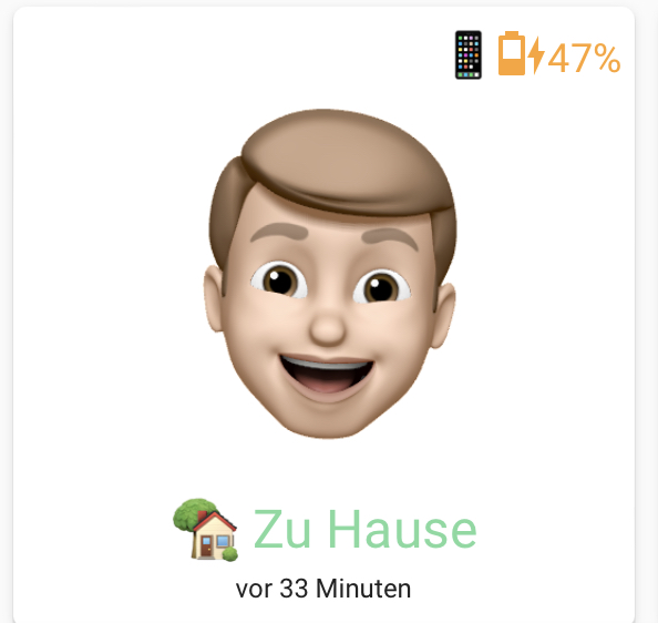
I am still working on further improvements, so this is not the end, but this achieves what you see in the last screenshot (yesterday I have added the distance and time to home to be only shown if above 0, those sensors require icloud3 to be available).

type: custom:button-card
aspect_ratio: 1/1
custom_fields:
  battery: |
    [[[
      var i = states['sensor.fliphone_battery_level'].attributes.icon;
      var b = states['sensor.fliphone_battery_level'].state;
      return `<span style='vertical-align: 1px'>📱</span><ha-icon icon='${i}' style='width: 16px; vertical-align:2px'></ha-icon>${b}%`
    ]]] 
  distance: |
    [[[
      if (states['sensor.fliphone_calc_distance'].state == 0)
      return ""
      else return `<ha-icon
          icon="mdi:map-marker-distance"
          style="width: 16px; height: 16px; vertical-align: 1px">
          </ha-icon>${
        states['sensor.fliphone_calc_distance'].state
      }`
    ]]]
  traveltime: |
    [[[
      if (states['sensor.fliphone_travel_time'].state == 0)
      return ""
      else return `<ha-icon
          icon="mdi:timelapse"
          style="width: 16px; height: 16px; vertical-align: 1px">
          </ha-icon>${
        states['sensor.fliphone_travel_time'].state
      }`
    ]]]
entity: person.myself
show_entity_picture: true
entity_picture: /local/img/myself.png
show_name: true
show_last_changed: true
triggers_update: all
state:
  - name: 🏡 Zu Hause
    styles:
      name:
        - color: '#7DDA9F'
    value: home
  - name: 🏃‍♂️ Unterwegs
    styles:
      name:
        - color: '#93ADCB'
    value: not_home
  - styles:
      name:
        - color: gray
    value: unknown
styles:
  name:
    - font-size: 16px
  label:
    - font-size: 8px
  custom_fields:
    distance:
      - position: absolute
      - left: 2%
      - top: 2%
      - font-size: 12px
    traveltime:
      - position: absolute
      - left: 15%
      - top: 2%
      - font-size: 12px
    battery:
      - align-self: right
      - position: absolute
      - right: 2%
      - top: 2%
      - font-size: 12px
      - color: >-
          [[[ if (states["sensor.fliphone_battery_level"].state < 30) return
          "#e45649"; if (states["sensor.fliphone_battery_level"].state < 50)
          return "#ffa229"; if (states["sensor.fliphone_battery_level"].state <
          101) return "#50A14F"; else return "#ffc640"]]]
  icon:
    - width: 80%
    - position: absolute
    - top: 1%
4 Likes

Thanks alot. I got most of it working. I’m also using the memoji avatar created with an iPhone but I saved it as a moving .gif I have different .gifs for different states/locations.

Sounds cool. Simply putting a gif instead of my png would also show that animated?
How did you create this gif and what is there animated? Recording the screen while using the face capture of the iOS emoji?

Yes, just a .gif instead of .png.
You can create the Memoji and hit record in the Messages app on iPhone X or later while doing facial expressions. I recorded a standard Memoji and one with working clothes on. Also two for my girlfriend. So whenever we’re at work it shows a different Memoji.

1 Like

I recorded a video and used the Shortcuts app to convert this to a gif. When using this in Home Assistant, it indeed shows as animated gif, but with a black rectangle, no transparency around the head. Is that just not visible for you as you are using a dark theme, or is there a smart way to have a animated gif with transparent background? The initial video before conversion seems to be transparent.

Independently of animation I also like your idea to use different images dependent on the location.

It’s been a long time ago I created those .gifs, but indeed I think I deleted the background in some way. Probably with this kind of online tool:
Remove the Background from a GIF – Online GIF Tools.

Ok thanks, than it was not just me being to dumb.
The tool you mentioned did not work, as it also made the black in the eye transparent, but this one here successfully just removed the black around the head, looks cool!

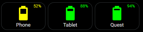
I just wanted to thank you for posting your code. I had some custom:button-cards that show battery levels of a couple of my devices. I wanted to add the battery percentage shown in the corner of the card. I was a bit overwhelmed with trying to understand how to make it happen. I took your code, ripped out what I needed, and adapted it for my use. I even managed to incorporate a few things that you might find useful.

    - type: custom:button-card
      template: battery_custom_button
      entity: sensor.s20_battery_level
      name: Phone

In the raw configuration editor, I have two templates (a general template that gets used on all my custom-buttons and another that is specific for the battery cards):

  battery_custom_button:
    template: generic_custom_button
    entity: sensor.fire_10_battery_level
    name: Tablet
    tap_action:
      action: none
    variables:
      var_color: |-
        [[[ 
          var battery_level=entity.state;
          if (battery_level > 70) return 'lime';
          else if (battery_level >= 30) return 'yellow';
          else return 'red';
        ]]]
    custom_fields:
      battery_percentage: |
        [[[ return `${entity.state}%` ]]] 
    styles:
      icon:
        - color: '[[[ return variables.var_color ]]]'
        - animation: |
            [[[ if (entity.state <= 10 ) return 'blink 2s ease infinite'; ]]]
      custom_fields:
        battery_percentage:
          - align-self: right
          - position: absolute
          - right: 9%
          - top: 3%
          - font-size: 14px
          - color: '[[[ return variables.var_color ]]]'
  generic_custom_button:
    show_icon: true
    show_name: true
    show_state: false
    triggers_update: all
    styles:
      card:
        - background-color: rgba(0, 0, 0, 0)
        - '--ha-card-box-shadow': none
        - border-radius: 20px
        - '--mdc-ripple-color': white
        - '--mdc-ripple-press-opacity': 1.5
    card_mod:
      style: |
        ha-card {
          border: solid 1px var(--primary-text-color);
        }
    tap_action:
      action: toggle
    hold_action:
      action: more-info
    double_tap_action:
      action: none

Using this method, I can easily replicate the card for use with different devices all while cutting down on the number of lines needed to make them work. The code also uses the entity defined within the card rather than hard-coding each one. Color of the icon and the battery percentage is handled with a variable that cuts down on duplicate lines of code. Also, if the battery percentage is 10% or lower, the icon will flash.
image
Again, that’s for sharing. This gives me a better understanding of what I can accomplish.

1 Like

Can you for us noobies please tell us where those templates should be put in?

Hi, can we add wifi info to this? I tried to do it but it didn’t work.
:neutral_face: :thinking: