Could we have a proper definition of all color variables, without trying to decode the source code? Could we have color variables not to be reused for various UI elements, that create undesirable resuls (like recent change to use divider-color for divider row, that forces to use the same color for separation of main UI major elements).
I gave up on custom theming after being blown out of the water after every update. As far as I could find, none of the color element changes were documented as “breaking changes” even though several of them left the UI unusable.
1 Like
So perhaps we finally can get this fixed and working as expected? This is, as I understand, purpose of What the heck initiative 
I think a lot of people might agree with this WTH… but could I suggest you alter the title?
I think it should be sometimes like WTH: theming items change without notice and aren’t documented
I think the current title is misleading… changes are to be expected at this stage. But document the changes, and have a list of what’s valid.
2 Likes
100% agree with Marc. As we continue to modify the frontend things are going to change. We need to do a better job at notifying users of breaking changes in the Themes
2 Likes
Done, title changed
1 Like
Actually I had just recently noticed that all of my dividers seemed to be gone and couldn’t figure out why.
Is there any way to work around this?
Where is the divider row color defined?
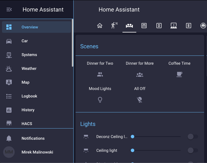
It is divider-color now. Be careful though, this is the same color that is used for separation of main interface sections (main menu, top bar, user element in lower left corner, etc), so changing it might create some undesired side effect (see my post: 0.114: Dark mode, Open Z-Wave progress and more automation & scripts).
1 Like
Right, I saw that and I also saw that in my own config when I changed it in my theme.
Do you know of any way to get the old functionality back?
Do you know where the new color is defined for the divider? IOW, how does the divider know to use divider-color instead of some other variable?
Well, probably something changed in source code… sort of sorce code cleanup?
I’m now considering to switch to text-divider-row to separate this from what was done in 0.114. I modified the code to narrow top and bottom margins and to get rif of bold text and actulally it fits quite well my needs…
You can set a theme per card or panel with just the divider color, that way the divider color would only be set for that card or lovelace panel and not for the rest of the UI.
Yes, but again why should I change this manually for 30+ entities, while previous theme variable was working perfectly and was changed for no reason?
I’d use this functionaly on exception basis rather, if I need to change just few of dividers to other color…
It probably wasn’t changed for no reason, as nothing is changed without a reason.
It was changed to make the new dark mode work properly, and was not expected to be a major issue, but to add more consistency throughout our theme system.
I’m actually curious what the before and after for you theme was, and why this caused an issue for you.
I’m happy to add a specific theme variable for this if the use case is right.
OK, not really 1 to 1 match, since I already make some work compensating for this change and replaced standard divider with text-divider-row, but here are the screenshots, that might show why I do not like this change. The first one more less resembling my original theme (though with replaced divider):

The second shows the same screen, after implementation of change. Since I set divider color to background, to hide unwanted separation of main user interface components, it caused divider to blend with bakground:

And finally I corrected divider-color to specifically cyan, and this caused unwanted separator to show:
Hope this explain issue. Default dark theme uses separator that is sort on mid tone between dark gray and white, so it eventuallyt blends… with contrasting colors I’d like use it is not possible.
But the previous color used was secondary text color with opacity, so your secondary text color is the same as your primary color?
Anyway, I will add a variable for the divider row and the same for the section row.
2 Likes
Yes, this is exactly the case… both are set to cyan.
Perhaps this is mistake on my side, but it is result of lack of documentation… most of work I did with theme I use was done by experimentig with colors and verifying what changed.
I don’t know if this has been said because I haven’t read the thread. But I think the best option here would be a website/demo site with a list of variables that link directly to a fake HA interface. This would allow us to view in real time what attribute changes what color.
Edit: then you could build a fake theme and export it.
Edit2: there could be a menu bar on the right side while the left side is a normal HA instance. The menu bar would allow you to style and color all sorts of attributes
5 Likes
@petro, I really like the idea…  though from here we are only step away from having theming build into HA itself!
  Perhaps that would be some add on that would allow to just click on specific element of UI, select the desired color and save to user theme or expert for others use… Dreaming a bit; it would allow to change font size and weight, or even manipulate card (border, shadow, margins or padding)
@Bram_Kragten I just found another place, where divider-color variable is used - it is calendar. So after I recently reverted to this color being same color as backgroud (to have nice overal UI), all dividers in calendar blended with background  :
:
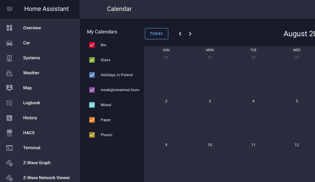
Means that even if you add text-divider specific variable, there is now another place where differentiating these colors would be welcomed… at least for me…
Ive tried creating that in my own setup, simply have all theme variables listed and show the color in the active theme, please see How to create a test sheet for theme colors
it would be great if we could simply list all these and see what happens given the theme one has set/created.
obviously my attempt was flawed, maybe this could still be done in another way currently available?