A little of a joke, because I see so many screenshots that are not Noctis, but I’ve found it so pleasant that I can’t get used to anything else. What are you all using?
5 Likes

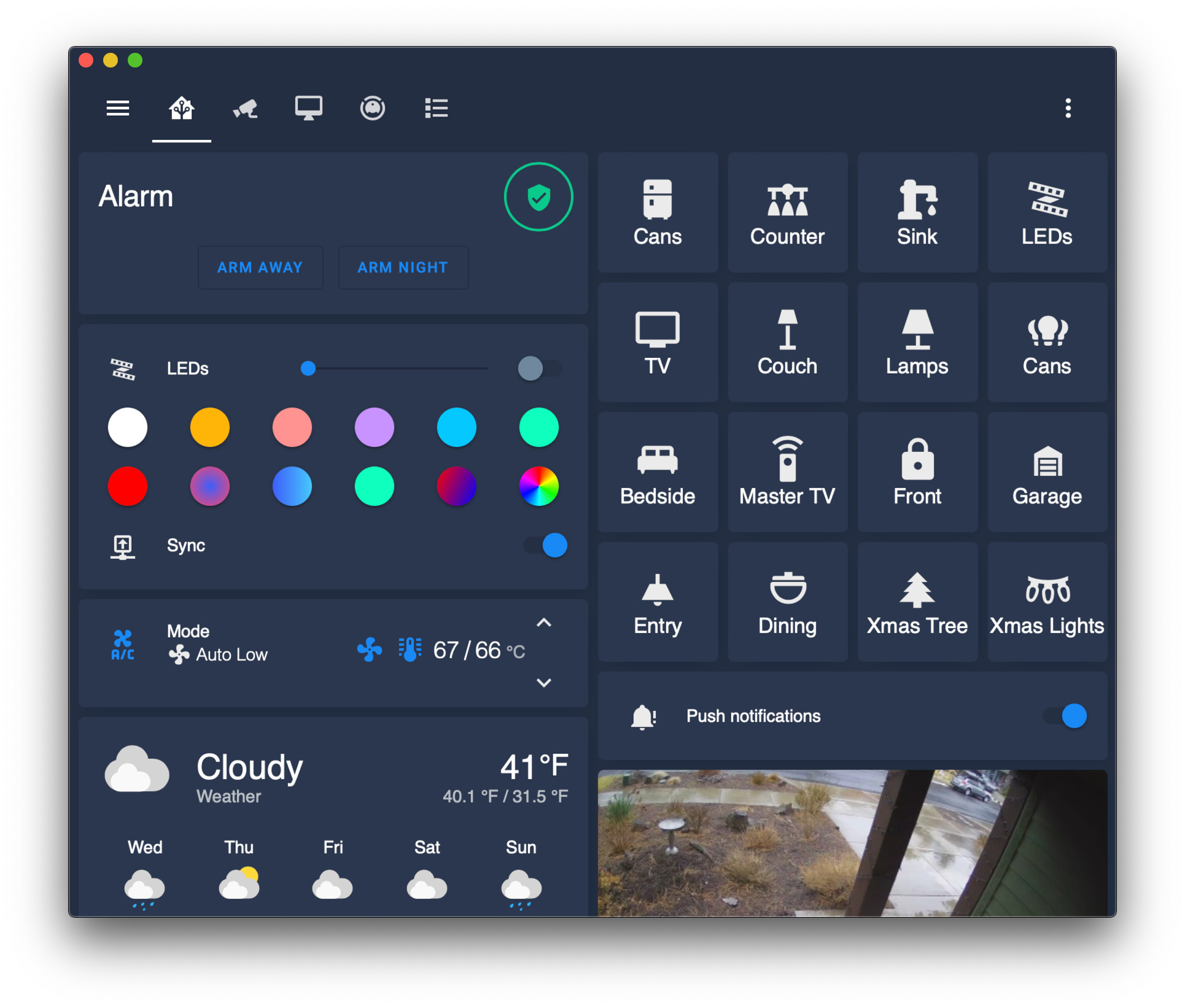
Hey @paulstronaut sorry this is a little offtopic but I love your design. Unfortunately I started using Home-Assistant yesterday. And I cant get those small cards on the left (Cans, Counter, Sink, LEDs, etc.) with the overlays done. Could you help me getting this realized? I want to use those small cards for the rooms and then have entities cards below it with the lights and the temperature.
would really appreciate the help
I used a grid card and buttons. Nothing special about it!
type: grid
columns: 4
cards:
  - type: button
    tap_action:
      action: toggle
    entity: switch.lightswitch_kitchen_cans
    icon: 'mdi:fridge'
    name: Cans
  # ...
@bergasha How did you get those nice lightbulb buttons? 
It’s the line in @paulstronaut example code
icon: ‘mdi:fridge’ or similar names, all from the Material Designs icon set
How did you make the header, transparent? CH?
I have tried editing kibibit theme file but haven’t had any luck yet…
I am just using png light bulbs from the web and using Custom buttons add on
Couldn’t do it, I had to use the background in the header as well so it’s not actually transparent.
@bergasha Thanks! 
Good idea, i will give it a try ! thanks ! 
What did you use to create the moji characters? I’d like to use something like that.

what is the name of your theme ?? I really like !
It is called kibibit-dark-cards, I have changed it a fair bit though my code is below.
kibibit-dark-cards:
  card-mod-theme: kibibit-dark-cards
  header-height: 48px
  card-mod-root-yaml: |
    .: |

      /* This hides the help button, menu button and title */
      ha-menu-button {
        display: none;
      }

      @media (orientation: portrait) {
        a.menu-link[target="_blank"], ha-button-menu, [main-title] {
          display: none;
        }
        paper-icon-button[icon="paper-tabs:chevron-right"] {
          display: none;
        }
        paper-icon-button[icon="paper-tabs:chevron-left"] {
          display: none;
        }
      }

      /* This adds the time */
      {% if user != 'kiosk' %}

      mwc-icon-button[slot="trigger"] > ha-svg-icon {
        display: none;
      }

      .edit-mode, app-header, app-toolbar {
        background: center / cover no-repeat url("/local/black.jpg") fixed !important;
      }

      mwc-icon-button[slot="trigger"]::after {
        font-size: 18px;
        height: 20px;
        width: 100px;
        margin-left: 0px;
        color: orange
        margin-right: 0px;
        content: "{{ states('sensor.time') }} - {{ states('sensor.multi_sensor') }}° ";
        position: absolute;
        top: 14px;
        right: 0px;
      }
      {% endif %}
  # Global
  app-header-background-color: 'rgba(0, 0, 0, 0.0)'
  app-header-text-color: 'rgba(255, 184, 5, 1)'
  lovelace-background: 'center / cover no-repeat url("/local/black.jpg") fixed'
  primary-color: "#209cee"
  light-primary-color: "#B6B6C1"
  primary-background-color: "#212121"
  secondary-background-color: rgba(25, 25, 25, 0.7)
  divider-color: var(--primary-background-color)
  accent-color: rgba(255, 159, 9, 1)
  # Fonts
  primary-font-family: 'Comfortaa'
  paper-font-common-base_-_font-family: "var(--primary-font-family)"
  paper-font-common-code_-_font-family: "var(--primary-font-family)"
  paper-font-body1_-_font-family: "var(--primary-font-family)"
  paper-font-subhead_-_font-family: "var(--primary-font-family)"
  paper-font-headline_-_font-family: "var(--primary-font-family)"
  paper-font-caption_-_font-family: "var(--primary-font-family)"
  paper-font-title_-_font-family: "var(--primary-font-family)"
  # Text
  primary-text-color: "#FFF"
  secondary-text-color: "#d3d3d3"
  text-primary-color: "#FFF"
  disabled-text-color: "#555"  # XXX: https://github.com/basnijholt/lovelace-ios-dark-mode-theme/issues/2
  text-dark-color: "#FFF"
  # Sidebar Menu
  sidebar-background-color: var(--primary-background-color)
  sidebar-icon-color: "#8f0303"
  sidebar-text-color: "#F1F1F1"
  sidebar-selected-background-color: var(--primary-background-color)
  sidebar-selected-icon-color: "#FFF"  # (light: systemGray5 from iOS light mode, dark: XXX)
  sidebar-selected-text-color: var(--sidebar-selected-icon-color)
  # States and Badges
  state-icon-color: "#FFF"
  state-icon-active-color: "#7a0c02"  # or make light icons yellow when active: rgba(255, 214, 10, 1)
  state-icon-unavailable-color: var(--disabled-text-color)
  # Sliders
  paper-slider-knob-color: "#FFF"
  paper-slider-knob-start-color: var(--paper-slider-knob-color)
  paper-slider-pin-color: var(--paper-slider-knob-color)
  paper-slider-active-color: "#0984ff"  # from Apple systemBlue dark mode
  paper-slider-secondary-color: var(--paper-slider-knob-color)
  paper-slider-container-color: rgba(255, 255, 255, 0.5)
  paper-slider-font-color: "#000"
  ha-slider-background: none !important
  # Labels
  label-badge-background-color: "#23232E"
  label-badge-text-color: "#F1F1F1"
  label-badge-red: rgba(255, 159, 9, 0.7)  # from Apple systemOrange dark mode
  # Cards
  card-background-color: var(--secondary-background-color)  # Unused entities table background
  paper-listbox-background-color: var(--primary-background-color)
  ha-card-border-radius: 20px
  ha-card-background: 'rgba(0, 0, 0, 0.3)'
  paper-card-background-color: var(--ha-card-background)
  # Toggles
  paper-toggle-button-checked-button-color: "#484848"
  paper-toggle-button-checked-bar-color: "#484848"
  paper-toggle-button-unchecked-button-color: var(--paper-toggle-button-checked-button-color)
  paper-toggle-button-unchecked-bar-color: var(--disabled-text-color)
  # Table row
  table-row-background-color: var(--primary-background-color)
  table-row-alternative-background-color: var(--secondary-background-color)
  # Switches
  switch-checked-color: "#30d257"  # XXX: remove when https://github.com/home-assistant/home-assistant-polymer/pull/4203 is in HA
  switch-checked-track-color: "#30d158"  # from Apple systemGreen dark mode
  switch-checked-button-color: "#FFF"
  # Other
  paper-dialog-background-color: rgba(55, 55, 55, 0.6)
  paper-item-icon-color: "#7a0c02"
  more-info-header-background: rgba(25, 25, 25, 0.5)
  # Custom
  mcg-title-letter-spacing: .15em
  mini-media-player-base-color: white
  mini-media-player-icon-color: white
1 Like
Hi mate.
I know this is really old but i’ve just stumbled across this.
I use that kibibit-dark-cards like you and i have just added your code but it’s only changed the header to match the lovelace background but the sidebar has remained black and i can’t work out what needs changing for that bit.
Any ideas?
Cheers
Hey mate, Are you talking about the sidebar background? If that is the case it’s under ‘Sidebar menu’ just change sidebar-background-color: to whatever you prefer.
Thanks yeah the sidebar, I did think that but I thought you could only use a color code in there not background image.
I’ll try again when I get home as I think I need to make 2 versions as the time works well in the corner on my laptop and tablet but when I view it on my phone the time overlaps the menu.
I did try deleting the time code part but everytime I did the header background went back to black lol, I’m guessing I deleted a extra open/closed bracket somewhere.
No worries, hit me up later if you get stuck…
1 Like
Edit 103259:
Since I liked the default Homebridge Theme (Purple) … I took some ideas

and made it into a Homeassistant Theme:

Haven’t messed with Paddings yet at all … and some things like Title-Weight are currently sadly unfixable due to internal errors of the theme engine … but aside from that I’m pretty happy now.