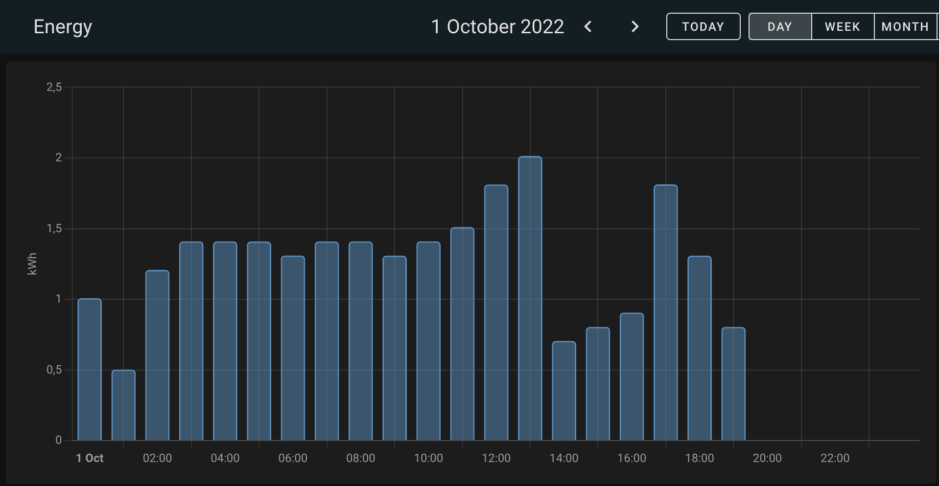
It would be awesome to be able to show energy usage for individual devices in a similar graph as the energy source itself (like the graph below). And even better: to be able to select multiple devices and stack them on top of each other in the graph.
Combined with WTH, why can I only compare periods in the Energy Dashboard with the previous period?, this would be even better.
2 Likes
Agree, My current workaround for this is to add my individual devices as GAS devices. So the solution is already there, but only as a special case for gas, this could be generalised and made configurable (colours etc). To extend the idea, my devices are Heat Pump electric consumption numbers, would be awesome to also have heat production, calculated COP-number etc etc. in the energy dashboard. HeatPumps are energy devices and should have support i HA. Or any other kind of heating devices. Why only gas as a special case?
