That’s really helpful - thank you, Robert.
What about state-alarm-armed_home etc?
Is there somewhere a disctionary with all potential states for lookup purposes?
That’s really helpful - thank you, Robert.
What about state-alarm-armed_home etc?
Is there somewhere a disctionary with all potential states for lookup purposes?
that has been mentioned more than a few times above, please search in this topic first? look for styles.ts and ha_style.ts
also see the solution post marked in the opening post
Not aware of any. I would try 2 ways:
wait, seems to be reversed from what I would intuitively think:
https://www.researchgate.net/figure/Map-of-RSSI-Received-Signal-Strength-Indication-The-color-bars-on-the-right-indicate_fig6_271532643
red being best ?
this feels more in sync with the idea I started out with:
which only shows the professional technical data coloring is not always what simple endusers like me would expect. 
settling for:
          icon_color: >
            if (state >= -50) return 'darkgreen';
            if (state >= -60) return 'green';
            if (state >= -67) return 'lightgreen';
            if (state >= -70) return 'gold';
            if (state >= -80) return 'orange';
            return 'red';
for now then. Provides a wider perspective on ok/green too, which is much less alarming.
I don’t bother with that many levels (custom bar card):
severity:
  - color: '#e45e65' # red
    from: '-100'
    to: '-80'
  - color: '#e0b400' # yellow
    from: '-80'
    to: '-68'
  - color: '#0da035' # green
    from: '-67'
    to: '0'
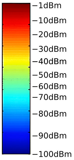
I think you’re putting too much thought into that first links graph. That’s clearly a graphing program with automatic gradient set so that you can differentiate the values. The colors are not indication good or bad, it’s a simple heat map where highs are red and blues are low. This is standard in all plotting software.
lol, yes, I had that too at first, but then wanted to use the mdi icons, so needed a bit more granularity …
      templates:
        icon: >
          if (state >= -50) return 'mdi:wifi-strength-4';
          if (state >= -60) return 'mdi:wifi-strength-3';
          if (state >= -67) return 'mdi:wifi-strength-2';
          if (state >= -70) return 'mdi:wifi-strength-1';
          if (state >= -80) return 'mdi:wifi-strength-outline';
          return 'mdi:wifi-strength-alert-outline';
the Overkiz discrete btw uses this tighter scale from the device itself:
        icon_color: >
          var level = {'good':'green','normal':'gold','low':'orange'};
          return level[state] || 'red';
I would say it depends on what has to be indicated by colors. What state of a can has to be indicated as warning: full or empty can? open door or closed one? Is 90dBm a desired level or not?
How can I assign colors to different zones so they are distinguishable on a history graph?
I have a history graph that shows the places my family members have been for the last 24 hours. It is just a history-graph card populated with the person entities for each family member. It used to be that each defined zone (“Home”, “School”, “Work”, etc.) got a different color in the history graph, plus gray for “Away” (i.e. not in any zone). Now it just has two zone colors: “Home” and “Any-zone-but-Home”. So “School”, “Work”, etc. all end up the same color. I can no longer, for instance, look at my daughter’s bar and clearly see that she made it safely from her early-morning off-campus class to her school.
There are others commenting about this further up in the thread and I don’t believe it’s currently possible to do this after the changes in 2022.12.
maybe, I would just use the following:
![]()
I think, that should fit… green is OK… red is bad… everything else, is somewhere in between and it would use the already available colors…
or, use the same schema as the batteries do
Whoops, I didn’t see that. I searched for “location” and not “zone”. Thanks for the info. That’s disappointing. Hopefully this gets fixed soon. I like the new colors overall, but it did break a number of things.
You’re right - I did not see the additional links.
Sorry for that.
However, I still struggle and obviously need to dig deeper (I just migrated from openhab a few months ago).
Anyway - thank you I might come back with more questions…
A reminder. The zone colours before 2022.11.x were assigned randomly. You could not count on a specific zone to always be shown as a specific colour. The only thing lost is that it is less easy to see changes between non-home zones. And you actually won that you can now count on the home zone being always same colour
This topic became more or less useless.
A proposal: for discussing a particular color for particular sensor - let’s create a GitHub issue or a Github discussion - and then post links here to let people to join them.
No particular person (dev or otherwise) is under an obligation to answer questions in here. This thread was carved off so people could
a) highlight the particular things they found frustrating
b) help others find workarounds and solutions
c) identify when those workarounds are no longer necessary as the product itself has changed
You know, like all forum threads on a community forum. In that regard please stop tagging piitaya. He clearly is reading and reacting to this thread given all the recent changes. Repeating the same questions again and again aimed at him isn’t really helpful, it’s just increasing the noise.
It seems like you submitted everything you still find frustrating as issues. That seems like the right approach at this point. Then the community can thumbs up and comment if they agree, focusing attention on the specific aggravations remaining.
Because - as it was said here already many times - there is a trend:
This is exactly what I did - I registered some issues.
But in most of them there is no reaction from Dev, one important issue related to new rgb format was closed.
I posted links to these issues here. Some people joined.
Surely I hope so. Then why not to come down here and calm people?
I’ve never talked with Paul myself so I can’t really speak for him, but if I were in his shoes I’d ignore your constant repetitive questions. Especially with the REACTIONS you give with any response. Your responses can be impertinent and demanding. I’m not sure if that’s your intentions, but that’s how they come across to me.
Just your personal opinion, and I tried to explain a sequence here. I admire dev’s work for sure, but this is a joint work. And ignoring technical questions is, let’s say, a bad behaviour for a technician.
I’m just hinting that you might want to look inward. There’s probably a reason he’s ignoring just you…

