wow, looks pretty nice!
how did you implement the sankey diagram? and you mind sharing the name of the fonts?
Sankey chart: Anyone using the Sankey Chart Card?
Font: a Formula1 font found on the web
3 Likes
Looks reallygood - do you share your config anywhere?
Can someone please help me add under the code of Sidebar.yaml Image, in my case QRCODE.
Thanks
Srry, not yet, still optimizing. Might in the future
1 Like
To get more entities on the dashboard, i nested multiple grid-cards inside a swipe-card so that i can swipe though the grid-cards (same principle as the conditional media area).
The problem i have now is, that i’m no longer able to adjust the brightness by dragging the circle. Does anyone know how to get around this? My skills are not good enough to figure it out.
Thanks!
Edit: It seems to work fine on my android phone, where the tilt option is disabled.

This is the lovelace yaml i’m using:
- type: grid
    title: Stue
    view_layout:
      grid-area: vardagsrum
    columns: 1
    cards:
      - type: custom:swipe-card
        parameters:
          speed: 550
          spaceBetween: 40
          threshold: 5
        cards:
          - type: grid
            columns: 2
            cards:
              - type: custom:button-card
                entity: light.stue_skaenk_1
                name: Skænk
                template:
                  - light
                  - icon_lamp
              - type: custom:button-card
                entity: light.stue_gulvlampe_1_sofa
                name: Gulvlampe
                template:
                  - light
                  - icon_shade
              - type: custom:button-card
                entity: media_player.samsung_tv
                name: Tv
                state_display: >
                  [[[
                    if (variables.state === 'on') {
                        return 'Tændt';
                    }
                    if (variables.state === true) {
                        return variables.translate_unknown;
                    }
                  ]]]
                double_tap_action: !include popup/stue_tv.yaml
                template:
                  - base
                  - icon_tv
                  #- icon_ambilight
                  - loader
              - type: custom:button-card
                entity: light.stue_lille_lampe_sofa
                name: Lille lampe
                #double_tap_action: !include popup/vardagsrum_balkong.yaml
                template:
                  - light
                  - icon_hue
                  - loader
          - type: grid
            columns: 2
            cards:
              - type: custom:button-card
                entity: climate.stue
                name: Radiator
                double_tap_action: !include popup/stue_klima.yaml
                template:
                  - base
                  - icon_climate
                  - circle
                variables:
                  circle_input: >
                    [[[
                      if (entity) {
                          return entity.state === 'cool'
                              ? Math.round(entity.attributes.temperature).toString()
                              : Math.round(entity.attributes.current_temperature).toString();
                      }
                    ]]]
                  circle_input_unit: "°C"

              - type: custom:button-card
                entity: light.stue_tvbord_1
                name: TV bord
                template:
                  - light
                  - icon_lamp

              - type: custom:button-card
                entity: light.skabslys_spisestue
                name: Vitrine
                template:
                  - light
                  - icon_wled
And the circle template:
circle:
  styles:
    card:
      - --c-stroke-color-on: "#b0b0b0"
      - --c-stroke-color-off: none
      - --c-fill-color-on: none
      - --c-fill-color-off: rgba(255,255,255,0.04)
      - --c-stroke-width: 2.3
      - --c-stroke-width-dragging: 4
      - --c-font-color: "#97989c"
      - --c-font-size: 14px
      - --c-unit-font-size: 10.5px
      - --c-font-weight: 700
      - --c-letter-spacing: -0.02rem
    custom_fields:
      circle:
        - display: initial
        - width: 88%
        - margin: -3% 2% 0 0
        - justify-self: end
        - opacity: 1
  custom_fields:
    circle: >
      [[[
        if (entity) {
            let r = 22.1,
                c = r * 2 * Math.PI,
                tspan = '<tspan dx=".2" dy="-.4">',
                domain = entity.entity_id.split('.')[0],
                state = variables.state_on,
                input = variables.circle_input || ' ',
                unit = variables.circle_input_unit || ' ';

           /* * * * * * * * * * * * * * * * * *
            *                                 *
            *             CIRCLE              *
            *                                 *
            * * * * * * * * * * * * * * * * * */

            let circle = (state, input, unit) => {
                return `
                  <svg viewBox="0 0 50 50">
                    <style>
                      circle {
                        transform: rotate(-90deg);
                        transform-origin: 50% 50%;
                        stroke-dasharray: ${c};
                        stroke-dashoffset: ${typeof input === 'number' && c - input / 100 * c};
                        stroke-width: var(--c-stroke-width);
                        stroke: ${state ? 'var(--c-stroke-color-on)' : 'var(--c-stroke-color-off)'};
                        fill: ${state ? 'var(--c-fill-color-on)' : 'var(--c-fill-color-off)'};
                      }
                      text {
                        font-size: var(--c-font-size);
                        font-weight: var(--c-font-weight);
                        letter-spacing: var(--c-letter-spacing);
                        fill: var(--c-font-color);
                      }
                      tspan {
                        font-size: var(--c-unit-font-size);
                      }
                      #circle_value, tspan {
                        text-anchor: middle;
                        dominant-baseline: central;
                      }
                    </style>
                    <circle id="circle_stroke" cx="25" cy="25" r="${r}"/>
                    <text id="circle_value" x="50%" y="52%">${input}${tspan}${unit}</tspan></text>
                  </svg>

                  ${domain === 'light' && `
                      <input id="circle_slider" type="range" min="0" max="100" value="${input}">
                  `}
                `;
            }

           /* * * * * * * * * * * * * * * * * *
            *                                 *
            *              LIGHT              *
            *                                 *
            * * * * * * * * * * * * * * * * * */

            if (domain === 'light' && state) {

                // wait 0ms for shadow dom
                setTimeout(() => {

                    // then get elements
                    let elt = this.shadowRoot,
                        circle_slider = elt.getElementById('circle_slider'),
                        circle_value = elt.getElementById('circle_value'),
                        circle_stroke = elt.getElementById('circle_stroke');

                    // approximate position of thumb relative to circle
                    circle_slider.style.top = `${(circle_slider.value - 50) / 1.66 - 1}%`;

                    // debug position
                    let debug = false;
                    if (debug) circle_slider.style.opacity = 0.3;

                    // pass each event to handler
                    ['click', 'input', 'mousedown', 'mouseup', 'touchstart', 'touchend'].forEach((event) => {
                        circle_slider.addEventListener(event, handler, { passive: true })
                    });

                    function handler(event) {

                        // "this" refers to slider
                        if (event.target === this) {

                            // bypass button-card tap_action
                            event.stopPropagation();

                            // update circle_value
                            circle_value.innerHTML = `${this.value}${tspan}${unit}</tspan>`;

                            // update stroke
                            circle_stroke.style.strokeDashoffset = c - this.value / 100 * c;
                            circle_stroke.style.strokeWidth = 'var(--c-stroke-width-dragging)';

                            // set cursor while dragging
                            if (event.type === 'mousedown' || event.type === 'input') {
                                this.style.cursor = 'grabbing';
                            } else {
                                this.style.cursor = 'grab';
                            }

                            // reset stroke width if value doesn't change
                            if (input == this.value && (event.type === 'click' || event.type === 'touchend'))
                                circle_stroke.style.strokeWidth = 'var(--c-stroke-width)';

                            // on release
                            if (event.type === 'mouseup' || event.type === 'touchend') {

                                // display loader if brightness is 0
                                if (circle_slider.value == 0 && elt.getElementById('loader')) {
                                    elt.getElementById('loader').style.display = 'initial';
                                    elt.getElementById('circle').style.display = 'none';
                                }

                                // set brightness
                                hass.callService('light', 'turn_on', {
                                    entity_id: entity.entity_id,
                                    brightness_pct: this.value
                                });
                            }
                        }
                    }
                }, 0);

                return circle(state, input, unit);
            }

           /* * * * * * * * * * * * * * * * * *
            *                                 *
            *             PERSON              *
            *                                 *
            * * * * * * * * * * * * * * * * * */

            else if (domain === 'person') {
                let time = c => {
                    let s = (c/1e3),
                        m = (c/6e4),
                        h = (c/36e5),
                        d = (c/864e5);
                    return s < 60
                        ? parseInt(s) + 's'
                        : m < 60 ? parseInt(m) + 'm'
                        : h < 24 ? parseInt(h) + 'h'
                        : parseInt(d) + 'd';
                };
                let input = states[variables.retain] === undefined || states[variables.retain].state === 'unavailable'
                        ? time(Date.now() - Date.parse(entity.last_changed))
                        : time(Date.now() - Date.parse(states[variables.retain].state)),
                    unit = ' ';
                return circle(state, input, unit);
            }

           /* * * * * * * * * * * * * * * * * *
            *                                 *
            *             CLIMATE             *
            *                                 *
            * * * * * * * * * * * * * * * * * */

            else if (domain === 'climate') {
                return circle(state, input, unit);
            }

           /* * * * * * * * * * * * * * * * * *
            *                                 *
            *              OTHER              *
            *                                 *
            * * * * * * * * * * * * * * * * * */

            else if (variables.state_on) {
                return circle(state, input, unit);
            }
        }
      ]]]
1 Like
I’m a developer and this thing had me stuck for a bit swell, you need to add touchStartPreventDefault: false to the parameters section of the swipe-card
- type: custom:swipe-card
  start_card: 1
  parameters:
    touchStartPreventDefault: false
this is my full config fro my swipe cards
- type: custom:swipe-card
  start_card: 1
  parameters:
    touchStartPreventDefault: false
    roundLengths: true
    effect: coverflow
    speed: 650
    spaceBetween: 20
    threshold: 7
    coverflowEffect:
      rotate: 80
      depth: 300
BTW this is a perfect example of how to ask a good question.
4 Likes
Thank you very much! I have battled this for days now 
1 Like
happy to help, would love to see your full dashboard once its complete
Sure, i’ll post an update when I have something worth sharing.
are you able to share your layout card config please? I’m interested in how you’ve done your sidebar and top menu
i have this already in my base tempate of button-card-templates
        - background-color: >
            [[[
              return variables.state_on
                ? 'rgba(255, 255, 255, 0.8)'
                : 'rgba(115, 115, 115, 0.2)';
            ]]]
Which turns the background on to white when a device is on.
I’m looking to have the background colour change with different power values
So for example if power 50w (white) if 100w (yellow) if 200w (red)
how can i do this?
@tomcoleman try this, this gives me the following. You only need to change let power = "251"; to your own sensor. something like let power = states['sensor.YOURSENSOR'].state
            styles:
              card:
                - background-color: >
                    [[[
                      let power = "251";
                      if ((power >= 50) && (power < 100))
                        return '#FFFFFF';
                        if ((power >= 100) && (power < 200))
                          return '#0099cc';
                            if (power >= 200)
                              return '#ff0000';
                      else
                        return "rgba(115, 115, 115, 0.25)";
                    ]]]
Maybe not the cleanest code, but i don’t have enough javascript knowledge to make it cleaner.
thanks i have set it to
          - type: custom:button-card
            name: <marquee behavior=scroll scrollamount="3">Kitchen PV</marquee>
            entity: sensor.solax_pv_power_2
            template:
              - base
            styles:
              card:
                - background-color: >
                    [[[
                      let power = "sensor.solax_pv_power_2";
                      if ((power >= 50) && (power < 100))
                        return '#FFFFFF';
                        if ((power >= 100) && (power < 200))
                          return '#0099cc';
                            if (power >= 200)
                              return '#ff0000';
                      else
                        return "rgba(115, 115, 115, 0.25)";
                    ]]]
            custom_fields:
               icon: >
                 <ha-icon icon="mdi:solar-power-variant"></ha-icon>
and it shows no change
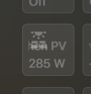
got it
its now showing
           styles:
              card:
                - background-color: >
                    [[[
                      let power = states['sensor.solax_pv_power_2'].state
                      if ((power >= 50) && (power < 100))
                        return '#FFFFFF';
                        if ((power >= 100) && (power < 200))
                          return '#0099cc';
                            if (power >= 200)
                              return '#ff0000';
                      else
                        return "rgba(115, 115, 115, 0.25)";
                    ]]]
            custom_fields:
               icon: >
                 <ha-icon icon="mdi:solar-power-variant"></ha-icon>

although now cant see text clearly ! LOL
@tomcoleman You can do the same with color to change your text color.

I want to slide the 6 buttons to 6 other buttons. but something is wrong in the code. Anyone who can help me ?
    - type: custom:swipe-card
        parameters:
        speed: 550
        spaceBetween: 40
        threshold: 5

        cards:
          - type: vertical-stack
            cards:
              - type: horizontal-stack
                cards:
                  - type: "custom:button-card"
                  - type: "custom:button-card"

          - type: vertical-stack
            cards:
              - type: horizontal-stack
                cards:
                  - type: "custom:button-card"
                  - type: "custom:button-card"
I have 4 buttons on a row to slide, but not 2 rows with 2 buttons. What am I doing wrong ?
do you know what that code will be ?
@tomcoleman something like this.
			styles:
              card:
                - color: >
                    [[[
                      let power = states['sensor.solax_pv_power_2'].state
                      if ((power >= 50) && (power < 100))
                        return '#97989c';
                        if ((power >= 100) && (power < 200))
                          return '#97989c';
                            if (power >= 200)
                              return '#97989c';
                      else
                        return "#97989c";
                    ]]]
                - background-color: >
                    [[[
                      let power = states['sensor.solax_pv_power_2'].state
                      if ((power >= 50) && (power < 100))
                        return '#FFFFFF';
                        if ((power >= 100) && (power < 200))
                          return '#0099cc';
                            if (power >= 200)
                              return '#ff0000';
                      else
                        return "rgba(115, 115, 115, 0.25)";
                    ]]]
            custom_fields:
               icon: >
                 <ha-icon icon="mdi:solar-power-variant"></ha-icon>
I was looking through the code and trying to figure out how to integrate HACS updates into the footer update button/popup, and I realized that it’s already partially there, or maybe just not working correctly on my install.
The HACS sensors are working correctly, showing repositories and available updates, but they don’t show up in the footer/popup.

The footer is showing a single update, but that is for ESPHome (older WLED install w/ WS2801 LEDs)


I’ve looked through popup/footer_updates.yaml and I see a reference to a hacs_installed variable, but nothing for sensor.hacs.
Is line 121 in button_card_templates/update.yaml correct?
hacs_update = states['update.hacs_update']?.attributes.installed_version,
“update.hacs_update” doesn’t seem right but I could very easily be wrong. Furthermore, I don’t have a sensor or any entity named “hacs_update” and in sensor.hacs, installed_version is part of an array in the repositories attribute.
Does anyone have this working that can shed some light on this? @masoncrawford1994 you seem to have a pretty good handle on these templates. Is this something you have working?