Do note it’s limited by resolution. If only 3 columns fit, it will show 3 columns. The columns setting is a maximum number of columns
4 Likes
It’s the max number of sections shown side by side , not the columns inside a section.
(Columns in a view)
Definitely appreciate adding an option to customize grid-gap. As of now the default grid gap is squishing items too much on a 7-inch tablet dashboard where I have a two column layout. I tried to migrate from a grid layout to sections and while sections makes things so much easier to manage, the loss of readability on a 7 inch screen is a blocker.
1 Like
Agree, Creating a “Default” (ultra)wide-grid-gap, to satisfy a few, is definitely not a good approach.
People can add padding’s to most Cards. And they do already, both padding and margins, to create the Views/Cards to fit their taste and requirements/visibility depending upon Devices and specific usability case.
So there is in my opinion absolutely no reason, other than trying to create a “Brand Look & Taste”
All major Brands, whether Microsoft, Google, Apple etc. etc.have “tried and followed” , and will continuing changing their “Brand Look & Taste” as time/opinions/influences changes
What ever “Default Look” the team behind HA-Frontend want/like now and in the future, doesn’t bothers me, i couldn’t care less, And i doubt they can “influence me”, if that’s the purpose.
In fact, when i initially was trilled about the new sections-view, i as you discovered fast the the huge-gap was a “Show Stopper” , so i stopped “testing” as my Grid Layout Views works fine, but with Sections i have issues on Vertical Wall Tablet Dashboard, with 2 columns, beside it looks terrible on laptop etc
PS: Yes , im also not a fan of they ways various Phone Apps have changed just the past 5years, one see less and less, on the screen ( Very bad “visibility” / overview(usability) !, one have to scroll and therefore looses “overview”.
LOL , i think we’re in the middle of the " Scroll " generation phase
Is there any way to increase the number of columns for section view? I have a wide screen touchscreen that could use more than 4 columns but right now the section view starts to stack any more than 4 columns.
I heard what you’re saying, but I’m afraid you’re jumping to conclusions way too soon.
2 Likes
Yes, there will be a new setting in the next version coming next week.
2 Likes
Sorry, im just being stubborn
PS: I did actually get the impression in your latest answer to me, that you were considered it, and that you would implement some “option” , just needed to get my thoughts out of my head, no offence
Thank you! Yeah I want to agree with you but it was very hard to when you put it like that. 
3 Likes
Yeah, it wasn’t mend to “catch likes”, but i could have phrased it better, and mention that the “option” most likely was on the way.
I guess i got “caught in the crossfire” of the bunch of same repeatedly requests/questions in here, annoyed by the fact that many people don’t read, before they post. And the fact that i last week did a new attempt to get 1 of my other Dashboards “aligned” in a Section-Dashboard, but failed (again) doo to my “stubbornness” and willingness to compromise, upon the work/design i’ve already made, and the ideas i have.
I will ofcause give Sections another “go” , as i’ve already have excluded/minimized the use of many custom:cards. ( And my “design” opinions do also change over time ! )
Worse thing that can happen, is when any of my House/Garden renovating projects takes more than +3 years  , family and friends have learned not to ask, and just wait for the “outcome”, which doo to my stubborn/perfectionism always ends up “like it was mend to be !”
  (noone can see that i’ve change mind/direction 10 times)
1 Like
How? How can you modify the sizes of the columns, both at a section level and sub-section (or individual col)? It seems to require YAML, not via the UI, yes?
Yes, and nested cards.
I.E if you take my middle-column, you could divide first(header) section into i.e 2 “subsection” (maybe eventually 4)
And the below graph is 1 whole-width section
Size goes 2 ways horizontal and vertical, so it’s kind of an “open” question you ask.
The “header” in column 1 & 3, could be 2-3 sections(wide), depends upon how much flexibility will be implemented eventually
As most you see in this Dashboard is Custom:button-cards, one have the options to set height/width, so the “section” to the left of the graph(in column 1) , could be 2 whole width sections (i choosed to just copy-pasted all in 1 section) But it is(was) actually 2x5 custom:buttons, in a horizontal-stack , in a vertical-stack
As this was my first attempt, i just copied parts of what i had from another Dashboard , and tried to adapt it , Had to fiddle some with margins/padding, as this new Dashboards have some hard coded settings as well as most cards have.
As different Devices have different sized “viewport” and resolution , i suggest you get use to Yaml and CSS, well you will eventually 
PS: Where as grids is defined in columns / rows, it can also be defined with a Max: and/or Min:
A Card is 1 unit, and can be defined in PX width/height or a Max-size in PX ( most cards have this hard coded, in some ways )
As a common “viewport” has a certain amount of horizontal pixels, many cards have a max-width of i.e 430-530 px ( meaning can be less )
So if you have a high-resolution wide-screen, you would most likely get 4 columns (current max value) , that is if the cards is “coded” with a fixed max-width in px, and/or the grid-columns-width is not set/fixed in i.e %
As the Native Section/Grid system, needs to “adapt” to a huge variations of viewports & resolutions ( phones/touchpads-horizontal/vertical ) etc. etc. And still retain usability , there quite often need to be a “min/max-size” in, somewhere !, which also don’t distort the cards.
So if you i.e want’s small/narrow icons/button ( in touchpad-view ), in first column, you somehow need the option to set column-width, in either px, or % … So You see where this is getting ?
How would you “combine” a 40px column, with 2 auto-sized %, when you flip the touchpad, or view it on your phone ? Span over 2 columns is another “advance” setting, the more you add the more complex, the more can go wrong, the more complains. ( It’s doable if you know your devices and know about CSS-Grid ) And CSS in common!.
However a Default “layout” out of the box, which should work “in all weather” , and even for a “novice/new user” is a hard task to overcome, and it will require some “limitations”.
And through a UI editor ? That would involved quite some extensive UI-Editor capabilities, and in terms user-capabilities/knowledge of a “complex UI editor” ( Not to mention Usage )
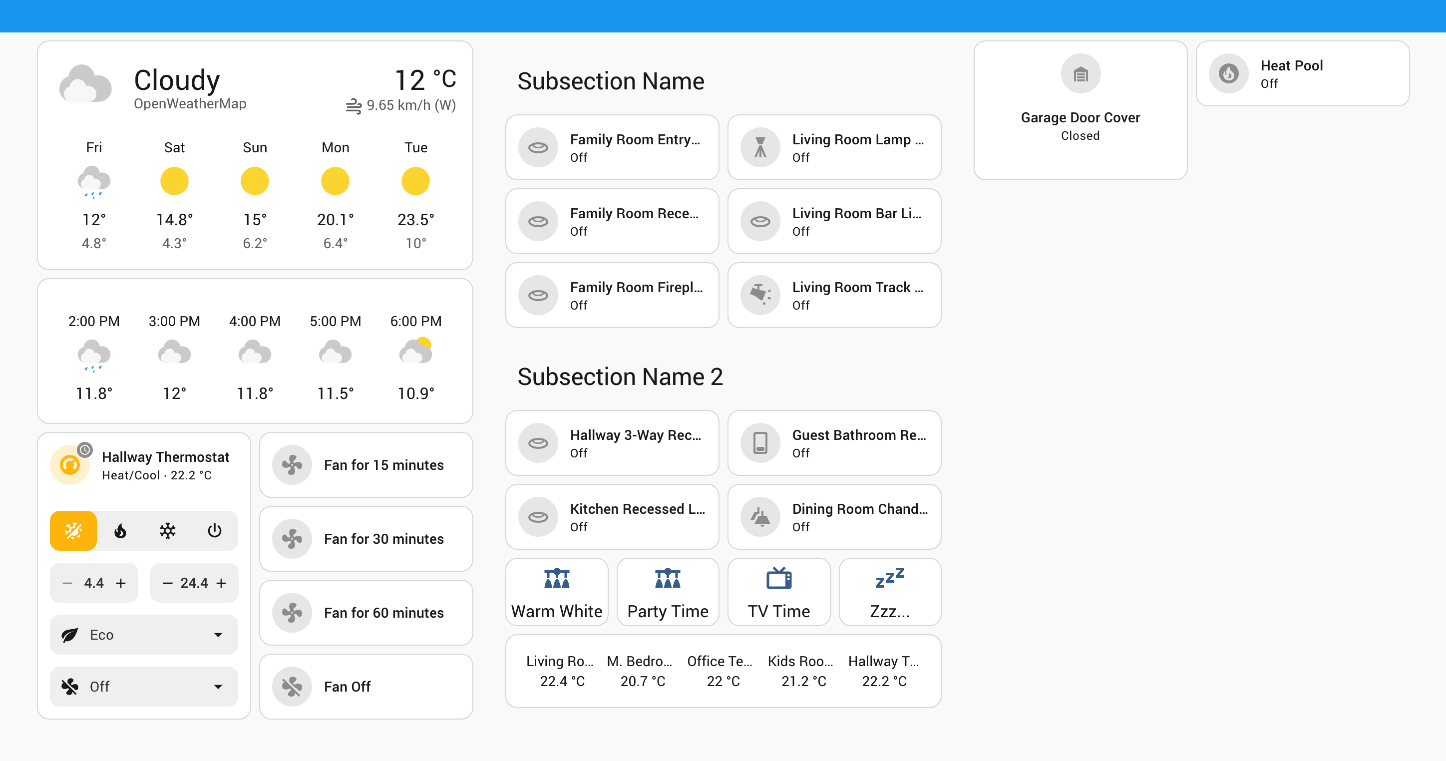
I love the new modern design, but have a few issues. One, I’d like to be able to set the size of each section. I.e. if I want a wider section on top going all the way accross, then have all the other’s under it in 4 colums, or if i want a colum to be 2 columns wide because there is a lot of items in it, then i’d have 2 other columns and under that go back to 4 and so on.
And one of my items is long with sensors and graphs, and that keeps the second row of items ALL THE WAY to the bottom making it useless. I’d like the next colum to be up to the bottom of the one under it… to it all fits together.
This new view is great and special thanks for adding sections count option - things can now fit on a regular tablet screen.
I am missing couple other things to move away from the less usable “mansory”:
- Really need 4 tiles in a row, have to work around it with other card types.
- Need a nice tile to name sub-sections, using smth else now.
Here is a preview (third section - work in progress):
For the sub-sections titles , I now use the mushroom title card but only use the second line …
That’s the one I am using too, just the first line. Both first and second line are aligned a bit weirdly (vertical alignment) and I didn’t find a way to fix it.
I would love to be able to control the width if the section. So i can have one hard expand the entire width so it doesn’t look like a skinny section on a tablet etc.
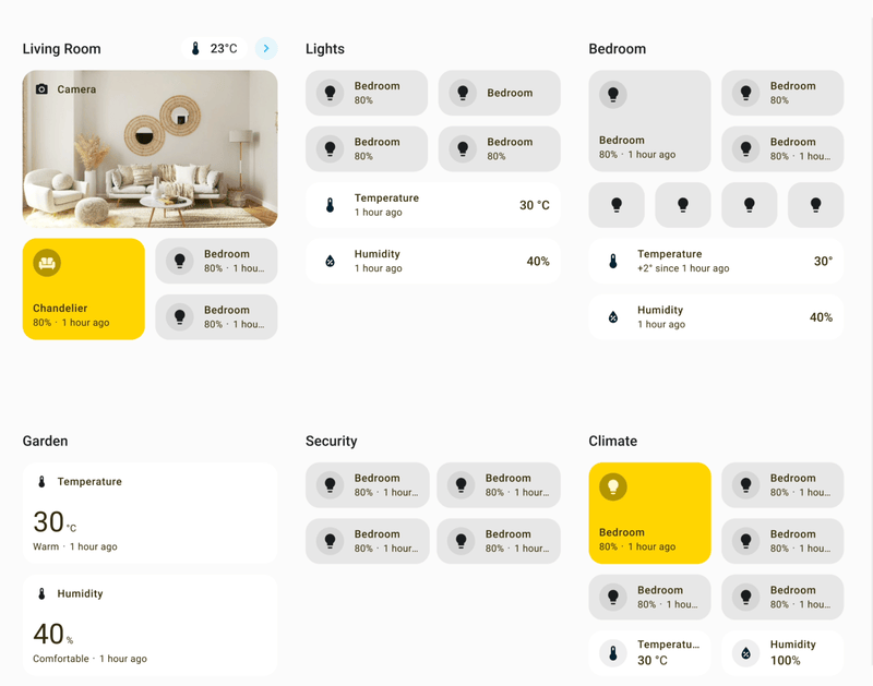
I’m surprised there’s not much talk about this particular screenshot - is this from a dev build and a sneak peak of what to expect later in the year?
If so I’m really excited - yes please to All The Cards Lining Up and an official implementation of the Mushroom Chip cards…!
3 Likes
That’s from a current release
For what reason(s) ?
Now, Paul ( TheAuthor ) can publish features/fixes whenever ! , beside using this as “test-cases” , for implementations in Tile’s and whatever comes in Native UI