Hello all, this is Madelena. You may know me from some of my previous projects. 🙂
As you may have heard from our celebration for the 10th anniversary of Home Assistant, we are making some tweaks to our logo! This is no small feat, as the logo is a big part of the identity of Home Assistant, and by extension a representation of the contributions of our community. This logo has served us well for 8 years. When we see the logo, it represents the culmination of work that we are all proud of.
Humble beginnings
As Paulus had mentioned here, Home Assistant started as his solo project while working on his Master thesis, and on September 17, 2013, it was first published on GitHub. Home Assistant has always been engineered as a direct solution to the state of the Open Home, and its name and its first logo reflected its no-frills get-it-done attitude.
The logo was simply a house with blue doors, and the name was simply Home Assistant. No fancy startup names. No following Big Tech trends. Home Assistant is exactly what it is!

It’s a Material Design world.
As Home Assistant became more and more robust, its user base also began to expand. Users from all walks of life started building their smart home with Home Assistant, people started buzzing about it, and contributors coalesced around it. The identity of the project formed organically. The families and housemates of our users started to use Home Assistant, and a more friendly and memorable user experience was needed.
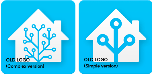
In 2015, Jeremy Geltman came to the rescue and contributed a brand new logo for Home Assistant. The new logo follows Google’s Material Design language. Home Assistant grew up with Material Design - It adopted the first version upon release, and so the same design language was also applied to our logo. It used the blue color that Home Assistant used in the interface and it came in two versions: a high detailed version (for homescreen icon etc) and a simple version (for favicon etc).

Iteration, not revolution
The Geltman design has served us well - It was used everywhere from our website to the loading screen to the app icon. It was used on big desktop screens, small mobile screens, and most recently, in print, such as our “Works with Home Assistant” partnership program and our hardware products Home Assistant Yellow, Home Assistant SkyConnect, and the newest Home Assistant Green. However, the logo was not designed to handle all these different usages, and it was time for a new iteration.
We started this iteration with three goals in mind:
Familiar
Home Assistant serves both power users who have been using the project for many years, as well as home automation users who are outgrowing their previous setup from other companies. We want it to feel instantly familiar to our fans old and new.
Refined
Home Assistant is an established brand with ten years of history. We want to refine our logo by executing it with even more rigor and craftsmanship, which reflects the growth and maturity of the project as a whole. We also want it to feel friendly and modern to all users.
Unified
Home Assistant has spawned out so many projects and initiatives over the past decade. We want to create a unified identity across all Home Assistant related projects to increase awareness. We also want to make sure that the logo is versatile across all media where it will be applied.
The blue house with antenna
At the core of the Home Assistant logo is what we call the Blue House with Antenna, its three most recognizable and distinct features.

Blue
Blue feels stable and essential. A bright sky blue is joyful, clear, and free of clouds.
House
Of all possible combinations of shapes, a home is best abstracted in the shape of a structure with a pitched roof. With the vast amount of logos based on this shape, the best we can do is to make it more iconic. The house is further simplified - there is no gable and there is no chimney - to an orthogonal shape with an elegant and deliberate proportion.
Antenna
Call it a tree, a set of nodes, a PCB, or an antenna. The antenna is the most recognizable and memorable part of the Home Assistant logo that stands out from the rest of other home automation brands, and is an easily understandable symbol that conveys technologies that are smart, connected, and growing evergreen. The three nodes of the antenna represent our three core values: Privacy, Choice, and Sustainability.
And for those design nerds who are interested…
The elements within the logo were laid out with better proportions, and they were designed to be legible at small or large sizes.

We have also changed our logotype to something more cozy and modern like a home. Gone was the all-business no-play Roboto typeface (to its credit, the United Nations used it as its logotype), and replaced by a geometric sans serif Biotif typeface. Figtree serves as the free open-source fallback.
We have also toned the blue color to be slightly more saturated to make it feel brighter and more utopian, and expanded the palette to a wider gamut.
For those who want to use our logo and for more details, the latest brand guidelines can be found at our design repository.
There’s more to come!
The new logo will roll out gradually in the next few weeks. You will start seeing it on our website, our updated onboarding experience, app icons, and more. For those who love our old logo, fear not! You can still change the app icon to our classic logos on our iOS phone companion.
And while you are here, why not grab some new merch with the new logo?
This is a companion discussion topic for the original entry at https://www.home-assistant.io/blog/2023/09/17/a-refreshed-logo-for-home-assistant/
 . It’s been a blast seeing this project grow out to the product it is today. From the YAML days in the 0.x era towards a more user friendly product now in 2023.


