No. Material Design no longer accepts brand logos.
Too bad. Hope this logo will be available inside HA as an icon to update my dashboard (old logo is available as a mdi icon)
1 Like
Everything about the new logo is so unbalanced compared to the previous one. The antenna now looks more like a simplified tree in front of a house.
13 Likes
Looks like Albert Heijn bought Home Assistant 

Congrats on 10 years HA!
4 Likes
While I would agree with almost anything you have written, what on earth has the LOGO to do with motivating new coders or making the UI as a whole more user friendly?
2 Likes
After changing the logo, there will be no decrease in supported integrations/devices?
[irony]You obviously don’t understand the current generation of developers.[/irony]
In my company, I even experienced an attempt to rewrite system architecture… not because of performance or stability. But to satisfy the feelings of ownership in teams. Because otherwise, devs are not motivated enough, reject taking responsibility etc etc.
If i look at the “old” 2 logos above, the one to the right, is just damn ugly, looks like a “perfect” Plastic Christmas tree ( not like a versatile network “logo” ), the one to the left, i’ve had problems to “shrink” to an Icon in HA-UI , without it looked “messy”, too compressed … This New Logo fit’s not only as an Icon, and it has nice “proportions” but still looks like a “Network” Logo … And yes i know, My house have a Chimney and Brim, but everyone should be able to “spot” a house, regardless if it has a chimney,or brim(which btw many houses don’t have) , just like a Laptop doesn’t “look like a Laptop” in an i.e mdi: design
1 Like
Please, now that you are changing the logo you could make the logo from our local HA instance to be slightly different than the official logo, to tell apart them!
For example, the local instance could have the new logo, but with an extra line with the gabled roof and chimney over it, this way, to note that it’s our home’s Home Assistant… Something like this:


20 Likes
This beauteful speech regarding new logo and fixing something what ain’t broken: I feel wind from Big Companies. At least in their structure desiners have to show some work to still receive money, not sure why this trend came to HA community.
I hope there will be no other “very useful” practices frome them…
6 Likes
Well, being Gen X, I understand what you are saying about Gen Z…feelings over facts. So if we need to attract people based on that, maybe I should change back to OpenHab  where this strange view hasn‘t taken over yet…
Oh boy…
3 Likes
It seems that there is a lot of controversy about the new logo, but I think that the best way to solve it would be for the user to be able to upload a new logo of his own.
From my understanding the logo on the user installation can’t be changed, except with some hacks that I haven’t tried.
2 Likes
Thanks for pointing this out. The text is simply vertically aligned to the whole icon, however, the pointy roof of the house shifts perspective. It would probably look a lot better if the text was aligned at the bottom and height set at the middle of the roof part of the icon.
1 Like
Squeaky wheel syndrome. There are way more than quarter of a million users. How many are complaining?
It’s open source. You can add any logo you like but that is unlikely to be implemented in an easy user configurable way. Brand identity is important.
5 Likes
At least they should allow us to select the local setup favicon/logo from a few alternatives and/or colors. I just want to be able to tell apart tabs from my local HA setup from other tabs with HA documentation…
5 Likes
Which web browser do you use?
There’s probably an extension to change favicons.


8 Likes
I want to bring some alternative view(s) to this discussion.
Home Assistant is one of the five big players in the home automation market (the Verge listed HA as one of five besides Amazon, Google, Samsung and Apple!), and it needs to give new users the feeling there is some reliable basis, they can count on. Not only for a year, but for many years to come.
This needs a streamlined logo, that is modern and gets recognized by as many people as possible. Think about the HA green in a Best-Buy/MediaMarkt/your_local_electronic_supplier, and you recognize it by just walking by. Then, it’s a good logo.
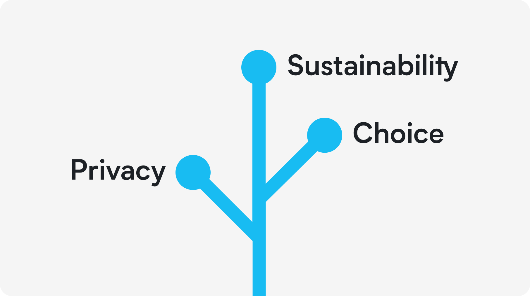
Another thing a good logo needs, is a message. In our case these are the three bullet points HA is giving:
- Privacy
- Choice
- Sustainability
And last but not least, the design of the logo should give you a keen edge, eg. take a look at the packaging of the new HA green. Have you noticed, that the hole to open the ethernet cable box is shaped like the new logo? You can’t have such nice additions with a chimney.
These are all things, that need to be taken into account, while designing a logo. I know from experience, that people always think, that could’ve been done by their nephew, but that is not the case.
A new logo needs to have a lot of thought into it. The best example is Apple. They are still leading in design, device or software, because they do check every little dot for a good user experience. And that’s why they are still, more than 15 years after the first iPhone, leader in all UI designs…
Like it or not, but for the majority of the people, this is progress and it will bring HA further into even more homes.
7 Likes
I have a preference for the older version; the roof seems a bit too high in comparison to the walls, but of course, this is simply a matter of personal taste. Change is inevitable, and we’ve transitioned from the familiar blue bird to a black X – that’s just how life goes.
Nonetheless, a decade is a substantial milestone to consider a logo update, although not too drastically.
I’m eagerly anticipating seeing the new logo featured on all those boxes that showcase Apple Home Kit, Alexa, and Google Home.

As we say, it should be about outcome, not output.
So I would ask you, how are you going to measure the result of this “it will bring HA further into even more homes”. And personally, I cannot imagine this particular change may influence such a metric. Obviously, I may be wrong. But the initial read provides no information about that.
4 Likes