I don’t like the new logo. In small versions the antenna looks like the USB icon.
I don’t think anyone started a poll?
- Dislike the new logo
- Like the new logo
0 voters
Not really a fan of the new logo, or many of the UI element changes to be honest. But it’s not like the vocal minority on the forums will be able to do anything about it.
I’m missing the 3rd option. “Do not care”
Being serieus btw  I cannot be the only one who could not care less about a logo change.
You are not… was looking for the same option to vote…
Yeah I know, Itried to change it later on, but I am not allowed to edit the poll anymore 
besides the new logo, we have the new buttons everywhere in the documentation now.
I really wasnt too bothered with the new logo, because all a matter of taste and not compromising functionality.
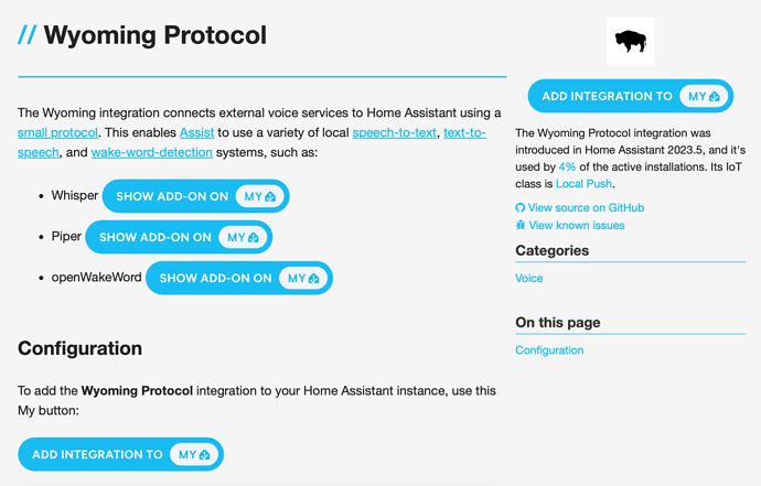
The buttons however seem to block my brain, when confronted with pages like this:
How is this good UX? the buttons state almost the same (all state Show add-on/integration on My) and they’re huge and right there in our faces.
For my part, the old fashioned html link on the items would have been much better, because easier on the eye, and not confusing.
The text above those bloated balloons shows how functional and easy that can be…
Aware someone finds them ‘beautiful’
but thats no reason to drop them all over and distract from the important stuff…
My goodness !, this was definitely Not expected !
I wonder if this " Design " is based upon A Believe that people are either Blind or Stupid, Or Both, And have 10 thumbs or Parkinson-Symptoms
Now one really can imagine where the “Kids Toys” argument comes from
Folks… Everything is going to be alright 
This logo looks like a virus taking over a home. I’m happy to lose it.
Damn You !, until now i liked it, thou first recently realized some people were referring to “soldering” point , I just saw it as a Network, the different “branches” associating, various ie “protocols” and/or devices i various rooms.
Now You made me see alot of " Wood-Boring Beetles " in my House 

They were there before, the mylink html was updated 
Not bothered so much about the new logo itself, though I’m not sure what was wrong with the old one.
However:
-
the buttons are just an awful in-your-face mass of blue that majorly distracts from the content of the page they appear on. Previous buttons were spot-on and could fit in anywhere. They feel greedy for attention.
-
On Android at least, the app icon makes me go grrrr every time I see it. While there likely the same number of pixels top and bottom, it appears to sit too low due to the ‘weight’ of the house icon sitting below the vertical centre. It just screams wrong every time I look at it.
-
The (Android) app icon is also significantly smaller than all other Android app icons, which again makes it stand out in a bad way.
Sadly I can see these are going to grate until / unless changed 
Yes, updated badly!
I got the app update last night on iOS and am having the same experience with the house appearing too low. I’m sure if I were to check, the space from the tip of the house to the top of the whole icon would be equal to that of the bottom of the house to the bottom of the icon, but still, it just feels wrong. I want to be clear: I thought I’d prefer the more detailed icon more, but in fact, I don’t mind the simpler, bolder look overall…it’s just that the overall balance feels off now.
It’s not the end of the world or anything, but I wouldn’t say ‘no’ to some continued refining of the general concept as time goes on.
I disagree with the design decisions that led to this new logo:
- Calling oversimplification minimalism does not justify it
- The typography vertical alignment !?
- The USB logo borderline plagiarism is retrograde
Also:
- I miss the PCB traces, they were a great metaphor of the far-reaching abilities of HA. Some could mistake them as a cute ivy and it was fine.
- Much like the save icon remains a 3.5" floppy disk, keeping the proverbial house outline was not an issue. Now it’s completely lost. I see an index / bookmark / arrow.
The new icon on Android does not look intended, it looks like a legacy app icon that’s forcefully put into a material circle. Too small.


Well, maybe some of you like it, but I think the new logo is just disgusting. Just look at it between all my other items. It doesn’t really fit in. The white phone is bigger than this “house”. The previous icon was just brilliant. This is just a way too small icon in a way too big blue box with way too childish design. Please add an option to revert it to the old one.
Well, if i take a look at my poll, i would have expected there would be a distinct difference between yeay’s and ney’s…but it is actually a close call….
There is a team member who created this. Like it or don’t like it, but words like “disgusting” have no place. Imagine how you are going to feel when someone calls out your own post as disgusting and bullying.
Oops I just did.


