Just adding my vote on this. Please revert or give the option to choose the larger text.
Agreed - my vote also for big number current temperature. It should be the default - but at least as an option…
hm… I can see why many people want to have the “current temperature” shown as the main information - and I can also agree with this, when I see some of the screenshots here - because on those, it is really hard to tell…
what I don’t get at the moment, where the differences are comming from.
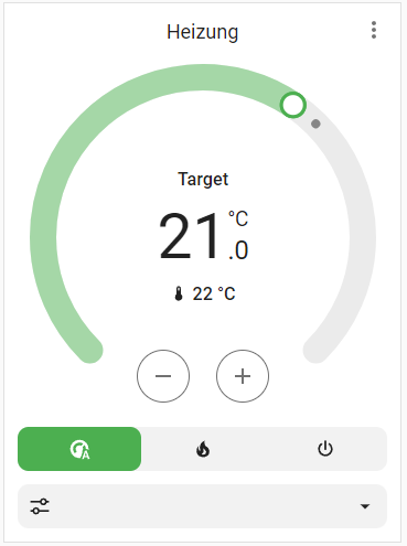
HEATING - In automatic mode → Current temperature is highlighted

HEATING - In heating mode → Current temperature is highlighted

IDLE - in automatic mode → no highlights… the “Target” Temperature is the information my thermostat is showing on the display…
I have to note here:
The devices I am using are HomematicIP Thermostats on my radiators.
So they just show the target temperature I’ve set the thermostat to … This is why I personally don’t see a big issue with the current layout… but I can understand the people who are using wall-thermostats, etc. that do show the CURRENT temperature.
I am not sure, if it will confuse others if the design will now be changed to show the current temp as the main information… Personally, I wasn’t a fan of the old thermostat card at all - and have banned it from my dashboard… I was using custom thermostat cards instead, such as “simple thermostat card” - which also always showed the target temperature as main information…

So for me, this is just “common” and I am used to it… but that’s “just me”…
Anyway - this got my vote ![]()
3 Likes
The thing is, your eyes are attracted to the biggest number first. So when you want to quickly check the temperatures it takes a bit of effort to refocus to the smallest numbers even if they are highlighted. I have about 10 thermostats and it’s become highly impractical.
5 Likes
Only 35 requests ??? ![]()
1 Like
I agree with this!
I have the thermostat card on my wall display. I want to be able to quickly see what the temperature is from a few feet away.
If I’m adjusting the temperature I will be at the display, so those numbers should be smaller.
It just makes sense to have them the other way around.
5 Likes
The new card is now totally “over-engineered”. I can no longer see the wood for the trees. As for why the set temperature takes precedence over the actual temperature is a mystery. This sort of issue usually emerges in over-sized organisations where the designers work in isolation from the users, in a committee environment which tries to satisfy everyone and ends up with a lowest common denominator solution which pleases no-one. Most HA developments to date have been amazing and very positive. Sadly, this is not one of them.
7 Likes
Agree with previous comments about this change.
I, like another poster, have many room level thermostats over two floors - 13 in total. I’ve been using this now for many months here at home and it’s been great and a pleasure to use.
Whilst I really do appreciate all the efforts that have gone into this redesign, I also would like to have the option to use the old design or at least, the same layout/theme.
The way information is conveyed in the original UI is just perfect. It’s pleasant on the eye and allows you to very quickly see state across multiple rooms - it’s the perfect balance of information and control!
I really like the flame and power buttons that the original design uses. They are spot on - just the foreground colour change to reflect state is enough here.
The new flat stretched feature buttons take up so much space. They are extremely distracting on my dashboard that has 5-8 thermostats on the page. The amount of orange/grey background on the buttons is overwhelming - when it’s just the orange on the heating ring and flame button, that’s so much more intuitive and visually more accessible to understand the current state.
I have rolled back (for the first time) to the previous version, as I really do prefer the old card.
It would be great to have the option to select the classic design please - thanks for your consideration team!
2 Likes
Fully agree. The new look is misleading.
Especially when it is turned off.
Why randomly swap the temperature target / actual displays?
Or was someone not paying attention?
1 Like
Adding my vote as well. The new thermostat card is beautiful, but not having the current temperature be the larger, more prominent value doesn’t make sense to me.
1 Like
Plus one.
New card has been forced upon the user base and ruined my UX.
Really bad move to dictate this change.
3 Likes
Fully agree, although, compared to this current/target switch, it’s a minor issue.
When you have 1-2 thermostats the new feature buttons are probably ok, but when you got 15+ it’s a whole lot of buttons.
Someone should open a new feature request for this. It certainly has my vote.
Maybe the best option would be just to have 2 themes: old one, new one. As much as the new one looks nice, those are minor design tweaks. On the other hand the functionally has pretty much deteriorated in every possible aspect. If given a choice I would switch to the old one without a doubt. It didn’t look so bad in the first place.
1 Like
I’ve replaced every thermostat card by a better thermostat UI card, it was impossible to read the dashboard at a glance…
1 Like
Good suggestion Glasofruix - thanks for this! I was aware of this project, but didn’t think to use it as a replacement!
Just spent some time playing with this on a couple of my thermostats. It looks promising, although I will have to upgrade all my thermostats to BT first and run it for a few weeks to see if it’s stable.
I installed lovelace-card-mod to increase the font size of the main temperature (I don’t need window open etc) and remove the line and now it’s pretty close to the stock card and has some additional information/control (humidity, eco temp), which is useful. I also prefer the title of the room at the top that BT card provides. For some reason on my dashboard, the target temp and humidity seemed to not have enough space, so I scaled things a bit to make it fit nicely.
If it works out then I think this could be a good solution/better outcome for me.
Here are my mods, in case anyone else is trying to get close to the original. I’m not sure I can shrink the size of the slider, but I don’t mind that so much.
card_mod:
  style: |
    .name { margin-bottom: 20px }
    bt-ha-control-circular-slider { transform: scale(1.1) !important; }
    .main-value {
      font-size: 25px !important;
      letter-spacing: -0.5px !important;
    }
    line { stroke: transparent !important;}
    .window, .summer { display: none }
Which makes it look like this:

2 Likes
I’ve now done the same. With 17 thermostats it was impossible to navigate without touching and changing multiple settings with those oversized discs going right to the edges. A complete nightmare! Did no-one test this before releasing? Form over Function strikes again.
1 Like
This will be a replacement for me. Just a toggle to swap and some other improvements.
Thanks!
A link for anyone looking for it that might not use HACS.
Works fine without the integration its meant for.
Many people did in the beta testing. Not only that but user feedback was sought during the design process. See https://www.youtube.com/live/2o-Uw5ZGd0M?si=HxijmzIBcglF4zh6&t=1163
So what you are seeing in this topic is a vocal minority.
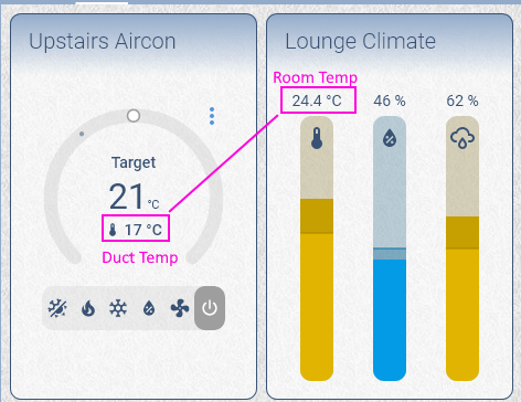
Personally I like the large target temp. My climate integration reports the duct temperature instead of the room temperature (even though it actually uses room temp for control). So I have another display for the actual room temperature as the temperature in the climate card is meaningless.
Adding my vote as well.
I am adding my vote as well.
I watched all 9 minutes of the video relevant to this issue. Nothing was discussed about the decision to make the set temperature the larger value. A lot of discussion went into the usability of the ring to change the temperature. If I was to guess, the change was made for those who want this displayed as a small card. It would be difficult to read the set value without it being big.
I was in software development and know how siloed one can get when writing user interfaces. Making good UI really depends on meeting the needs of the user not what you as a programmer think is beautiful. I suspect their beta testing sample was not representative.
Your use of the term “vocal minority” is dismissive. Good for you, your use case works with the new design. It does not work for others.
This is poor UI design as is breaks the paradigm set by standard thermostats. It seems that is has become fashionable for smart thermostats to have the set temperature large and in the middle. Nest, Amazon, and Ecobee all show this design choice. Since the hardware fixes this choice it cannot be changed. But a HA card is just code. Better Thermostat Climate Card UI shows that the values can be switched - its not undoable. Its just a variable being written to a text box. We don’t have to be forced into poor UI.
8 Likes