Weekends we have only one tariff, and those days there is no problem with the total.
Still scratching my head at what can be going wrong…
Weekends we have only one tariff, and those days there is no problem with the total.
Still scratching my head at what can be going wrong…
This has to be one of the biggest impacting projects on the UI for some time… Thanks for all your hard work Nice one @RomRider !
Can someone help me get the line to correspond with the value from the sensor?

As you can see, at present, all the colors are showing at every point.
However I would like it to look like this:

ie, 90% = green line
5% = red line
type: custom:apexcharts-card
experimental:
  color_threshold: true
graph_span: 14 days
show:
  last_updated: true
header:
  standard_format: false
  show: true
  show_states: true
  colorize_states: true
  title: Cubecell Tracker Batteries
now:
  show: true
  color: '#B20000'
  label: Now
series:
  - entity: sensor.1_tracker_battery_percentage
    type: line
    name: 1 Tracker
    fill_raw: last
    show:
      header_color_threshold: true
    stroke_width: 5
    color_threshold:
      - color: '#B20000'
        value: 5
      - color: '#FF9912'
        value: 25
      - color: '#FFFF00'
        value: 50
      - color: '#98FB98'
        value: 75
      - color: '#00CD00'
        value: 90
  - entity: sensor.2_tracker_battery_percentage
    stroke_width: 5
    name: 2 Tracker
    fill_raw: last
    show:
      header_color_threshold: true
    color_threshold:
      - color: '#B20000'
        value: 5
      - color: '#FF9912'
        value: 25
      - color: '#FFFF00'
        value: 50
      - color: '#98FB98'
        value: 75
      - color: '#00CD00'
        value: 90
Many thanks for any advice
Looks like it is possible with the underlying Apex Charts library but not sure if you can achieve this in HA Line color based on value · Issue #585 · apexcharts/apexcharts.js · GitHub
Hi,
Thanks for getting back to me.
I do know that this is possible with the mini-graph card in HA as I use this already.

also, if you look https://github.com/RomRider/apexcharts-card/tree/dev#brush-experimental-feature:~:text=color_threshold%3A%0A%20%20%20%20%20%20%2D%20value,color%3A%20orange in the docs, the image is the image I want, I just don’t know how to get it.
The code above, (where the link points to) does not represent the graph below
Yeah ok. He does says its experimental! Only thing I noticed is that you don’t have a colour for 0-5? You could try removing some of the other key values you have to see if you are getting a conflict somewhere. Strip it right back and see if you can just get one line and colours.
Hallo, I need your help.
I have a daily increasing meter sensor and I’m using Apex Chart to show daily and weekly/monthly long time statistics. However, the problem is that the long time statistics seems not to reset the daily sensor exactly at 0:00 but some seconds later. This results in the problem that the fist value of the statistics is mostly not zero but the value of the previous day.
So, for daily statistics, I could fix this by using func: last
series:
  - entity: sensor.daily_energy_consumption
    name: Daily Energy
    statistics:
      type: max
      period: hour
    group_by:
      func: last
      duration: 1d
However, if I want to generate weekly or monthly statistics, I need to use func: sum which sums up wrongly when the last day value is higher then the current day value… as mentioned above … the statistics max function thinks that the first value is the maximum since the daily sensor reset was too late.
series:
  - entity: sensor.daily_energy_consumption
    name: Monthly Energy
    statistics:
      type: max
      period: hour
    group_by:
      func: sum
      duration: 30d
Do you have any idea how I can skip or correct the first value in the daily statistics bucket?
Many thanks in advance
yea, get the whole experimental part, was just wondering as it does appear in the docs and if I was doing anything wrong in my yaml…
FWIW… here are the 2 side by side with the exact same thresholds…
anyway, thanks again,
Hey ! On it, ty for the direction
shall I publish again in MQTT ? as now I get unknown instead of the value

and yes this is a newbee here…

Currently i’ve this chart, but i want to add two horizontal lines one with a entity value (average price) and a static value 40.0 in this case.
Can someone give me a clue, with the default documentation i can’t my head around this.
type: custom:apexcharts-card
graph_span: 24h
hours_12: false
header:
  title: cent/kWh uurtarief vandaag
  show: true
span:
  start: day
now:
  show: true
  color: grey
  label: Nu
series:
  - entity: sensor.nordpool
    type: column
    data_generator: |
      return entity.attributes.raw_today.map((start, index) => {
        return [new Date(start["start"]).getTime(), entity.attributes.raw_today[index]["value"]];
      });
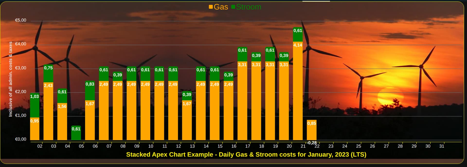
Hi all, I thought I’d share the code and image for a Monthly Stacked example that hopefully will answer some recently asked questions. There are some reported known issues when using this method, so checkout the HA Apex Chart github issues page if your question has not been answered by my posting. github link
type: vertical-stack
cards:
  - type: custom:config-template-card
    entities:
      - sensor.month
      - sensor.year
    card:
      type: custom:apexcharts-card
      graph_span: 1month
      cache: true
      span:
        start: month
        offset: +1day
      show:
        last_updated: false
        loading: false
      header:
        show: false
        standard_format: true
        floating: false
        show_states: false
      yaxis:
        - id: stroom&gas
          show: true
          min: 0
          max: 5
          decimals: 2
          apex_config:
            forceNiceScale: 'yes'
            labels:
              show: true
              formatter: |
                EVAL:function(value) {
                let text = parseFloat(value).toFixed(2);
                let result = "€" +text.replace(".", ",");
                return result;
                }
              style:
                colors: '#ffffff'
                fontSize: 14px
              offsetX: 0
              offsetY: 0
            axisBorder:
              show: false
              color: '#78909C'
            title:
              text: Inclusive of all admin. costs & taxes
              rotate: -90
              offsetX: 0
              offsetY: 0
              style:
                fontSize: 14px
      series:
        - entity: sensor.daily_gas_consumption_costs
          float_precision: 2
          type: column
          name: Gas
          yaxis_id: stroom&gas
          statistics:
            type: state
            period: day
            align: middle
          fill_raw: zero
          group_by:
            fill: zero
            duration: 1d
            start_with_last: false
            func: last
          color: orange
          unit: ' '
          show:
            legend_value: false
            in_header: true
            name_in_header: true
            header_color_threshold: true
            in_chart: true
            datalabels: true
            hidden_by_default: false
            extremas: false
        - entity: sensor.daily_electric_consumption_costs
          float_precision: 2
          type: column
          name: Stroom
          yaxis_id: stroom&gas
          statistics:
            type: state
            period: day
            align: middle
          fill_raw: zero
          group_by:
            fill: zero
            duration: 1d
            start_with_last: false
            func: last
          color: green
          unit: ' '
          show:
            legend_value: false
            in_header: true
            name_in_header: true
            header_color_threshold: true
            in_chart: true
            datalabels: true
            hidden_by_default: false
            extremas: false
      apex_config:
        chart:
          height: 500
          type: bar
          stacked: true
        plotOptions:
          bar:
            borderRadius: 5
            dataLabels:
              position: top
        dataLabels:
          enabled: true
          offsetX: 0
          offsetY: 0
          style:
            fontSize: 14px
            colors:
              - '#ffffff'
          zoom:
            enabled: false
          toolbar:
            show: true
            tools:
              download: true
              zoom: true
              zoomin: false
              zoomout: false
              pan: false
              reset: true
        tooltip:
          enabled: false
          shared: false
          theme: light
          style:
            fontSize: 14px
          onDatasetHover:
            highlightDataSeries: false
          x:
            show: true
            format: ddd dd MMM yyyy
          marker:
            show: false
          fixed:
            enabled: true
            position: topRight
            offsetX: -10
            offsetY: 0
        grid:
          show: true
          strokeDashArray: '0'
          borderColor: '#666666'
          xaxis:
            lines:
              show: false
          yaxis:
            lines:
              show: true
        xaxis:
          labels:
            show: true
            rotate: 0
            rotateAlways: true
            style:
              colors: '#ffffff'
              fontSize: 14px
            offsetX: 0
            offsetY: 0
            format: dd
          position: bottom
          showDuplicates: false
          axisBorder:
            show: true
            color: yellow
            height: 1
            width: 100%
            offsetX: 0
            offsetY: 5
          axisTicks:
            show: true
            color: yellow
            height: 6
            offsetX: 0
            offsetY: 0
          title:
            text: >-
              ${{'Stacked Apex Chart Example - Daily Gas & Stroom costs for ' +
              states['sensor.month'].state + ', ' + states['sensor.year'].state
              + ' (LTS)'}}
            offsetX: 0
            offsetY: 0
            floating: true
            style:
              fontSize: 20px
              color: '#fff000'
        legend:
          show: true
          showForSingleSeries: true
          position: top
          horizontalAlign: center
          fontSize: 25px
          offsetX: 0
          offsetY: 0
          labels:
            useSeriesColors: true
          onItemClick:
            toggleDataSeries: true
          onItemHover:
            highlightDataSeries: false
      card_mod:
        style: |

          ha-card {
            background-color: transparent;
            box-shadow: 0px 0px;

            border: 1px solid yellow;
            border-radius: 20px 20px 20px 20px;

            width: 99.4% !important;

            background-image: url("/local/images/windmill-sunset-3.jpg");

            background-size: 100% 500px;
          }
See my latest post that is using a monthly stacked method.
See my latest post that is using a monthly stacked method with datalabels.
Please help. How come the one graph plot is not even showing on the chart?
Do I need to set a min/max?
Thanks

Which one isn’t showing? Looks like your pool temp is only updating occasionally so there are gaps in the data.
Yea im not sure whats up with that, but its also almost below the minimum of the graph?
The default graph in HA displayed it just fine.
Confirm you are using chart_type line and not scatter?
And yes if you want to have more of a gap at the bottom you will have to use min but beware that is then fixed and may not be want you always want.
Yes, you should publish in MQTT