ApexCharts card - A highly customizable graph card

Team,

Is it possible to display the label at the “end of the line”?
Like in the photoshopped example below:

Regardles of the nice colors, it will be faster to see the room names if the labels are right there with the temperature axis.

Any pointers or suggestions?

Cheers!
DJ

Does anyone knows if its possible to make x-axis bolder than the other y=constant lines. Not the BASE of the chart, but y=0 line.

My workaround so far is use a helper which value is always 0. But adds an entity to the plot, etc…

      - entity: input_number.y_igual_a_zero
        color: rgb(255,255,255)
        float_precision: 1
        stroke_width: 2
        group_by:
          func: avg
          duration: 2s

Hi all,

I really like and appreciate the flexibility of ApexCharts and its implementation in HA.
However, I’m severely struggling with the shared tooltip once combining entities with “normal” sensor readings (like actual PV solar production) with those populated by the data_generator function (for getting forecast values from an entity’s attributes.

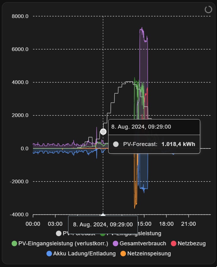
But only one data point is shown as soon as I add the PV forecast data (read from attributes):

This is my card’s YAML:

type: custom:apexcharts-card
graph_span: 1d
span:
  end: day
all_series_config:
  fill_raw: last
  extend_to: false
  show:
    legend_value: false
header:
  show: false
apex_config:
  stroke:
    show: true
    width: 1
    dashArray:
      - 2
      - 0
  dataLabels:
    enabled: true
  chart:
    height: 560px
  legend:
    showForZeroSeries: true
  tooltip:
    enabled: true
    shared: true
    intersect: false
series:
  - entity: sensor.solcast_pv_forecast_prognose_heute
    name: PV-Forecast
    data_generator: |
      return entity.attributes.detailedForecast.map((entry) => {
        return [new Date(entry.period_start), (entry.pv_estimate * 1000)];
      });
    color: lightgrey
    group_by:
      func: avg
      duration: 1min
  - entity: sensor.inverter_pv_leistung
    type: area
    name: PV-Eingangsleistung
    color: '#37872D'
    opacity: 0.2
    group_by:
      func: avg
      duration: 1min
  - entity: sensor.inverter_eingangsleistung_verlustkorrigiert
    color: '#73BF69'
    name: PV-Eingangsleistung (verlustkorr.)
    group_by:
      func: avg
      duration: 1min
  - entity: sensor.hausverbrauchsleistung
    type: area
    color: '#B877D9'
    opacity: 0.2
    name: Gesamtverbrauch
    group_by:
      func: avg
      duration: 1min
  - entity: sensor.power_meter_netzbezug
    type: area
    color: '#F2495C'
    opacity: 0.2
    name: Netzbezug
    group_by:
      func: avg
      duration: 1min
  - entity: sensor.battery_lade_entladeleistung_verlustkorrigiert
    type: area
    color: '#5794F2'
    opacity: 0.2
    name: Akku Ladung/Entladung
    group_by:
      func: avg
      duration: 1min
  - entity: sensor.power_meter_netzeinspeisung
    type: area
    invert: true
    color: '#FF9830'
    opacity: 0.2
    name: Netzeinspeisung
    group_by:
      func: avg
      duration: 1min
view_layout:
  grid-area: pvchart
card_mod:
  style: |
    ha-card {
      height: 572px !important;
    }

I already fiddled around with…

  • different grouping durations
  • letting the data_generator push the forecast values in shorter intervals (repeating hourly value 60-120 times per hour → for getting one value per minute and also for every 30th second returned)
  • changing the generated data to UTC time format

None worked. I assume that there is some kind of misalignment - either on the time scale (which I doubt though, as the sensor values carry different millisecond timestamps each as well), or in format.

Does anyone have an idea where I could look for the error next?

Thanks a lot,
Mat

EDIT - SOLUTION:

This is how the tooltip looks like as long as I don’t include the PV forecast data entity:

1 Like

thank you!

*don’t know how to do it but given this is something that deviates from documentations, this really should be stickied somewhere

Documentation can be updated by creating a fork from the github, modifying it and sending those back as a Pull Request … but if not known to github stuff this is not the easiest and that is imo also the reason wh a lot of doc remain untouched.

Helo all

How can I achieve labels showing the total sum of stacked columns?
I wonder if it takes inverted values as negative ones into equation.

I succeeded somehow by adding

show:
  datalabels: total

to all_series_config. But It displays the result (total) inside of each serie’s column (instead of once ber column)

type: custom:apexcharts-card
graph_span: 2h
update_interval: 10m
all_series_config:
  type: column
  stroke_width: 2
  float_precision: 3
  group_by:
    duration: 15m
    func: diff
stacked: true
header:
  show: true
  title: Energy 15mins
  show_states: true
  colorize_states: true
yaxis:
  - max: 2
color_list:
  - '#96C0B7'
  - '#878E88'
  - '#D4DFC7'
series:
  - entity: sensor.wattsonic_phase_a_energy_purchased
    name: Purchased A
    invert: true
  - entity: sensor.wattsonic_phase_b_energy_purchased
    name: Purchased B
    invert: true
  - entity: sensor.wattsonic_phase_c_energy_purchased
    name: Purchased C
    invert: true
  - entity: sensor.wattsonic_phase_a_energy_injected
    name: Injected A
  - entity: sensor.wattsonic_phase_b_energy_injected
    name: Injected B
  - entity: sensor.wattsonic_phase_c_energy_injected
    name: Injected C

Thank you in advance

Hi all,
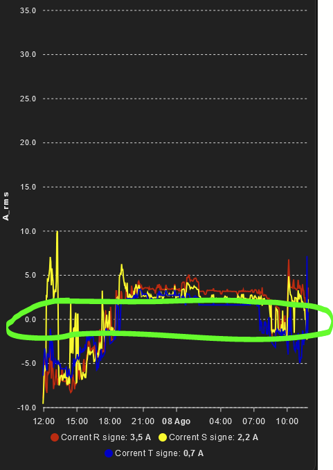
just startet with Apex charts. I created a bar chart that shows me per day for different power ranges for how long my solar panels produced in this range. I am trying to improve the orienatation to maximize the orientation to get above 100W for the longest time rather than a maximum power.

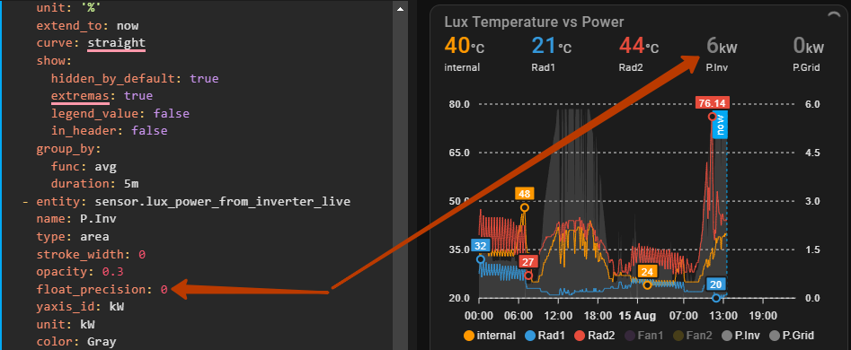
How can i change the time format so that it only shows hours and minutes rather than all the time until ms?

thank you, Martin

It looks like it’s still classified as a bug: I took the liberty of adding your observation to color_threshold missing since v2.1.2 · Issue #729 · RomRider/apexcharts-card · GitHub

2 Likes

Hi everyone,
does anybody know if it is possible to format the header states? I would like to show the value without decimals.

Is it possible to change the thickness of the horizontal grid lines?
image

Maybe ‘float_precision: 0’ might help?

1 Like

That was it, thank you :slight_smile:

Under apex_config:

  xaxis:
    crosshairs:
      show: true
      width: 5

The question was not about crosshairs, but about increasing the thickness of all the horizontal grid lines, which are marked with arrows in my screenshot.

Yeah, misread… apexcharts.js itself does not have it…so guess no option

1 Like

How to force the y-axis data labels to show 3 decimal places?

image

As a tip, you can start reading here for possible options (! not all will work) and then try out / search for similar things within the HA space to see if there are different annotations needed.
Options (Reference) > yaxis – ApexCharts.js

  yaxis:
    labels:
      show: true
      formatter: |
        EVAL:function(val) {
          return val.toFixed(3);
        }
1 Like

@vingerha , thanks, worked.

Why does the ‘now’ crosshair conflict with the x-axis labeled crosshair?
When ‘now’ is used, the x-axis labeled crosshair disappears.