fl-hol
June 7, 2025, 2:04pm
4489
Hi,
i am a beginner with coding and home assistant and i have a question about an apexcharts data generator.
sensor.electricity_meter_energy_consumption - sensor.electricity_meter_energy_production
can someone help me with this? i have this.
[type: custom:apexcharts-card
apex_config:
  chart:
    stacked: true
graph_span: 28day
span:
  end: day
show:
  last_updated: true
header:
  show: true
  show_states: true
  colorize_states: true
  title: Energieverbruik per dag
series:
  - entity: sensor.electricity_meter_energieverbruik
    name: energieverbruik
    type: line
    unit: ' kWh'
    color: darkviolet
    group_by:
      func: avg
      duration: 1d
  - entity: sensor.electricity_meter_energieproductie
    name: teruglevering
    type: column
    unit: ' kWh'
    color: slateblue
    invert: true
    group_by:
      func: max
      duration: 1d
  - entity: sensor.netto_verbruik
    name: Netto verbruik
    data_generator: |
      [[sensor.electricity_meter_energieverbruik - sensor.electricity_meter_energieproductie]]
    type: line
    show: in_header: true
Easiest is via a template sensor. The only other thing I know of is using statistics via the websocket api. Sadly this is not well documented as I would expect there would also be a solution for the states.
          data_generator: |
            const stat_entity1 = 'sensor.yoursensor1';
            var statistics1 = await hass.callWS({type: 'recorder/statistics_during_period',
            start_time: new Date(start).toISOString(), end_time: new Date(end).toISOString(),
            statistic_ids: [stat_entity1], period: 'hour'});
            var stats1 = statistics1[stat_entity1];
            var result = [];
            var len = stats1.length;
            for (let i = 0; i < len; i++) {let stat = stats1[i].state;
            result.push([(new Date(stats1[i].start).getTime()),stat]);}
            return result;
tilz0R
June 7, 2025, 6:22pm
4491
How does the statistics and group_by work together?
type: custom:apexcharts-card
graph_span: 12month
span:
  start: month
  offset: "-11month"
header:
  show: true
  title: Monthly use of washing machine
  show_states: true
  colorize_states: true
series:
  - entity: sensor.washing_machine_cycles_total
    type: column
    statistics:
      type: state
      period: month
Produces the correct values, grouped by month, but not number of times per month .
If I add the group_by part:
    statistics:
      type: state
      period: month
    group_by:
      duration: 1month
      func: diff
The chart disappears and I don’t see any issue in the JS console log.
What am I doing wrong?
NateJG
June 14, 2025, 8:25pm
4493
I’m getting odd behaviour when using color threshold.
I accept that this is experimental (and I’m happy raise it as a bug if necessary) but I’ve got a fairly simple graph setup:
type: custom:apexcharts-card
graph_span: 14d
experimental:
  color_threshold: true
header:
  show: true
  standard_format: true
  show_states: true
  colorize_states: true
series:
  - entity: sensor.front_bedroom_thermometer_pressure
    show:
      extremas: true
      header_color_threshold: true
    name: Air Pressure
    color_threshold:
      - value: 995
        color: blue
        opacity: 1
      - value: 1000
        color: cyan
        opacity: 1
      - value: 1005
        color: green
        opacity: 1
      - value: 1010
        color: yellow
        opacity: 1
      - value: 1015
        color: orange
        opacity: 1
      - value: 1020
        color: red
        opacity: 1
However on any dashboard I get a graph that looks like this:
Is it my settings or something else as I’d expect the colors to align with the Y axis?
TIA
Possibly gaps in the data, try to add fill_raw: last to the series
josemsubcn
June 16, 2025, 9:38pm
4496
Annotations, point yaxis to entity value:
I have a apexchart card and inside apex_config I have two annotations to draw a limit tolerance, but I want to point second limit (24.8) not a fixed value, I need to be equal to a entity value:
apex_config:
  annotations:
    position: back
    yaxis:
      - "y": 26.2
        strokeDashArray: 1
        borderColor: "#f80808"
        borderWidth: 3
      - "y": 24.8
        strokeDashArray: 1
        borderColor: "#f80808"
        borderWidth: 3
with a template solution is not working well, for example the following code do not work:
apex_config:
  annotations:
    position: back
    yaxis:
      - "y": 26.2
        strokeDashArray: 1
        borderColor: "#f80808"
        borderWidth: 3
      - "y": {{ states('input_number.lim_confort_suite') | float }}
        strokeDashArray: 1
        borderColor: "#f80808"
        borderWidth: 3
There is any solution?
Thanks
Embed the card in card-templater, this question pops up many (!) times up in this thread…
Hi! Sorry for the late bump on the message. Did you find a solution for this? Thanks
As I just looked at the same thing, I went for config-template-card to accomplish this, with limitations. The issue with annotations, as far as I could see: they are fixed because they aren’t loaded dynamically when the graph is re-drawn/appended. So if that dynamic value changes, there is nothing there that would notify the annotation to redraw.
With config-template-card you can accomplish this but be aware that each refresh of that input will cause a full redraw of the graph. No other way to update the annotation. So make sure it’s not a sensor that updates often!
Here my code for the relevant parts:
type: custom:config-template-card
entities:
  - sensor.solcast_pv_forecast_power_now
variables:
  forecast_kw: states['sensor.solcast_pv_forecast_power_now'].state / 1000
card:
  type: custom:apexcharts-card
  graph_span: 15m
  update_interval: 2s
  apex_config:
    chart:
      animations:
        enabled: false
    tooltip:
      shared: true
    legend:
      show: false
    annotations:
      yaxis:
        - "y": 20.59
          borderColor: "#FF0000"
          strokeDashArray: 3
          label:
            text: Inverter Limit
            position: left
            offsetX: 60
            style:
              color: "#FF0000"
              fontSize: 8px
        - "y": ${forecast_kw}
          borderColor: "#A9A9A9"
          strokeDashArray: 3
          label:
            text: Forecast Power
            position: left
            offsetX: 60
            style:
              color: "#A9A9A9"
              fontSize: 8px
Chykan
June 23, 2025, 9:48am
4500
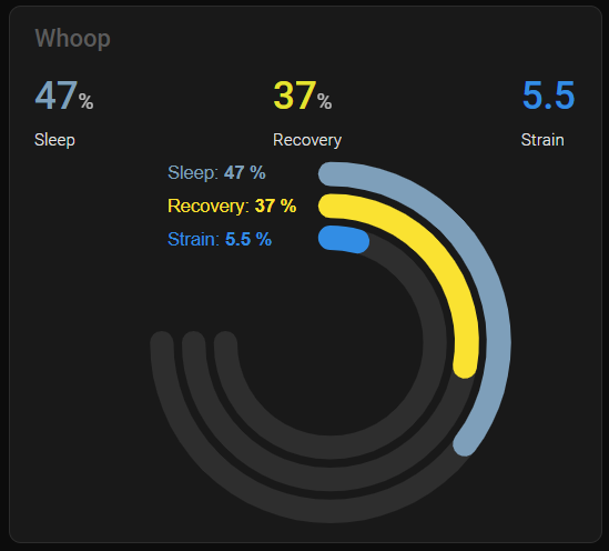
@sturgeo Finally got it working, this is adjusted to fit within section few. Card jumps around a bit when editing and changing view port size.
FULL CARD CODE (4 Wide Sections) (JUST ADD 3 SENSORS)
type: custom:apexcharts-card
header:
  show: true
  title: Whoop
  floating: true
  show_states: true
  colorize_states: true
experimental:
  color_threshold: true
chart_type: radialBar
apex_config:
  chart:
    offsetX: 0
    offsetY: 0
  grid:
    padding:
      left: 0
      right: 0
      bottom: -20
      top: 70
  plotOptions:
    radialBar:
      offsetY: 0
      startAngle: 0
      endAngle: 270
      hollow:
        margin: 100
        size: 40%
        background: transparent
      dataLabels:
        name:
          show: true
        value:
          show: true
  legend:
    show: true
    floating: true
    fontSize: 10vw
    position: left
    offsetX: 80
    offsetY: 73
    labels:
      useSeriesColors: true
    markers:
      size: 0
series:
  - entity: sensor.whoop_andrew_sleep_performance
    name: Sleep
    fill_raw: last
    color_threshold:
      - value: 0
        color: " #7BA1BB"
    show:
      legend_value: true
      header_color_threshold: true
  - entity: sensor.whoop_andrew_recovery_score
    name: Recovery
    fill_raw: last
    color_threshold:
      - value: 0
        color: "#FF0026"
      - value: 34
        color: "#FFDE00"
      - value: 67
        color: "#16EC06"
    show:
      legend_value: true
      header_color_threshold: true
  - entity: sensor.whoop_andrew_day_strain
    name: Strain
    fill_raw: last
    color_threshold:
      - value: 0
        color: "#0093E7"
    show:
      legend_value: true
      header_color_threshold: true
offset for chart
apex_config:
  chart:
    offsetX: -30
    offsetY: 0
offset for legend
apex_config:
legend:
    show: true
    floating: true
    fontSize: 12px
    position: left
    offsetX: 95
    offsetY: 78
1 Like
Chykan
June 24, 2025, 7:30am
4501
Radial Bar Chart Layouts
          - type: custom:apexcharts-card
            apex_config:
              chart: # Moves the Radial Bars themselves around
                offsetX: 0
                offsetY: 20
              grid: # Adjust this when you move the chart with the above offsets
                padding:
                  left: 0
                  right: 0
                  bottom: 0
                  top: 0
              legend: # Moves the legend around, change the font size and you will have to change the offset.
                show: true
                floating: true
                fontSize: 15px
                position: top
                offsetX: -20
                offsetY: 5
Only Legend displayed at top
Whoop Mobile Legend
- type: custom:apexcharts-card
            header:
              show: true
              title: Whoop Mobile Legend
              floating: true
              show_states: false
              colorize_states: true
            experimental:
              color_threshold: true
            chart_type: radialBar
            apex_config:
              chart:
                offsetX: 0
                offsetY: 20
              grid:
                padding:
                  left: 0
                  right: 0
                  bottom: 0
                  top: 0
              plotOptions:
                radialBar:
                  offsetY: 0
                  startAngle: 0
                  endAngle: 270
                  hollow:
                    margin: 100
                    size: 40%
                    background: transparent
                  dataLabels:
                    name:
                      show: true
                    value:
                      show: true
              legend:
                show: true
                floating: true
                fontSize: 15px
                position: top
                offsetX: -20
                offsetY: 5
                labels:
                  useSeriesColors: true
                markers:
                  size: 0
            series:
              - entity: sensor.whoop_andrew_sleep_performance
                name: Sleep
                fill_raw: last
                color_threshold:
                  - value: 0
                    color: ' #7BA1BB'
                show:
                  legend_value: true
                  header_color_threshold: true
              - entity: sensor.whoop_andrew_recovery_score
                name: Recovery
                fill_raw: last
                color_threshold:
                  - value: 0
                    color: '#FF0026'
                  - value: 34
                    color: '#FFDE00'
                  - value: 67
                    color: '#16EC06'
                show:
                  legend_value: true
                  header_color_threshold: true
              - entity: sensor.whoop_andrew_day_strain
                name: Strain
                fill_raw: last
                color_threshold:
                  - value: 0
                    color: '#0093E7'
                show:
                  legend_value: true
                  header_color_threshold: true
Legend and States Displayed
Whoop Mobile States
- type: custom:apexcharts-card
            header:
              show: true
              title: Whoop Mobile States
              floating: true
              show_states: true
              colorize_states: true
            experimental:
              color_threshold: true
            chart_type: radialBar
            apex_config:
              chart:
                offsetX: 0
                offsetY: 10
              grid:
                padding:
                  left: 0
                  right: 0
                  bottom: 0
                  top: 70
              plotOptions:
                radialBar:
                  offsetY: 0
                  startAngle: 0
                  endAngle: 270
                  hollow:
                    margin: 100
                    size: 40%
                    background: transparent
                  dataLabels:
                    name:
                      show: true
                    value:
                      show: true
              legend:
                show: true
                floating: true
                fontSize: 10px
                position: left
                offsetX: 40
                offsetY: 50
                labels:
                  useSeriesColors: true
                markers:
                  size: 0
            series:
              - entity: sensor.whoop_andrew_sleep_performance
                name: Sleep
                fill_raw: last
                color_threshold:
                  - value: 0
                    color: ' #7BA1BB'
                show:
                  legend_value: true
                  header_color_threshold: true
              - entity: sensor.whoop_andrew_recovery_score
                name: Recovery
                fill_raw: last
                color_threshold:
                  - value: 0
                    color: '#FF0026'
                  - value: 34
                    color: '#FFDE00'
                  - value: 67
                    color: '#16EC06'
                show:
                  legend_value: true
                  header_color_threshold: true
              - entity: sensor.whoop_andrew_day_strain
                name: Strain
                fill_raw: last
                color_threshold:
                  - value: 0
                    color: '#0093E7'
                show:
                  legend_value: true
                  header_color_threshold: true
Shows only Legend
Whoop Mobile Legend
- type: custom:apexcharts-card
            header:
              show: true
              title: Whoop Mobile Legend
              floating: true
              show_states: false
              colorize_states: true
            experimental:
              color_threshold: true
            chart_type: radialBar
            apex_config:
              chart:
                offsetX: 0
                offsetY: 0
              grid:
                padding:
                  left: 0
                  right: 0
                  bottom: 0
                  top: 0
              plotOptions:
                radialBar:
                  offsetY: 0
                  startAngle: 0
                  endAngle: 270
                  hollow:
                    margin: 100
                    size: 40%
                    background: transparent
                  dataLabels:
                    name:
                      show: true
                    value:
                      show: true
              legend:
                show: true
                floating: true
                position: left
                offsetX: 20
                offsetY: 5
                labels:
                  useSeriesColors: true
                markers:
                  size: 0
            series:
              - entity: sensor.whoop_andrew_sleep_performance
                name: Sleep
                fill_raw: last
                color_threshold:
                  - value: 0
                    color: ' #7BA1BB'
                show:
                  legend_value: true
                  header_color_threshold: true
              - entity: sensor.whoop_andrew_recovery_score
                name: Recovery
                fill_raw: last
                color_threshold:
                  - value: 0
                    color: '#FF0026'
                  - value: 34
                    color: '#FFDE00'
                  - value: 67
                    color: '#16EC06'
                show:
                  legend_value: true
                  header_color_threshold: true
              - entity: sensor.whoop_andrew_day_strain
                name: Strain
                fill_raw: last
                color_threshold:
                  - value: 0
                    color: '#0093E7'
                show:
                  legend_value: true
                  header_color_threshold: true
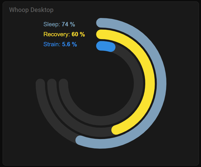
Shows States and Legend
Whoop Desktop States
          - type: custom:apexcharts-card
            header:
              show: true
              title: Whoop Desktop States
              floating: true
              show_states: true
              colorize_states: true
            experimental:
              color_threshold: true
            chart_type: radialBar
            apex_config:
              chart:
                offsetX: 0
                offsetY: 60
              grid:
                padding:
                  left: 0
                  right: 0
                  bottom: 40
                  top: 0
              plotOptions:
                radialBar:
                  offsetY: 0
                  startAngle: 0
                  endAngle: 270
                  hollow:
                    margin: 100
                    size: 40%
                    background: transparent
                  dataLabels:
                    name:
                      show: true
                    value:
                      show: true
              legend:
                show: true
                floating: true
                position: left
                fontSize: 15
                offsetX: 65
                offsetY: 10
                labels:
                  useSeriesColors: true
                markers:
                  size: 0
            series:
              - entity: sensor.whoop_andrew_sleep_performance
                name: Sleep
                fill_raw: last
                color_threshold:
                  - value: 0
                    color: ' #7BA1BB'
                show:
                  legend_value: true
                  header_color_threshold: true
              - entity: sensor.whoop_andrew_recovery_score
                name: Recovery
                fill_raw: last
                color_threshold:
                  - value: 0
                    color: '#FF0026'
                  - value: 34
                    color: '#FFDE00'
                  - value: 67
                    color: '#16EC06'
                show:
                  legend_value: true
                  header_color_threshold: true
              - entity: sensor.whoop_andrew_day_strain
                name: Strain
                fill_raw: last
                color_threshold:
                  - value: 0
                    color: '#0093E7'
                show:
                  legend_value: true
                  header_color_threshold: true
Shows Legend
Whoop Desktop Legend
- type: custom:apexcharts-card
            header:
              show: true
              title: Whoop Desktop Legend
              floating: true
              show_states: false
              colorize_states: true
            experimental:
              color_threshold: true
            chart_type: radialBar
            apex_config:
              chart:
                offsetX: 0
                offsetY: 0
              grid:
                padding:
                  left: 0
                  right: 0
                  bottom: 0
                  top: 0
              plotOptions:
                radialBar:
                  offsetY: 0
                  startAngle: 0
                  endAngle: 270
                  hollow:
                    margin: 100
                    size: 40%
                    background: transparent
                  dataLabels:
                    name:
                      show: true
                    value:
                      show: true
              legend:
                show: true
                floating: true
                position: left
                fontSize: 15
                offsetX: 65
                offsetY: 25
                labels:
                  useSeriesColors: true
                markers:
                  size: 0
            series:
              - entity: sensor.whoop_andrew_sleep_performance
                name: Sleep
                fill_raw: last
                color_threshold:
                  - value: 0
                    color: ' #7BA1BB'
                show:
                  legend_value: true
                  header_color_threshold: true
              - entity: sensor.whoop_andrew_recovery_score
                name: Recovery
                fill_raw: last
                color_threshold:
                  - value: 0
                    color: '#FF0026'
                  - value: 34
                    color: '#FFDE00'
                  - value: 67
                    color: '#16EC06'
                show:
                  legend_value: true
                  header_color_threshold: true
              - entity: sensor.whoop_andrew_day_strain
                name: Strain
                fill_raw: last
                color_threshold:
                  - value: 0
                    color: '#0093E7'
                show:
                  legend_value: true
                  header_color_threshold: true
3 Likes
Ideefiks
June 25, 2025, 1:52pm
4503
This is a nifty piece of code and it works great but is not compatible with custom:config-template-card, a case of you-can’t-have-it-all or is there a way to make both compatible?
If you search this thread you will find quite a few of working examples, so no clue how you came to this conclusion. There is also card-templater
Ideefiks
June 25, 2025, 2:44pm
4505
I couldn’t make it work first, but after noticing both use this syntax ${} I removed all config_template stuff and your tooltip code worked
Ideefiks
June 25, 2025, 3:01pm
4506
I did the same and left the update interval at 30s. Also, not all the entities you use in the variables need to be defined in the entities section, I only added the ones I want triggering an update. You can also use this to dynamically change the chart title, series names, axis ranges etc
Ideefiks
June 25, 2025, 3:13pm
4507
When using datetime the labels switch based on the span shown in the graph, so it automatically switches to hours because it considers there are not sufficient days to stick with days. I ended up using annotations to get the exact labels I wanted
Chykan
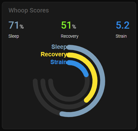
June 26, 2025, 12:52am
4508
barLabels: not legend: like in the above post .This example is using barLabels:offsetX: and offsetY: settings have no affect under the barLables: options (must be a bug).
The position of the barLabels: seems to be calculated on CSS device-width in px: and is also obscured by the margin of the track:
I found playing with the track margin unobscured the ‘barLabels:’
Depending on your screen width, change the track: margin: and barLabels: fontSize: under apex_config: plotOptions:
This means if you want to display the card on different devices you will have to setup a different config for the card for each device screen width. Use ‘@media-queries ’ screen sizes to conditionally show each card.
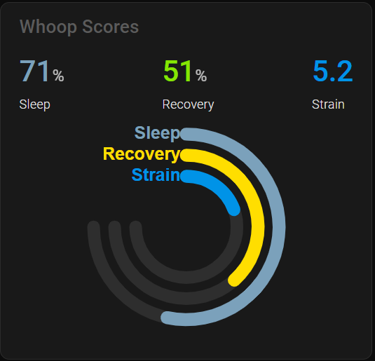
FULL CARD CODE (Behaviour shown below using the same code on different device screen screen widths)
type: custom:apexcharts-card
header:
  show: true
  title: Whoop Scores
  floating: true
  show_states: true
  colorize_states: true
experimental:
  color_threshold: true
chart_type: radialBar
apex_config:
  chart:
    offsetX: 0
    offsetY: 0
  grid:
    padding:
      left: 0
      right: 0
      bottom: 0
      top: 20
  plotOptions:
    radialBar:
      offsetY: 60
      startAngle: 0
      endAngle: 270
      hollow:
        margin: 100
        size: 30%
        background: transparent
      dataLabels:
        name:
          show: true
        value:
          show: true
      barLabels:
        enabled: true
        useSeriesColors: true
        offsetX: 0
        offsetY: 0
        fontSize: 15
      track:
        show: true
        margin: 7
  legend:
    show: false
    floating: true
    fontSize: 10px
    position: bottom
    offsetX: -15
    offsetY: 0
    labels:
      useSeriesColors: true
    markers:
      size: 0
series:
  - entity: sensor.whoop_andrew_sleep_performance
    name: Sleep
    fill_raw: last
    color_threshold:
      - value: 0
        color: " #7BA1BB"
    show:
      legend_value: false
      header_color_threshold: true
  - entity: sensor.whoop_andrew_recovery_score
    name: Recovery
    fill_raw: last
    color_threshold:
      - value: 0
        color: "#FF0026"
      - value: 34
        color: "#FFDE00"
      - value: 67
        color: "#16EC06"
    show:
      legend_value: false
      header_color_threshold: true
  - entity: sensor.whoop_andrew_day_strain
    name: Strain
    fill_raw: last
    min: 0
    max: 20
    color_threshold:
      - value: 0
        color: "#0093E7"
    show:
      legend_value: false
      header_color_threshold: true
device-width in px: 360px
device-width in px: 1280px
device-width in px: >2000px
Below is a good tool to test your screens.
could anyone please check if they see this too:
opened 01:03PM - 29 Jun 25 UTC
### Checklist
- [x] I have updated to the latest available Home Assistant versi… on.
- [x] I have cleared the cache of my browser.
- [x] I have tried a different browser to see if it is related to my browser.
- [ ] I have tried reproducing the issue in [safe mode](https://www.home-assistant.io/blog/2023/11/01/release-202311/#restarting-into-safe-mode) to rule out problems with unsupported custom resources.
### Describe the issue you are experiencing
user theme
<img width="301" alt="Image" src="https://github.com/user-attachments/assets/afbc92b3-fd4d-4a48-b0bd-ee0bef432ddc" />
HA default theme
<img width="340" alt="Image" src="https://github.com/user-attachments/assets/07f5ae91-cb33-4880-9003-b946baf4082e" />
### Describe the behavior you expected
not shining through
### Steps to reproduce the issue
1. use apexchartscard in view and scroll, or edit UI
2.
3.
...
### What version of Home Assistant Core has the issue?
2025.7.0b4
### What was the last working version of Home Assistant Core?
_No response_
### In which browser are you experiencing the issue?
Safari Mac
### Which operating system are you using to run this browser?
macOS Sequoia 15.5
### State of relevant entities
```txt
```
### Problem-relevant frontend configuration
```yaml
```
### JavaScript errors shown in your browser console/inspector
```txt
```
### Additional information
As I have never seen this, and havent updated Apexcharts card in a long time (it's on the latest release of course), I figured it would be a HA issue introduced during beta 2025.7
all of a sudden I notice those controls shining through the menu,
If its new to HA (running 2025.7 beta myself) it would be a HA issue.
if you all see it too, running non 2025.7 beta, it probably is an unnoticed apexcharts-card issue…apexcharts-toolbar z-index too high, shining through HA menu and menubar · Issue #927 · RomRider/apexcharts-card · GitHub