ApexCharts card - A highly customizable graph card

I am having a little problem with this card.
I have configured a series in this way:

    - entity: climate.salotto
      attribute: temperature
      name: Temp. desiderata
      stroke_width: 1.5
      type: line
      color: "#CC3333"
      opacity: 1
      unit: °C
      show:
        extremas: false
        in_header: false
      group_by:
        func: avg
        duration: 2m

The attributes of that entity are these:

But i have this in the dashboard about this entry:

Why the attribute ‘temperature’ in ‘Temp. desiderata’ is not rendered?

Hi,

I have been hacking away at ApexCharts for some time and my latest project is to create a weather dashboard which looks as closed as possible to my weather app. This may be a fools errand, but actually delivering this has become secondary to tinkering around.

I have created something pretty close to what I want, but there are a few things that I am unable to sort, hence my post.

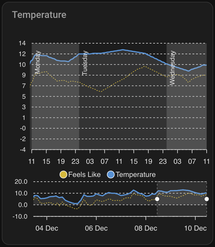
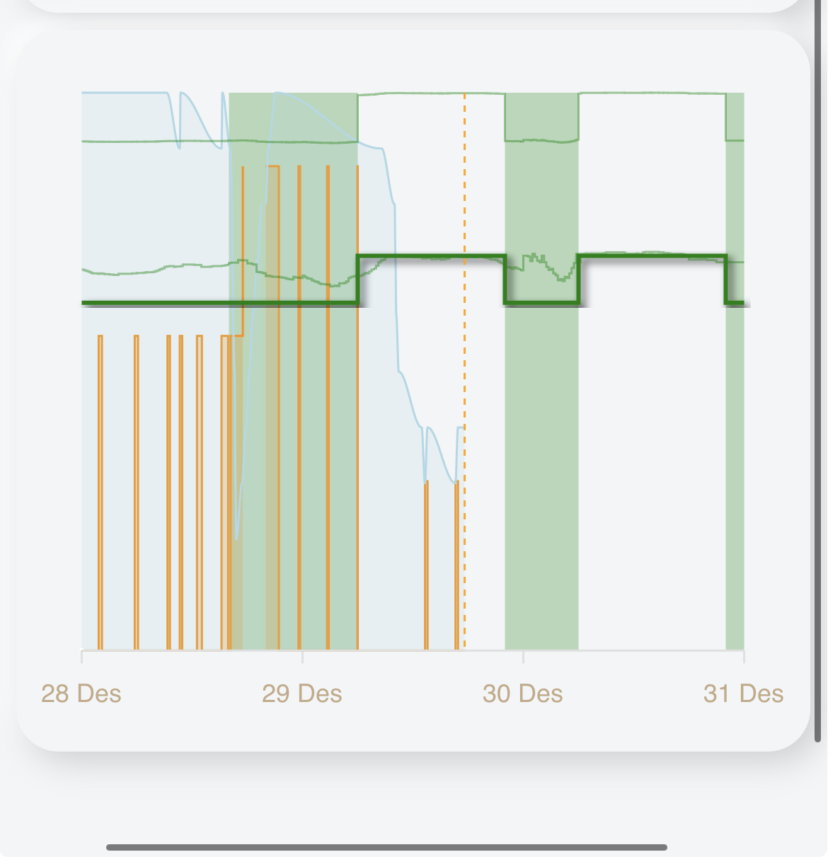
I am creating an hourly view that allows me to toggle between charts for temperature, precipitation, wind etc. In my app, I can see two days and I am able to scroll the chart with my finger to see up to 10 days out.

In Apexcharts, I have achieved something similar by defining a brush which is working well and gives me what I want. However, when the chart is initially rendered, the selection on the brush is rightmost, which results in the default view being 5 days in the future. Ideally, I would like the default selection to be left aligned, which sill provide the forecast for now up to the next 2 days. I have included a screenshot that shows this.

Reading through the documentation, it seems that this is possible and would be configured using apex_config under chart and selection as shown below:

apex_config:
  chart:
    id: temperature
    height: 100%
  selection:
    enabled: true
    xaxis:
      min: EVAL:new Date().setMinutes(00,0,0)
      max: >-
        EVAL:new Date(new Date().setDate(new Date().getDate() +
        2)).setMinutes(00,0,0)

Sadly, this does not work as expected and I have spent a lot of time researching and hacking and have not managed to find a solution, hence my post here. One thing I did try is to put the relevant apex_config for this under brush, as follows:

brush:
  selection_span: 2d
  apex_config:
    selection:
      enabled: true
      xaxis:
        min: EVAL:new Date().setMinutes(00,0,0)
        max: >-
          EVAL:new Date(new Date().setDate(new Date().getDate() +
          2)).setMinutes(00,0,0)      

Right now I am circling the drain on this and any help would be much appreciated.

For completeness, here is the full card config:

type: custom:apexcharts-card
experimental:
  color_threshold: true
  brush: true
apex_config:
  plotOptions:
    area:
      fillTo: end
  chart:
    id: temperature
    height: 100%
  selection:
    enabled: true
    xaxis:
      min: EVAL:new Date().setMinutes(00,0,0)
      max: >-
        EVAL:new Date(new Date().setDate(new Date().getDate() +
        2)).setMinutes(00,0,0)
  grid:
    show: true
    xaxis:
      lines:
        show: false
  xaxis:
    type: datetime
    tickAmount: 12
    labels:
      format: HH
  annotations:
    xaxis:
      - x: >-
          EVAL:new Date(new Date().setDate(new Date().getDate() +
          1)).setHours(00,0,0)
        x2: >-
          EVAL:new Date(new Date().setDate(new Date().getDate() +
          2)).setHours(00,0,0)          
        borderColor: "#0000"
        opacity: 0.2
        label:
          text: Tomorrow
          orientation: vertical
          textAnchor: middle
          offsetX: 18
          offsetY: 0
          borderWidth: 0
          style:
            background: "#0000"
      - x: >-
          EVAL:new Date(new Date().setDate(new Date().getDate() +
          2)).setHours(00,0,0)
        x2: >-
          EVAL:new Date(new Date().setDate(new Date().getDate() +
          3)).setHours(00,0,0)          
        borderColor: "#0000"
        opacity: 0
        label:
          text: >-
            EVAL:["Sunday", "Monday", "Tuesday", "Wednesday", "Thursday",
            "Friday", "Saturday"][new Date(new Date(new Date().setDate(new
            Date().getDate() + 2)).setHours(00,0,0)).getDay()]
          orientation: vertical
          textAnchor: middle
          offsetX: 18
          offsetY: 0
          borderWidth: 0
          style:
            background: "#0000"
      - x: >-
          EVAL:new Date(new Date().setDate(new Date().getDate() +
          3)).setHours(00,0,0)
        x2: >-
          EVAL:new Date(new Date().setDate(new Date().getDate() +
          4)).setHours(00,0,0)          
        borderColor: "#0000"
        opacity: 0.2
        label:
          text: >-
            EVAL:["Sunday", "Monday", "Tuesday", "Wednesday", "Thursday",
            "Friday", "Saturday"][new Date(new Date(new Date().setDate(new
            Date().getDate() + 3)).setHours(00,0,0)).getDay()]
          orientation: vertical
          textAnchor: middle
          offsetX: 18
          offsetY: 0
          borderWidth: 0
          style:
            background: "#0000"
      - x: >-
          EVAL:new Date(new Date().setDate(new Date().getDate() +
          4)).setHours(00,0,0)
        x2: >-
          EVAL:new Date(new Date().setDate(new Date().getDate() +
          5)).setHours(00,0,0)          
        borderColor: "#0000"
        opacity: 0
        label:
          text: >-
            EVAL:["Sunday", "Monday", "Tuesday", "Wednesday", "Thursday",
            "Friday", "Saturday"][new Date(new Date(new Date().setDate(new
            Date().getDate() + 4)).setHours(00,0,0)).getDay()]
          orientation: vertical
          textAnchor: middle
          offsetX: 18
          offsetY: 0
          borderWidth: 0
          style:
            background: "#0000"
      - x: >-
          EVAL:new Date(new Date().setDate(new Date().getDate() +
          5)).setHours(00,0,0)
        x2: >-
          EVAL:new Date(new Date().setDate(new Date().getDate() +
          6)).setHours(00,0,0)          
        borderColor: "#0000"
        opacity: 0.2
        label:
          text: >-
            EVAL:["Sunday", "Monday", "Tuesday", "Wednesday", "Thursday",
            "Friday", "Saturday"][new Date(new Date(new Date().setDate(new
            Date().getDate() + 5)).setHours(00,0,0)).getDay()]
          orientation: vertical
          textAnchor: middle
          offsetX: 18
          offsetY: 0
          borderWidth: 0
          style:
            background: "#0000"
      - x: >-
          EVAL:new Date(new Date().setDate(new Date().getDate() +
          6)).setHours(00,0,0)
        x2: >-
          EVAL:new Date(new Date().setDate(new Date().getDate() +
          7)).setHours(00,0,0)          
        borderColor: "#0000"
        opacity: 0
        label:
          text: >-
            EVAL:["Sunday", "Monday", "Tuesday", "Wednesday", "Thursday",
            "Friday", "Saturday"][new Date(new Date(new Date().setDate(new
            Date().getDate() + 6)).setHours(00,0,0)).getDay()]
          orientation: vertical
          textAnchor: middle
          offsetX: 18
          offsetY: 0
          borderWidth: 0
          style:
            background: "#0000"
      - x: >-
          EVAL:new Date(new Date().setDate(new Date().getDate() +
          7)).setHours(00,0,0)
        x2: >-
          EVAL:new Date(new Date().setDate(new Date().getDate() +
          8)).setHours(00,0,0)          
        borderColor: "#0000"
        opacity: 0.2
        label:
          text: >-
            EVAL:["Sunday", "Monday", "Tuesday", "Wednesday", "Thursday",
            "Friday", "Saturday"][new Date(new Date(new Date().setDate(new
            Date().getDate() + 7)).setHours(00,0,0)).getDay()]
          orientation: vertical
          textAnchor: middle
          offsetX: 18
          offsetY: 0
          borderWidth: 0
          style:
            background: "#0000"
graph_span: 7d
span:
  start: hour
brush:
  selection_span: 2d
header:
  show: true
  title: Temperature (Working)
  show_states: false
  colorize_states: true
yaxis:
  - id: temperature
    decimals: 0
    align_to: 2
    apex_config:
      tickAmount: 10
series:
  - entity: weather.pirateweather
    name: Feels Like
    data_generator: >
      const serviceData = {
        "type": "hourly"
      };

      const target = {
        "entity_id": "weather.pirateweather"
      };

      const hourlyForecast = await hass.callService("weather", "get_forecasts",
      serviceData, target, true, true);

      return
      hourlyForecast.response["weather.pirateweather"].forecast.map((forecast,
      index) => {
        return [new Date(forecast.datetime).getTime(), forecast.apparent_temperature];
      });
    unit: °C
    color: "#D8B800"
    yaxis_id: temperature
    stroke_width: 1
    stroke_dash: 2
    show:
      in_chart: true
      in_brush: true
      legend_value: false
  - entity: weather.pirateweather
    name: Temperature
    data_generator: >
      const serviceData = {
        "type": "hourly"
      };

      const target = {
        "entity_id": "weather.pirateweather"
      };

      const hourlyForecast = await hass.callService("weather", "get_forecasts",
      serviceData, target, true, true);

      return
      hourlyForecast.response["weather.pirateweather"].forecast.map((forecast,
      index) => {
        return [new Date(forecast.datetime).getTime(), forecast.temperature];
      });
    unit: °C
    color: "#4990D8"
    opacity: 0.5
    yaxis_id: temperature
    type: area
    stroke_width: 2
    fill_raw: last
    show:
      in_chart: true
      in_brush: true
      legend_value: false
    color_threshold:
      - value: 0
        color: "#8D8E90"
        opacity: 0.2

Try with config-template-card HACS. For example I am dynamically setting graph_span like this:

type: custom:config-template-card
entities:
  - sensor.xxxx
card: 
  type: custom:apexcharts-card
  graph_span: ${new Date().getHours().toString() + "h"}
...

I was just looking for the same solution, so this one works for me. Entities can also be empty. From the docs:
“List of entity strings that should be watched for updates”, sicne I don’t have entities inside templates I think it can be left empty.

I didn’t try with min/max, but I think it should also work.

Hi!

I really love apex-charts!

I wanted to share with you a dash I made with the apex as the main event. It displays electricity prices and planned solar production.

Then there’s some other good to know sparklines and other stuff as well.

1 Like

@Timpa That is a very nice looking dashboard. Well polished, well done.

1 Like

No, templating is not supported by default but you can wrap an apex chart in a config-template-card. I posted a (very elaborate) example that includes what you are looking for

These are two different things, selection highlights an area within your chart (such a user dragging over it manually) whilst the brush allows scrolling the entire chart but does not select anything. Others have asked this as well but I don’t think it is possible.

Alternatively, why not remove the brush, create a couple identical copies of this chart with different spans in a conditional card and toggle between them? @Mariusthvdb described this method in more detail above.

Fools errand it may be, but you are not the only one trying to build a weather dashboard using apex charts :sweat_smile:

I have same issue with the N/A of the sensors above the graph. Do you have a solution?

Thanks! Took a while :sweat_smile: If anyone want anything from it let me know

1 Like

Hey Guys

Loving this card. I’m using this to monitor the water level on my Pond
I’m having trouble setting the Y Axis as I’d like to see it.

My min value is 40cm
My Max value is 60cm
My IDEAL Level is between 48 to 52cm

So I’d love my Y axis to show
60
52
48
40

Is there anyway to achive this; Currently I have

yaxis:
  - min: 40
    max: 60
    decimals: 1
    apex_config:
      tickAmount: 2

Which only shows
60
50
40

If anyone could help that would be amazballs

For anyone else trying to do the same, this did the trick for me

type: custom:apexcharts-card
header:
  show: true
  title: Pond Water Height = 48-50cm - Fill <48 - Empty >50
  show_states: false
  colorize_states: false
graph_span: 12h
update_interval: 10min
apex_config:
  annotations:
    yaxis:
      - "y": 48
        borderColor: "#9575CD"
        borderWidth: 3
        strokeDashArray: 3
        label:
          text: "48"
          style:
            color: "#fff8dc"
            background: rgba(0, 0, 0, 0.8)
            fontSize: 10px
            fontFamily: Segoe UI Light
          position: left
      - "y": 50
        borderColor: "#9575CD"
        borderWidth: 3
        strokeDashArray: 3
        label:
          text: "50"
          style:
            color: "#fff8dc"
            background: rgba(0, 0, 0, 0.8)
            fontSize: 10px
            fontFamily: Segoe UI Light
          position: left
  yaxis:
    forceNiceScale: true
    min: 46
    max: 52
    tickAmount: 1
    labels:
      style:
        fontSize: 10px
        fontFamily: Segoe UI Light
series:
  - entity: sensor.zigbee_moray_pond_pond_water_height_sensor_liquid_depth
    type: line
    color: darkcyan
    stroke_width: 2
    curve: smooth

Almost there…

In a small graph like this:

How can I get the x-axis labels to be the first letter of the weekday (so that all of them get shown)?

type: custom:apexcharts-card
section_mode: true
grid_options:
  columns: 6
  rows: auto
graph_span: 144h
header:
  show: false
span:
  start: day
  offset: "-7d"
apex_config:
  chart:
    type: line
    height: 200
  stroke:
    show: false
  legend:
    show: false
  dataLabels:
    enabled: false
  xaxis:
    type: datetime
    labels:
      format: "ddd"
series:
  - entity: sensor.bresser51_rain
    name: Neerslag
    type: column
    statistics:
      type: change
      period: day
      align: start

After some struggling with javascript functions, I found out that in my case I can use the apex option locale for this.

apex_config:
  chart:
    locales:
      - name: nl
        options:
          shortDays: [ "Z","M","D","W","D","V","Z" ]
    defaultLocale: nl
3 Likes

If you ended up setting the min to 46 and the max to 52 why not just set the tick to three?

To do what you originally planned, easiest would be to set a formatter function on the axis labels and hide every label except your ideal range.

With annotations you have more freedom, you always need two to show the two values but you can also turn one into a range so you can immediately see whether your series is within your ideal range.

I am trying to replicate the chart of my electricity company that charges us for the average of three highest power peaks per month.

How do I map the entity in apexchart in order to use the custom attribute last_updated_real instead of the normal timestamp (presumably last_updated)?

I am using a time triggered sensor (helper) to poll today’s maximum value from another daily max sensor (this as I’m not interested in the progress to establish the max value, and as it is reset to 0 every midnight)).

The custom time attribute is added in the configuration.yaml

template:
  - triggers:
    - trigger: time
      at: "23:55:00"
    sensor:
      - name: "Power Consumed Hourly Average Daily Max Running"
        unique_id: power_consumed_hourly_average_daily_max_running
        device_class: power
        unit_of_measurement: kW
        state: "{{ (states('sensor.power_consumed_hourly_average_daily_max') | float ) }}"
        attributes:
          last_updated_real: "{{ states.sensor.power_consumed_hourly_average_daily_max.last_updated }}"

My knowledge and understanding of java, which seems to be the key here, is still very limited.

Is there a way to choose the placement of datalabels for each serie? I have an average line compared to 7 daily bars. The daily bars need the datalabel -15 above the bar and the datalabel of the avg line needs to be directly on the line, so offset 0. You can only set offset one time right?

How do i get the header in one row? now the third value is on a new row. Can i adjust this? or maybe the make the font smaller? i want all 3 values in a single row.

Have anyone managed to create vertical(?) ‘buckets’ that show an entities value? I have a ‘fill level’ sensor for my hot water tank and wish to visualise it in 10 ‘buckets’ or ‘steps’ like in the UniFi-app for connections, example:

Here is my visualization for the time being, the blue area-graph is what i wish to have in a 10-step bucket (the sensor increases/decreases with 10%, so i guess 10 steps…)

Never tried it myself but look for card-mod examples on how to make the font smaller

Yes, according to the docs offset does not accept an array setting a value for each series. You could replicate data labels using annotations, but it will require a massive effort …