ApexCharts card - A highly customizable graph card

Hello.
Does ApexCharts support sensors of state_class: total_increasing?
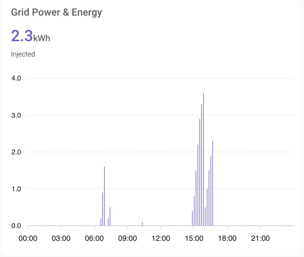
I mean, these, their values can drop to zero at any time, then increase again.

TBH I doubt, since neither the diff nor the delta aggregators’ descriptions mention the ability to handle resets. But maybe?

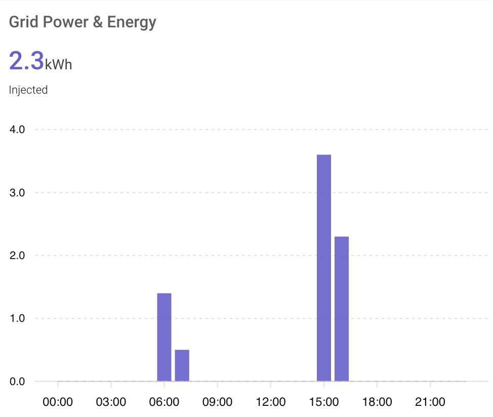
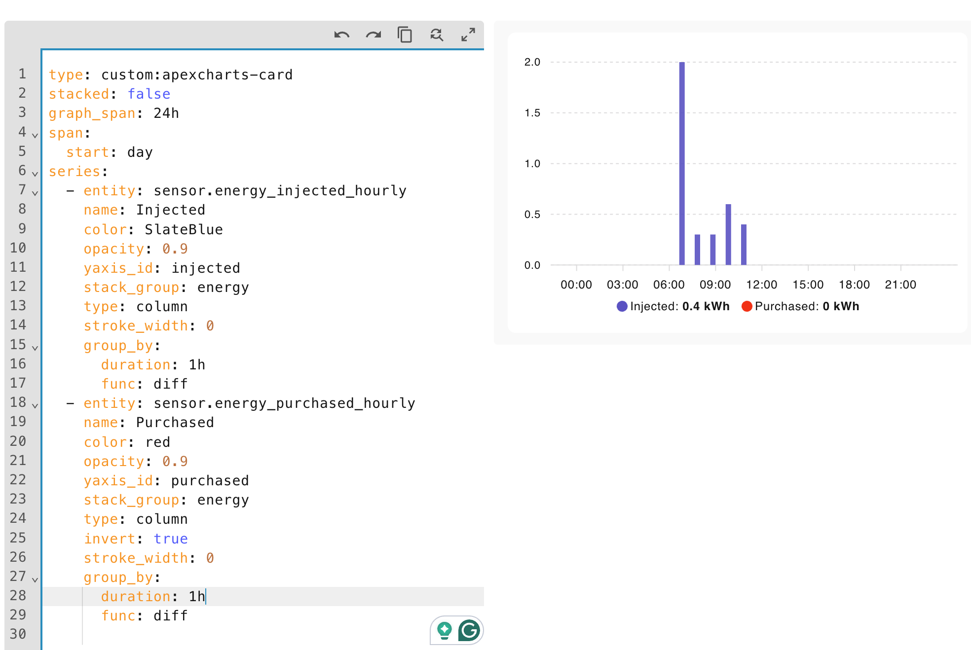
The only way I found is using hourly sensors and aligning the graph with the hour/day beginning. It makes it possible to use a delta, diff or max aggregator.

You may ask why not read the value without aggregation?
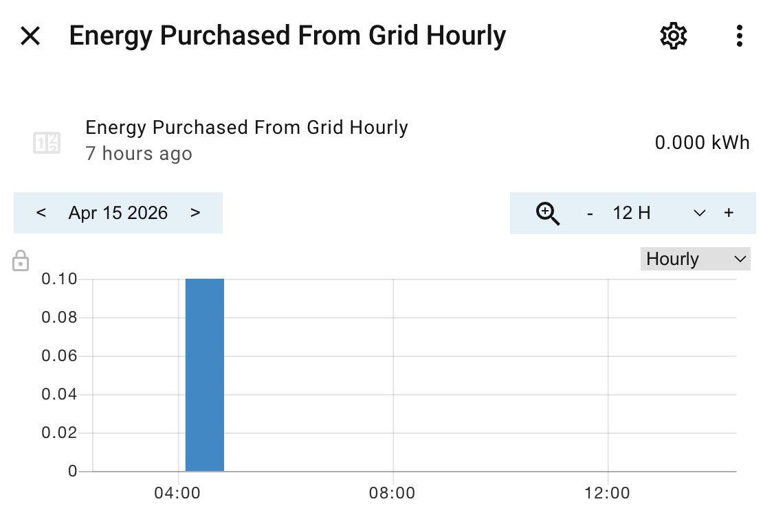
If you have quarter-hourly and hourly sensors, then the hourly history records consist of these quarter-hourly. For example:

In this case

    group_by:
      duration: 1h
      func: diff

results in

It works thanks to the fact that utility sensors start every time period with a record of 0.0 value.
The requirement is, however, to align the graph with the sensor interval start.

To me it seems there is no method to display data from original sensor directly (ths being independent on hour-beginning aligment). But maybe you can help with that.

I see from the code you have posted (hint), you are using a text color of black on a black background. Not very helpful. Please follow the rules for posting in this community.

I haven’t posted any code in my post with question.

Hi forum! Maybe someone can help me.
I have a chart like this:


I would like to perform an action when the current value (yellow bar under “Nu”) is below the average which is represented by the red line.
Is it possible to set a helper or a switch if that is the case?
If not, is it possible to put the average value in a HA entity (numerical), so I can use it in an automation?

Thanks for any assistance.
Kindest regards, JP

I’m fairly new with HA so bare with me.

I made my first card with Apex Chart but the x-axis seems to lose the 24h when I change to another dashboard or leave the screen. It seems to happen immediately. When I then come back, click the edit button of the dashboard and save, the x-axis changes back to normal again.

type: custom:apexcharts-card
graph_span: 24h
header:
title: Energy price today (snt/kWh)
show: true
span:
start: day
now:
show: true
label: Now
series:
-entity: sensor.nordpool_kwh_nl_eur_3_10_021
type: column
data_generator: |
return entity.attributes.raw_today.map((start, index) => {
return [new Date(start[“start”]).getTime(), entity.attributes.raw_today[index][“value”]];
});
yaxis:
-decimals: 2

Thank you so much for making this Graph Possible!

I have a few issues that I cannot get around and I thought someone might be able to guide me further to a fix for it.

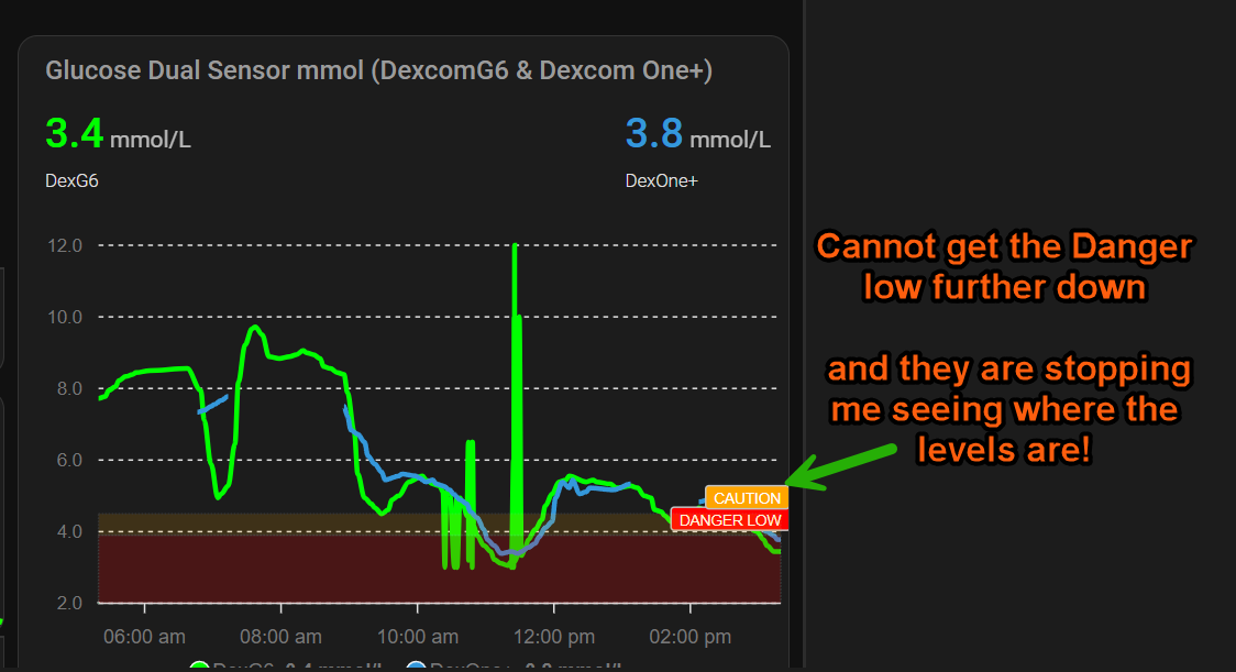
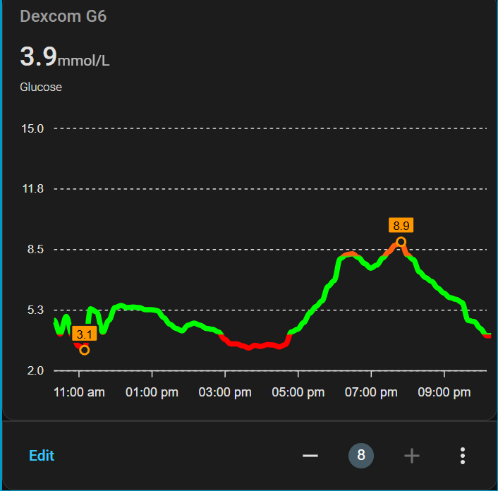
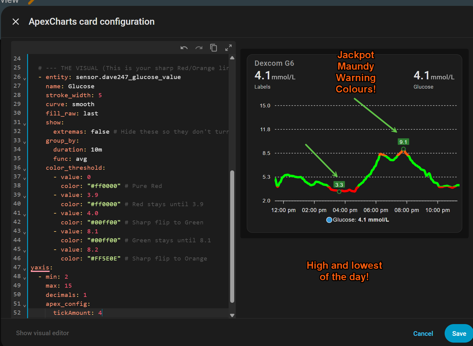
After playing around with it for a few weeks and lots of testing have come up with 3 good cards, but on some, I’m supposed to be able to use a Threshold to change the colour of the lines to warn me.

No matter what code I put in or change its not doing this adn thought it needed to be done from the file editor.

But not sure how a Dexcom G6 Theme can be overwritten to allow this in the code of the Apexcharts card.

It’s got a little over my head now!

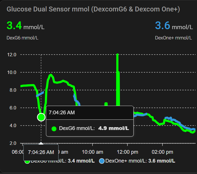
Here is the graph I made, which is a Glucose Dual Sensor

The other one is a Horizontal stack card configuration so I will not post that here!

This is with it without them at all.

I made another one and it’s based on xdrip colours except I cannot get a darker green into the back of the high and low readings.

But here it is.

Think I got it right now with a high and low of the day highlighted! And colours to low =Red = Normal = Green, and High = Orange

Hello
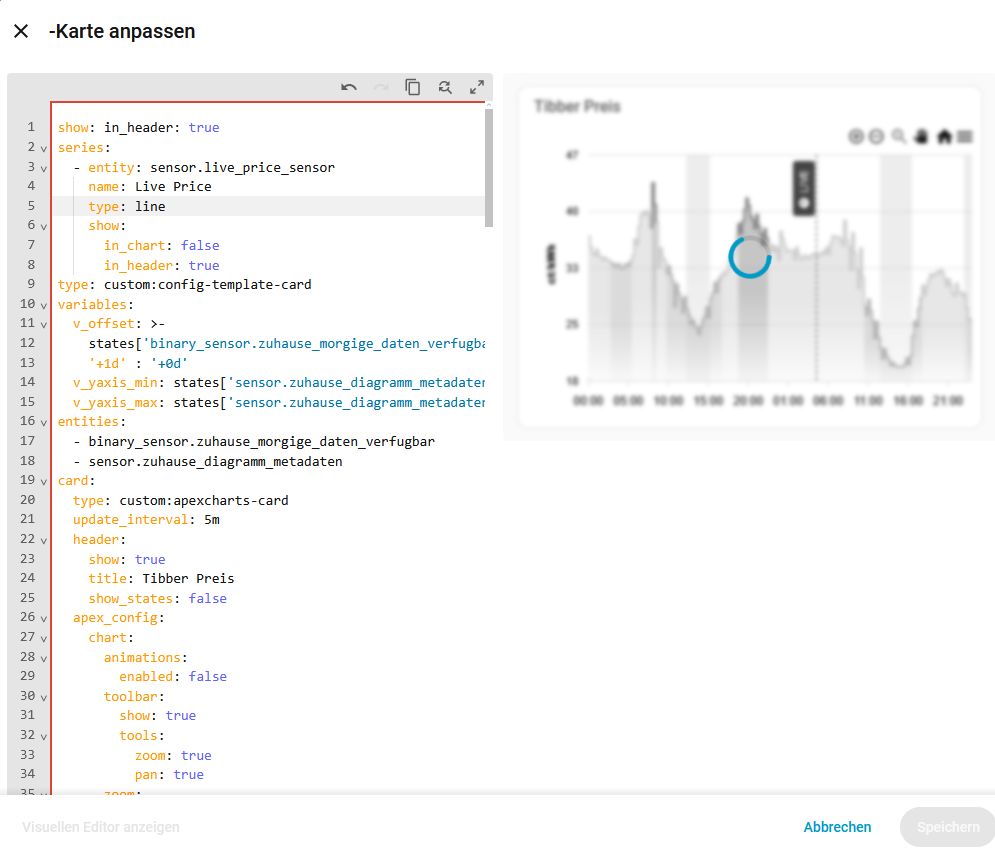
Is it is possible to render an annotation at x value based on a sensor entity?
So far, the syntax below throws an error that hass object is not defined

- x: EVAL:new Date(hass.states['sensor.pv_ctrl_most_expensive_hours_morning'])

It seems apex charts for HA does not provide hass collection everywhere, just for certain usecases.

I worked it around with the use of template card:

type: custom:config-template-card
variables:
  startCharging: new Date(states['sensor.pv_ctrl_cheapest_hours'].state).getTime()
  endCharging: >-
    new Date(states['sensor.pv_ctrl_cheapest_hours'].state).getTime()  + 2 * 60
    * 60 * 1000
  startDischargingEvening: >-
    new
    Date(states['sensor.pv_ctrl_most_expensive_hours_evening'].state).getTime()
  endDischargingEvening: >-
    new
    Date(states['sensor.pv_ctrl_most_expensive_hours_evening'].state).getTime() 
    + 1 * 60 * 60 * 1000
  startDischargingMorning: >-
    new
    Date(states['sensor.pv_ctrl_most_expensive_hours_morning'].state).getTime()
  endDischargingMorning: >-
    new
    Date(states['sensor.pv_ctrl_most_expensive_hours_morning'].state).getTime() 
    + 1 * 60 * 60 * 1000
entities:
  - sensor.pv_ctrl_cheapest_hours
  - sensor.pv_ctrl_most_expensive_hours_morning
  - sensor.pv_ctrl_most_expensive_hours_evening
card:
  type: custom:apexcharts-card
  update_interval: 1min
  header:
    show: true
    title: Electricity spot price
    show_states: true
    colorize_states: true
  graph_span: 48h
  span:
    start: day
  now:
    show: true
    label: Now
    color: "#448866"
  series:
    - entity: sensor.current_spot_electricity_price_15min
      name: ""
      show:
        in_chart: false
        in_header: true
        name_in_header: false
    - entity: sensor.current_spot_electricity_price_15min
      name: Spot price
      type: line
      data_generator: |
        const src = hass.states['sensor.today_spot_electricity_prices'];
        if (!src || !src.attributes.data) return [];

        return src.attributes.data.map((item) => {
          return [
            new Date(item.time).getTime(),
            item.price
          ];
        });
      stroke_width: 1
      curve: stepline
      show:
        in_chart: true
        in_header: false
  apex_config:
    grid:
      borderColor: rgba(118,128,128, 0.2)
    xaxis:
      type: datetime
    annotations:
      xaxis:
        - x: EVAL:new Date().setHours(24,0,0,0)
          borderColor: "#888888"
          strokeDashArray: 1
          label:
            text: Tomorrow
            borderWidth: 0
            style:
              background: DimGrey
              color: white
              border: 0px
        - x: ${startDischargingMorning}
          x2: ${endDischargingMorning}
          fillColor: var(--purple-color)
          opacity: 0.2
        - x: ${startDischargingEvening}
          x2: ${endDischargingEvening}
          fillColor: var(--purple-color)
          opacity: 0.2
        - x: ${startCharging}
          x2: ${endCharging}
          fillColor: "#B3F7CA"
          opacity: 0.3
      yaxis:
        - "y": 0.25
          borderColor: "#00AA00"
          strokeDashArray: 4
          label:
            text: 0.25 threshold
            borderWidth: 0
            style:
              background: DimGrey
              color: white

I want to show the pv power from the last month in column style. It basically works, but today is missing. how can I add the current (incomplete) day?

type: custom:apexcharts-card
update_interval: 15min
section_mode: true
grid_options:
  rows: 12
  columns: 6
experimental:
  color_threshold: true
header:
  show: true
  title: PV Tagesmaximum
graph_span: 1month
span:
  start: day
  offset: "-1month"
series:
  - entity: sensor.solarflow_800_pro_solarleistung
    name: Tagesmaximum
    type: column
    group_by:
      func: max
      duration: 1d
    color_threshold:
      - value: 0
        color: red
      - value: 300
        color: yellow
      - value: 800
        color: green
apex_config:
  xaxis:
    type: datetime
    labels:
      format: dd.MM.
  tooltip:
    x:
      format: dd.MM.yyyy

Does anyone know if it’s possible to hide labels for the x-axis or y-axis without using the minimal layout?

2 little questions :slight_smile: ):
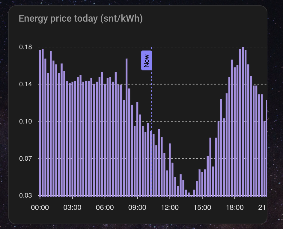
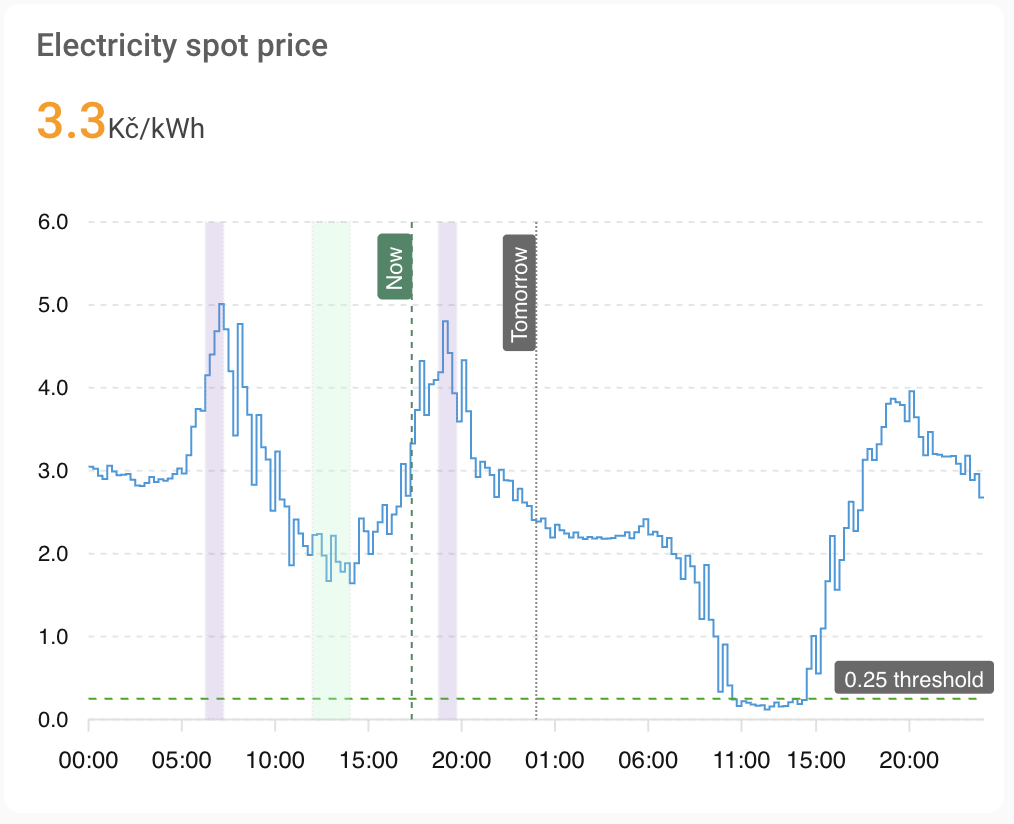
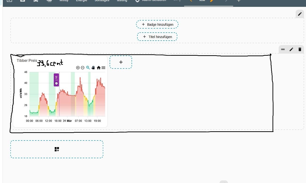
A: Is it possible to make this chart use the full width of the screen ?
B: put the number of the actual live PRICE in it (also without mouseover?) ?

@higgy_de

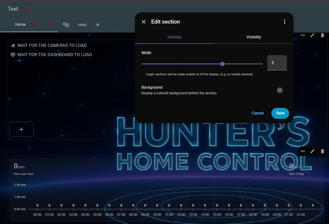
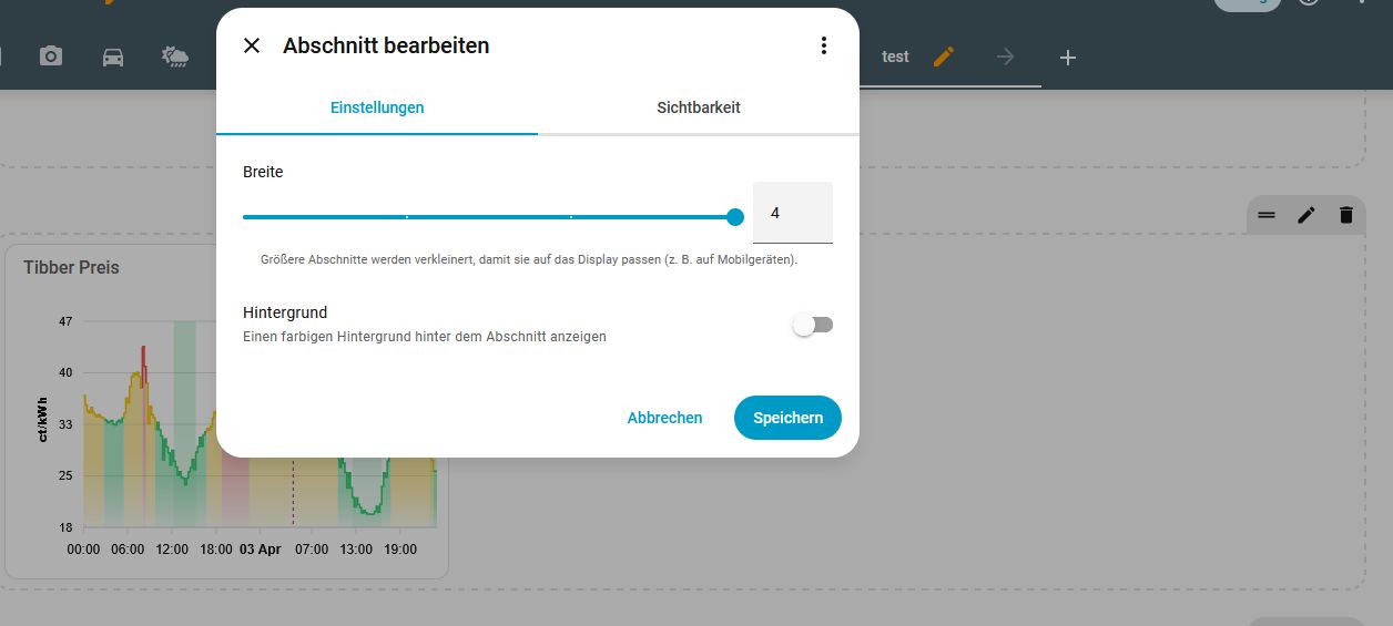
A: looks like you are in sections view. Your card is contained within a section. Click the edit pencil top right when hovering over the section. From there select how many sections wide it should be.

B: Add a series for the live price or just add ‘show: in_header: true’ to the figure you want in the header.

series:
  - entity: sensor.live_price_sensor
    name: Live Price
    type: line
    show:
      in_chart: false
      in_header: true

Thanks for try to help me, but I think… it didnt work :frowning: ?!


copy and paste your whole card. sensor.live_price_sensor is just an example sensor I gave you. It will have to use a real sensor.

Here is an example.

type: custom:apexcharts-card
header:
  title: ""
  show: true
  show_states: true
graph_span: 24h
span:
  end: day
yaxis:
  - min: 0
    decimals: 1
    apex_config:
      labels:
        formatter: |
          EVAL: (v) => `${(v ?? 0).toFixed(2)} mm`
apex_config:
  fill:
    type: gradient
    gradient:
      type: vertical
      shadeIntensity: 0
      opacityFrom: 1
      opacityTo: 0.5
      stops:
        - 0
        - 100
  chart:
    height: 150px
  grid:
    show: false
    borderColor: darkslateblue
    strokeDashArray: 2
  dataLabels:
    background:
      borderWidth: 0
      opacity: 0
      foreColor: white
    offsetY: -10
  plotOptions:
    bar:
      borderRadius: 0
      dataLabels:
        position: top
series:
  - entity: sensor.netatmo_devonport_tas_indoor_rain_rain_last_hour
    name: Rain Last Hour
    type: line
    show:
      in_chart: false
      in_header: true
  - entity: sensor.netatmo_devonport_tas_indoor_rain_rain_today
    name: Hourly Rain Bars
    type: column
    color: mediumslateblue
    statistics:
      type: change
      period: 5minute
      align: end
    transform: "return x < 0 ? 0 : x;"
    group_by:
      duration: 1h
      func: sum
      start_with_last: true
    show:
      in_chart: true
      datalabels: true
      in_header: false
  - entity: sensor.netatmo_devonport_tas_indoor_rain_rain_today
    name: Rain Today
    type: line
    statistics:
      type: change
      period: 5minute
      align: end
    transform: "return x < 0 ? 0 : x;"
    group_by:
      duration: 1d
      func: sum
      start_with_last: true
    show:
      in_chart: false
      in_header: true
      name_in_header: true
grid_options:
  columns: 36
  rows: auto

Ok, thanks for the try…but I think, its much over my experience in this yaml stuff … so I think i have to live with it, as it is. But again, thanks for help

@higgy_de You are right, from your screenshot you seem to have your YAML keys in the wrong position. We can help if you are able to paste the whole YAML for your graph here.

Nobody?
No one displays data from total increasing sensors?

I have example of how it goes wrong:

Looks not bad, except of missing purchase. I know that it’s recorded:

Also it appears on apexchart when I remove group_by from the series. But it works coincidently. For instance removal the group by from “incjected” series makes render all its entries recorded within an hour instead of cumulated value.

I am pretty sure I am using total increasing in one of my rain graphs.

Thanks for the answer.

You’re using statistics. I came across this just half an hour ago:

A small drawback of using statistics is that the chart doesn’t show data for the current period (i.e., the current hour). It appears once the period has ended.
This might be slightly improved by using a 5-minute interval (see below). However, I’m not sure whether that would require more granular helper sensors, or if it would help even when only an hourly sensor is available.

    statistics:
      type: sum
      period: 5minute
    group_by:
      duration: 1h
      start_with_last: true
      func: diff

By the way, your settings are different and don’t work for me. My guess is that they work for you because your sensors don’t store sub-period data. By the guess, if you change to settings above, it will not change your results.

What I mean is a case where an hourly sensor also contains quarter-hourly data. To be honest, I’m not sure why Home Assistant introduces this kind of data redundancy, or if it is documented.

1 Like

long term statistics are only recorded every 15mins more recent should be the sensor data that is in the recorder. On my hourly graph the duration: (buckets) are 1hr. You could try group by a shorter duration.

                statistics:
                  type: change
                  period: 5minute
                  align: end
                transform: 'return x < 0 ? 0 : x;'
                group_by:
                  duration: 1h
                  func: sum
                  start_with_last: true