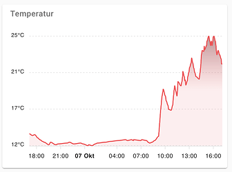
ApexCharts card - A highly customizable graph card

@arifroni I have had a similar problem. I think you need to add .state: hass.states['sensor.yearly_energy_nuc'].state

Maybe you need use parseFloat like: parseFloat(hass.states['sensor.yearly_energy_nuc'].state)

This is my test:

            series:
              - entity: sensor.ble_temperature_a4c138cf053b
                transform: "return parseFloat(x) + parseFloat(hass.states['sensor.ble_humidity_a4c138cf053b'].state);"

Regards.

4 Likes

I can’t seem to get the min/max working for a series if only one is defined and the other is left to auto.

I.e. my goal is to set min to 0 and max to auto.

  1. If I set min to 0 and do not add max to the config, the y-axis doesn’t start at zero
  2. If I set min to 0 and max to 10, the y-axis does range from 0 to 10 correctly
  3. If I set min to 0 and set max to auto, the y-axis doesn’t start at zero

Is there a bug with this? I’m fairly certain i’m configuring it correctly as it sets the y-axis correctly when both min and max are defined.

Did anyone reach to make like this chart…?
I tried to make a workaround on line chart but i couldn’t reach.

thanks. problem solved.

Hi.
I’m trying to use the color_threshold feature of apexcharts, just like in the example in the readme.

I’ve got a couple of cards setup for my fridge/freezer, an example as follows:

type: custom:apexcharts-card
graph_span: 120h
experimental:
  color_threshold: true
header:
  show: true
  title: Fridge
  show_states: true
series:
  - entity: sensor.fridge_temp_sensor_temperature
    show:
      extremas: true
    color_threshold:
      - value: 9.5
        color: red
      - value: 4
        color: orange
      - value: 0
        color: green
      - value: -20
        color: blue

This doesn’t display as per the example though - it looks like this:

What am I doing wrong?

Thanks

Hey, i want to user 1 week of data, but auto zoom in to 24 or 48h automaticly. Is this possible?

Hi, great card, very useful and really well done. Thank you :smiley:
I’m having an issue though when plotting light data with a logarithmic y-axis. The data ranges between ~100,000 and ~0.001, all the data above 1 plots fine, the data below 1 does not. It looks like the plots will only go down to 1, am I missing something or is this a bug?

It can be shown by the following card

type: custom:apexcharts-card
y_axis_precision: 3
header:
  show: true
  title: ApexCharts-Card
  show_states: true
  colorize_states: true
yaxis:
  - id: first
    apex_config:
      logarithmic: true
      forceNiceScale: false
series:
  - entity: sun.sun
    yaxis_id: first
    data_generator: >-
      const data = [[moment(),1000],[moment().subtract(1,
      'hours'),100],[moment().subtract(2, 'hours'),10],[moment().subtract(3,
      'hours'),1],[moment().subtract(4, 'hours'),0.1],[moment().subtract(5,
      'hours'),0.01],[moment().subtract(6, 'hours'),0.1],[moment().subtract(7,
      'hours'),1],[moment().subtract(8, 'hours'),10],[moment().subtract(9,
      'hours'),100],[moment().subtract(10, 'hours'),1000]];  return data;

Hi All,

Im sure it is simple, however after looking into this thread and into the documentation I can not figure out. I would like to remove the values from the x-axis. I can remove yaxis values with the show command. I have been looking into the examples, not finding it.

Basically, like the graph shown as an example in the first post here:-) I can do all the rest, not removing the x axis values.

image

I wonder how to calculate the min and max values used to the axis by my own. I found an example like that.
max: EVAL:max => max
But how would I do more advanced calculations like
${Math.round(max)}
My goal is to have integer values on the axis which are not rounded…
The exmple below show, that just doing a round causes sometimes 5 and sometime 4 degree difference from value to value.

I have a sensor that resets daily, like - bandwidth usage. This sensor is updated multiple times a day, maybe 5-6 times.

I can build a chart with:

group_by:
   func: last
    duration: 1d

to get a daily usage. I can also use the max func, but I guess last requires less processing cycles.

Question:

How do I create a weekly usage? I would need a sum of daily max?

I guess I would use:

group_by:
   func: XXXX
    duration: 1w

but I don’t find a XXX function to do sum of daily max - or I’m missing another approach? I would try to stay away from creating another sensor to keep the usage for that week and resets every week.

Thanks.

Is it possible to have both group_by and curve: smooth somehow on the same series? Currently, curve value is ignored once group_by is added.

Is it possible to dynamically change the span offset?

I want to have a button under the chart where I’ll be able to modify the offset after clicking.

Possibly related, but is there a way of getting the brush span to default to the start of the graph rather than the end? i.e. I’d like it to load up like this:
image
But instead it defaults to being the latter portion of the graph.

Hi everyone,

how can i hide this value only in this view?

image

type: custom:apexcharts-card
graph_span: 24h
header:
  title: ''
  show: true
  show_states: true
  colorize_states: true
apex_config:
  grid:
    show: false
  chart:
    height: 200
  yaxis:
    - id: Watt
      opposite: false
      decimalsInFloat: 0
    - id: Kosten
      show: false
      opposite: true
      decimalsInFloat: 0
    - id: mittel
      opposite: true
      decimalsInFloat: 0
      max: 20
      min: -20
    - id: nacht
      show: false
      opposite: true
      decimalsInFloat: 0
  xaxis:
    axisBorder:
      show: false
  legend:
    show: false
all_series_config:
  stroke_width: 1.5
  opacity: 0.2
  curve: smooth
  type: area
  group_by:
    func: avg
    duration: 10min
  show:
    extremas: true
color_list:
  - '#bf5e5e'
  - '#3b6ba1'
  - '#3ba190'
  - gray
series:
  - entity: sensor.energieverbrauch
    name: Watt
    yaxis_id: Watt
  - entity: sensor.kosten_tagesverbrauch
    name: Kosten
    yaxis_id: Kosten
  - entity: luxtronik.id_web_mitteltemperatur
    opacity: 0
    yaxis_id: mittel
    name: Mitteltemp.
    unit: °C
  - entity: binary_sensor.below_horizon
    transform: 'return x === ''on'' ? 1 : 0;'
    yaxis_id: nacht
    opacity: 0.1
    stroke_width: 0
    show:
      extremas: false
      in_header: false

how can I transform the total number with 2 digits after the decimal?
image

code:

- type: 'custom:vertical-stack-in-card'
        view_layout:
          grid-area: graph2
        title: Power Monitor (Yearly)
        cards:
          - type: custom:apexcharts-card
            header:
              show: false
              title: ApexCharts-Card
              show_states: false
              colorize_states: true
            apex_config:
              chart:
                height: 400px
              legend:
                show: true
                fontSize: 15px
                horizontalAlign: left
              plotOptions:
                pie:
                  dataLabels:
                    minAngleToShowLabel: 40
                  donut:
                    labels:
                      show: true
                      name:
                        show: true
                      value:
                        show: true
                      total:
                        show: true
                    total:
                      show: false
                      showAlways: false
            chart_type: donut
            series:

Hello everybody.
How do I remove this border? Couldn’t find a solution.2021-10-15_11-36-08

I wrote this in my config:

apex_config:
  dataLabels:
    enabled: true
    style:
      fontSize: 18px
      fontWeight: bold
    background:
      enabled: true
      padding: 4
      borderRadius: 2
      borderWidth: 1
      borderColor: white
      opacity: 0.1

But nothing has changed

You must specify this parameter

series:
  - entity: sensor.netatmo_oleg_vnutrennii_modul_co2
    color_threshold:
      - value: 500
        color: lime
      - value: 700
        color: aqua
      - value: 800
        color: gold
      - value: 1000
        color: red
    name: ' '
    type: line
    color: Teal
    opacity: 1
    curve: smooth
    show:
      in_header: true
      extremas: true
    stroke_width: 3
    float_precision: 0
    float_precision: 2

it doesnt work, i guess it works individually…not on the total value. maybe i should do with some formatter here

image

I don’t know what to write here.

I am experiencing the same behaviour. Quite strange is, that i had a graph, where color_thresholds worked correctly in the beginning and suddenly mad the rainbowish behaviour than yours. Anyone figured out the cause for this behaviour so far? Tried a lot playing around with the config but no success…