Also, any reason why you use a script here? You could easily use a Browser Call with fire-dom-event with inline popup code or use a popup card which can be be on any dashboard.
Can you submit an issue so we can track? Please include what you have here as well as script for script.mail_retrieval_popup. i.e. I need to be able to replicate a setup similar to yours, and for that I need to review all code. Thank you.
EDIT: Another workaround would be to call browser_mod.close_popup in the script hat calls the new popup.
EDIT2: I have replicated - Issue [Bug]: Calling script from popup which calls popup does not work · Issue #1248 · thomasloven/hass-browser_mod · GitHub
@FortranFour this has now been fixed in 2.10.2-beta.1
1 Like
Thanks for rapidly addressing and fixing this issue. I can confirm that it is resolved in v2.10.2-beta.1. And thanks as well for your suggestion about using a popup card (as opposed to a script).
1 Like
Thank you for confirming. I will release 2.10.2 in line with 2026.4.0 this week.
1 Like
Thanks so much for version 2.10.2. It fixed a minor issue I had on my iPhone, and was too lazy to fix myself. The problem was that when I opened a standard popup from the adaptive dialog, it wouldn’t appear immediately, but after a few seconds.
Now it works again without having to change any code. Here’s what it looks like (I select an event from the calendar, the adaptive dialog appears, then I choose to edit it, and the “normal” dialog immediately appears).
1 Like
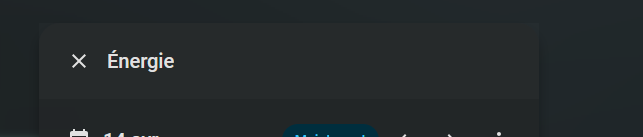
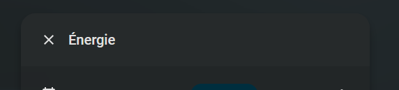
Hi,
I’m trying to solve an issue I have with one of my popup : it cuts off part of the tooltip that overflows from the popup :
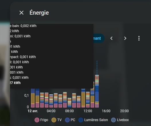
I’ve searched in different part of the css, looking for a overflow:hidden to change, but have found none.
Here’s my code :
action: fire-dom-event
browser_mod:
  service: browser_mod.popup
  data:
    title: Énergie
    style: >
      --popup-min-width: 500px;
      --grid-card-gap: 0px;
    content:
      type: grid
      columns: 1
      square: false
      cards:
        - type: energy-date-selection
        - type: energy-devices-detail-graph
          uix:
            style: |
              ha-card div.content {
                margin: 0 20px 0 20px !important;
              }
Any ideas ?
Overflow needs to be adjusted in three positions. Two in the wa-dialog dialog and body parts where overflow is set to hidden, and one in the body content.
show_name: true
show_icon: false
type: button
name: Popup
tap_action:
  action: fire-dom-event
  browser_mod:
    service: browser_mod.popup
    data:
      title: Énergie
      style: |
        --popup-min-width: 500px; --grid-card-gap: 0px;
      content:
        type: grid
        columns: 1
        square: false
        cards:
          - type: energy-date-selection
          - type: energy-devices-detail-graph
            uix:
              style: |
                ha-card div.content {
                  margin: 0 20px 0 20px !important;
                }
      uix:
        style:
          ha-dialog $: |
            wa-dialog div.body {
              /* inherent style is auto */
              overflow: visible !important;
            }
            wa-dialog::part(dialog),
            wa-dialog::part(body)
            {
              /* inherent style is hidden */
              overflow: visible !important;
            }
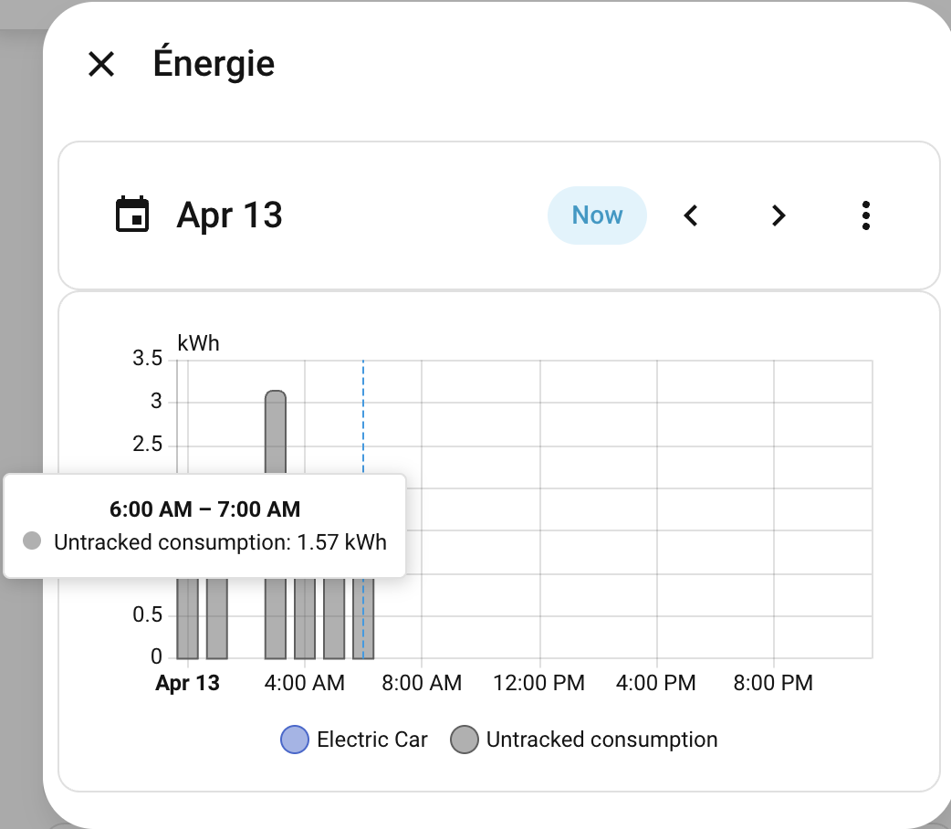
Thanks, the tooltip is now able to go outside the popup !
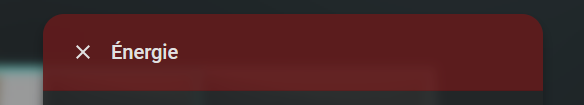
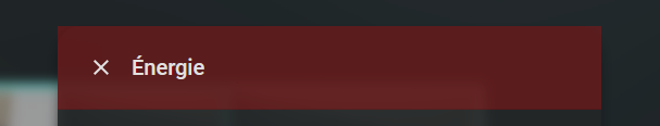
One side effect of that, is that my background-color for the header, set in my theme, is now showing outside of the border radius :
  uix-dialog-yaml: |
      wa-dialog ha-dialog-header {
        background-color: var(--tablet-popup-header-color);
      }
Not sure you can control that as that is likely why the wa-dialog sets overflow: hidden.
Note, review of dark themes/mode and backgrounds don’t come out well in the screenshots. To me it all looks the same.
I found a way around it :
Just had to set “border-top-left-radius” and “border-top-right-radius” to the same value as “popup-border-radius” to fix the issue.
To better visualize the difference in dark mode, here’s some flashy colors :
1 Like
Nice workaround. I can see it well 
So this “split” is now a must but not an option, right? Was used to do
    service: browser_mod.popup
    data:
      allow_nested_more_info: true
      title: Telefon und Internet
      style: |
        ha-dialog {
          --popup-min-width: 500px;
          --popup-max-width: 500px;
          --dialog-surface-margin-top: auto !important;
          scrollbar-color: #2e2e2e transparent;
          scrollbar-width: 1px;
        }
        ha-dialog > ha-dialog-header {
          margin-bottom: -20px !important;
        }
and wanted to reactivate some of them, but then adapt the new format as well.
    service: browser_mod.popup
    data:
      allow_nested_more_info: true
      title: Wecker
      popup_styles:
        - style: all
          styles: |
            ha-dialog {
              --popup-min-width: 500px;
              --popup-max-width: 500px;

            }
      uix:
        style:
          .: |
            ha-dialog {
              scrollbar-color: #2e2e2e transparent;
              scrollbar-width: 1px;
            }
          ha-dialog:
            $: |
              wa-dialog slot:nth-of-type(1) ha-dialog-header {
                margin-bottom: -20px !important;
              }
Would now not work anymore in any case and only this kind of split, right? Only want to avoid not necessary overhead and duplication. And realy for everything else than a variable or only for shadow rood topics?
Esp. as is now very slow now and the margin-button ha a very visibly lack and jump now…
And secondly, my heigh popups now running out of the screen on top and button of the screen. And now my auto high size anymore. Anything I have overread? Do I really always set --popup-max-height and no standard is there anymore?
It is still and always will be an option, though its recommend that any style that targets light DOM go into Browser Mod styles. Any styling where you need shadow root can go to UIX, though if possible use CSS vars and style in Browser Mod styles.
Splitting yaml selector like this only recommended if the shadow root is delayed. Here it is not so you should not split - it may look like convenience, however it actually creates one uix-node at ha-dialog and then another it its shadow root, and done async so may cause a delay.
No lag that I see. However refer to comment above about yaml selector chain.
Popups should not grow off screen, so there may be styling that is causing this for you. If you share a minimal example then we can reveiw for you.
Thanks for the fast reply.
My question was more specific regarding:
So if only CSS vars should and can be placed there, which is different than “any style” here
Regarding lag, was directly there and smoothly as it was still possible to to via browser mod because popup structure that way.
      style: |
        ha-dialog {
          scrollbar-width: 1px;
        }
        ha-dialog > ha-dialog-header {
          margin-bottom: -20px !important;
        }
Now, esp. on desktop (different devices different browser) it is really ugly. Most probably because the header is now in shadow DOM. Any more idea reduce the gap faster? Remove the split didn’t help.
      uix:
        style:
          ha-dialog $: |
            ha-dialog-header {
              margin-bottom: -20px !important;
            }
Sure. Every big popup behaves here now that way.
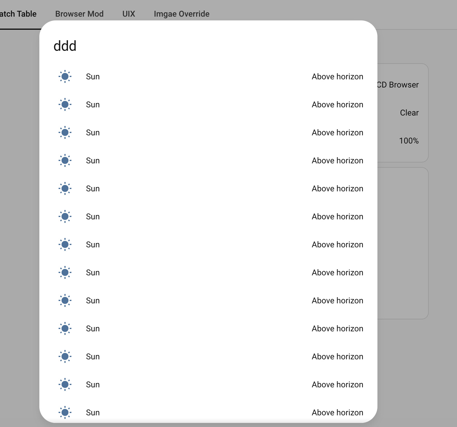
type: custom:button-card
entity: sun.sun
tap_action:
  action: fire-dom-event
  browser_mod:
    service: browser_mod.popup
    data:
      popup_styles:
        - style: all
          styles: |
            ha-dialog {
              --popup-min-width: 500px;
              --popup-max-width: 500px;
              --dialog-surface-margin-top: auto !important;
              scrollbar-color: #2e2e2e transparent;
              scrollbar-width: 1px;
            }
      uix:
        style:
          ha-dialog $: |
            ha-dialog-header {
              margin-bottom: -20px !important;
            }
      content:
        type: entities
        title: ddd
        entities:
          - entity: sun.sun
          - entity: sun.sun
          - entity: sun.sun
          - entity: sun.sun
          - entity: sun.sun
          - entity: sun.sun
          - entity: sun.sun
          - entity: sun.sun
          - entity: sun.sun
          - entity: sun.sun
          - entity: sun.sun
          - entity: sun.sun
          - entity: sun.sun
          - entity: sun.sun
          - entity: sun.sun
          - entity: sun.sun
          - entity: sun.sun
          - entity: sun.sun
          - entity: sun.sun
          - entity: sun.sun
          - entity: sun.sun
          - entity: sun.sun
          - entity: sun.sun
          - entity: sun.sun
          - entity: sun.sun
          - entity: sun.sun
          - entity: sun.sun
          - entity: sun.sun
          - entity: sensor.moon_phase
What I mean here is to always preference vars that can go into Browser Mod style rather than seeking to style a shadow element directly. Browser Mod styles can have any style that is applicable to the light DOM.
Browser Mod needed to change to follow Home Assistant.
The jarring could just be that the property is not transitioned. So perhaps look at that.
Try and build this up without styling first so you see what causes the issue, likely to be dialog surface margin. I can confirm that long content does not cause dialog itself to go off screen.
Even without the styling and with standard theme it goes off.
Ok. Please share minimal config and screenshot in a Browser Mod issue with all the custom plugins/integrations that may alter teller Frontend disabled. Thank you
Here the example above with just the styling removed:
type: custom:button-card
entity: sun.sun
tap_action:
  action: fire-dom-event
  browser_mod:
    service: browser_mod.popup
    data:
      content:
        type: entities
        title: ddd
        entities:
          - entity: sun.sun
          - entity: sun.sun
          - entity: sun.sun
          - entity: sun.sun
          - entity: sun.sun
          - entity: sun.sun
          - entity: sun.sun
          - entity: sun.sun
          - entity: sun.sun
          - entity: sun.sun
          - entity: sun.sun
          - entity: sun.sun
          - entity: sun.sun
          - entity: sun.sun
          - entity: sun.sun
          - entity: sun.sun
          - entity: sun.sun
          - entity: sun.sun
          - entity: sun.sun
          - entity: sun.sun
          - entity: sun.sun
          - entity: sun.sun
          - entity: sun.sun
          - entity: sun.sun
          - entity: sun.sun
          - entity: sun.sun
          - entity: sun.sun
          - entity: sun.sun
          - entity: sensor.moon_phase