⚪ Bubble Card - A minimalist card collection for Home Assistant with a nice pop-up touch

I tried this and it works, based on the state of a sensor, notice the samme button but referred to as 0 or 1:

                              ${card.querySelector('.bubble-sub-button-1 .bubble-sub-button-name-container').innerText = 
                                hass.states['fan.fan'].state === 'on' 
                                ? "Cooling" 
                                : "Current:"
                                }
                              
                              ${subButtonIcon[0].setAttribute("icon", hass.states['fan.fan'].state === 'off' ? 'mdi:thermometer' : 'mdi:thermometer-chevron-down')} 

I’m trying to show entity_picture from a person to show in place of an icon in a sub-button, however I’m unsuccessful.

.bubble-sub-button-1 {
    background-image: url(${hass.states['person.name']?.attributes.entity_picture}) !important;
}

Any ideas? thanks

Hi, love the bubble cards! Wanna get your attention on an issue with the back button in HA though that might be related to Bubble Cards…

See this thread: Back Button doesn't work · Issue #17820 · home-assistant/frontend · GitHub

Hi! This is a known issue, but take a look this comment:

Hi all. Great mod offering so much customization.
Fairly new to css so I cannot find a way to solve this.
Can some one help me coding light-dark mode so that border color changes accordig to UI mode?
thanks in advance.

Hi all,

Please guide how to add text below each button…

The example is taken from the bubblecard documentation.

type: custom:bubble-card
card_type: button
card_layout: large
button_type: name
show_icon: false
show_name: false
sub_button:
  - name: Mute
    icon: mdi:volume-off
    tap_action:
      action: toggle
      service: input_boolean.toggle
    entity: input_boolean.silent_mode
  - name: Covers
    entity: cover.all_group
    show_background: false
    tap_action:
      action: navigate
      navigation_path: '#cover'
  - name: Shopping list
    icon: mdi:cart-outline
    show_background: false
    tap_action:
      action: navigate
      navigation_path: '#shopping-list'
  - name: Security
    icon: mdi:video-outline
    show_background: false
    tap_action:
      action: navigate
      navigation_path: '#security'
  - name: Settings
    icon: mdi:cog
    show_background: false
    tap_action:
      action: navigate
      navigation_path: '#configuration'
styles: |
  .card-content {
    width: 100%;
    margin: 0 !important;
  }
  .bubble-button-card-container {
    background: none;
  }
  .bubble-sub-button {
    height: 46px !important;
    width: 46px !important;
  }
  .bubble-sub-button-container {
    width: 100%;
    justify-content: space-between !important;
  }
  .bubble-sub-button-icon {
    --mdc-icon-size: inherit !important;
  }
  .bubble-name-container {
    margin-right: 0px !important;
  }

Hello all

I remember that @Cloos had posted a comment with the code for the CSS Template to be able to make the cards rectangular like this:
Capture d’écran 2024-10-21 120746

The code that can be added here:

but it’s been over an hour now that I’ve been looking in this thread but without success.
In fact I’m not using the “Bubble” theme but the “Bubbles” cards
Could you give me the code again please @Cloos or if someone could give it to me that would be nice.

Thanks

another question

Can we make a “navigation_path”

tap_action:
  action: navigate
  navigation_path: /lovelace/test-2

with a Horizontal buttons stack?

If yes, how please?

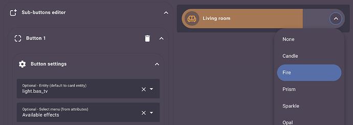
Is it possible to add dropdown to the sub-buttons?

That each sub-button show their own list and executes according to those selected. At the moment I have only been able to make the dropdown of the entire card for a single parameter.

The CSS code ist right in the post you linked at the beginning of your post.
But it’s not french in my case, maybe your Browser translation is causing problems and hides the code?

Guys plz help

Bubble Card 2

v2.3.0-beta.3

Hi everyone!

I’m so glad to finally be able to release this update! It’s a major one that took a lot of time and effort, and I’m really proud of the result!

This version brings a number of new features, including a highly requested new card that many of you have been waiting for! I’ve also fixed quite a few bugs and further optimized the code, so this version should consume even fewer resources on some setups. As always, I really hope everything works as expected :crossed_fingers:

Here are all the details.


:bulb: New features

Climate card

A new experimental climate card is available! It’s still in testing but should work seamlessly. This card automatically changes color based on the selected modes. The temperature display and mode selection menu are sub-buttons that are added automatically when creating the card. You can then modify or remove these sub-buttons as you wish. #398


Select cards and sub-buttons now support attribute lists

Select cards and sub-buttons now support attribute lists for climate, light, and media player entities. If you notice any missing supported attributes, please report them. This option will only show if your entity is supported. #665


Media player blurred background

A new blurred background option for media player cards based on the media cover has been added, giving a cleaner and more modern look.


Toggle for disabling background color in sub-buttons

In the sub-buttons editor, you can now toggle to disable the background color based on the entity’s state.


:heavy_check_mark: Bug fixes and optimizations

  • Global separator line background color variable: You can now globally adjust the separator line background color using the --bubble-line-background-color variable in your theme file.
  • Back button issue: The back button issue has been resolved in some cases. #856
  • Slider fixes: Sliders that were not working anymore are now fixed. #849 #838
  • Fan sliders: Fan sliders are now set to 0 when turned off.
  • Climate slider: Climate sliders now support expected float values. #768
  • Scroll detection on hold actions: Hold actions will no longer trigger if a scroll action is detected. #843 by @brunosabot
  • Minor CSS fixes: Various minor CSS adjustments have been made for improved visual consistency.
  • Miscellaneous fixes: Several fixes and optimizations to improve overall performance.

I can’t wait for your feedback as always!

Oh, and one more thing! I’ve been wanting to start my own YouTube channel for a while, focusing on tutorials around Home Assistant and Bubble Card. There are two videos so far, an introduction explaining the project and a first tutorial on how to create your first pop-up. I really hope you will enjoy them. Don’t hesitate to subscribe to help give my channel more visibility. Thank you in advance!

YouTube

The next video will cover the new global variables, as well as custom styles and templates, since I’ve noticed more and more questions on these topics.

And if you are interested I’ve opened a Subreddit for Bubble Card where I post my progress on the project. Here it is:

Reddit Page

:beers:

8 Likes

@Cloos

Please help me with this

type: custom:bubble-card
card_type: button
card_layout: large
button_type: name
show_icon: false
show_name: false
sub_button:
  - name: Mute
    icon: mdi:volume-off
    tap_action:
      action: toggle
      service: input_boolean.toggle
    entity: input_boolean.silent_mode
    show_name: true
  - name: Covers
    entity: cover.all_group
    show_background: false
    tap_action:
      action: navigate
      navigation_path: "#cover"
    show_name: true
  - name: Shopping list
    icon: mdi:cart-outline
    show_background: false
    tap_action:
      action: navigate
      navigation_path: "#shopping-list"
    show_name: true
  - name: Security
    icon: mdi:video-outline
    show_background: false
    tap_action:
      action: navigate
      navigation_path: "#security"
    show_name: true
  - name: Settings
    icon: mdi:cog
    show_background: false
    tap_action:
      action: navigate
      navigation_path: "#configuration"
    show_name: true
styles: |-
  .card-content {
    width: 100%;
    margin: 0 !important;
  }
  .bubble-button-card-container {
    background: none;
  }
  .bubble-sub-button {
    height: 46px !important;
    /* width: 46px !important; */
    flex-direction: column-reverse;
  }
  .bubble-sub-button-container {
    width: 100%;
    justify-content: space-between !important;
  }
  .bubble-sub-button-icon {
    --mdc-icon-size: inherit !important;
  }
  .bubble-name-container {
    margin-right: 0px !important;
  }

  .icon-with-state{
    margin-right: unset;
    padding-top: 2px;
  }

The most relevant parts are changing the flex-direction in the .bubble-sub-button class, and changing the right margin and top padding in the .icon-with-state class. The buttons as shown in the original example are perfect circles (fixed at 46 x 46 px in .bubble-sub-button), which look good with just icons but won’t really work for text labels of more than a few characters, so you may need to adjust those height and/or width attributes, depending on your preferences and needs. I just disabled the width so they will auto-grow to fix the content. If you can set show_background: to false on everything(meaning you won’t be able to see the state of a switch/etc.), I think it looks pretty good visually. If you need state shown, then you’ll have to play with it to see what works best for your exact scenario.

Not sure if it’s just me, but the up and down buttons on the new climate card don’t appear to be working. I have an Ecobee thermostat integrated through HomeKit. The integration does work and I can control HVAC modes, or manually increase/decrease the temperature through more-info. Just wanted to point this out…

Thank you so much, this is exactly what I wanted.

Perhaps a very dumb question, but how do we install these beta versions of i.e. bubble-card?
My HACS seems to only update when there is an official release and not when there is another beta-version.

Hi! Can you take a look at your browser console then click on that buttons again, is there any error that is shown?

Hi! You can go to the Bubble Card page in HACS, then go to the menu, from there you can click on Re-download and select the beta in the dropdown menu.

1 Like


Hello guys,

Please guide how to increase the width of the drop down, as you can see in the screenshot, the whole text is not visible.

Kindly guide