🔹 Card-mod - Add css styles to any lovelace card

@Ildar_Gabdullin Thanks for you fast help. :+1:
But what i do wrong?
This (part of) code:

 ...
  - type: conditional
    conditions:
      - entity: sensor.kompaktansicht_kinderzimmer_dimm_einzeln_deckenlicht
        state: 'on'
    row:
      entity: light.kinderzimmer_01_esph
      icon: 'false'
      name: 'Fenster'
      type: 'custom:slider-entity-row'
      state_color: false
    style:
      hui-text-entity-row$: |
        hui-generic-entity-row {
          text-indent: 45px;
          color: red;
        }
  - type: conditional
    conditions:
      - entity: sensor.kompaktansicht_kinderzimmer_dimm_einzeln_deckenlicht
        state: 'on'
    row:
      entity: light.kinderzimmer_02_esph
      icon: 'false'
      name: 'Mitte'
      type: 'custom:slider-entity-row'
      state_color: false
   ...

results:
ss_mod2

Thanks again

These will not work together:

Replace "hui-text-entity-row" with an appropriate element’s name (cannot tell it, I do not use "custom:slider-entity-row".

1 Like

okay, @Ildar_Gabdullin you bring me on the right track. Thanks a lot. This works:

    style:
      slider-entity-row$: |
        hui-generic-entity-row {
          text-indent: 30px;
        }

I followed the official instructions on Github. But I have no CSS experience. Accidentally found “slider-entity-row” in the source code, added a $ (like in your example) and it worked. A random noob hit.

So that I can understand this and apply it to other cards. Why does it work with it:

 ...
      slider-entity-row$: |
        hui-generic-entity-row {
 ...

and why does it not work with it:

 ...
      slider-entity-row$: |
        slider-entity-row$ {
 ...

Thanks one more time :wink:

I am also a noob in CSS. No web programming experience at all ))). Used to be a software developer for real-time applications. But what I understand and you can understand too:

  • a web page has a tree structure, one element can contain other elements;
  • each element has smth like a name;
  • to style some element you need to point to that element;
  • to point some element = to define a path to this element like “element 1 → element 1.3 → element 1.3.2 → element 1.3.2.6” and so on;
  • path contains “names” of elements and may contain “$” element which specifies a “shadow-root” of some element (a special sub-element inside some element); this “shadow-root” may contain some internal elements; some of this internal elements may contain “shadow-root” elements too;
  • a good tool to find a path to some required element is Code Inspector (in Chrome it is called by F12).

According to written above - it is impossible to have a path like this:

      slider-entity-row$: |
        slider-entity-row$ {

BTW, on your screenshot I see nothing about slider-entity-row…

1 Like

@Ildar_Gabdullin Wonderful, thank you very much for this execution

I’ll go crazy. Everything now seems to be working and the text is now shifted to the right. But that does not work if the hidden entity rows are “shown turn on” during i’m looking on my Lovelace-dashboard. You have to reload the page every time so that it is displayed correctly. With my plan (press a button so that the details are displayed for a few seconds) unfortunately not to be used. Here’s how the effect works:

red square in GIF = is displayed incorrectly, green square = is displayed correctly.
This effect can be seen in all browsers including the HA-IOS-APP.

What am I doing wrong?
(My dashboard idea is based on this “extended detail button” and that’s why it’s important to me)

I also have this effect without type: ‘custom: slider-entity-row’)

type: entities
title: 1.OG BĂźro / Korridor
style: |
  ha-card {

    --ha-card-background: rgba(255,228,0,0.07);
  }
entities:
  - type: conditional
    conditions:
      - entity: timer.auto_off_korridor_1og
        state_not: idle
    row:
      entity: timer.auto_off_korridor_1og
      icon: 'mdi:timer-outline'
      name: Licht Korridor automatisch aus in...
  - entity: light.1_og_korridor_c
    icon: 'mdi:vanity-light'
    name: Korridor
  - type: section
  - type: conditional
    conditions:
      - entity: timer.auto_off_buro
        state_not: idle
    row:
      entity: timer.auto_off_buro
      icon: 'mdi:timer-outline'
      name: Licht BĂźro automatisch aus in...
  - entity: light.buro
    icon: 'mdi:vanity-light'
    name: Deckenleuchte BĂźro
  - entity: group.buro_nahlichter_beide
    icon: 'mdi:desk-lamp'
    name: Nählampen
    extend_paper_buttons_row:
      buttons:
        - entity: script.kompaktansicht_buro_einzelne_naehlicht_lampen
          name: false
          icon: 'mdi:arrow-split-horizontal'
          style:
            button:
              margin-right: 15px
  - type: conditional
    conditions:
      - entity: sensor.kompaktansicht_buro_naehlicht
        state: 'on'
    row:
      entity: light.buro_nahlicht
      icon: 'mdi:subdirectory-arrow-right'
      name: Tischlampe
    style:
      hui-toggle-entity-row$: |
        hui-generic-entity-row {
          text-indent: 50px;
          margin-bottom: -12px;
          margin-top: -10px;
        }
  - type: conditional
    conditions:
      - entity: sensor.kompaktansicht_buro_naehlicht
        state: 'on'
    row:
      entity: switch.nahmaschienen_spot
      icon: 'mdi:subdirectory-arrow-right'
      name: Spot
    style:
      hui-toggle-entity-row$: |
        hui-generic-entity-row {
          text-indent: 50px;
          margin-bottom: -5px;
        }
  - type: section
  - entity: switch.bugeleisen
    icon: 'mdi:curling'
    name: BĂźgeleisen
  - entity: switch.plotter
    name: Plotter
    icon: 'mdi:printer'
  - type: conditional
    conditions:
      - entity: timer.auto_off_bugeleisen
        state_not: idle
    row:
      entity: timer.auto_off_bugeleisen
      icon: 'mdi:timer-outline'
      name: BĂźgeleisen aus in...
  - type: conditional
    conditions:
      - entity: sensor.kompaktansicht_buro_fenster
        state: 'on'
    row:
      type: section
  - type: conditional
    conditions:
      - entity: sensor.kompaktansicht_buro_fenster
        state: 'on'
    row:
      entity: binary_sensor.aqara_kontaktsensor_buro_links_c
      icon: 'mdi:window-open-variant'
      name: Fenster
show_header_toggle: false

many thanks for the help

Styling "hui-input-number-entity-row" - entity row for "input_number"

This post is dedicated to styling an "input_number" entity defined with a "box" type:

input_number:
  test_number:
    name: ...
    min: ...
    max: ...
    step: ...
    mode: box
    icon: ...

If an "input_number" entity is defined with a "slider" type - then check this post for “slider entities”.

Update (21.06.22): the post is updated with styles for MDC controls; old styles (see at the bottom of the post) do not work since 2022.3.

Warning: different browsers may display input_number rows differently; here pictures from Chrome are provided by default.


Colored name:
Two methods are available:
– using a short “:host” navigation;
– using a more detailed DOM navigation.

image

code
      - type: entities
        title: Colored name
        entities:
          - entity: input_number.test_number_2
            name: Colored name (method 1)
            card_mod: &ref_card_mod_red_text_host
              style: |
                :host {
                  color: red;
                }
          - entity: input_number.test_number_2
            name: Colored name (method 1)
            secondary_info: last-changed
            card_mod: *ref_card_mod_red_text_host
          - entity: input_number.test_number_2
            name: Colored name (method 2)
            card_mod: &ref_card_mod_red_text_dom
              style:
                hui-generic-entity-row $: |
                  .info {
                    color: red;
                  }
          - entity: input_number.test_number_2
            name: Colored name (method 2)
            secondary_info: last-changed
            card_mod: *ref_card_mod_red_text_dom
          - entity: input_number.test_number_2
            name: default
          - entity: input_number.test_number_2
            name: default
            secondary_info: last-changed

How to style several rows:
image

Note that a common style may be overwritten for some particular entity.

code
      - type: entities
        title: Colored name for all entities
        card_mod:
          style:
            .card-content:
              div:
                hui-input-number-entity-row $ hui-generic-entity-row $: |
                  .info {
                    color: orange;
                  }
        entities:
          - entity: input_number.test_number_2
            name: Cannot be overwritten
            style: |
              :host {
                color: red !important;
              }
          - entity: input_number.test_number_2
            name: Overwritten style
            card_mod: &ref_card_mod_overwritten_text
              style:
                hui-generic-entity-row $: |
                  .info {
                    color: red !important;
                  }
          - entity: input_number.test_number_2
            name: Overwritten style
            secondary_info: last-changed
            card_mod: *ref_card_mod_overwritten_text
          - entity: input_number.test_number_2
            secondary_info: last-changed
            name: Colored name (common)
          - entity: input_number.test_number_2
            name: Colored name (common)
          - entity: input_number.test_number_2
            secondary_info: last-changed
            name: Colored name (common)

Colored secondary_info:
image

code
      - type: entities
        title: Colored secondary_info for some entity
        entities:
          - entity: input_number.test_number_2
            name: Colored secondary_info
            secondary_info: last-changed
            card_mod:
              style:
                hui-generic-entity-row $: |
                  .info .secondary ha-relative-time {
                    color: orange !important;
                  }
          - entity: input_number.test_number_2
            name: Different colors
            secondary_info: last-changed
            card_mod:
              style:
                hui-generic-entity-row $: |
                  .info .secondary ha-relative-time {
                    color: orange !important;
                  }
                  .info {
                    color: red;
                  }
          - entity: input_number.test_number_2
            secondary_info: last-changed
            name: default
          - entity: input_number.test_number_2
            name: default

How to style several rows:
image

Note that a common style may be overwritten for some particular entity.
But - the new style is working unstable in my setup (HA 2022.6, card-mod 3.1.5) - sometimes it is applied, sometimes not…

code
      - type: entities
        title: Colored secondary_info for all entities
        card_mod:
          style:
            .card-content:
              div:
                hui-input-number-entity-row $ hui-generic-entity-row $: |
                  .info .secondary ha-relative-time {
                    color: cyan !important;
                  }
        entities:
          - entity: input_number.test_number_2
            secondary_info: last-changed
            name: Colored sec.info (common)
          - entity: input_number.test_number_2
            name: Overwritten color (unstable)
            secondary_info: last-changed
            card_mod:
              style:
                hui-generic-entity-row $: |
                  .info .secondary ha-relative-time {
                    color: orange !important;
                  }
          - entity: input_number.test_number_2
            secondary_info: last-changed
            name: Colored sec.info (common)
          - entity: input_number.test_number_2
            name: default

Colored icon:
Two methods are available:
– using a CSS variable;
– using a CSS property with a detailed DOM navigation.

image

code
      - type: entities
        title: Colored icon for some entity
        entities:
          - entity: input_number.test_number_2
            name: 'Colored icon (method #1)'
            card_mod:
              style: |
                :host {
                  --paper-item-icon-color: red;
                }
          - entity: input_number.test_number_2
            name: 'Colored icon (method #2)'
            card_mod:
              style:
                hui-generic-entity-row $: |
                  state-badge {
                    color: red;
                  }
          - entity: input_number.test_number_2
            name: default

How to style several rows:
image

Note that a common style may be overwritten for some particular entity.

code
      - type: entities
        title: Colored icon for all entities
        card_mod:
          style: |
            ha-card {
              --paper-item-icon-color: cyan;
            }
        entities:
          - entity: input_number.test_number_2
            name: Overwritten color
            card_mod:
              style: |
                :host {
                  --paper-item-icon-color: red;
                }
          - entity: input_number.test_number_2
            name: Colored icon (common)
          - entity: input_number.test_number_2
            name: Colored icon (common)

Some other styles for an icon - resized icon, hidden icon:
image

code
      - type: entities
        title: Other styles for icon
        entities:
          - entity: input_number.test_number_2
            name: resized icon
            card_mod:
              style: |
                :host {
                  --mdc-icon-size: 40px;
                }
          - entity: input_number.test_number_2
            name: hidden icon
            card_mod:
              style:
                hui-generic-entity-row $: |
                  state-badge {
                    display: none;
                  }

Colored value:
image

code
      - type: entities
        title: Colored value
        entities:
          - entity: input_number.test_number_2
            name: colored value
            card_mod:
              style: |
                :host {
                  --mdc-text-field-ink-color: red;
                }
          - entity: input_number.test_number_2
            name: default

Colored UoM:
By default a UoM label is colored by “--secondary-text-color”; you may specify any color or set it equal to “--primary-text-color”.
image

code
      - type: entities
        title: colored UoM
        entities:
          - entity: input_number.test_value_uom
            name: red
            card_mod:
              style: |
                :host {
                  --secondary-text-color: red;
                }
          - entity: input_number.test_value_uom
            name: primary-text-color
            card_mod:
              style: |
                :host {
                  --secondary-text-color: var(--primary-text-color);
                }
          - entity: input_number.test_value_uom
            name: default

Colored field’s background:
image

code
      - type: entities
        title: Colored background
        entities:
          - entity: input_number.test_number_2
            name: colored background
            card_mod:
              style: |
                :host {
                  --mdc-text-field-fill-color: lightgreen;
                }
          - entity: input_number.test_number_2
            name: default

Colored underline:
The underline had 3 possible states:
– a default (static) state;
– the input field is hovered by a mouse;
– the input field is selected by a mouse.

There are CSS variables for each state.
In the example below:
– the 1st row is modded by using these CSS variables;
– the 2nd row is modded by changing CSS properties with a detailed DOM navigation;
– the 3rd row has transparent underlines.

in

code
      - type: entities
        title: Colored underline
        entities:
          - entity: input_number.test_number_2
            name: method 1
            card_mod:
              style: |
                :host {
                  --mdc-text-field-idle-line-color: red;
                  --mdc-text-field-hover-line-color: cyan;
                  --mdc-theme-primary: magenta;
                }
          - entity: input_number.test_number_2
            name: method 2
            card_mod:
              style:
                ha-textfield $: |
                  .mdc-line-ripple::before {
                    border-bottom-color: red !important;
                  }
                  .mdc-line-ripple::after {
                    border-bottom-color: magenta !important;
                  }
          - entity: input_number.test_number_2
            name: no underline
            card_mod:
              style:
                ha-textfield $: |
                  .mdc-line-ripple::before,
                  .mdc-line-ripple::after {
                    border-bottom-style: none !important;
                  }
          - entity: input_number.test_number_2
            name: default

Changing a padding around an input field:
Two methods are available:
– using a CSS variable;
– using a CSS property with a detailed DOM navigation.

image

code
      - type: entities
        title: padding
        entities:
          - entity: input_number.test_number_2
            name: left & right padding = 0
            card_mod:
              style: |
                :host {
                  --text-field-padding: 0px;
                }
          - entity: input_number.test_number_2
            name: right padding = 0
            card_mod:
              style:
                ha-textfield $: |
                  label {
                    padding-right: 0px !important;
                  }
          - entity: input_number.test_number_2
            name: default

Changing a width of the input field:
Two methods are available:
– using a CSS variable;
– using a CSS property with a detailed DOM navigation.

image

code
      - type: entities
        title: field width
        entities:
          - entity: input_number.test_number_2
            name: custom (method 1)
            card_mod:
              style: |
                :host {
                  --ha-textfield-input-width: 160px;
                }
          - entity: input_number.test_number_2
            name: custom (method 2)
            card_mod:
              style:
                ha-textfield $: |
                  input {
                    width: 120px !important;
                  }
          - entity: input_number.test_number_2
            name: default

Changing a padding around the UoM label:
image

code
      - type: entities
        title: padding for UoM
        entities:
          - entity: input_number.test_value_uom
            name: custom padding
            card_mod:
              style: |
                :host {
                  --text-field-suffix-padding-left: 0px;
                  --text-field-suffix-padding-right: 12px;
                }
          - entity: input_number.test_value_uom
            name: default

Wrapping a long name:
image

code
  - type: entities
    title: Wrapping a text for the name
    entities:
      - entity: input_number.test_number_2
        name: long long long long long long long
        secondary_info: last-changed
        card_mod: &ref_card_mod_wrapping_text
          style: 
            hui-generic-entity-row $: |
              .info {
                text-overflow: unset !important;
                white-space: unset !important;
              }
      - entity: input_number.test_number_2
        name: long long long long long long long
        card_mod: *ref_card_mod_wrapping_text
      - entity: input_number.test_number_2
        secondary_info: last-changed
        name: long long long long long long long
      - entity: input_number.test_number_2
        name: long long long long long long long

Hidden name:
Two methods are available:
– use a “blank” name;
– hide the name.

image

code
  - type: entities
    title: Hidden name
    entities:
      - entity: input_number.test_number_2
        name: ' '
      - entity: input_number.test_number_2
        card_mod:
          style:
            hui-generic-entity-row $: |
              .info {
                display: none;
              }
      - entity: input_number.test_number_2
        name: default

Changed row’s height:
image

code
type: entities
entities:
  - entity: input_number.test_number_2
    name: custom height
    card_mod:
      style:
        ha-textfield $: |
          .mdc-text-field {
            height: 40px !important;
          }
  - entity: input_number.test_number_2
    name: default

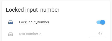
How to disable an input_number row:
Two methods are available:
– the row is displayed as disabled;
– the row only has a read-only input field.

image

code
  - type: entities
    title: Locked input_number
    entities:
      - entity: input_boolean.test_boolean
        name: Lock input_number
      - entity: input_number.test_number_2
        name: disabled
        tap_action:
          action: none
        card_mod:
          style: |
            :host {
              {% if is_state('input_boolean.test_boolean','on') %}
                --mdc-text-field-ink-color: var(--disabled-text-color);
                color: var(--disabled-text-color);
                --mdc-text-field-idle-line-color: var(--disabled-text-color);
                --paper-item-icon-color: var(--disabled-text-color);
                pointer-events: none;
              {% endif %}
            }
      - entity: input_number.test_number_2
        name: read-only
        tap_action:
          action: none
        card_mod:
          style: |
            :host {
              {% if is_state('input_boolean.test_boolean','on') %}
                pointer-events: none;
              {% endif %}
            }

      - type: section
        label: with UoM
      - entity: input_number.test_value_uom
        name: custom padding
        name: disabled
        tap_action:
          action: none
        card_mod:
          style: |
            :host {
              {% if is_state('input_boolean.test_boolean','on') %}
                --mdc-text-field-ink-color: var(--disabled-text-color);
                color: var(--disabled-text-color);

                --mdc-text-field-idle-line-color: var(--disabled-text-color);
                --paper-item-icon-color: var(--disabled-text-color);
                --secondary-text-color: var(--disabled-text-color);
                pointer-events: none;
              {% endif %}
            }

Short list of CSS variables available for “textfield” control:


Old styles - not valid since HA 2022.3

Colored value:
Styling is done like for "input-text" entity row - check this description.
image

Colored background:
Styling is done like for "input-text" entity row - check this description.
image

Aligned value:
Styling is done like for "input-text" entity row - check this description.
image

Changing a width of the input field:
Styling is done like for "input-text" entity row - check this description.
image

Colored underline:
Styling is done like for "input-text" entity row - check this description.
image
image

Disabled control:

type: entities
title: Locked input_number
entities:
  - entity: input_boolean.test_boolean
    name: Lock input_number
  - entity: input_number.test_number_2
    tap_action:
      action: none
    card_mod:
      style: |
        :host {
          {% if is_state('input_boolean.test_boolean','on') %}
            --paper-item-icon-color: var(--disabled-text-color);
            --paper-input-container-color: var(--disabled-text-color);
            --paper-input-container-input-color: var(--disabled-text-color);
            color: var(--disabled-text-color);
            pointer-events: none;
          {% endif %}
        }

image
Also, you may remove color options to make the row clearly visible but “read-only”.


More examples are described here.

1 Like

Hi!

I try all examples from this thread, but not work for me. I try change Badge icon color in HA Dark Theme, path for svg-icon:

/html/body/home-assistant//home-assistant-main//app-drawer-layout/partial-panel-resolver/ha-panel-lovelace//hui-root//ha-app-layout/div/hui-view/hui-masonry-view//div[1]/hui-state-label-badge[1]//ha-state-label-badge//ha-label-badge//div/div[1]/div/slot/ha-icon//ha-svg-icon

Any ideas?
Thanks!

PS:
This work without problem:

        card_mod:
          style: |
            :host {
              --label-badge-blue:
                {% if is_state(config.entity, 'on') %}
                  var(--label-badge-red)
                {% else %}
                  var(--label-badge-blue)
                {% endif %};
            }

Elaborate with context and your specific intent in order for us to help you.

Look at the 1st post, it contains a link to another post with many possible styles.

1 Like

I want to change the color of the icon in the badge depending on the state of the sensors. I use default HA Dark theme.

Thanks, tried again today, it didn’t work, did a cache cleanup and a hard reset in Chrome, it worked.

1 Like
type: custom:auto-entities
card:
  type: glance
  title: Pollenvarsel i dag
entities: null
filter:
  include:
    - state: Medium
    - state: Low
    - state: High
  exclude:
    - entity_id: sensor.pollen_0*_tomorrow
      options:
            options:
              style: |
                :host {
                  --paper-item-icon-color:
                    {% if states(config.entity) | string == Medium}
                      orange
                    {% elif states(config.entity) | string == Low}
                      red
                    {% else %}
                      green
                    {% endif %}
                    ;
                }

What am i doing wrong here, the states are low, medium, high, i want to color the icons based on low, medium, high

Why it is written twice?
And why you are applying a style to the excluded entity?
The "options" section must a part of each "include" section.
Since you decided to list your entities as “first Medium, then Low, then High”, you should “hard-code” a corresponding style for each group.

no idea, its late, moved it to included, and removed the extra options, didnt solve it though

Already tried changing the code and moving it to each include section, still black

Try this (not checked by myself):

filter:
  include:
    - state: Medium
      options:
        style: |
          :host {
            --paper-item-icon-color: smth;
          }
    - state: Low
      options:
        style: |
          :host {
            --paper-item-icon-color: smth;
          }
    - state: High
      options:
        style: |
          :host {
            --paper-item-icon-color: smth;
          }

or you can use one "include" with "or" option and one "style" (with if & else).
Kind of this (cannot check by myself):

filter:
  include:
    - or:
        state: Medium
        state: Low
        state: High
      sort:
        method: state
        reverse: true
      options:
        style: YOUR_COMPLEX_STYLE_WITH_IF_ELSE

hi
how i make weather card bigger in height ?

type: custom:swipe-card
cards:
  - type: custom:simple-thermostat
    entity: climate.bf6d70bf6a79938e9794fu
    sensors:
      - entity: sensor.temperatura_maia
      - entity: sensor.sonoff_a480001b01_temperature
      - entity: sensor.motion_sensor_air_temperature
      - entity: sensor.sonoff_a480001b01_humidity
    decimals: '1'
    step_layout: row
    header:
      name: Termostato
      icon: mdi:thermometer-lines
    layout:
      mode:
        names: false
    step_size: '1'
    view_layout:
      mode:
        names: false
  - type: weather-forecast
    entity: weather.maia
    card_mod:
      style: |
        ha-card {
          color: red;
          height: 1000px
        }

solved

 card_mod:
      style:
        .: |
          ha-card {
            height: 292px !important;
            #background: teal;
          }
           ha-card .name-state .state {
           #color: red;
           font-size: 16px;
          }
           ha-card .name-state .name {
           #color: blue;
           font-size: 35px;
          }

Is there any way to make the slider knob appear even if it is at the top of the stack?

image

image

cards:
  - type: vertical-stack
    cards:
      - type: entities
        entities:
          - input_number.system_startup_event_delay
          - input_number.system_startup_event_delay

1 Like

May cause another issues…

type: vertical-stack
cards:
  - type: entities
    style: |
      ha-card {
        overflow: visible !important;
      }
    entities:
      - entity: input_number.test_number
      - entity: input_number.test_number
      - entity: input_number.test_number
2 Likes

Thanks.
Something for me to work with!