Styling a slider entity inside Entities card:
NOTE:
Do not forget to add a "card_mod:" keyword before "style:" (new in card-mod 3).
Colored icon (2 options):

type: entities
entities:
  - entity: input_number.battery_level_check
    name: Сolor icon
    card_mod:
      style: |
        :host {
          --paper-item-icon-color: red;
        }
  - entity: input_number.battery_level_check
    name: Сolor icon (#2)
    card_mod:
      style:
        hui-generic-entity-row:
          $: |
            state-badge {
              color: orange;
            }
Colored text: (without “secondary_info”)

type: entities
entities:
  - entity: input_number.battery_level_check
    name: Сolor all text
    style: |
      :host {
        color: red;
      }
  - entity: input_number.battery_level_check
    name: Color value's name
    style:
      hui-generic-entity-row:
        $: |
          .info {
            color: green;
          }
  - entity: input_number.battery_level_check
    name: Color value
    style: |
      hui-generic-entity-row .flex .state {
        color: magenta;
      }
Word wrapped text: (without “secondary_info”)

type: entities
entities:
  - entity: input_number.battery_level_check
    name: Wrapped Wrapped Wrapped Wrapped Wrapped
    style:
      hui-generic-entity-row:
        $: |
          .info {
            color: red;
            text-overflow: unset !important;
            white-space: unset !important;
          }
  - entity: input_number.battery_level_check
    name: Not wrapped Not wrapped Not wrapped Not wrapped
All styles described above: (without “secondary_info”)

type: entities
entities:
  - entity: input_number.battery_level_check
    name: Wrapped Wrapped Wrapped Wrapped Wrapped
    card_mod:
      style:
        hui-generic-entity-row:
          $: |
            state-badge {
              color: orange;
            }
            .info {
              color: red;
              text-overflow: unset !important;
              white-space: unset !important;
            }
          .: |
            .flex .state {
              color: magenta;
            }
Common style for all sliders: (without “secondary_info”)

type: entities
title: Common
card_mod:
  style:
    hui-input-number-entity-row:
      $:
        hui-generic-entity-row:
          $: |
            state-badge {
              color: orange;
            }
            .info {
              color: red;
              text-overflow: unset !important;
              white-space: unset !important;
            }
          .: |
            .flex .state {
              color: magenta;
            }
entities:
  - entity: input_number.battery_level_check
    name: Slider Slider Slider Slider Slider
  - sun.sun
  - entity: input_number.battery_level_check
    name: Cannot ovewrite style Cannot ovewrite style Cannot ovewrite style
    card_mod:
      style: |
        :host {
          color: green !important;
        }
Note that a style for the 2nd slider cannot be overwritten individually.
If “secondary_info” is specified then a code changes a little - I have to use ".info" instead of ".info.text-content":

type: entities
entities:
  - entity: input_number.battery_level_check
    name: Color value's name
    secondary_info: last-changed
    style:
      hui-generic-entity-row:
        $: |
          .info {
            color: green;
          }
But according to my tests in all the cases described above it is possible to always use ".info" - it seems to work anyway.
Colored secondary-info:

type: entities
entities:
  - entity: input_number.battery_level_check
    name: Сolor secondary
    secondary_info: last-changed
    style:
      hui-generic-entity-row:
        $: |
          .info .secondary ha-relative-time {
            color: orange;
          }
Different colors for name & secondary_info:

type: entities
entities:
  - entity: input_number.battery_level_check
    name: Different colors
    secondary_info: last-changed
    style:
      hui-generic-entity-row:
        $:
          .info: |
            .secondary ha-relative-time {
              color: orange;
            }
          .: |
            .info {
              color: green;
            }
Colored slider:

type: entities
entities:
  - entity: input_number.battery_level_check
    name: Сolored slider
    style:
      hui-generic-entity-row: |
        .flex ha-slider {
          --paper-slider-active-color: orange;
          --paper-slider-knob-color: green;
          --paper-slider-container-color: cyan;
        }
Hiding elements:
Hidden icon:

type: entities
entities:
  - entity: input_number.battery_level_check
    name: Hidden icon
    style:
      hui-generic-entity-row:
        $: |
          state-badge {
            display: none;
          }
Hidden state:

type: entities
entities:
  - entity: input_number.battery_level_check
    name: Hidden state
    style: |
      hui-generic-entity-row .flex .state {
        display: none;
      }
Hidden name:

type: entities
entities:
  - entity: input_number.battery_level_check
    name: Hidden name
    style:
      hui-generic-entity-row:
        $: |
          .info {
            display: none;
          }
        .: |
          ha-slider {
            max-width: unset !important;
          }
Minimal view:

type: entities
entities:
  - entity: input_number.battery_level_check
    style:
      hui-generic-entity-row:
        $: |
          .info {
            display: none;
          }
          state-badge {
            display: none;
          }
        .: |
          ha-slider {
            max-width: unset !important;
          }
          .flex .state {
            display: none;
          }
Adjusting a slider’s width:


type: entities
entities:
  - entity: input_number.test_number
    name: slider's width
  - entity: input_number.battery_level_check
    name: value
    card_mod:
      style: |
        ha-slider {
          {% set WIDTH = states("input_number.test_number")|int(0) %}
          width: {{WIDTH}}px !important;
          max-width: unset !important;
        }
Disabled slider:
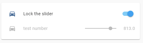
type: entities
title: Locked slider
entities:
  - entity: input_boolean.test_boolean
    name: Lock the slider
  - entity: input_number.test_number
    tap_action:
      action: none
    card_mod:
      style: |
        :host {
          {% if is_state('input_boolean.test_boolean','on') %}
            --paper-slider-active-color: var(--disabled-text-color);
            --paper-slider-knob-color: var(--disabled-text-color);
            --paper-slider-container-color: var(--disabled-text-color);
            --paper-item-icon-color: var(--disabled-text-color);
            color: var(--disabled-text-color);
            pointer-events: none;
          {% endif %}
        }
More examples are described here.