Some examples of using "::before", "::after" & "content":
Note: may be used with many Lovelace cards (I hope).
NOTE:
Do not forget to add a "card_mod:" keyword before "style:" (new in card-mod 3).
Prefix & suffix:
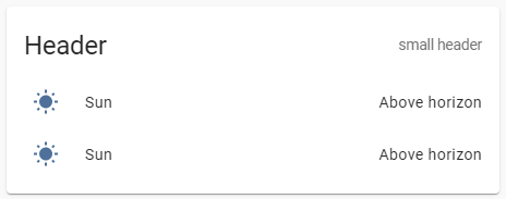
type: entities
entities:
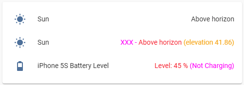
- entity: sun.sun
- entity: sun.sun
style:
hui-generic-entity-row $: |
.text-content:not(.info) {
color: red;
}
.text-content:not(.info)::before {
content: "XXX - ";
color: magenta;
}
.text-content:not(.info)::after {
content: " (elevation {{state_attr(config.entity,'elevation')}})";
color: orange;
}
- entity: sensor.iphone_5s_battery_level
card_mod:
style:
hui-generic-entity-row $: |
.text-content:not(.info) {
color: red;
}
.text-content:not(.info)::before {
content: "Level: ";
color: red;
}
.text-content:not(.info)::after {
content: " ({{states('sensor.iphone_5s_battery_state')}})";
color: magenta;
}
+ undocumented feature for "secondary_info":
type: entities
entities:
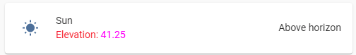
- entity: sun.sun
secondary_info: true
style:
hui-generic-entity-row:
$: |
.info .secondary {
color: red;
}
.info .secondary::before {
content: "Elevation: ";
color: red;
}
.info .secondary::after {
content: "{{state_attr(config.entity,'elevation')}}";
color: magenta;
}
“Undocumented” means that you can use also "secondary_info: bla_bla_bla" instead of "secondary_info: true", it will create a "div" element anyway.
Math operations:

type: entities
entities:
  - entity: sensor.cleargrass_1_co2
    style:
      hui-generic-entity-row $: |
        .text-content:not(.info) {
          color: red;
        }
        .text-content:not(.info)::before {
          content: "{{states(config.entity)|int/10}} (divided), ";
          color: magenta;
        }
Replacing a value:
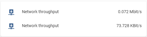
For the Entities card it is enough to set a transparent color for the element keeping the state:
type: entities
entities:
  - entity: sensor.network_throughput_in_eth0_mbits
    name: Network throughput
  - entity: sensor.network_throughput_in_eth0_mbits
    name: Network throughput
    style:
      hui-generic-entity-row $: |
        .text-content:not(.info)::after {
          content: "{{states(config.entity)|float*1024}} KBit/s";
          color: var(--primary-text-color);
        }
        .text-content:not(.info) {
          color: transparent;
        }
But for the Glance card I have to set a zero font-size:

type: glance
entities:
  - entity: sensor.network_throughput_in_eth0_mbits
    name: Network throughput
  - entity: sensor.network_throughput_in_eth0_mbits
    name: Network throughput
    style: |
      :host div:not(.name)::after {
        content: "{{states(config.entity)|float*1024}} KBit/s";
        font-size: var(--mdc-typography-body1-font-size, 1rem);
      }
      :host div:not(.name) {
        font-size: 0px;
      }
One more example for “input_boolean” entity:

type: glance
entities:
  - entity: input_boolean.test_boolean
    name: default
  - entity: input_boolean.test_boolean
    name: modded
    style: |
      :host div:not(.name)::after {
        content: "{% if is_state(config.entity,'on') -%}
                  switched ON
                  {%- else -%}
                  switched OFF
                  {%- endif %}";
        font-size: var(--mdc-typography-body1-font-size, 1rem);
      }
      :host div:not(.name) {
        font-size: 0px;
      }
For "multiple-entity-row" it is much tricky:

The original value must be transparent & placed on the next line whose height must be set to 0px:
type: entities
entities:
  - type: 'custom:multiple-entity-row'
    style: |
      .entities-row div.entity:nth-child(1) div::before {
        color: orange;
        content: {%if is_state('sun.sun','above_horizon') -%} "Rise and shine\A" {%- else -%} "Sleep well\A" {%- endif %};
        line-height: var(--mdc-typography-body1-line-height, 1.5rem);
      }
      .entities-row div.entity:nth-child(1) div {
        color: transparent;
        line-height: 0px;
      }
    entity: sun.sun
    entities:
      - entity: sun.sun
        name: xxx
        styles:
          width: 60px
      - entity: sun.sun
        name: xxx
        styles:
          width: 60px
    unit: ''
    icon: ''
    toggle: false
    show_state: false
    state_header: ''
    state_color: false
For badges inside "picture-elements" card:
This trick may be useful since there is no possibility to display any text for the entity’s name. (Update: it is possible since this PR merged)
(BTW, for badges displayed on the top of views this possibility is present - a “name” property.
Update: since 2024.8 those “badges displayed on the top of views” are replaced with new-style ones.).
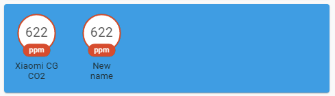
type: picture-elements
image: /local/images/blue.jpg
style: |
  ha-card { height: 130px !important; }
elements:
  - type: state-badge
    entity: sensor.cleargrass_1_co2
    style:
      top: 18%
      left: 10%
  - type: state-badge
    entity: sensor.cleargrass_1_co2
    style:
      top: 18%
      left: 30%
    card_mod:
      style:
        ha-state-label-badge:
          $:
            ha-label-badge:
              $:
                .badge-container: |
                  .title {
                    color: transparent;
                    line-height: 0px !important;
                  }
                  .title::before {
                    color: var(--primary-text-color);
                    content: "New name\A";
                    line-height: normal;
                  }
For icons inside “picture-elements” card:

Described here.
custom:multiple-entity-row:
How to display "last-changed" for items:
described here
custom:mini-graph-card:
How to display an additional info on the card:

described here
Any card with a title:
How to add a small header:
described here
More examples are described here.