Yaml anchors to reduce repeating code
I used it to add the same style for 2 more elements.
I’m looking to change the entity icon based on a template state change, but nothing changes. If I can get this working I wanted to add this to one of my swipe cards.
The idea is to have an indication of if the doors are closed then the icon will show one icon and if the doors are open the the icon will change and may place in some text as well displaying which door has opened
type: entity
entity: group.doors
card_mod:
  style: |
     ha-card {
        --card-icon:
            {% if states('group.door') == 'on' %} mdi:shield-off-outline
            {% else %} mdi:shield-outline
            {% endif %};
     }
Tried this and it didn’t work either. As described above it was working till 20.10.x. Afterwards only with this curious additional $: And on card level, as in your recommendation, I didn’t get this work.
What changed with 2010.x. in the way it is working?
What happens with this additional $: on same level?
How would it work on card level as in your recommendation instead restriction card level?
At least show us the code where you tried to achieve the result, may be people will help you.
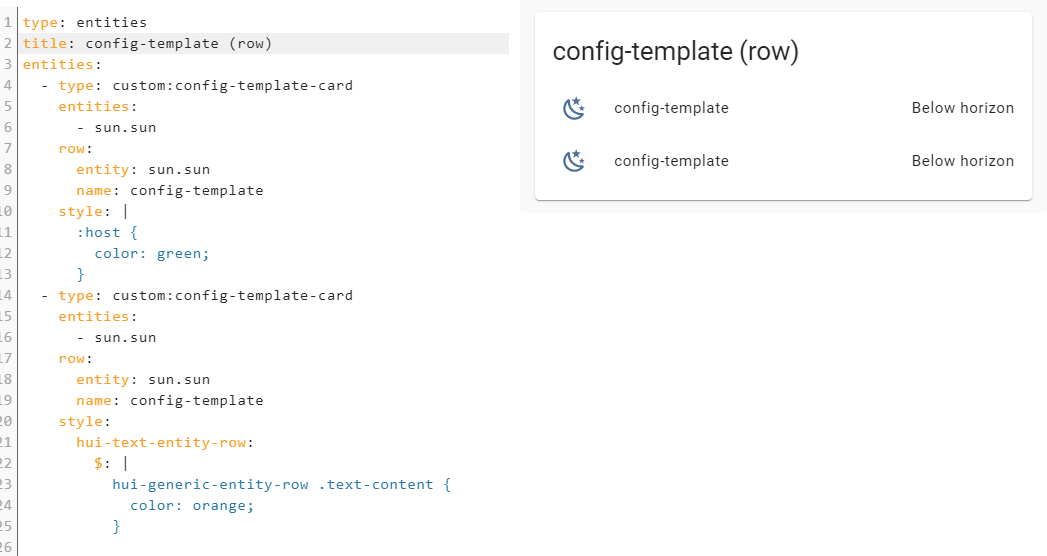
Sorry, but what is this? This is not a part of config-template-card…
Will do so, but do you have ideas regarding:
What changed with 2010.x. in the way it is working?
What happens with this additional $: on same level, with which it is (only) working now.
  - type: custom:restriction-card
    card_mod:
      style:
        $:
        hui-cover-entity-row:
          $:
            hui-generic-entity-row:
              $:
                state-badge:
                  $:
                    ha-icon:
                      $: |
                        ha-svg-icon {
                          {% if state_attr('cover.rolladen_kinderzimmer', 'current_position')|int < 100 %}
                            color: var(--hilf-color);
                          {% else %}
                            color: var(--hilf-active-color);
                          {% endif %}
                        }
As this is working now, but was not needed before, I really like to know the background. This was the background of my question above, not to have another solution as you have suggested putting on another level.
I have never seen using this construction:
    card_mod:
      style:
        $:
        some_element:
I think only the author of card-mod can answer your question.
Register an issue on Github.
As for me, I am using restriction-card only inside a decluttering template where styling is done w/o any issues.
1 Like
The code I posted is an !inlude file which uses # lovelace_gen (apologies for omitting that line in the post)
  - type: vertical-stack
    cards:
      - type: entities
        show_header_toggle: false
        entities:

          - !include
            - heating_schedule_line.yaml
            - floor: upstairs
              schedule: 1

          - !include
            - heating_schedule_line.yaml
            - floor: upstairs
              schedule: 2
So {{ floor }} is passed in.
As is {{ schedule }}.
I reuse the code on two views. One for Upstairs and one for Downstairs which both have their own set of schedules.
The arrow icon points to the active schedule.
Thanks for looking.
Is it a typo???
rgba() has 4 args.
OK, may be the 4th arg is an optional one, rgba(255,155,0) shows orange anyway…
I simplified your example:
- excluded Lovelace_gen;
- excluded
{%raw%}staff; - replaced
rgba()withgreen.
Now it is:
type: entities
entities:
  - type: custom:multiple-entity-row
    entity: input_boolean.test_boolean
    name: Time
    icon: mdi:arrow-right-bold
    toggle: true
    state_header: Enabled
    entities:
      - entity: input_boolean.test_boolean
        toggle: true
        name: Turn ON
      - entity: input_boolean.test_boolean_2
        toggle: true
        name: Turn OFF
      - entity: input_datetime.test_boolean_3
        name: Time
      - entity: input_number.test_number
        name: Temperature
    card_mod:
      style: |
        :host {
          {% if is_state('input_boolean.test_boolean','on') %}
            --paper-item-icon-color: green;
          {% else %}
            color: var(--secondary-text-color);
            --paper-item-icon-color: var(--accent-color);
          {% endif %}
        }
The colors are changing:

If colors are not changing in your setup - check the templates…
BTW, which row do you like more?

I have a question, I can’t seem to fix:
In my screenshot below, I think you can guess what I’m going for. I just want to make sure the buttons are smaller(only on this screen) and there is some margin in between.

I am unable to do this with custom styling, or I 'm doing it in the wrong place  ?
?
My code:
        card:
          type: custom:layout-card
          layout: horizontal
          min_columns: 3
        filter:
          include:
            - domain: binary_sensor
              attributes:
                device_class: door
              options:
                type: custom:button-card
                template:
                  - doorsensor
                  - icon_closet
                entity_id: this.entity_id
          exclude:
            - entity_id: binary_sensor.dishwasher_door
First the easy bit.
I like the way the labels are aligned in line 2. But I would like it even more if they were exactly aligned  How did you do that?
I did the same. No use of lovelace_gen or {% raw %}, all ‘variables’ hardcoded.
With just a custom:multiple-entity-row it works as you show. (Line two in the picture)
Including it in the custom:config-template-card it doesn’t work. (line one in the picture)

It points to a problem with custom:config-template-card? There was an update recently but I rolled back to a previous version but it still didn’t work so maybe something changed in the core frontend???
This works (as you pointed out)
          - type: custom:multiple-entity-row
            entity: input_boolean.heating_downstairs_schedule1_enabled
            name: Downstairs Time 1
            toggle: true
            state_header: Enabled
            entities:
              - entity: input_boolean.heating_downstairs_schedule1_turn_on
                toggle: true
                name: 'Turn ON'
              - entity: input_boolean.heating_downstairs_schedule1_turn_off
                toggle: true
                name: 'Turn OFF'
              - entity: input_datetime.heating_downstairs_schedule_time1
                name: Time
              - entity: input_number.heating_downstairs_schedule_temperature1
                name: Temperature
            card_mod:
              style: |
                :host {
                  {% if schedule == states('sensor.heating_downstairs_active_schedule_number') %}
                    --paper-item-icon-color: rgb(255, 155, 0);
                  {% elif states('input_boolean.heating_downstairs_schedule1_enabled') == 'on' %}
                    --paper-item-icon-color: var(--accent-color);
                  {% else %}
                    color: var(--secondary-text-color);
                    --paper-item-icon-color: var(--secondary-text-color);
                  {% endif %}
                  ;
                }
This doesn’t
          - type: custom:config-template-card
            variables:
              CURRENT_SCHEDULE: states['sensor.heating_downstairs_active_schedule_number'].state
            entities:
              - sensor.heating_downstairs_active_schedule_number
              - input_boolean.heating_downstairs_schedule1_enabled
              - input_datetime.heating_downstairs_schedule_time1
              - input_number.heating_downstairs_schedule_temperature1
              - input_boolean.heating_downstairs_schedule1_turn_on
              - input_boolean.heating_downstairs_schedule1_turn_off
            card:
              type: custom:multiple-entity-row
              entity: input_boolean.heating_downstairs_schedule1_enabled
              name: Downstairs Time 1
              toggle: true
              state_header: Enabled
              entities:
                - entity: input_boolean.heating_downstairs_schedule1_turn_on
                  toggle: true
                  name: 'Turn ON'
                - entity: input_boolean.heating_downstairs_schedule1_turn_off
                  toggle: true
                  name: 'Turn OFF'
                - entity: input_datetime.heating_downstairs_schedule_time1
                  name: Time
                - entity: input_number.heating_downstairs_schedule_temperature1
                  name: Temperature
              card_mod:
                style: |
                  :host {
                    {% if schedule == states('sensor.heating_downstairs_active_schedule_number') %}
                      --paper-item-icon-color: rgb(255, 155, 0);
                    {% elif states('input_boolean.heating_downstairs_schedule1_enabled') == 'on' %}
                      --paper-item-icon-color: var(--accent-color);
                    {% else %}
                      color: var(--secondary-text-color);
                      --paper-item-icon-color: var(--secondary-text-color);
                    {% endif %}
                    ;
                  }
Up to you to decide whether it is aligned or not)))
        hui-generic-entity-row .entities-row div.entity:
          ha-entity-toggle:
            $: |
              ha-switch {
                padding-top: 2px !important;
                padding-bottom: 0px !important;
              }
Also, a typo in my code:
entity: input_datetime input_boolean.test_boolean_3
Probably there is an issue here.
Look here:
  - input_boolean.test_boolean
  - type: custom:config-template-card
    entities:
      - input_boolean.test_boolean
      - input_boolean.test_boolean_2
      - input_number.test_number
    row:
      type: custom:multiple-entity-row
      entity: input_boolean.test_boolean
      name: Time
      icon: mdi:arrow-right-bold
      toggle: true
      state_header: Enabled
      entities:
        - entity: input_boolean.test_boolean
          toggle: true
          name: Turn ON
        - entity: input_boolean.test_boolean_2
          toggle: true
          name: Turn OFF
        - entity: input_boolean.test_boolean_3
          name: Time
        - entity: input_number.test_number
          name: Temperature
    card_mod:
      style:
        multiple-entity-row:
          $: |
            hui-generic-entity-row {
              {% if is_state('input_boolean.test_boolean','on') %}
                --paper-item-icon-color: green;
              {% else %}
                color: var(--secondary-text-color);
                --paper-item-icon-color: var(--accent-color);
              {% endif %}
            }
The code is supposed to work (I think) but it does not.
A similar picture was mentioned here - may be the same reason.
Possible solution - wrap the row into decluttering card with mod-card, it will work.
Earlier this code worked too - see this post, now it does not:
A new issue:
1 Like
I have the code as shown below, it’s placed inside a picture elemtents card. When i refresh the page the first time after changing my lovelace everything is working good, when i refresh the page the css style is applied on the whole picture elements card?
- type: custom:hui-element
    card_type: markdown
    content: |2


         *here is some text..
    style:
      left: 25%
      top: 20%
      width: 30%
    card_mod:
      style: |
        ha-card {

          font-size: 50px;
          font-style: bold;
          font-family: "Copperplate", Fantasy, sans-serif;
          line-height: 1.6;
          text-align: center;
          animation-duration: 160s;
          animation-name: slidein;
          background-color: transparent;
          box-shadow: none;

         }

          @keyframes slidein {
            from {
              margin-top: 100%;
              width: 100%;
         }

            to {
              margin-bottom: 100%;
              width: 100%;
          }
          }
I almost figured it out, but I’m probably setting the style in the wrong place, anyone that can point me to the right direction.
code:
 - type: 'custom:auto-entities'
        card:
          type: custom:layout-card
          layout_type: masonry
          layout:
            width: 100
            max_cols: 7
          style: |
            .column > * {
              margin: 10px !important;
            }
        filter:
          include:
            - domain: light
              options:
                type: custom:button-card
                template:
                  - light
                  - icon_hue
                entity_id: this.entity_id
          exclude:
            - state: "unavailable"
I’m trying to overwrite the margin element on the “column > *”

If I manually change it in the “developer tools” to
margin: 10px !important;I get the result I want, however if I place it in the code as you can see, the old value for margin is still applied. (I don’t see my change)
Hello
I would like to add the last_changed status on a motion badge (just under the badge, and above the “motion patio” label), is it possible to make that?

Hi,
I’m trying to style an icon inside a custom:paper-buttons-row and am stuck in the shadow-dom navigation.
The path to the icon I want to style:

MWE of the code (currently not working):
                - type: entities
                  title: Humidificateur
                  entities:
                    - type: 'custom:paper-buttons-row'
                      base_config:
                        style:
                          button:
                            color: lightgrey
                            border-radius: 10%
                      buttons:
                        - icon: 'mdi:air-humidifier'
                          tap_action:
                            action: call-service
                            service: humidifier.toggle
                            service_data:
                              entity_id: humidifier.master_bedroom
                          style:
                            button:
                              color: >-
                                {% if is_state('humidifier.master_bedroom', 'on') %}
                                  var(--accent-color)
                                {% else %}
                                  rgba(255, 255, 255, 0.4)
                                {% endif %}
                              background-color: rgba(255, 255, 255, 0.4)
                  card_mod:
                    style:
                      paper-buttons-row$:
                        paper-button:nth-child(1):
                          ha-icon$: |
                            ha-svg-icon {
                              animation: {% if is_state('humidifier.master_bedroom', 'on') %} blink 1s linear infinite alternate {% else %} none {% endif %};
                              color: red !important;
                            }
                            @keyframes blink {
                              0% { opacity: 0.1; }
                              100% { opacity: 1; }
                            }
The following CSS code works, blinks the whole button (I only want the icon to blink):
                  card_mod:
                    style:
                      paper-buttons-row$: |
                        paper-button:nth-child(1) {
                          animation: {% if is_state('humidifier.master_bedroom', 'on') %} blink 1s linear infinite alternate {% else %} none {% endif %};
                          color: red !important;
                        }
                        @keyframes blink {
                           0% { opacity: 0.1; }
                           100% { opacity: 1; }
                        }
What am I missing?
Can Picture_entity card have padding? I’m trying to make this Little Mole smaller but haven’t been succesful so far:

This is what I’m trying:
      - type: picture-entity
        style: |
          ha-card {
          }
          .card-content {
            padding: 10 10 10 10px;
            box-shadow: none;
          }
        entity: script.turn_on_tv_and_kodi
        image: /local/user_images/krtek.png
        name: Krkek?
        tap_action:
          action: call-service
          service: script.turn_on_tv_and_kodi
          service_data: {}
          target: {}
        show_state: false
        show_name: false
        aspect_ratio: '1'
Thanks.
Hi. I’m trying to style color of icon basing on sensor state, but I can’t get it working. So at the beginning I’m trying to do some basing styling, but my icon does not appear anywhere on card.
type: picture-elements
title: Foo
image: local/bar.png
elements:
  - type: icon
    icon: hass:white-balance-sunny
    card-mod:
      style: |
        :host {
          top: 50%;
          left: 50%;
          color: red;
        }
Thank you for your time.
There are errors in your code:
type: picture-elements
title: Foo
image: /local/images/blue.jpg
elements:
  - type: icon
    icon: hass:white-balance-sunny
    style:
      top: 50%
      left: 50%
    card_mod:
      style: |
        :host {
          color: red;
        }
-
Styling from
picture-elementsis mixed with styling bycard-mod. - The path is
/local/.... - Keyword
card_mod.
1 Like
You’re boss. Thank you!