šŸ”¹ Card-mod - Add css styles to any lovelace card

image

I got the streamline card in there now btw :wink:

type: custom:vertical-stack-in-card
horizontal: false
cards:
  - type: custom:streamline-card
    template: sprinkler_row
    variables:
      - entity: backyard_group_1
      - name: Achtertuin 1
  - type: custom:streamline-card
    template: sprinkler_row
    variables:
      - entity: backyard_group_2
      - name: Achtertuin 2
  - type: custom:streamline-card
    template: sprinkler_row
    variables:
      - entity: backyard_group_3
      - name: Achtertuin 3
  - type: custom:streamline-card
    template: sprinkler_row
    variables:
      - entity: frontyard
      - name: Voortuin

Itā€™s a bit hard to remote-debug as Iā€™m using the timer-bar-card as well and I donā€™t have that issue. Youā€™ll have to go through the browser debug tools to find out where this is coming from exactly. Not sure how familiar you are with those, but just select Achtertuin 1 with that dev tool selector thingy (see below) and start hovering through the parent elements to find out where it is coming from. And then fix it based on that, or send me a screenshot showing the culprit in the dev tools

image

amazing, right! it doesnā€™t seem to be timer-bar card parent that is causing your issues though, but something within it. If you find the right element, then the margins/paddings are highlighted orange/green. likely you have either a margin bottom somewhere or maybe the flexbox inside the timer-bar-card is somehow weirdā€¦

Man, I donā€™t think I can express into words how much I hate CSS and all this style crap. I can program ESPHomes or automations all day long but this stuff is breaking me up. HOURS have gone into this :sweat_smile:

I think I got it nowā€¦

image

Specifically, these changes did the trick:

added max-height to mushroom-template

        vertical-stack-in-card$: |
          mushroom-template-card {
            flex: 0 0 13% !important;
            max-height: 40px;
          }

added the following CSS to the timer-bar-card:

                timer-bar-entity-row {
                  max-height: 35px;
                }    

Full code, in case anyone wants to duplicate my monstrosity:

streamline_templates:
  sprinkler_row:
    card:
      type: custom:mod-card
      style:
        vertical-stack-in-card$: |
          mushroom-template-card {
            flex: 0 0 13% !important;
            max-height: 40px;
          }
      card:
        type: custom:vertical-stack-in-card
        horizontal: true
        cards:
          - type: custom:mushroom-template-card
            icon: mdi:toggle-switch{{'-off' if states(entity) == 'off'}}
            entity: switch.sprinklercontroller_[[entity]]_include_in_cycle
            fill_container: true
            icon_color: '{{''amber'' if states(entity) == ''on'' }}'
            tap_action:
              action: toggle
            hold_action:
              action: none
            double_tap_action:
              action: none
            layout: vertical
          - type: custom:timer-bar-card
            state_color: true
            mushroom: null
            tap_action:
              action: toggle
            bar_height: 10px
            entities:
              - entity: switch.sprinklercontroller_[[entity]]
                name: '[[name]]'
                remain_time:
                  entity: sensor.sprinklercontroller_remaining_time_current_valve
                  units: seconds
                duration:
                  entity: number.sprinklercontroller_[[entity]]_duration
                  units: minutes
            card_mod:
              style: |
                .card-content {
                  padding-top: 0; 
                  padding-bottom: 0;
                  padding-left: 0;
                }
                timer-bar-entity-row {
                  max-height: 35px;
                }     

And the card:

type: custom:vertical-stack-in-card
horizontal: false
cards:
  - type: custom:streamline-card
    template: sprinkler_row
    variables:
      - entity: backyard_group_1
      - name: Achtertuin 1
  - type: custom:streamline-card
    template: sprinkler_row
    variables:
      - entity: backyard_group_2
      - name: Achtertuin 2
  - type: custom:streamline-card
    template: sprinkler_row
    variables:
      - entity: backyard_group_3
      - name: Achtertuin 3
  - type: custom:streamline-card
    template: sprinkler_row
    variables:
      - entity: frontyard
      - name: Voortuin

I think itā€™s perfect now, and Iā€™m going to stop touching it.
I do see 2 issues but at this point I donā€™t care anymore :stuck_out_tongue:

  1. I get an error in the visual editor so I canā€™t press save. I have to make my changes through the raw editor:

  2. If I am in the edit mode and press done, it looks like this:
    image

After pressing F5, it looks fine again. This happened since I switched to the stream-line card.

loocd: Hats off to you good sir. Thanks for all of your patience and assistance!

EDIT: Back to the drawing boardā€¦ this last issue I mentioned happens on my phone permanently as soon as I go to the page a second time. Super, super weird.

this could be posted in a tile card or custom:button-card thread too, but since I am trying to find the right card-mod, Iā€™ll start hereā€¦

I have this tile card mod

      type: tile
      icon: mdi:water
      name: ' '
      vertical: true
      tap_action:
        action: more-info
      card_mod:
        style: |
          .icon-container {
            border-radius: 24px;
            background: radial-gradient(var(--card-background-color) 60%,transparent calc(60% + 1px)),
            conic-gradient(var(--tile-color) {{states(config.entity)}}% 0%,
            var(--card-background-color) 0% 100%);
          }

which draws a perfect border according to the percentage of the entity:

Iā€™d love to do the same with my light buttons, but cant find the right mod to do so:

I have some of these on a custom field:

  custom_fields:
    info: &info_light
      >
        [[[ if (entity.state === 'on' && entity.attributes.brightness) {
            var brightness = Math.round(entity.attributes.brightness/2.54);
            const radius = 20.5;
            const circumference = radius * 2 * Math.PI;
            return `
              <svg viewBox="0 0 50 50">
                <circle cx="25" cy="25" r="${radius}"
                  stroke="var(--button-card-light-color,var(--active-color))" stroke-width="2" fill="none"
                  style="transform: rotate(-90deg);transform-origin: 50% 50%;
                  stroke-dasharray: ${circumference};
                  stroke-dashoffset: ${circumference - brightness / 100 * circumference};" />
                <text x="50%" y="54%" fill="black" font-size="16" font-weight= "bold"
                  text-anchor="middle" alignment-baseline="middle">
                  ${brightness}<tspan font-size="10">%</tspan>
                </text>
              </svg>
            `;
          }
        ]]]

and that works fine:

SchermĀ­afbeelding 2024-10-23 om 17.44.58

. but in this case I want the border to be drawn on the img_cell of the button-card, or, checking the element in the dom, the .img-cell

so I copied that tile card mod over to

  card_mod:
    style: |
      .img-cell {
        border-radius: 24px;
        background: radial-gradient(var(--card-background-color) 60%,transparent calc(60% + 1px)),
        conic-gradient(var(--button-card-light-color) {{states(config.entity)}}% 0%,
        var(--card-background-color) 0% 100%);
      }

note I did change to the button-card-light-color, but nothing is happeningā€¦

this is the original button with a regular style section on the image_cell:

    img_cell:
      - justify-content: center
      - background: >
          [[[ var rgb = (entity.state === 'on')
                ? entity.attributes.rgb_color : '211,211,211';
              return 'rgba(' + rgb + ',0.2)'; ]]]
      - border-radius: 24px
      - place-self: start
      - width: 42px
      - height: 42px

SchermĀ­afbeelding 2024-10-23 om 17.39.29

but when I take that out, and change to the card-mod there is nothing:

tbh, I wouldnā€™t yet know how to write the background in styles syntax native to the custom:button-card, thats why I tried it with card-mod

please have a look what could be done to fix this?

3 Likes

I have this progress-like border for Entities card.
Will try to post in a week.

1 Like

thx.
hope you can help me out, it would really bring those buttons in sync.

I wel also try and figure out the styles syntax for the custom:button-card directly, maybe it is doable after all :wink:

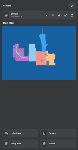
Hey everyone. Iā€™ve rotated a picture-entity card but now Iā€™m left with a large gap below it. Any suggestions on how to remove the gap?

show_state: false
show_name: false
camera_view: auto
type: picture-entity
entity: image.roborock_s7_maxv_main_floor
card_mod:
  style: |
    ha-card {
      transform: scale(73%) translate(0%, -32%) rotate(90deg);
      transition: none !important;
    }

Try rotating an image element, not a whole card

Just tried this and ended up with essentially the same result:

show_state: false
show_name: false
camera_view: auto
type: picture-entity
entity: image.roborock_s7_maxv_main_floor
card_mod:
  style:
    hui-image$: |
      img {
        transform: scale(73%) translate(0%, -32%) rotate(90deg);
      }

Suggest you to publish a test image with SAME dimension for users who may wish to reproduce your case and thus help you.

Thanks for the help btw! Hereā€™s the image being used:

image

Are you using this map to show a current status of vacuum cleaning?
Have a look
It creates a camera entity which can be zoomed, trimmed and rotated and even placed above a floor plan.

Ofc you can still use your current approach, just FYI.

Iā€™ve been using that for a couple years, but recently switched to the core Roborock integration which isnā€™t supported by that card. It also has pretty bad performance when switching between multiple maps. Iā€™ve made my own solution that seems to be working better so far for my needs, just stuck trying to figure out this last issue with the image.

well there is progress:

      - background: >
          [[[ var rgb = (entity.state === 'on')
                ? entity.attributes.rgb_color : '211,211,211';
              var rgba = 'rgba(' + rgb + ',0.2)';
              if (entity.state === 'on')
              return `radial-gradient(${rgba} 80%,transparent calc(60% + 1px)),
                      conic-gradient(var(--button-card-light-color) ${Math.round(entity.attributes.brightness/2.55)}% 0%,
                      var(--card-background-color) 0% 100%)`;
             return `${rgba}`; ]]]

and

  triggers_update:
    - entity

does a lot of good, thanks to @khaisilk1910 for helping me in Discord!

the final thing I need now is get rid of the actual conic, and have the background inside the img_cell only show that conic in the outer borderā€¦

just like in the print cartridge buttonsā€¦
I cant see it though

alternative since there is no apparent way to do as I hoped:

    img_cell:
      - justify-content: center
      - background: >
          [[[ var rgb = entity.state === 'on'
                ? entity.attributes.rgb_color : '211,211,211';
              var rgba = 'rgba(' + rgb + ',0.2)';

              return entity.state === 'on'
              ? `radial-gradient(var(--card-background-color) 60%,transparent calc(60% + 1px)),
                 conic-gradient(var(--button-card-light-color) ${Math.round(entity.attributes.brightness/2.55)}% 0%,
                 ${rgba} 0% 100%)`
              : `${rgba}`; ]]]

but, this has developed into a card-mod post, so Ill refrain from elaborating here, my pardon

Out of curiousity: Why is the ā€œ+1pxā€ inside that percentage calculation? And why is that needed?

it has to do with the left over section of the overlay (but no, it didnt make any difference in solar I could find out)

Iā€™ve found another solution now though:

I am using the same info custom filed, and I overlay it exactly over the icon img_cell of the button-card. It feels a bit hacky, and ofc its not 100% linked to the img_cell itself (not all as a matter of fact, it;'s just a custom field after all) but is is the best I could come up with for now.

Click to unhide this `custom:button-card` yaml, it's off topic here....
  custom_fields:
    info: >
      [[[ if (entity.state === 'on' && entity.attributes.brightness) {
          var brightness = Math.round(entity.attributes.brightness/2.54);
          var rgb = (entity.state === 'on')
                  ? entity.attributes.rgb_color : '211,211,211';
          var rgba = 'rgba(' + rgb + ',0.2)';
          const radius = 20.5;
          const circumference = radius * 2 * Math.PI;
          return `
            <svg viewBox="0 0 50 50">
              <circle cx="25" cy="25" r="${radius}"
                stroke="var(--button-card-light-color,var(--active-color))" stroke-width="2" fill="${rgba}"
                style="transform: rotate(-90deg);transform-origin: 50% 50%;
                stroke-dasharray: ${circumference};
                stroke-dashoffset: ${circumference - brightness / 100 * circumference};" />
            </svg>
          `;
        }
      ]]]

  styles:
    custom_fields:
      info:
        - position: absolute
        - left: 2%
        - top: 4%
        - width: 48px

SchermĀ­afbeelding 2024-10-25 om 11.50.34

Moved to Lovelace: Button card - #7296 by Mariusthvdb

Hello community,
maybe you could help me quickly.
I would like to remove the space above the first entity entry.
Thank you!

My current code is

type: entities
entities:
  - entity: sensor.siegesplatz_first_departure
    name: 26A (Siegesplatz)
    secondary_info: none
  - entity: sensor.aspern_zachgasse_first_departure
    name: 92A (Zachgasse)
  - entity: sensor.oberdorfstrasse_first_departure
    name: 25 (OberdorfstraƟe)
show_header_toggle: false
card_mod:
  style: |
    ha-card {
      --mdc-icon-size: 16px;
      }
    .card-content div {
      margin-top: 0px !important;
      margin-bottom: 0px  !important;
      margin-left: -15px !important;
      height: 17px;
     }

you should always try to target the root element of what is causing your ā€˜issueā€™, otherwise it can get messy.

Youā€™ve targeted .card-content div - but these donā€™t have a height assigned, instead they get their height from their children.

The height is assigned by the children of this element by setting the line-height:
image
image

meaning that this is pretty much all you need to do:

card_mod:
  style:
    .: |
      ha-card {
        --mdc-icon-size: 16px;
        }
    hui-sensor-entity-row$:
      hui-generic-entity-row$: |
        * {
          line-height: unset;
        }

and then you can still further reduce the top/bottom padding if required by using this instead:

card_mod:
  style:
    .: |
      ha-card {
        --mdc-icon-size: 16px;
        }
      .card-content {
        padding-top: 5px;
        padding-bottom: 5px;
      }

    hui-sensor-entity-row$:
      hui-generic-entity-row$: |
        * {
          line-height: unset;
        }

Thank you loocd for your help.
I do not have any experience in ccs coding, but with some try and error I have completed your code.

card_mod:
  style:
    .: |
      ha-card {
        --mdc-icon-size: 16px;
        }
      .card-content {
        padding-top: 5px;
        padding-bottom: 5px;
      }
    hui-sensor-entity-row$:
      hui-generic-entity-row$: |
        * {
          line-height: unset;
          margin-top: 0px !important;
          margin-bottom: 0px  !important;
          margin-left: 0px !important;
          height: 17px;
        }

Elseway the icons and text would be shifted.
Thanks again!