If its a sensor, then you just need to check out this custom card.
But how do I display future data points?
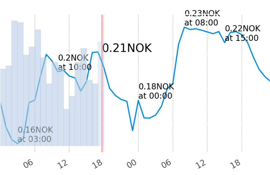
I do have the Tibber price in exactly this graph. But it shows the last 24 hours. That’s interesting - but not helpful if I want to know what happens tomorrow.
Oh i got you now. If you are using grafana addon, there is a provision for plotting forecast values. Other than that there are no ready made solution available. But if you have some experience with javascript you can edit this custom card and make it adapt to tibber sensor.
This is to forcast rain but I have heard the script is simple
I was afraid to hear that.
Grafana is the simpler option but you will need to use any database addon like influx db to push data to it.
Sadly, this solution is broken now.
Apex Cards?
1 Like
Hi,
I guess my approach here solves your problem:
1 Like
Well, it looks like a reasonable workaround.
(I wouldn’t call it a solution, as it really is just a workaround with quite some effort.)
Did you look up this solution: Display future values in a graph - #7 by lowlander1977 ?
I did not try it yet, but it seems to exactly do what you want. My usecase would also be to display future electricity prices, in my case from awattar
I have recently moved away from ApexChart and now I have my future price chart using Plotly. I’m enjoying the results so far…

Also looks good.
This is my first attemp, easy to configure:

Why did you move to Plotly? Since i don’t have any experience with it, what is better there? Maybe i stop investigating in apex and also use plotly.
1 Like
My main reason to move was the capability to easily navigate into the past data, zoom, etc…
But to be honest, I’m not using those functionalities that much… maybe just because I’m not that familiar with this yet…
This looks really great! Can you please share the code or explain how i could get this nice graph?
Sure

This is an Apex Card: ApexCharts card - A highly customizable graph card
Readme: apexcharts-card/README.md at master · RomRider/apexcharts-card · GitHub
The Code is as follows:
type: custom:apexcharts-card
experimental:
  hidden_by_default: true
graph_span: 45h
all_series_config:
  stroke_width: 2
span:
  start: hour
  offset: '-25h'
now:
  show: true
update_interval: 5min
header:
  show: true
  title: Strompreisprognose (€/kWh)
  show_states: true
  colorize_states: true
series:
  - entity: sensor.awattar_full
    yaxis_id: left
    type: line
    float_precision: 5
    name: Preisprognose
    curve: stepline
    unit: €/kWh
    show:
      in_header: false
      extremas: true
      legend_value: false
    data_generator: |
      return entity.attributes.data.map((record, index) => {
              return [record.start_timestamp, record.marketprice /1000 * 1.20];
            });
  - entity: sensor.awattar_current
    name: Preis
    yaxis_id: left
    type: line
    float_precision: 5
    unit: €/kWh
    curve: stepline
    extend_to: now
    fill_raw: last
    show:
      hidden_by_default: false
      legend_value: false
  - entity: sensor.awattar_median
    yaxis_id: left
    type: line
    curve: stepline
    fill_raw: last
    float_precision: 5
    name: Median
    unit: €/kWh
    show:
      hidden_by_default: true
      legend_value: false
  - entity: sensor.awattar_terzil2
    yaxis_id: left
    type: line
    curve: stepline
    fill_raw: last
    float_precision: 5
    name: oberstes Terzil
    unit: €/kWh
    show:
      hidden_by_default: false
      legend_value: false
  - entity: sensor.wirkenergie
    curve: stepline
    type: area
    opacity: 0.3
    name: Bezug
    extend_to: now
    show:
      in_header: false
      legend_value: false
    yaxis_id: right
    group_by:
      func: delta
      duration: 1h
      fill: zero
yaxis:
  - id: left
    decimals: 2
    min: 0
  - id: right
    opposite: true
    decimals: 2
    min: 0
    max: 10
    show: false
1 Like
Thanks, so sensor.awattar_full is somehow providing future data, right? I am using tibber. Nor sure if I can use their sensor, for this, too.
Yes you are right.
The definition of the sensor:
- platform: rest
  resource_template: "https://api.awattar.at/v1/marketdata" # alle verfügbaren zukünftigen Daten
  name: awattar_full
  json_attributes:
    - data
  scan_interval: 10800 #jede 3. Stunde neue Daten holen
  value_template: "{{ (value_json.data[0]) }}"
As far as i know does tibber also provide data but not via rest api. Its a GraphQL subscription or a websocket subscription and you need an personal authentication token. I dont know how this works, maybe someone figured it out already, or you dig through the documentation of tibber and HA. My Code is also just a bunch of copy and paste, so i can not give deeper support on this topic.
But as a dirty workaround for testing purposes you can also use the awattar.de api. The price is the same, you just have to add Taxes and Netznutzungsgebühren depending on the area you live and depending on which price you want as I did it in my previous post with the taxes *1.20 :
using plotly, it is quite easy to show future prices, I’m using the Nordpool integration and you just have to add “time_offset: 24h” to the entity for which you want to show the future prices in your graph
entity: sensor.nordpool_mwh_be_eur_3_10_0
name: Belpex
time_offset: 24h
Is there a solution for the prices in Germany?
Problem is that the prices including taxes vary from town to town in Germany as the grid fees highly vary. So I cannot use awattar prices.
1 Like