Fun with custom:button-card

I’ve recently discovered the power of custom:button-card (GitHub - custom-cards/button-card: ❇️ Lovelace button-card for home assistant) and want to share some nice layouts I created. Be sure to read the documentation for the button-card at that link if you try to use any of these examples. I make extensive use of its templating feature.

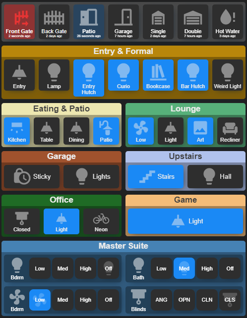
If the image above is not animated, try clicking it to open a popup. The fans should be spinning and 2 sensors should be flashing red or blue.

There are a few things going on in that image, and everything you see is a custom button card or combination of them.

  1. standard and wide button variations
  2. a container that only needs one color setting to theme the header and body
  3. multi-option button
  4. sensors that have color animation when active

A Quick Note On Templates

The templates go in your raw dashboard config, usually at the top. To view your raw dashboard yaml, first get into edit mode in the UI, then click the same 3-dot menu icon again and choose Raw configuration editor . For detailed info on how to define templates, there is a good section about it in the documentation for the custom button card here. In general, you define the template the same as you would if you were using the element in your dashboard, but you leave out the settings that would change (like entity). Then, when you use a custom button card in your dashboard you simply refer to your template by name in the template setting and add the unique settings for that button.


Standard & Wide Buttons

The standard and wide button variations are fairly straightforward. I have these defined as templates:

button_card_templates:
  standard:
    color_type: card
    size: 80%
    hold_action:
      action: more-info
    styles:
      card:
        - padding: 0.2em
        - '--mdc-ripple-color': yellow
        - '--mdc-ripple-press-opacity': 0.5
      icon:
        - opacity: 0.5
      name:
        - font-size: 0.65em
        - white-space: normal
      state:
        - font-size: 0.65em
        - white-space: normal
      label:
        - font-size: 0.4em
        - white-space: normal
  wide:
    template: standard
    styles:
      grid:
        - position: relative
        - grid-template-areas: '"i n"'
        - grid-template-columns: 1fr 1fr
        - grid-template-rows: 1fr

I use the standard template to set my common style. The wide template builds on the standard template and just makes the icon and name side by side instead of over/under. To make the wide buttons actually wide rather than square I set the aspect_ratio, such as 2/1 or 4/1 depending on what ratio I need. I then tweak the ratio to fine-tune it to be the same height as other buttons on the same row. For example, the Garage and Upstairs buttons are 2.2/1, the Office buttons are 1.4/1 and the Game Room button is 4.5/1.

To use them in my dashboard I just supply the desired template and any other relevant properties that aren’t defined by the template or that I want to override:

        - entity: switch.patio_light
          template: standard
          name: Patio
          icon: 'mdi:outdoor-lamp'
          type: 'custom:button-card'

Container with Header

This layout was inspired by a control that I used to use for the same effect, banner-card (GitHub - nervetattoo/banner-card: A fluffy banner card for Home Assistant 🥰). I like the look of that, but I wanted more flexibility of the content. Fortunately it was quite easy to make a container with a button card using the custom_fields config.

button_card_templates:
  container:
    color_type: label-card
    color: dimgray
    styles:
      card:
        - padding: 0
      name:
        - border-radius: 0.4em 0.4em 0 0
        - padding: 0.1em
        - width: 100%
        - font-weight: bold
      grid:
        - grid-template-areas: '"i" "n" "buttons"'
        - grid-template-columns: 1fr
        - grid-template-rows: 1fr min-content min-content
      custom_fields:
        buttons:
          - background-color: 'rgba(0,0,0,0.3)'
          - margin: 0
          - padding: 0.3em

This is a label card that contains a horizontal or vertical stack, which then contains whatever I want, such as buttons to control things. In the template above I defined a custom grid for the layout and set the styles. In the grid-template-areas I have a grid area called buttons that matches the buttons custom field in custom_fields. The custom_fields is defined twice: once in the template styles, and once in my dashboard where I am defining the container. Below is the dashboard yaml for one of my containers in the example image.

type: 'custom:button-card'
template: container
color: '#EDE7B0'
name: Eating & Patio
custom_fields:
  buttons:
    card:
      type: horizontal-stack
      cards:
        - entity: switch.ge_14291_in_wall_smart_switch_switch_2
          name: Kitchen
          template: standard
          icon: 'mdi:wall-sconce-flat'
          type: 'custom:button-card'
        - entity: light.ge_14294_in_wall_smart_dimmer_level_10
          name: Table
          template: standard
          icon: 'mdi:ceiling-light'
          type: 'custom:button-card'
        - entity: light.ge_14294_in_wall_smart_dimmer_level_7
          name: Dining
          template: standard
          icon: 'mdi:ceiling-light'
          type: 'custom:button-card'
        - entity: switch.patio_light
          template: standard
          name: Patio
          icon: 'mdi:outdoor-lamp'
          type: 'custom:button-card'


Multi-option Button

The multi-option button is a bit more involved. It is essentially a button showing its own icon/name and 4 more buttons. In principal it works the same as the container, but it is styled differently and assumes I always want 4 options so that most of it is standard templates and reduces what I have to put in my dashboard. This also has custom javascript templates to detect value ranges when a particular option should be “on”, and it uses service calls to set the desired option value.

This uses several templates, so I will describe each one separately.

Option Button

This defines the basic look of an option button. It builds on the standard button, hides the icon, sets 1/1 aspect ratio to make it square, and sets a nice border radius.

button_card_templates:
  option-button:
    template: standard
    show_icon: false
    aspect_ratio: 1/1
    styles:
      card:
        - border-radius: 20%

Dimmer Option, Blind Option, Fan Option

This builds on the option-button and defines the tap_action and state monitoring. You will notice that is is using the variables feature of the button-card to get some necessary values. Those are provided by the presets template that I will describe in a moment.

I am only showing the dimmer option here because they are all the same definition, but with different service type and service_data for the tap_action, and different attributes to examine in the javascript.

button_card_templates:
  dimmer-option:
    template: option-button
    tap_action:
      action: call-service
      service: light.turn_on
      service_data:
        entity_id: entity
        brightness: '[[[ return variables.set_value ]]]'
    state:
      - operator: default
        styles:
          card:
            - background-color: '[[[ return variables.option_button_off_color ]]]'
            - color: '[[[ return variables.option_text_off_color ]]]'
      - operator: template
        value: >-
          [[[ return (entity.attributes.brightness||0) >= variables.range_start
          && (entity.attributes.brightness||0) <= variables.range_stop ]]]
        styles:
          card:
            - background-color: '[[[ return variables.option_button_on_color ]]]'
            - color: '[[[ return variables.option_text_on_color ]]]'

Presets Template

This is a big template. It defines the whole layout and all of the variables, with default values.

Special note on overflow: visible: this is to allow the option button’s shadow to appear correctly.

button_card_templates:
  presets:
    template: standard
    color_type: icon
    tap_action:
      action: none
    styles:
      card:
        - background-color: 'rgba(0,0,0,0.3)'
      icon:
        - color: white
      grid:
        - grid-template-areas: '"i opt1 opt2 opt3 opt4" "n opt1 opt2 opt3 opt4"'
        - grid-template-columns: 1fr 1fr 1fr 1fr 1fr
      custom_fields:
        opt1:
          - margin: 0.1em
          - overflow: visible
        opt2:
          - margin: 0.1em
          - overflow: visible
        opt3:
          - margin: 0.1em
          - overflow: visible
        opt4:
          - margin: 0.1em
          - overflow: visible
    variables:
      option_template: dimmer-option
      option_button_on_color: var(--paper-item-icon-active-color)
      option_text_on_color: white
      option_button_off_color: var(--paper-card-background-color)
      option_text_off_color: white
      option1_name: Low
      option1_set_value: 51
      option1_range_start: 1
      option1_range_stop: 77
      option2_name: Med
      option2_set_value: 102
      option2_range_start: 78
      option2_range_stop: 170
      option3_name: High
      option3_set_value: 255
      option3_range_start: 171
      option3_range_stop: 255
      option4_name: 'Off'
      option4_set_value: 0
      option4_range_start: 0
      option4_range_stop: 0
    custom_fields:
      opt1:
        card:
          type: 'custom:button-card'
          entity: '[[[ return variables.entity ]]]'
          template: '[[[ return variables.option_template ]]]'
          name: '[[[ return variables.option1_name ]]]'
          variables:
            set_value: '[[[ return variables.option1_set_value ]]]'
            range_start: '[[[ return variables.option1_range_start ]]]'
            range_stop: '[[[ return variables.option1_range_stop ]]]'
            option_button_on_color: '[[[ return variables.option_button_on_color ]]]'
            option_button_off_color: '[[[ return variables.option_button_off_color ]]]'
            option_text_on_color: '[[[ return variables.option_text_on_color ]]]'
            option_text_off_color: '[[[ return variables.option_text_off_color ]]]'
      opt2:
        card:
          type: 'custom:button-card'
          entity: '[[[ return variables.entity ]]]'
          template: '[[[ return variables.option_template ]]]'
          name: '[[[ return variables.option2_name ]]]'
          variables:
            set_value: '[[[ return variables.option2_set_value ]]]'
            range_start: '[[[ return variables.option2_range_start ]]]'
            range_stop: '[[[ return variables.option2_range_stop ]]]'
            option_button_on_color: '[[[ return variables.option_button_on_color ]]]'
            option_button_off_color: '[[[ return variables.option_button_off_color ]]]'
            option_text_on_color: '[[[ return variables.option_text_on_color ]]]'
            option_text_off_color: '[[[ return variables.option_text_off_color ]]]'
      opt3:
        card:
          type: 'custom:button-card'
          entity: '[[[ return variables.entity ]]]'
          template: '[[[ return variables.option_template ]]]'
          name: '[[[ return variables.option3_name ]]]'
          variables:
            set_value: '[[[ return variables.option3_set_value ]]]'
            range_start: '[[[ return variables.option3_range_start ]]]'
            range_stop: '[[[ return variables.option3_range_stop ]]]'
            option_button_on_color: '[[[ return variables.option_button_on_color ]]]'
            option_button_off_color: '[[[ return variables.option_button_off_color ]]]'
            option_text_on_color: '[[[ return variables.option_text_on_color ]]]'
            option_text_off_color: '[[[ return variables.option_text_off_color ]]]'
      opt4:
        card:
          type: 'custom:button-card'
          entity: '[[[ return variables.entity ]]]'
          template: '[[[ return variables.option_template ]]]'
          name: '[[[ return variables.option4_name ]]]'
          variables:
            set_value: '[[[ return variables.option4_set_value ]]]'
            range_start: '[[[ return variables.option4_range_start ]]]'
            range_stop: '[[[ return variables.option4_range_stop ]]]'
            option_button_on_color: '[[[ return variables.option_button_on_color ]]]'
            option_button_off_color: '[[[ return variables.option_button_off_color ]]]'
            option_text_on_color: '[[[ return variables.option_text_on_color ]]]'
            option_text_off_color: '[[[ return variables.option_text_off_color ]]]'

Using the multi-option button in the dashboard

For this, you can omit any variables that have defaults that match waht you want. In this example I have set a lot of them, but not all.

            - entity: cover.master_bath_blinds
              type: 'custom:button-card'
              template: presets
              name: Blinds
              variables:
                entity: cover.master_bath_blinds
                option_template: blind-option
                option1_name: ANG
                option1_set_value: 12
                option1_range_start: 2
                option1_range_stop: 35
                option2_name: OPN
                option2_set_value: 50
                option2_range_start: 36
                option2_range_stop: 99
                option3_name: CLN
                option3_set_value: 100
                option3_range_start: 100
                option3_range_stop: 100
                option4_name: CLS
                option4_set_value: 0
                option4_range_start: 9999
                option4_range_stop: 9999

Alerting Sensors

This sensor button is all about CSS animation. I have 2 templates (alerter & alerter-dual) using extra_styles to define the animation keyframes and the styles section to define the animation using the keyframes. I have some variables and javascript templates in there to set the color and the timing to switch from one color to the other. Transitioning to a second color after a period of time requires a bit more animation handling, but I’m happy with the result.

I got the idea for this from Sam Wakefield in the Home Assistant group on Facebook: Good evening, Whilst playing around with the 'custom:button-card' I figured out a way of using additional animations instead of just 'blink' You'll find... | By SamFacebook.

button_card_templates:
  alerter:
    template: standard
    show_last_changed: true
    color_type: icon
    extra_styles: |
      [[[ return `
        @keyframes pulse {
          20% {
            background-color: ${variables.color};
          }
        }
      `]]]
    variables:
      color: var(--paper-item-icon-active-color)
    state:
      - value: 'on'
        id: value_on
        styles:
          card:
            - animation: pulse 1s infinite
  alerter-dual:
    template: standard
    show_last_changed: true
    color_type: icon
    extra_styles: |
      [[[ return `
        @keyframes pulse1 {
          20% {
            background-color: ${variables.color_initial};
          }
        }
        @keyframes pulse2 {
          20% {
            background-color: ${variables.color_extended};
          }
        }
        @keyframes color {
          0% {
            color: unset;
            opacity: 0.5
          }
          99% {
            color: unset;
            opacity: 0.5
          }
          100% {
            color: ${variables.color_extended};
          }
        }
      `]]]
    variables:
      color_initial: var(--paper-item-icon-active-color)
      color_extended: 'rgba(240,52,52, 0.9)'
      color_seconds: 60
    state:
      - value: 'on'
        id: value_on
        styles:
          card:
            - animation: >-
                [[[ return `pulse1 1s ${variables.color_seconds}, pulse2 1s
                ${variables.color_seconds}s infinite` ]]]
          icon:
            - color: '[[[ return variables.color_extended ]]]'
            - opacity: 1
            - animation: '[[[ return `color ${variables.color_seconds}s 1` ]]]'
          name:
            - font-weight: bold

Here is how to use it in the dashboard:

        - entity: binary_sensor.garage_door
          template: alerter-dual
          name: Garage
          type: 'custom:button-card'
          variables:
            color_seconds: 120

Conclusion

I have dumped a lot of config here and fully expect there will be questions. I hope you find this useful :slight_smile:

98 Likes

Hi, very nice setup. As a newby I am interested to standardize the buttons . Can you explain where to put - and how to create the template?

The templates go in your raw dashboard config, usually at the top. To view your raw dashboard yaml, first get into edit mode in the UI, then click the same 3-dot menu icon again and choose Raw configuration editor. For detailed info on how to define templates, there is a good section about it in the documentation for the custom button card here. In general, you define the template the same as you would if you were using the element in your dashboard, but you leave out the settings that would change (like entity). Then, when you use a custom button card in your dashboard you simply refer to your template by name in the template setting and add the unique settings for that button.

5 Likes

I really like the organization! This is exactly what I have been wanting to do for a long time. Thanks for the very detailed writeup. I was able to get this going with very little effort.

One question though. How do you get containers to appear next to each other? When I do it the containers are one above the other down the center of the screen.

Thanks again!

1 Like

Thanks :slight_smile:

I used a horizontal-stack to get 2 containers side by side on the same row.

Thanks for this. I like the standard Lovelace interface well enough, but I like this a lot better. Here’s my “take” on it.


Two questions:

  1. How do you get the buttons to have universally have the dark grey background? (Mine pick up the color of the container except for the cameras and garage door.)
  2. Is there a way to make the font smaller on a specific button (to avoid Mo-tion and Kit-chen)? I tried a few applications of font-size: , but it didn’t seem to have any affect.
    Again. Thanks for creating these great templates.
1 Like

I’m glad you like it :slight_smile:

For the background color of the buttons, I’m getting that particular color from the theme I have configured (noctis grey via HACS). The theme variables are --paper-card-background-color and --paper-icon-active-color if you want to edit your current theme. Another option is to set the desired button color in your button-card template. You would need to set both selected and unselected colors. If I were to do it in my templates, I would modify the template I named standard because all my templates use that as a base style:

  #some config omitted to focus on what is affecting background color
  standard:
    color_type: card
    styles:
      card:
        - background-color: #2E2E2E
    state:
      - value: 'on'
        styles:
          card:
            - background-color: blue

For the font size you can also do that in your common button-card template. Below I am setting sizes and turning off the default ellipses behavior. There is a lot you can control with CSS properties.

  #some config omitted to focus on what is affecting font size
  standard:
    styles:
      name:
        - font-size: 0.65em
        - white-space: normal
      state:
        - font-size: 0.65em
        - white-space: normal
      label:
        - font-size: 0.4em
        - white-space: normal

An extra tip on your buttons that have a white background:
The button-card defaults to white background if the state of the entity is something other than on or off. If you set the background colors in your common template you can “fix” that with an appropriate state config for that button for the corresponding on value (open for example).

Perfect. Thanks. I kept trying various things, but hadn’t quite twigged on the answer.
Thanks again.

I’ve got the button background color working with

                - entity: binary_sensor.katie_smith_s_galaxy_s7_edge_presence_2
                  name: Katie
                  template: standard
                  type: 'custom:button-card'
                  state:
                    - value: 'on'
                      color: Gold
                    - value: 'off'
                      color: SlateGrey

I still haven’t quite figured out how to change the name color and icon color according to state. Suggestions?

Try using a styles section under the state. Using your example:

                - entity: binary_sensor.katie_smith_s_galaxy_s7_edge_presence_2
                  name: Katie
                  template: standard
                  type: 'custom:button-card'
                  state:
                    - value: 'on'
                      styles:
                        card:
                          - background-color: gold
                    - value: 'off'
                      styles:
                        card:
                          - background-color: slategrey

You can change a lot of visuals with the styles under each state value. The above should work fine for the background color for both on and off, but it can also be done this way:

                - entity: binary_sensor.katie_smith_s_galaxy_s7_edge_presence_2
                  name: Katie
                  template: standard
                  type: 'custom:button-card'
                  styles:
                    card:
                      - background-color: slategrey
                  state:
                    - value: 'on'
                      styles:
                        card:
                          - background-color: gold

That approach gives a standard style regardless of the state, then the on state adjusts what is needed for that state. This is particularly useful to avoid repeating the same settings in every state, such as font size. Also, since you are using the standard template, you can set the background color in that template instead of in the specific button. That will reduce what you need to define in your buttons.

1 Like

I just re-read your question about name and icon colors and realized I misunderstood in my initial reply. To affect those colors use the same styles sections under each state value and specify the styles for name and icon. Building on my other example:

                - entity: binary_sensor.katie_smith_s_galaxy_s7_edge_presence_2
                  name: Katie
                  template: standard
                  type: 'custom:button-card'
                  state:
                    - value: 'on'
                      styles:
                        card:
                          - background-color: gold
                        name:
                          - color: black
                        icon:
                          - color: white
                          - opacity: 0.5
                    - value: 'off'
                      styles:
                        card:
                          - background-color: slategrey
2 Likes

Perfect. Thanks for the help.

Here’s what I did with it: I created a set of additional templates, based on the standard one: (under button_card_templates)

  standard-button:
    template: standard
    state:
      - value: 'on'
        styles:
          card:
            - background-color: gold
          name:
            - color: blue
          icon:
            - color: blue
            - opacity: 1
      - value: 'off'
        styles:
          card:
            - background-color: slategrey
          name:
            - color: white
          icon:
            - color: white
            - opacity: 0.5
  standard-alert:
    template: standard
    state:
      - value: 'on'
        styles:
          card:
            - background-color: darkgrey
          name:
            - color: yellow
          icon:
            - color: yellow
            - opacity: 1
      - value: 'off'
        styles:
          card:
            - background-color: darkgrey
          name:
            - color: white
          icon:
            - color: white
            - opacity: 0.5
  standard-cover:
    template: standard
    state:
      - value: 'open'
        styles:
          card:
            - background-color: gold
          name:
            - color: blue
          icon:
            - color: blue
            - opacity: 1
      - value: 'closed'
        styles:
          card:
            - background-color: slategrey
          name:
            - color: white
          icon:
            - color: white
            - opacity: 0.5

Then, within my custom button cards, something like this:

                - entity: binary_sensor.katie_smith_s_galaxy_s7_edge_presence_2
                  name: Katie
                  template: standard-button
                  type: 'custom:button-card'

or this:

                - entity: binary_sensor.daytime_sensor
                  name: Day?
                  template: standard-alert
                  type: 'custom:button-card'

or this:

                    - entity: cover.garage
                      name: Over head
                      template: standard-cover
                      type: 'custom:button-card'
                      aspect_ratio: 1/1.3

That looks like it will work :+1:

The more you play with it the more you’ll see places where you can consolidate some of the settings. For example, the off’ state is pretty consistent across all 3 of your templates, so if you wanted to you could make a base template with that config that the other 3 use as a template. There is also an id feature for states that makes it possible for the templates to merge state configs correctly (even if the values aren’t the same!)

Just for fun, and because I like sharing ideas, here is a different way to define your templates given your example:

  standard-button:
    template: standard
    state:
      - id: value_on
        value: 'on'
        styles:
          card:
            - background-color: gold
          name:
            - color: blue
          icon:
            - color: blue
            - opacity: 1
      - id: value_off
        value: 'off'
        styles:
          card:
            - background-color: slategrey
          name:
            - color: white
          icon:
            - color: white
            - opacity: 0.5
  
  standard-alert:
    template: standard-button
    state:
      - id: value_on
        styles:
          card:
            - background-color: darkgrey
          name:
            - color: yellow
          icon:
            - color: yellow
      - id: value_off
        styles:
          card:
            - background-color: darkgey

  standard-cover:
    template: standard-button
    state:
      - id: value_on
        value: 'open'
      - id: value_off
        value: 'closed'

What I did was use your standard-button as a common template for the other two templates. I added id settings for the 2 states so that the other 2 templates can add or replace configs as needed.

In your standard-alert template I changed the state settings to refer to the id instead of the value and removed any settings already defined in the standard-button template, such as the icon opacity and a few other things.

In the standard-cover template I only had to change the value settings to open and closed, since the colors in the standard-button template are already what is needed.

The custom button card is so flexible that there is often more than a couple ways to get the desired effect. You could even use a single template to do this with some variables and javascript to adjust the colors. I’m having fun writing this up, so I’ll give an example:

  standard-button:
    template: standard
    variables:
      value_on: 'on'
      value_off: 'off'
      background_color_on: gold
      background_color_off: slategrey
      text_color_on: blue
      text_color_off: white
    state:
      - id: value_on
        value: '[[[ return variables.value_on ]]]'
        styles:
          card:
            - background-color: '[[[ return variables.background_color_on ]]]'
          name:
            - color: '[[[ return variables.text_color_on ]]]'
          icon:
            - color: '[[[ return variables.text_color_on ]]]'
            - opacity: 1
      - id: value_off
        value: '[[[ return variables.value_off ]]]'
        styles:
          card:
            - background-color: '[[[ return variables.background_color_off ]]]'
          name:
            - color: '[[[ return variables.text_color_off ]]]'
          icon:
            - color: '[[[ return variables.text_color_off ]]]'
            - opacity: 0.5

And then to use that template:

                # the variables don't need to be set because the template's default values are good
                - entity: binary_sensor.katie_smith_s_galaxy_s7_edge_presence_2
                  name: Katie
                  template: standard-button
                  type: 'custom:button-card'

                # same template, but setting a few variables to change colors
                - entity: binary_sensor.daytime_sensor
                  name: Day?
                  template: standard-button
                  type: 'custom:button-card'
                  variables:
                    background_color_on: darkgrey
                    background_color_off: darkgrey
                    text_color_on: yellow

                # again, same template but set some variables to change the on/off values
                - entity: cover.garage
                  name: Over head
                  template: standard-button
                  type: 'custom:button-card'
                  aspect_ratio: 1/1.3
                  variables:
                    value_on: open
                    value_off: closed

Hopefully that wasn’t too deep and it gives you a taste of what’s possible. :slight_smile:

1 Like

Not too deep at all and I can definitely see some other possibilities.
Thanks again.
I’d noticed the use of variables in another part of your example and had wanted to try using them. Your example is right along those lines.
As a side note, I’m always walking a balance point when I’m coding. I like to get things as elegant as possible without getting too cute (to the point where I won’t be able to remember what I did and why when I look back at it in a year :slight_smile: ) I made the mistake of some Byzantine CSS some time back. It looks like your examples are just the right level of actual simplification as opposed to obfuscation.

1 Like

I noticed that my garage cover has two additional states: “closing” and “opening”. (Go figure.) However, I like the fact that these don’t share the color theme with “open” or “closed”. It highlights that it’s in progress. A little serendipity along the way and something I can tweak if I decide to tweak it later.

Nice. I don’t have those states on mine.
We can easily add styling for those states like this:

  standard-cover:
    template: standard-button
    state:
      - id: value_on
        value: 'open'
      - id: value_off
        value: 'closed'
      - value: 'opening'
        styles:
          card:
            - background-color: magenta
      - value: 'closing'
        styles:
          card:
            - background-color: cyan

Or, if you were using the variables version:

                - entity: cover.garage
                  name: Over head
                  template: standard-button
                  type: 'custom:button-card'
                  aspect_ratio: 1/1.3
                  variables:
                    value_on: open
                    value_off: closed
                  state:
                    - value: 'opening'
                      styles:
                        card:
                          - background-color: magenta
                    - value: 'closing'
                      styles:
                        card:
                          - background-color: cyan
2 Likes

Yes. I’d figured something like that. I’m leaving it the way it is for now, but if I get an urge for completeness, I’ll that in.

One last question (I think):
Is there a way to change the name based on state? For instance, could the button tied to my binary_sensor.daytime_sensor (states ‘on’ or ‘off’) be “Day” when “on” and “Night” when “off”? I’m not entirely sure how to code the name text in the middle of a conditional state.

Specify the name you want in each of the states. You can set a few other things in states too, like icon and spin.

...
  state:
    - value: 'on'
      id: value_on
      name: Day
    - value: 'off'
      id: value_off
      name: Night
...
1 Like