Hello,
Thanks for your exemples .
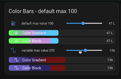
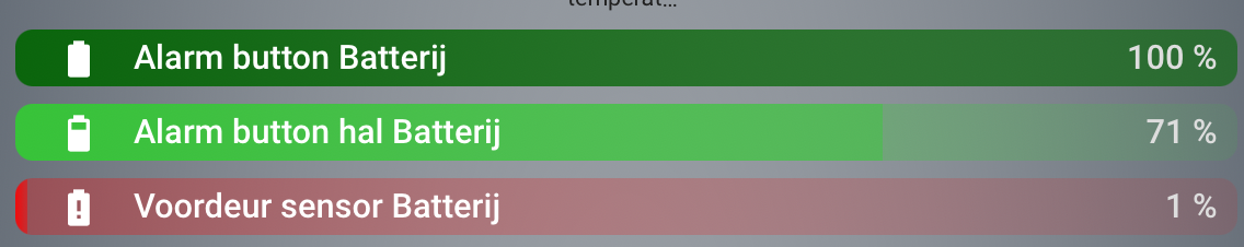
A solution full button-card inspired from your code
The template :
button_card_templates:
  ts_bar_card:
    variables:
      _BaseName: baseName
      _sensor: null
      _maxSensor: null
      _maxLimit: -1
      _colorBase: grey
      _color1: SeaGreen
      _color50: SandyBrown
      _color75: Tomato
      _color90: red
      _sensorValue: >-
        [[[var val='';try{val = states[variables._sensor].state;}catch(e){val =
        -1;}return val; ]]]
      _maxSensorValue: >-
        [[[var val='';try{val = states[variables._maxSensor].state;}catch(e){
        try{val = variables._maxLimit;}catch(e){val =-1;}}return val; ]]]
      _z_FormatedTitle: |-
        [[[
            var base = variables._BaseName;
            var val = variables._sensorValue;
            var max = variables._maxSensorValue;
            var unit = states[variables._sensor].attributes.unit_of_measurement;
            var Lspan = "<span style=\"float:left;\">";
            var Rspan = "<span style=\"float:right;margin-right:5px;color:#dddddd;\">";
            var smallText = "<span style=\"font-size:0.75em;font-weight:500;\">"
            var cl = "</span>";
            var _t = Lspan+base+cl+Rspan+val+" "+unit+smallText+" / "+max+" "+unit+cl+cl;
            return _t;
        ]]]
    name: '[[[return variables._z_FormatedTitle;]]]'
    entity: '[[[return variables._sensor;]]]'
    triggers_update: '[[[return variables._sensor;]]]'
    show_state: false
    styles:
      grid:
        - grid-template-areas: '"i n"'
        - grid-template-rows: 1fr
        - grid-template-columns: 50px 1fr
      name:
        - width: 100%
        - color: white
        - font-weight: 500
      card:
        - color: lightgrey
        - font-size: 1.1em
        - height: 26px
        - padding: 0px 4px
        - border-radius: 8px
        - '--card-mod-icon-color': white
        - '--mdc-icon-size': 25px
        - background: |-
            [[[
              var v=variables;
              var perc = Math.round((v._sensorValue / v._maxSensorValue)*100.0);
              var rest = 100-perc;
              var bar = v._colorBase;
              if (perc >= 80 ){bar = v._color90 ;}
              else if (perc >= 60 ){bar = v._color50 ;}
              else if (perc >= 49 ){bar = v._color50;}
              else if (perc >= 1 ){bar = v._color1;}
              var ramp = 'linear-gradient(to right, rgba(from '+bar+' r g b / 0.9) 0%, rgb(from '+bar+' r g b /0.6) '+perc+'%, rgba(from '+bar+' r g b /0.3)'+perc+'%, rgba(from '+bar+' r g b /0.1) 100%)';
              return ramp;
            ]]]
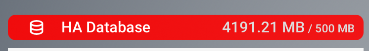
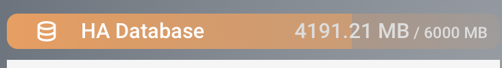
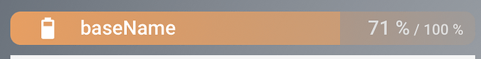
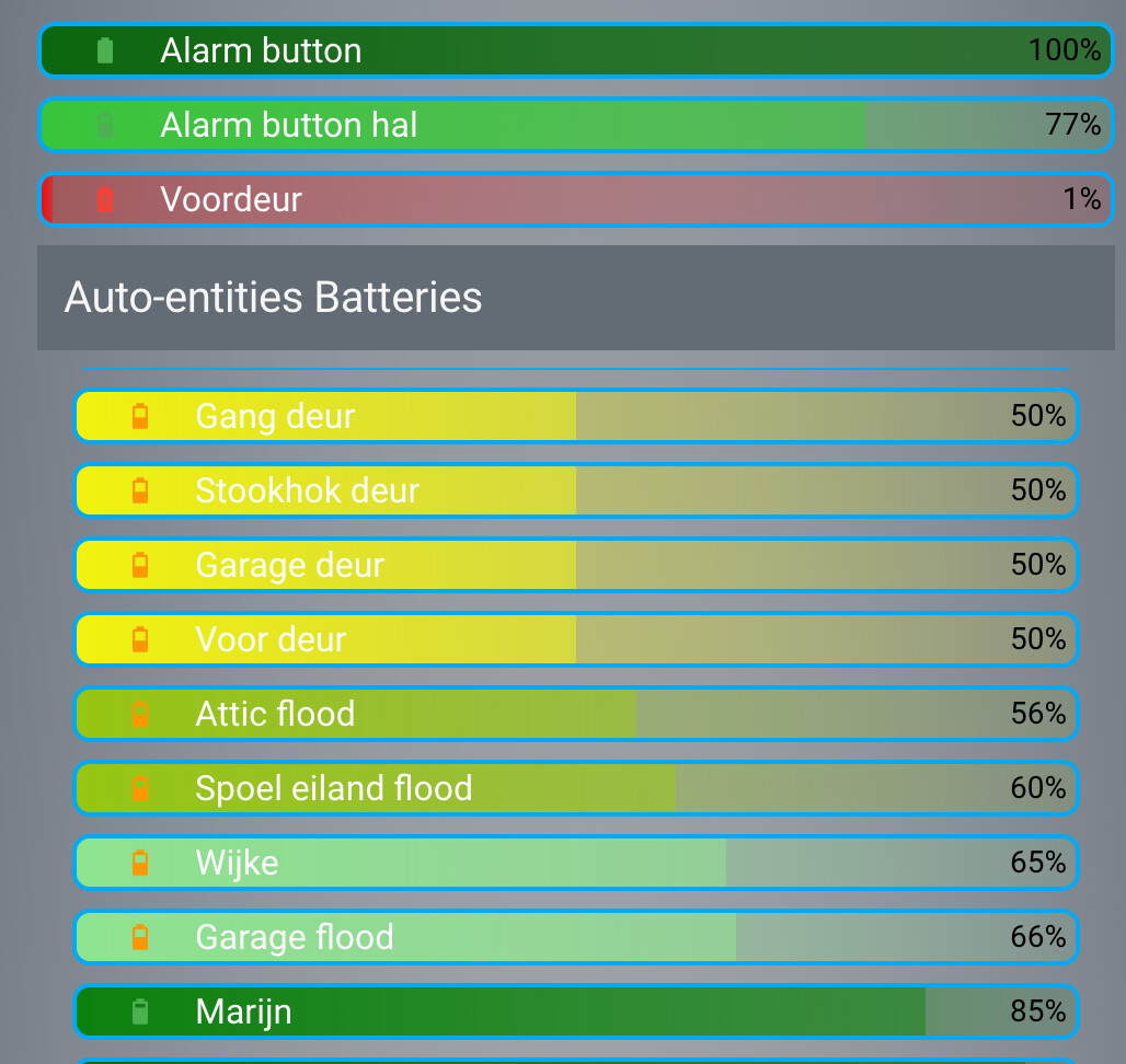
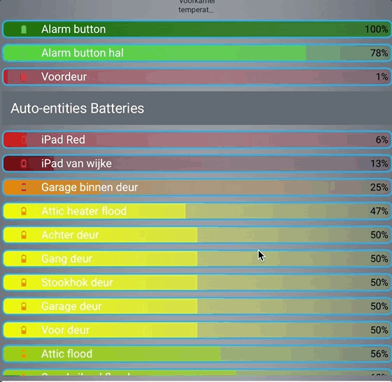
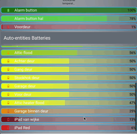
An exemple of card:
type: custom:button-card
template: ts_bar_card
variables:
  _BaseName: HA Database
  _sensor: sensor.home_assistant_v2_db_taille
  _maxSensor: null
  _maxLimit: 500
icon: mdi:database-outline


