Fist and for all, many thanks for bringing and everybody supporting custom:grid-layout.
I have arrived at the point, where I want to tweak the position of the items withing a grid area. As suggested in the documentation, I started reading up on CSS Grid. Here, I noticed the justify-self and align-self properties. These let the each item decide “for themselves” where it should be placed withing the grid area.
justify-selfAligns a grid item inside a cell along the inline (row) axis. This value applies to the content inside a single grid item.
align-selfAligns a grid item inside a cell along the block (column) axis. This value applies to the content inside a single grid item.
I’ve made many attempts at CSS selectors using mod_card, but just can’t figure how to specify properties for the custom:grid-layout items / children / areas (or whatever the correct terminology is).
I reduced my example to the basic lovelace page shown below.
views:
  - type: custom:layout-card
    layout_type: custom:grid-layout
    layout:
      height: calc(100vh - 56px) # assuming a header
      place-items: center center
      grid-template-columns: 1fr
      grid-template-rows: repeat(3, 1fr)
      grid-template-areas: |
        "a"
        "b"
        "footer"
    cards:
      - type: markdown
        content: "area a"
        view_layout:
          grid-area: a
      - type: markdown
        content: "area b"
        view_layout:
          grid-area: b
      - type: markdown
        content: "area footer"
        view_layout:
          grid-area: footer
        card_mod:
          style: |
            ha-card {
              background: red;
            }
Here, I want to e.g. place the footer at the vertical and horizontal end of its grid area.
In comparison, button-card has a styles field that let you specify CSS properties for its grid items, as in:
views:
  - type: custom:button-card
    name: "area n"
    state_display: "area s"
    label: "area l"
    show_label: true
    show_state: true
    styles:
      card:
        - border: none
        - padding: 0
      grid:
        - padding: 0
        - height: calc(100vh - 56px)
        - grid-template-columns: 1fr
        - grid-template-rows: repeat(3, 1fr)
        - grid-template-areas: |
            "n"
            "s"
            "l"
      name:
        - justify-self: start # horizontal
        - align-self: start # vertical
      state:
        - justify-self: center
        - align-self: center
      label:
        - justify-self: end
        - align-self: end
        - background: red
Is a similar approach possible with custom:grid-layout? Is there a CSS selector that I just missed?
Thanks for your time and consideration,
/coert
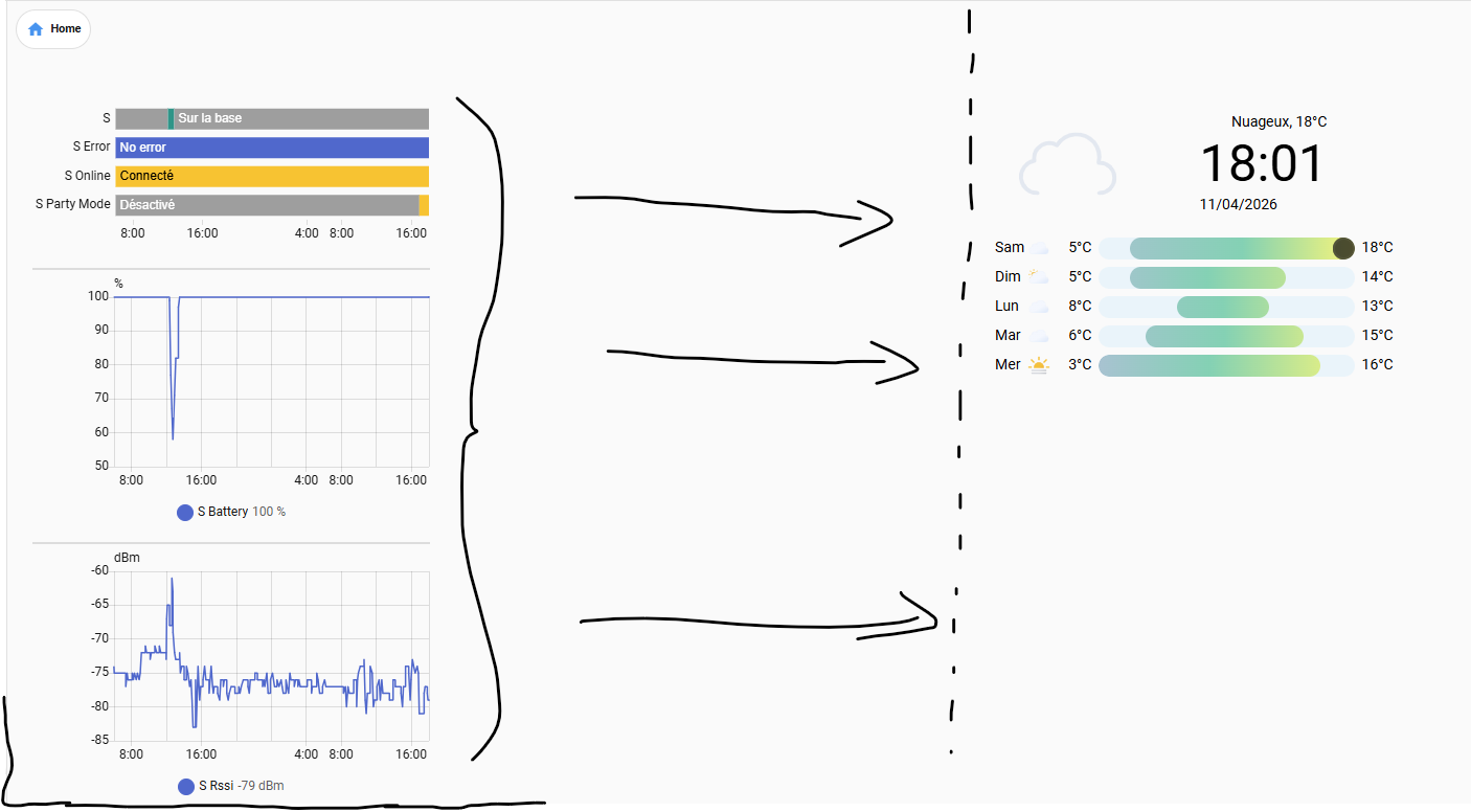