
Hi,
I was wondering if there is a way to space the buttons out. Right now there is just another button in between with 0% transparency however if you look closely you can see a small shhadow of the card.
I now removed the shadow: However a spacing would be more convenient.
You can use color_type: blank-card
Perfect! Thank you!
Is there a way to make like some sort of dpad so the butoons touch and there is no gap in between them.
Check out stack-in-card (also by RomRider). It allows you to stack cards without any paddings, making them look like one entire card. These are button-cards an a different card entirely under those, all together inside a stack-in-card:

Keep in mind that stack-in-card doesn’t support grid, only vertical and horizontal modes. So if you want to create a grid, you have to nest multiple stack-in-cards in horizontal and vertical mode.
Other way might be using card-mod with a margin variable, but I’m not sure.
Using the name is not optimal (if you want to name the button).
It is better to use a variable 
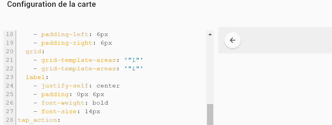
type: custom:button-card
variables:
  back: |
    [[[
     if (entity.state == 'on') {history.back() ;}
    ]]]
show_icon: true
icon: mdi:arrow-left
size: 80%
styles:
  img_cell:
    - width: 24px
  card:
    - border-radius: 30px
    - box-shadow: var(--box-shadow)
    - height: 36px
    - width: auto
    - padding-left: 6px
    - padding-right: 6px
  grid:
    - grid-template-areas: '"l"'
    - grid-template-areas: '"i"'
  label:
    - justify-self: center
    - padding: 0px 6px
    - font-weight: bold
    - font-size: 14px
tap_action:
  action: toggle
entity: input_boolean.back
show_name: false
show_state: false
show_label: true
1 Like
right, and for the fun of it I added the forward button too:
  - type: custom:button-card
    template: button_shortcut_menu
    tooltip: Forward
    icon: mdi:arrow-right
    show_name: false
    tap_action:
      action: toggle
    entity: input_boolean.forward_button
    variables:
      next: |
        [[[
         if (entity.state == 'on') {history.forward() ;}
        ]]]

as you can see in my card config, I use tooltip, to hove and display. Thats perfect for all other views, but for these back and forwards, I would love to see the view in the history. Cant find that in inspector, so not sure if at all possible. Would you know of some extra witchcraft?? 
Would you like to share your cat code?
I’ve actually changed my dashboard a lot since then and don’t use any of that any more. As for Cat, it’s actually just the light in the Cat room (where my foster cats live).
My main dashboard looks like this now. Loads more quickly and I can see everything about my home at a glance.

Pity for me. But very nice! Is this tablet view or desktop view?
Is there any way to apply a gradient background-color to a notification field? When I apply the code below, it just goes transparent for the option that should turn gradient. I essentially want the notification field in the top right to be a gradient of green and blue if the result of my entity is ‘both’. All other solid colours work fine, just the gradient that doesn’t.

notification:
          - background-color: >
              [[[
                if (states['[[notification_entity]]'].state === 'on')
                  return "var(--green)";
                if (states['[[notification_entity]]'].state === 'pool')
                  return "var(--blue)";
                if (states['[[notification_entity]]'].state === 'vege')
                  return "var(--green)";
                if (states['[[notification_entity]]'].state === 'both')
                  return 'linear-gradient(90deg, #8AB8A2, #5391AE)';
Don’t you need to define percentages so the gradient knows when one color stops and the next one starts? Try using this tool and copy/paste the code into your style: https://cssgradient.io/
Percentages are not required. You can even use simple
[[[ return 'linear-gradient(to right, blue, green)' ]]]
(resp. to left, to bottom, to top).
or - for a more scalable result -
[[[ return 'linear-gradient(to right, rgb(30, 144, 255), rgb(50, 205, 50))' ]]]
Just tried with the below, doesn’t seem to work:
                if (states['[[notification_entity]]'].state === 'both')
                  return "linear-gradient(135deg, rgba(138,184,162,1) 0%, rgba(83,145,174,1) 100%)";
Will try your solution, but I did try very similar to that and didn’t work. Wondering if the background-color attribute just doesn’t accept gradients?!!?
thanks for testing! Strange! I’ll change it to a solid colour to rule out one or the other and report back 
What browser are you using out of interest? I am using IOS and Safari, think my issue might be I need -webkit- as well?!?! Will try again tomorrow anyway 
Also i(Pad)OS and Safari. Did you try without conditions?
- background: 'linear-gradient(135deg, rgba(138,184,162,1) 0%, rgba(83,145,174,1) 100%)'