Was just about to come post an edit that I figured it out.  Attached an entity and it worked perfectly.
I believe I’d still need the template, though, since I’m referencing the current_activity attribute, and not the state, wouldn’t I?
Was just about to come post an edit that I figured it out. Attached an entity and it worked perfectly.
I believe I’d still need the template, though, since I’m referencing the current_activity attribute, and not the state, wouldn’t I?
Yes true  i was thinking about my config, but I have a sensor for that, sorry…
 appreciate the efforts. same here…my family too is addicted to the homekit design, except me…or me too sometimes, we all use the homekit app for everthing but going forward i think due to more and more components getting added its unlikely we will stick to homekit eco, im looking to make the companion app UI as appealing as it is with homekit. I will surely wait for your updated code.
This is addictive, unable to stop myself from migrating to the new button cards… 
Yeah same here haha, but I hate Homekit, so many times it failed randomly. And so many times it forgets where I live making automations break. So past december I decided to get into lovelace, and although I may hate Homekit, I love the minimalistic and simple design (but Homekit was just a bit too simple).
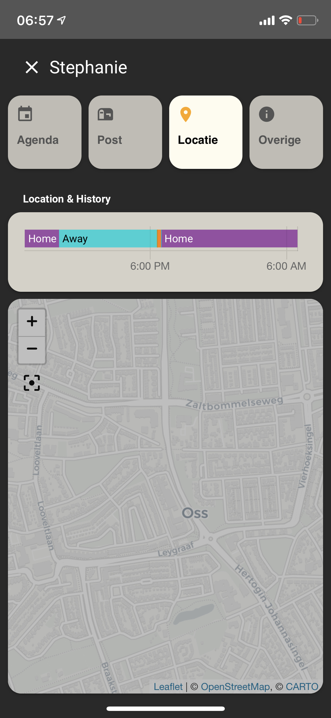
This is interesting,  last image showing the map, is it conditional card showing location or calender or Others as you click on them? is it per user data?. tooooooooo good.
NEW FEATURES
label anymore to transform your binary_sensor of type door to open or closed. It will be done directly when show_state is true
- type: "custom:button-card"
  entity: switch.skylight
  color_type: card
  show_name: false
  show_label: true
  layout: icon_label
  size: 20px
  styles:
    card:
      - height: 50px
      - border-radius: 10px
    grid:
      - grid-template-columns: min-content min-content
      - width: min-content
      - margin: auto
      - grid-gap: 0px 10px
icon_label layout on the right, custom one overloading the icon_label on the left using the config above:
FIXES
mwc-ripple to fix #145
I’ve updated some CSS so some of your current customizations might break a bit, hopefully not too much. I’m very sorry for that 
Next thing in the pipe is to be able to repeat the hold_action while you hold the button down (useful for volume for example), code is already done, but I’m waiting on some feedback:

        - type: custom:button-card
          entity: input_number.test
          show_state: true
          hold_action:
            action: call-service
            repeat: 500
            service: input_number.increment
            service_data:
              entity_id: input_number.test
If you have any other fancy ideas for the next release, please let me know
This looks amazing, I wish it was possible to have a vertical brightness slider though. But this is a great step up. The existing ways are not my preferred. They all slide horizontally. But most proprietary apps I have used do it vertically.
Now couldn’t it be possible to have a hold and slide or a tap and a slide action at the same time? For example, hold_action+slide up will increase the brightness and hold_action+slide down decrease. I think what I am looking for is a bit exotic but ultimately what it must look like is this:
For example: custom button with a light entity, when hold_action is used open the more-info window. Replace window with popup card. Make a single button in any style which accepts a tap+slide action to adjust the brightness in set direction (horizontal, vertical or maybe even bidirectional).
I guess this won’t be possible, but you asked for ideas
Basically what can be done with it would be something like the slider in the screenshot:
Edit: on the current idea, you show a hold action to increase the volume, but then there would be no way to decrease it in the same way no? How about zones? Like left and right zone, that can be configured separately?
And maybe some visuals if possible, like when holding you would see the entire button be filled vertically with a different color in the percentage of brightness, e.g. you would see a 100% white button turn into a 90% white and 10% grey button, but only show this like an animation and only when you do the action, thus keeping the buttons good looking afterwards. (Pff it is hard to explain what I mean, I might try some photo editing later and show it somehow).
This looks like a complete different button
I don’t want to overload too much, it’s already very complicated
However, what I can think about is something with double clic / double tap. On double-click:
And then after a timeout, show again the content of the button.
Yes, it would be more or less something like that. Yeah like I said it is really hard to explain something like this. But it would be more or less something like that yes. Sounds good to me. (All of what you’ve done for this card is good so I don’t worry).
Anyways your first idea with the hold a bit longer sounds great too, though, I think having it go only one direction (e.g. only volume up) would not be ideal.
@RomRider I would just like to say thank you for continuing to provide excellent documentation with very useful examples on the Github page, both for existing and new features as you release them. Having animated gifs next to the code really helps me understand what is going on too, so thanks again!
I completely agree, thanks to his modifications to this button card I am currently building something that a few months ago seemed impossible for a non-programmer like me. This solved most of my problems. Thanks a million times 
The new card is great. Loving how easy it is to move things around.
Been playing around with styles and I’m loving this card. I do have a question though, is it possible to adjust the intensity of the colors based on the percentage? I know I could use the template card, I’m just wondering about the built in theme/light color based on the color picker and the light intensity.

With color: auto it should do that, but what you want probably is to be able to use it also for example on the shadows of the button, not only the icon?
That looks awesome! Love seeing all the different things everyone’s doing with this card.
Quick question - can you modify the style of the state_last_changed operator?
As per the button below, I’m wanting to move it to the right, plus change its color based on the state.
Love the card by the way, seems incredibly powerful.

Just one question
HOW you do that
that is so sexly
Use the label to customize the show last changed part:
styles:
  label: