Thanks allot, works perfect! 
Looks like card-mod 3.0.0 breaks the state colors?
              - type: custom:button-card
                entity: switch.mm1_a0_out
                name: Testswitch
                show_state: true
                state:
                  - value: "on"
                    color: red
                  - value: "off"
                    color: blue


after card-mod 3.0.0 and page reload


A click on the button fixes the colors until the next refresh.
EDIT: perfect timing 
This one broke also my config, removing it did fix it immediately.
ok, but the info is all there? the config for the stack, and a few individual cards are shared already?
my setup has changed quite a bit since then 
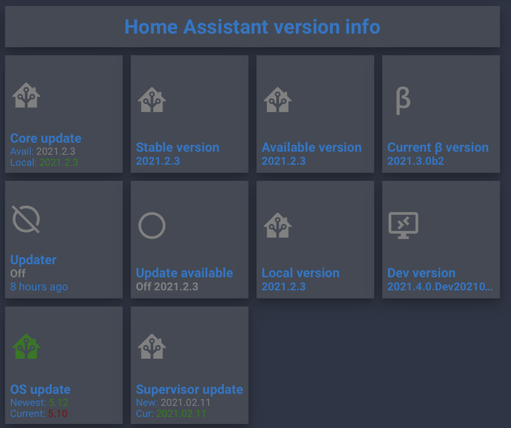
this is my version dashboard for now ( a bit dark, but its the dark mode not to disturb the other bedroom user):
config is like this:
type: vertical-stack
cards:

  - type: custom:button-card
    name: Home Assistant version info
    template: button_default_title

  - type: horizontal-stack
    cards:

      - !include /config/lovelace/includes/include_button_updater.yaml

      - type: custom:button-card
        template: button_body
        entity: sensor.ha_current_stable_version
        name: Stable version

      - type: custom:button-card
        template: button_body
        entity: sensor.ha_available_version
        name: Available version

      - type: custom:button-card
        template: button_body
        entity: sensor.ha_current_beta_version
        name: Current β version

  - type: horizontal-stack
    cards:

      - type: custom:button-card
        template: button_updater
        entity: binary_sensor.updater
        name: Updater
        show_last_changed: true
        hold_action:
          action: url
          url_path: https://www.home-assistant.io/latest-release-notes/

      - type: custom:button-card
        template: button_updater
        entity: binary_sensor.ha_update_available
        name: Update available

      - type: custom:button-card
        template: button_body
        entity: sensor.ha_local_version
        name: Local version

      - type: custom:button-card
        template: button_body
        entity: sensor.ha_current_dev_version
        name: Dev version

  - type: horizontal-stack
    cards:

      - !include /config/lovelace/includes/include_button_hassos_update.yaml

      - !include /config/lovelace/includes/include_button_supervisor_update.yaml

      - type: custom:button-card
        color_type: blank-card

      - type: custom:button-card
        color_type: blank-card

  - type: custom:button-card
    template: vertical-filler
of course this needs the individual buttons and includes, with several button-card templates. But it all depends on your needs, for which you should create the backend data first.
1 Like
Hi @RomRider ,
posting the above I now notice the need for a request I forgot about: have us template the show_last_changed… I really need that only when the entity is on, like:
        show_last_changed: >
          [[[ return 'true' if entity.state == 'on'; ]]]
in the screenshot you can see the button Updater show 8 hours ago (last restart) but I really dont need that. Only want it to show last_changed when the updater is ‘on’.
allow a FR on that please?
did try this:
        state:
          - value: 'on'
            show_last_changed: true
          - value: 'off'
            show_last_changed: false
but it was against better judgement, (and not documented either) so it doesn’t work
edit added the tag, I saw I forgot that previously
Thanks, any chance your entire config is in a public github repo ? I’d love to pick and choose, your style is simliar to mine and I’d love to take creative license w/ some of your work
If not I’d settle for these
      - !include /config/lovelace/includes/include_button_updater.yaml
      - !include /config/lovelace/includes/include_button_hassos_update.yaml
      - !include /config/lovelace/includes/include_button_supervisor_update.yaml
1 Like
No sorry, no public repo.
but these are the cards you asked for:
include_button_updater.yaml:
type: custom:button-card
template: button_body
entity: binary_sensor.ha_update_available
icon: mdi:home-assistant
name: Core update
show_state: false
tap_action:
  action: more-info
  entity: sensor.ha_available_version
hold_action:
  action: url
  url_path: https://github.com/home-assistant/core/releases

#https://www.home-assistant.io/latest-release-notes/

styles:
  card:
    - font-size: 10px
  grid:
    - grid-template-areas: '"i i" "n n" "available available" "local local"'
  icon:
    - color: &color
        >
          [[[ if (entity.state == 'on') return 'green'; return 'grey'; ]]]
    - width: 30%
    - animation: &animation
        >
          [[[ if (entity.state == 'on') return 'blink 2s ease infinite'; ]]]
  custom_fields:
    available:
      - align-self: start
      - justify-self: start
      - --text-color-sensor: *color
      - --animation: *animation
    local:
      - align-self: start
      - justify-self: start
      - --text-color-sensor: >
          [[[ if (entity.state == 'on') return 'maroon'; return 'green'; ]]]
custom_fields:
  available: >
    [[[ return `<span>Avail: </span> <span style='color: var(--text-color-sensor);animation: var(--animation)'>${states['sensor.ha_available_version'].state}</span>`; ]]]
  local: >
    [[[ return `<span>Local: <span style='color: var(--text-color-sensor);'>${states['sensor.ha_local_version'].state}</span></span>`; ]]]
include_button_hassos_update.yaml:
type: custom:button-card
template: button_body
entity: sensor.hassos_updates
icon: mdi:home-assistant
name: OS update
show_state: false
tap_action:
  action: more-info
hold_action:
  action: url
  url_path: https://github.com/home-assistant/operating-system/releases

styles:
  card:
    - font-size: 10px
  grid:
    - grid-template-areas: '"i i" "n n" "newest newest" "current current"'
  icon:
    - color: &color
        >
          [[[ if (entity.state == 'on') return 'green'; return 'grey'; ]]]
    - width: 30%
    - animation: &animation
        >
          [[[ if (entity.state == 'on') return 'blink 2s ease infinite'; ]]]
  custom_fields:
    newest:
      - align-self: start
      - justify-self: start
      - --text-color-sensor: *color
      - --animation: *animation
    current:
      - align-self: start
      - justify-self: start
      - --text-color-sensor: >
          [[[ if (entity.state == 'on') return 'maroon'; return 'green'; ]]]
custom_fields:
  newest: >
    [[[ return `<span>Newest: </span> <span style='color: var(--text-color-sensor);animation: var(--animation)'>${entity.attributes.newest_version}</span>`; ]]]
  current: >
    [[[ return `<span>Current: <span style='color: var(--text-color-sensor);'>${entity.attributes.current_version}</span></span>`; ]]]
include_button_supervisor_update.yaml:
type: custom:button-card
template: button_body
entity: sensor.supervisor_updates
icon: mdi:home-assistant
name: Supervisor update
show_state: false
tap_action:
  action: more-info
hold_action:
  action: url
  url_path: https://github.com/home-assistant/supervisor/releases

styles:
  card:
    - font-size: 10px
  grid:
    - grid-template-areas: '"i i" "n n" "newest newest" "current current"'
  icon:
    - color: &color
        >
          [[[ if (entity.attributes.update_available == true) return 'green'; return 'grey'; ]]]
    - width: 30%
    - animation: &animation
        >
          [[[ if (entity.attributes.update_available == true) return 'blink 2s ease infinite';
              return 'none'; ]]]
  custom_fields:
    newest:
      - align-self: start
      - justify-self: start
      - --text-color-sensor: *color
      - --animation: *animation
    current:
      - align-self: start
      - justify-self: start
      - --text-color-sensor: >
          [[[ if (entity.attributes.update_available == true) return 'maroon'; return 'green'; ]]]
custom_fields:
  newest: >
    [[[ return `<span>New: </span> <span style='color: var(--text-color-sensor);animation: var(--animation)'>${entity.attributes.newest_version}</span>`; ]]]
  current: >
    [[[ return `<span>Cur: <span style='color: var(--text-color-sensor);'>${entity.attributes.current_version}</span></span>`; ]]]
templates:
button_body:
  template:
    - action_more
    - main_config
    - styles_grid
    - styles_img_cell
    - styles_label
    - styles_name_left
    - styles_state
  styles:
    icon:
      - color: grey
    lock:
      - color: red
    card:
      - background-color: var(--card-background-color)
      - color: var(--primary-color)

action_more:
  tap_action:
    action: more-info
    haptic: light
  hold_action:
    action: more-info
    haptic: success

main_config:
  color: auto
  size: 30%
  aspect_ratio: 1/1
  show_state: true
  show_label: true

styles_grid:
  template: styles_card
  styles:
    grid:
      - grid-template-areas: '"i" "n" "s" "l"'
      - grid-template-columns: 1fr
      - grid-template-rows: 1fr min-content min-content

styles_card:
  styles:
    card:
      - padding: 5px

styles_img_cell:
  styles:
    img_cell:
      - align-items: start
      - justify-content: start

styles_label:
  styles:
    label:
      - font-size: 11px
      - justify-self: start
      - text-align: start

styles_name_left:
  template: styles_name
  styles:
    name:
      - justify-self: start
      - text-align: start
      - text-overflow: unset
      - white-space: unset
      - word-break: break-word

styles_name:
  styles:
    name:
      - font-size: 13px
      - font-weight: bold

styles_state:
  styles:
    state:
      - font-size: 11px
      - font-weight: bold
      - justify-self: start
      - text-align: start
      - text-transform: capitalize
2 Likes
Hello @RomRider, what am I doing wrong, that it does not want to work, I cleaned the browser and nothing more, I have the latest plugins, this is my code:
              - type: horizontal-stack
                cards:
                  - type: 'custom:button-card'
                    icon: 'mdi:thermostat-box'
                    show_icon: true
                    show_name: false
                    state:
                      - value: 'on'
                        styles:
                          card:
                            - box-shadow: >
                                [[[ return states['sun.sun'].state ==
                                'below_horizon'
                                  ? 'inset -4px -4px 5px rgba(60, 60, 60, .6), inset 4px 4px 5px rgba(0, 0, 0, .5)'
                                  : 'inset -3px -3px 5px rgba(255, 255, 255), inset 3px 3px 5px rgba(0, 0, 0, .08)';
                                ]]]
                          icon:
                            - color: var(--paper-item-icon-active-color)
                    styles:
                      card:
                        - width: 80px
                        - height: 80px
                        - margin: 10px
                        - border-radius: 15px
                        - box-shadow: >
                            [[[ return states['sun.sun'].state ==
                            'below_horizon'
                              ? '-5px -5px 10px rgba(50, 50, 50, .2), 6px 6px 10px rgba(0, 0, 0, .08)'
                              : '-5px -5px 8px rgba(255, 255, 255, .5), 5px 5px 8px rgba(0, 0, 0, .03)';
                            ]]]
                        - background-color: var(--primary-background-color)
                      icon:
                        - color: var(--primary-text-color)
                    tap_action:
                      action: fire-dom-event
                      browser_mod:
                        command: popup
                        title: Termostat Salon
                        card:
                          type: 'custom:thermostat-card'
                          entity: climate.termostat_salon_danfos_thermostat
                          small_i: true
                          title: Salon
                          deviceID: this
What doesn’t work?
popup dosn’t work ;(
This thermostat-card has no options small_i and deviceID, also the deviceID should be removed since latest browser_mod.
Hi,
I’m trying to control the color of the icon on the state of different speakers. Tried creating a group speakers but this not seems to work. Now the icon/color only change if the Sonos keuken speaker is on/off, but if other speakers like badkamer and living are only playing the icon/color is not changing. Anyone have a clue how to listen to multiple entity’s and different states, because the play one speakers are on/paused and the playbar is on/idle. Or is there any other approach listening to the state of multiple speakers?
edit: Ok after readed further i have added the trigger_update to the code but it not seems to work? If i on/pause the sonos keuken it still works, but for sonos badkamer it’s not changing the icon/color?
triggers_update:
  - media_player.badkamer
type: 'custom:button-card'
entity: media_player.sonos_keuken
aspect_ratio: 1/1
tap_action:
  action: navigate
  navigation_path: sonos
hold_action:
  action: call-service
  service: media_player.media_play_pause
  service_data:
    entity_id: media_player.sonos_keuken
show_name: false
color: 'rgb(255, 197, 64)'
icon: 'mdi:speaker-multiple'
state:
  - value: paused
    icon: 'mdi:speaker-off'
    color: 'rgb(85, 145, 194)'
I have a sensor on my garagedoor that is defined as device_class garage_door (binary sensor template) but on the button I only get “on/off” instead of “open/closed”. I’m a beginner on this but if someone can point me in the right direction it would be appreciated.
binary_sensor.garageporten_template:
  device_class: garage_door
type: 'custom:button-card'
entity: binary_sensor.garageporten_template
label: |
  [[[
    return states['binary_sensor.garageporten_template'].state;
  ]]]
show_label: true
show_name: false
styles:
  card:
    - height: 100px
    - width: 100px
I’m getting this:

But would like this:

Don’t use label, just use show_state: true
What do you mean by listen to multiple entities? What are you trying to achieve exactly?
Thank you!
Can I also ask you one more thing that is a bit OT? I have a grid card with 5 columns, in each column I have a button. I want the grid card to be centered horizontally so that there is equal space on each size of the grid card. Is there an easy way to do that?
I want this:

I get this:

1 Like
I wanted to change a icon color based on the state of one of my three Sonos speakers. The problem was that the Sonos One’s have a on/paused state and the Playbar a on/idle state. With the help from someone I made a sensor template that defines all the three speaker states which work perfect.
Did you use the aspect_ratio?
Remove height and width from style and add aspect_ratio: 1/1 in button config.